
- SAP Community
- Products and Technology
- Technology
- Technology Blogs by SAP
- R Visualizations: How to Discover Qualitative Insi...
Technology Blogs by SAP
Learn how to extend and personalize SAP applications. Follow the SAP technology blog for insights into SAP BTP, ABAP, SAP Analytics Cloud, SAP HANA, and more.
Turn on suggestions
Auto-suggest helps you quickly narrow down your search results by suggesting possible matches as you type.
Showing results for
former_member75
Participant
Options
- Subscribe to RSS Feed
- Mark as New
- Mark as Read
- Bookmark
- Subscribe
- Printer Friendly Page
- Report Inappropriate Content
09-08-2020
12:22 PM
Analyzing text data can reveal powerful insights in your qualitative data, especially when trying to answer the “why" question. And with powerful tools like R Visualization at your disposal, you'll uncover richer insights, faster, and make more confident decisions.
But when you have a lot of data to sift through, knowing where to start can feel overwhelming.
In this blog post, we’ll explore how to successfully analyze qualitative data by walking through a real-life scenario with R Visualizations in SAP Analytics Cloud. You'll be uncovering insights in no time!
Jessica is a newly hired Junior Brand Manager. She's responsible for managing the Casual Women’s segment at Chorus Clothiers. After several weeks of onboarding, she was tasked with gathering insights from product reviews. Her Senior Brand Manager joked that it is a pretty mundane and tedious task and should keep her busy for the next few days.
“Work smarter, not harder” has always been Jessica’s motto. So, she’s going to leverage SAP Analytics Cloud to streamline her analysis and leverage R Visualizations to surface meaningful relationships from her data.
As a level set: R is a popular open-source programming language used by many people around the world for data analysis. It can be integrated with SAP Analytics Cloud to tell richer and more robust stories.
With R, you can:
After receiving the e-commerce product reviews in a csv file, Jessica uploads her data into SAP Analytics Cloud. Before she does anything else, she ensures that the product review comments (“Review Text”) is a dimension.
Remember: Dimensions are either characteristics of a measure or pieces of data that help contextualize the facts. This will allow her to understand and index measures in her data models.
Once that’s done, she’s ready to create a story and start visualizing her data!
To follow along with Jessica, you can click here to download her dataset.
Note: The excel file used in this guide is a modified version of the Women's E-Commerce Clothing Reviews found on Kaggle. Please keep in mind that the empty cells in the “Review Text” dimension represents the reviews with ratings, but the reviewer did not provide any comments. However, this will appear as “No Value” in the SAP Analytics Cloud story later.
[caption id="attachment_18859" align="aligncenter" width="700"] The “Review Text” dimension represents the reviews with ratings[/caption]
Jessica first wants to understand which words are highly recurring among the product reviews to form a better understanding of the customer perception in the products. To do that, she can create a word cloud to effectively visualize the frequencies of each word.
Larger sized words in the chart indicate a higher frequency allowing her to visually tell which words are more important. She can also compute the sentiment of each word. By analyzing the combined frequency and sentiment, she can expect positive words with high frequencies as overall strengths in her product. Negative words with high frequencies can be perceived as areas for the product to improve in.
First, create an R Visualization widget and select the “Review Text” dimension in the input data:
[caption id="attachment_18906" align="aligncenter" width="698"] Creating an R Visualization widget is easy.[/caption]
Click “Edit Script” and paste the following code into the editor, starting with the required libraries:
#Load Libraries
library(wordcloud)
library(tidytext)
library(dplyr)
library(tidyverse)
library(reshape2)
Prepare the stop words. Stop words are words that have little value in our analysis like “the," “is,” etc. Though clothing items like “shirt” are relevant, it contains less contextual value when compared to other words like itchy or scratchy.
#Prepare Stop Words
custom_stop_words <- tibble(word = c("top","blouse","shirt","knit","sweater"))
stop_words
Bring the model into the editor
#Bring in the model
review_df <- as.data.frame(Reviews)
review_df$"Review Text" <- as.character(review_df$"Review Text")
Transform the data frame to grab the frequency of every word. In addition, Bing from the Tidytext library will be used to compute the sentiment of each word. The output will either be a positive or negative sentiment. Words that score a neutral sentiment will be filtered out.
#Transform data to generate data frame with words, frequencies, and sentiment
sentiment_df <- review_df %>% unnest_tokens(word, "Review Text") %>%
anti_join (stop_words) %>%
anti_join (custom_stop_words) %>%
inner_join(get_sentiments('bing')) %>%
dplyr::count(word, sentiment, sort = "TRUE") %>%
acast(word ~ sentiment, value.var= "n", fill = 0)
Generate the word cloud. The parameters can be tuned, which will affect the output of the word cloud. Click Apply.
#Create word cloud
comparison.cloud(sentiment_df, colors = c("red", "darkgreen"), title.bg.colors = “white”, max.words = 40, title.colors="black",scale = c(4, .5), random.order=FALSE )
[caption id="attachment_18861" align="aligncenter" width="454"] We've just created our word cloud! Now we can start analyzing.[/caption]
We’ve just set up our word cloud!
But before Jessica can start analyzing it, she first needs to filter the chart to focus on a specific product category. To do this, create an input control on the “Product Category” dimension, which will allow us to filter through the different product classes.
Select “Sweaters” on the input control.
[caption id="attachment_18864" align="aligncenter" width="701"]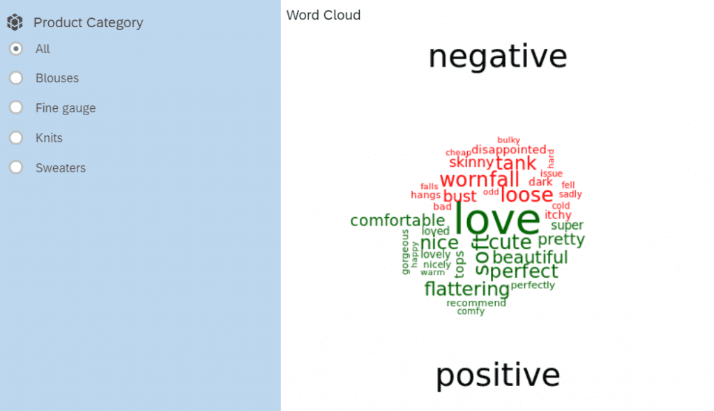 Our new word cloud contains all the sentiment of our customer reviews.[/caption]
And voila! Jessica generated a word cloud that displays the sentiment of the words.
At a glance, Jessica can quickly understand reviews from customers. Words like “soft,” “beautiful,” and “comfortable” are desirable traits in sweaters. She can forward these positive words to her marketing team to improve messaging in their external materials.
Jessica is alarmed by the negative words; she notices the size of the word “itchy” is especially large. This indicates a high frequency of this word in the product reviews. She wants to know more about reviews that mention “itchy,” but the word cloud lacks the necessary context for her to find out why.
Jessica can look at individual product reviews to understand the root cause of the itchy sweaters.
This is where a table containing this information comes in handy.
Create another R Visualization Widget, and add “Review Text,” “Rating,” and “Recommended Purchase” dimensions into the rows of the data input.
[caption id="attachment_18865" align="aligncenter" width="487"]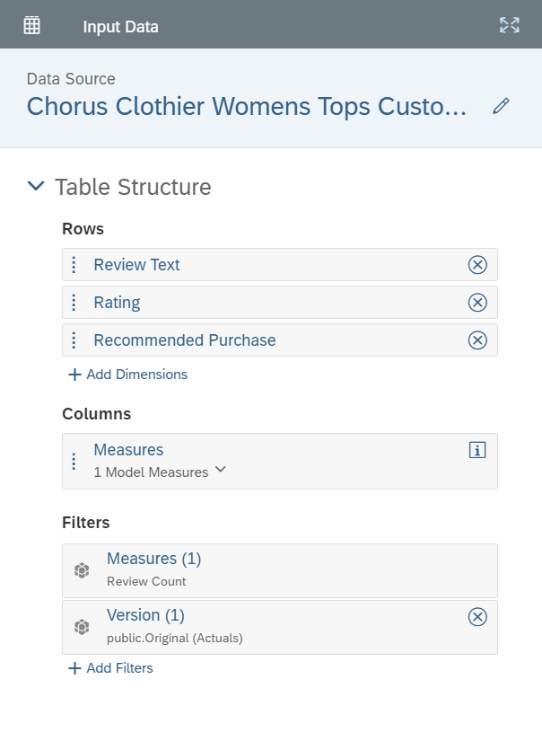 Using another R visualization, we can easily input our data and create a table to show our insights.[/caption]
Click “Edit Script” and paste the following code into the editor, starting with the required libraries.
#load libraries
library(dplyr)
library(tidyverse)
library(DT)
Bring the data into the editor.
#Bring in the data
review_df <- as.data.frame(Reviews)
review_df$"Review Text" <- as.character(review_df$"Review Text")
Generate the Data Table. Click Apply.
#generatethetable
datatable(review_df)
Search for “Itchy” in the Search field and sort “Rating” and “Recommended Purchase” by least to greatest.
[caption id="attachment_18866" align="aligncenter" width="702"]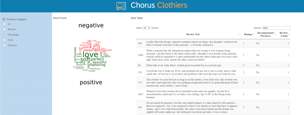 Now we can clearly understand our customer's sentiment. And we did it so quickly![/caption]
By looking at the comments that featured the word “itchy,” Jessica discovered that while the sweater was very appealing to customers, they found the materials in the sweater to be fairly itchy; enough to write a frustrated review on it.
This information is invaluable to the product team. She can recommend they consider continuing with the style in another material and have the recommendation backed by her data.
Finally, we will create a stacked column chart below our word cloud to visualize our positive and negative sentiment.
With “Review Count” as the measure, “Rating” as the dimension, and “Recommended Purchase” as the color, we can now see the distribution of ratings, as well as the proportion of reviews that recommend the product.
It’s peculiar that 3/5 stars indicate satisfaction with the product; however, of those reviewers, over half do not recommend the product to others.
[caption id="attachment_18867" align="aligncenter" width="702"] Now we can easily see the distribution of ratings and understand recommendations at a quick glance.[/caption]
Jessica will likely revisit this story. Let’s create another input control for the “Recommended Purchase” to make it easier to filter for reviewers that are willing to recommend the product.
[caption id="attachment_18868" align="aligncenter" width="701"] Here, we can filter our reviews to see who recommended the product.[/caption]
In a short period of time, Jessica was uncovered some important insights about the Sweaters in the Casual Women’s segment at Chorus Clothiers:
Jessica is quite pleased. With just a few clicks, she effortlessly analyzed and aggregated raw data into useful information, telling her where to focus her efforts.
She’s also reduced her time to complete her task in half; what was meant to take two to three days of work will now be done by the end of the day. This enables Jessica to spend more time discovering insights instead of aimlessly reading customer reviews, therefore speeding up important decision-making processes.
This was all possible with R visualizations. With her dashboard on SAP Analytics Cloud, she can share it with others in the company for collaboration. What was once considered a mundane task has now been transformed into a pool of insights.
But when you have a lot of data to sift through, knowing where to start can feel overwhelming.
In this blog post, we’ll explore how to successfully analyze qualitative data by walking through a real-life scenario with R Visualizations in SAP Analytics Cloud. You'll be uncovering insights in no time!
Getting Started with R Visualizations
Jessica is a newly hired Junior Brand Manager. She's responsible for managing the Casual Women’s segment at Chorus Clothiers. After several weeks of onboarding, she was tasked with gathering insights from product reviews. Her Senior Brand Manager joked that it is a pretty mundane and tedious task and should keep her busy for the next few days.
“Work smarter, not harder” has always been Jessica’s motto. So, she’s going to leverage SAP Analytics Cloud to streamline her analysis and leverage R Visualizations to surface meaningful relationships from her data.
As a level set: R is a popular open-source programming language used by many people around the world for data analysis. It can be integrated with SAP Analytics Cloud to tell richer and more robust stories.
With R, you can:
- Insert R visualizations into your stories
- Interact with your visualizations, using controls such as filters
- Edit your R scripts and preview visualizations
- Share stories containing R visualizations with other users
After receiving the e-commerce product reviews in a csv file, Jessica uploads her data into SAP Analytics Cloud. Before she does anything else, she ensures that the product review comments (“Review Text”) is a dimension.
Remember: Dimensions are either characteristics of a measure or pieces of data that help contextualize the facts. This will allow her to understand and index measures in her data models.
Once that’s done, she’s ready to create a story and start visualizing her data!
To follow along with Jessica, you can click here to download her dataset.
Note: The excel file used in this guide is a modified version of the Women's E-Commerce Clothing Reviews found on Kaggle. Please keep in mind that the empty cells in the “Review Text” dimension represents the reviews with ratings, but the reviewer did not provide any comments. However, this will appear as “No Value” in the SAP Analytics Cloud story later.
[caption id="attachment_18859" align="aligncenter" width="700"]
The “Review Text” dimension represents the reviews with ratings[/caption]Part One: Creating a Word Cloud
Jessica first wants to understand which words are highly recurring among the product reviews to form a better understanding of the customer perception in the products. To do that, she can create a word cloud to effectively visualize the frequencies of each word.
Larger sized words in the chart indicate a higher frequency allowing her to visually tell which words are more important. She can also compute the sentiment of each word. By analyzing the combined frequency and sentiment, she can expect positive words with high frequencies as overall strengths in her product. Negative words with high frequencies can be perceived as areas for the product to improve in.
How to Create a Word Cloud with R Visualization
First, create an R Visualization widget and select the “Review Text” dimension in the input data:
[caption id="attachment_18906" align="aligncenter" width="698"]
Creating an R Visualization widget is easy.[/caption]Click “Edit Script” and paste the following code into the editor, starting with the required libraries:
#Load Libraries
library(wordcloud)
library(tidytext)
library(dplyr)
library(tidyverse)
library(reshape2)
Prepare the stop words. Stop words are words that have little value in our analysis like “the," “is,” etc. Though clothing items like “shirt” are relevant, it contains less contextual value when compared to other words like itchy or scratchy.
#Prepare Stop Words
custom_stop_words <- tibble(word = c("top","blouse","shirt","knit","sweater"))
stop_words
Bring the model into the editor
#Bring in the model
review_df <- as.data.frame(Reviews)
review_df$"Review Text" <- as.character(review_df$"Review Text")
Transform the data frame to grab the frequency of every word. In addition, Bing from the Tidytext library will be used to compute the sentiment of each word. The output will either be a positive or negative sentiment. Words that score a neutral sentiment will be filtered out.
#Transform data to generate data frame with words, frequencies, and sentiment
sentiment_df <- review_df %>% unnest_tokens(word, "Review Text") %>%
anti_join (stop_words) %>%
anti_join (custom_stop_words) %>%
inner_join(get_sentiments('bing')) %>%
dplyr::count(word, sentiment, sort = "TRUE") %>%
acast(word ~ sentiment, value.var= "n", fill = 0)
Generate the word cloud. The parameters can be tuned, which will affect the output of the word cloud. Click Apply.
#Create word cloud
comparison.cloud(sentiment_df, colors = c("red", "darkgreen"), title.bg.colors = “white”, max.words = 40, title.colors="black",scale = c(4, .5), random.order=FALSE )
[caption id="attachment_18861" align="aligncenter" width="454"]
We've just created our word cloud! Now we can start analyzing.[/caption]We’ve just set up our word cloud!
But before Jessica can start analyzing it, she first needs to filter the chart to focus on a specific product category. To do this, create an input control on the “Product Category” dimension, which will allow us to filter through the different product classes.
Select “Sweaters” on the input control.
[caption id="attachment_18864" align="aligncenter" width="701"]
Our new word cloud contains all the sentiment of our customer reviews.[/caption]And voila! Jessica generated a word cloud that displays the sentiment of the words.
At a glance, Jessica can quickly understand reviews from customers. Words like “soft,” “beautiful,” and “comfortable” are desirable traits in sweaters. She can forward these positive words to her marketing team to improve messaging in their external materials.
Jessica is alarmed by the negative words; she notices the size of the word “itchy” is especially large. This indicates a high frequency of this word in the product reviews. She wants to know more about reviews that mention “itchy,” but the word cloud lacks the necessary context for her to find out why.
Part Two: Creating a Data Table with R Visualization
Jessica can look at individual product reviews to understand the root cause of the itchy sweaters.
This is where a table containing this information comes in handy.
How to Create a Data Table
Create another R Visualization Widget, and add “Review Text,” “Rating,” and “Recommended Purchase” dimensions into the rows of the data input.
[caption id="attachment_18865" align="aligncenter" width="487"]
Using another R visualization, we can easily input our data and create a table to show our insights.[/caption]Click “Edit Script” and paste the following code into the editor, starting with the required libraries.
#load libraries
library(dplyr)
library(tidyverse)
library(DT)
Bring the data into the editor.
#Bring in the data
review_df <- as.data.frame(Reviews)
review_df$"Review Text" <- as.character(review_df$"Review Text")
Generate the Data Table. Click Apply.
#generatethetable
datatable(review_df)
Search for “Itchy” in the Search field and sort “Rating” and “Recommended Purchase” by least to greatest.
[caption id="attachment_18866" align="aligncenter" width="702"]
Now we can clearly understand our customer's sentiment. And we did it so quickly![/caption]By looking at the comments that featured the word “itchy,” Jessica discovered that while the sweater was very appealing to customers, they found the materials in the sweater to be fairly itchy; enough to write a frustrated review on it.
This information is invaluable to the product team. She can recommend they consider continuing with the style in another material and have the recommendation backed by her data.
Finishing up the Story
Finally, we will create a stacked column chart below our word cloud to visualize our positive and negative sentiment.
How to Create a Stacked Column Chart
With “Review Count” as the measure, “Rating” as the dimension, and “Recommended Purchase” as the color, we can now see the distribution of ratings, as well as the proportion of reviews that recommend the product.
It’s peculiar that 3/5 stars indicate satisfaction with the product; however, of those reviewers, over half do not recommend the product to others.
[caption id="attachment_18867" align="aligncenter" width="702"]
Now we can easily see the distribution of ratings and understand recommendations at a quick glance.[/caption]Jessica will likely revisit this story. Let’s create another input control for the “Recommended Purchase” to make it easier to filter for reviewers that are willing to recommend the product.
[caption id="attachment_18868" align="aligncenter" width="701"]
Here, we can filter our reviews to see who recommended the product.[/caption]Putting it All Together
In a short period of time, Jessica was uncovered some important insights about the Sweaters in the Casual Women’s segment at Chorus Clothiers:
- Though the sweaters are itchy, Jessica validated that consumers found the styles to be trendy. Therefore, selling the same styles in a different material will be key in hitting the sales targets for the year
- Incorporating what customers love about the products into the messaging should improve conversions across all marketing channels
- There is a large amount of satisfactory (3/5 star) reviews that do not recommend the product to others. As a result, the team will need to develop a plan to address this issue immediately
Jessica is quite pleased. With just a few clicks, she effortlessly analyzed and aggregated raw data into useful information, telling her where to focus her efforts.
She’s also reduced her time to complete her task in half; what was meant to take two to three days of work will now be done by the end of the day. This enables Jessica to spend more time discovering insights instead of aimlessly reading customer reviews, therefore speeding up important decision-making processes.
This was all possible with R visualizations. With her dashboard on SAP Analytics Cloud, she can share it with others in the company for collaboration. What was once considered a mundane task has now been transformed into a pool of insights.
- SAP Managed Tags:
- SAP Analytics Cloud,
- Data and Analytics,
- SAP Business Technology Platform
Labels:
You must be a registered user to add a comment. If you've already registered, sign in. Otherwise, register and sign in.
Labels in this area
-
ABAP CDS Views - CDC (Change Data Capture)
2 -
AI
1 -
Analyze Workload Data
1 -
BTP
1 -
Business and IT Integration
2 -
Business application stu
1 -
Business Technology Platform
1 -
Business Trends
1,658 -
Business Trends
94 -
CAP
1 -
cf
1 -
Cloud Foundry
1 -
Confluent
1 -
Customer COE Basics and Fundamentals
1 -
Customer COE Latest and Greatest
3 -
Customer Data Browser app
1 -
Data Analysis Tool
1 -
data migration
1 -
data transfer
1 -
Datasphere
2 -
Event Information
1,400 -
Event Information
67 -
Expert
1 -
Expert Insights
177 -
Expert Insights
307 -
General
1 -
Google cloud
1 -
Google Next'24
1 -
GraphQL
1 -
Kafka
1 -
Life at SAP
780 -
Life at SAP
13 -
Migrate your Data App
1 -
MTA
1 -
Network Performance Analysis
1 -
NodeJS
1 -
PDF
1 -
POC
1 -
Product Updates
4,576 -
Product Updates
350 -
Replication Flow
1 -
REST API
1 -
RisewithSAP
1 -
SAP BTP
1 -
SAP BTP Cloud Foundry
1 -
SAP Cloud ALM
1 -
SAP Cloud Application Programming Model
1 -
SAP Datasphere
2 -
SAP S4HANA Cloud
1 -
SAP S4HANA Migration Cockpit
1 -
Technology Updates
6,873 -
Technology Updates
436 -
Workload Fluctuations
1
Related Content
- Composite Data Source Configuration in Optimized Story Experience in Technology Blogs by SAP
- Optimized Design Experience in SAP Analytics Cloud - Building Containers in a no code Environment in Technology Blogs by SAP
- Details of SAP Data and Analytics Advisory Methodology Phase III (Capability Map & Sol. Architect.) in Technology Blogs by SAP
- SAP Cloud ALM Implementation and Operations Configuration Webinar Series in Technology Blogs by SAP
- CSS Designs for a Stylish and Optimized SAP Analytics Cloud Experience in Technology Blogs by Members
Top kudoed authors
| User | Count |
|---|---|
| 25 | |
| 17 | |
| 11 | |
| 11 | |
| 9 | |
| 9 | |
| 9 | |
| 8 | |
| 8 | |
| 7 |