- SAP Community
- Products and Technology
- Technology
- Technology Q&A
- I have a bar chart with two measures, how can i di...
- Subscribe to RSS Feed
- Mark Question as New
- Mark Question as Read
- Bookmark
- Subscribe
- Printer Friendly Page
- Report Inappropriate Content
I have a bar chart with two measures, how can i display the axes label for both measures
- Subscribe to RSS Feed
- Mark Question as New
- Mark Question as Read
- Bookmark
- Subscribe
- Printer Friendly Page
- Report Inappropriate Content
02-15-2024 12:44 PM - edited 02-15-2024 5:55 PM
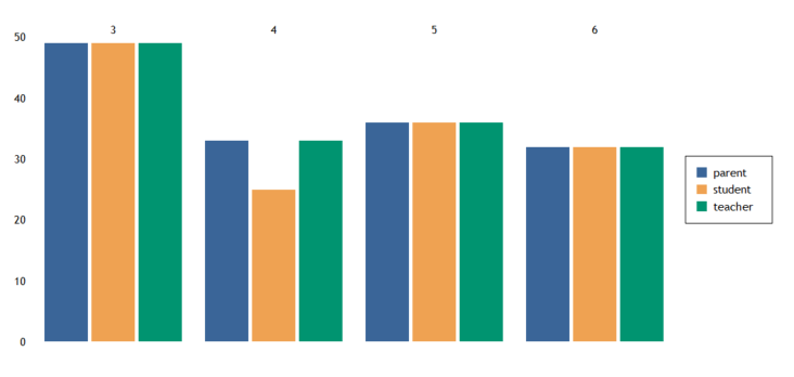
i have a survey data of multiple grades that were filled by eather the student, the techer or the parent.
i am showing the grade on the top axis and i want to show the parent/student/teacher measure on the bottom axis
- SAP Managed Tags:
- SAP Crystal Reports
Accepted Solutions (1)
Accepted Solutions (1)
- Mark as New
- Bookmark
- Subscribe
- Subscribe to RSS Feed
- Report Inappropriate Content
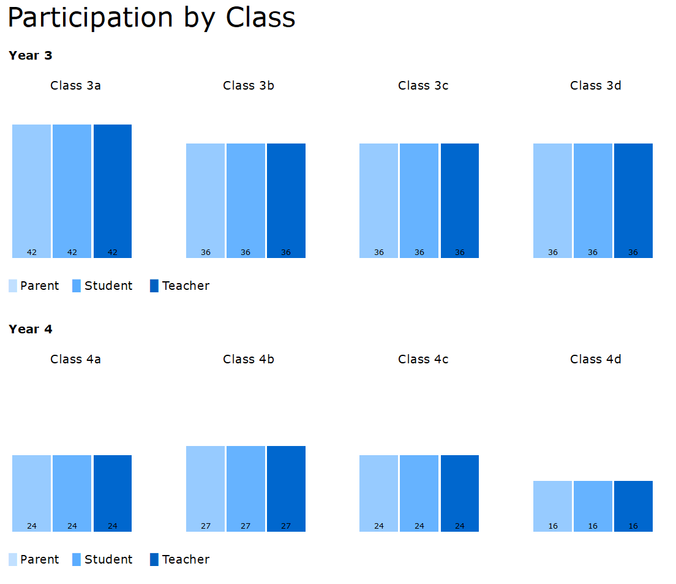
In this case, I would recommend creating a multicolumn / card style report...see below for the details. I can't attached a .zip or the file itself so I have sent it to you. If anyone else is looking to see how to create this type of report please feel free reach out to me.
The reason to use this type of report is that it will allow you a lot more flexibility in the chart formatting and more importantly allow you to add other survey objects at the class level; more info on that point further below.
Note that in the screenshot below all of the parent student teacher summaries are the same as there is an equal count for each.
- The report is grouped by year.
- The chart is contained in a subreport which is in the Group Header.
- The subreport is formatted as a multi-column report.
- The multi-column format is basically a "card" format.
- There is one card for each class and each card will have its own chart.
- See the Section Expert > Details section on the sizing.
- Right now the charts are showing the count of responses...this of course can be changed.
- Note that since each class has a card associated with it, you can add other objects such as cross-tabs, summaries, more charts etc. Those will also then be at the class level.
- You can of course add cross-tabs, summaries, charts at the group level and the report level as well.
- There is also a subreport in the report header which is used to find the maximum of all of the survey counts by year and class. This value is used to ensure that the scale for all of the charts in the entire report are the same. You can change this if you want the scale to be by year.
You must be a registered user to add a comment. If you've already registered, sign in. Otherwise, register and sign in.
- Mark as New
- Bookmark
- Subscribe
- Subscribe to RSS Feed
- Report Inappropriate Content
- Mark as New
- Bookmark
- Subscribe
- Subscribe to RSS Feed
- Report Inappropriate Content
- Mark as New
- Bookmark
- Subscribe
- Subscribe to RSS Feed
- Report Inappropriate Content
Answers (2)
Answers (2)
- Mark as New
- Bookmark
- Subscribe
- Subscribe to RSS Feed
- Report Inappropriate Content
Hi Alonso, one way to do this is to
- create a new Formula that is only the number of the highest value...in the case of your chart would that be 50?
- Next add that new formula as a Show Value to your chart. Depending on your chart that should now keep the scale the same for all 3 of your bar series.
- Now right click on the bar representing the formula and choose Format and change the Fill colour to transparent.
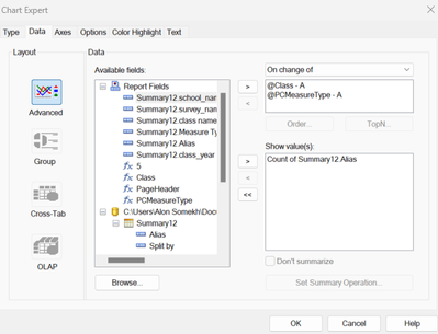
If on step 2 you don't see that happening can you please show us a picture of the Chart Expert's Data tab.
You must be a registered user to add a comment. If you've already registered, sign in. Otherwise, register and sign in.
- Mark as New
- Bookmark
- Subscribe
- Subscribe to RSS Feed
- Report Inappropriate Content
- Mark as New
- Bookmark
- Subscribe
- Subscribe to RSS Feed
- Report Inappropriate Content
- Mark as New
- Bookmark
- Subscribe
- Subscribe to RSS Feed
- Report Inappropriate Content
- Mark as New
- Bookmark
- Subscribe
- Subscribe to RSS Feed
- Report Inappropriate Content
If you're trying to show the Class & Parent Student Teacher data on the bottom as well then you would create a single formula that appends those two and then use that in the Chart Expert. e.g. The new formula coud have syntax of {@class} + chr(10) + {@PCMeasureType}
If you then want to show the measure then right click on the chart and choose Chart Options > Data Labels > Show Data labels and there is a base of chart option.
- Mark as New
- Bookmark
- Subscribe
- Subscribe to RSS Feed
- Report Inappropriate Content
- Mark as New
- Bookmark
- Subscribe
- Subscribe to RSS Feed
- Report Inappropriate Content
- Mark as New
- Bookmark
- Subscribe
- Subscribe to RSS Feed
- Report Inappropriate Content
Deleted answer.
You must be a registered user to add a comment. If you've already registered, sign in. Otherwise, register and sign in.
- SAP Analytics Cloud: Support Universal Account Model (UAM) with Custom Widget in Technology Blogs by SAP
- Getting Analytical Data on different Dates in one CDS Cube in Technology Blogs by SAP
- Allocation of multiple hierarchies from parent node to child nodes in Technology Q&A
- Composite Data Source Configuration in Optimized Story Experience in Technology Blogs by SAP
- Onboarding Users in SAP Quality Issue Resolution in Technology Blogs by SAP
| User | Count |
|---|---|
| 82 | |
| 10 | |
| 10 | |
| 9 | |
| 7 | |
| 6 | |
| 6 | |
| 5 | |
| 5 | |
| 4 |


You must be a registered user to add a comment. If you've already registered, sign in. Otherwise, register and sign in.