- SAP Community
- Products and Technology
- Technology
- Technology Q&A
- Gantt chart in SAC without custom widget for order...
- Subscribe to RSS Feed
- Mark Question as New
- Mark Question as Read
- Bookmark
- Subscribe
- Printer Friendly Page
- Report Inappropriate Content
Gantt chart in SAC without custom widget for order scheduling/monitoring
- Subscribe to RSS Feed
- Mark Question as New
- Mark Question as Read
- Bookmark
- Subscribe
- Printer Friendly Page
- Report Inappropriate Content
02-06-2024 10:53 AM - edited 02-06-2024 12:02 PM
Hello dear community,
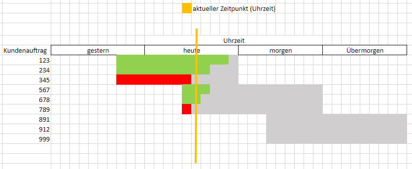
I have the following problem. We have the requirement to display an order monitoring dashboard in the SAC that resembles a Gantt chart. However, we are not allowed to use custom widgets. The final product must look like this:
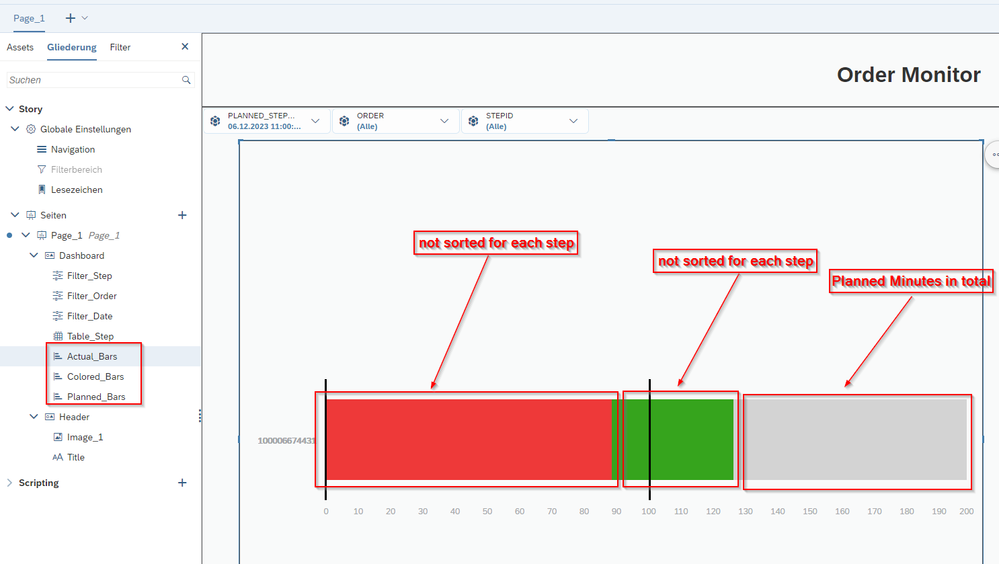
As a first approach, I used several stacked column charts, the planned tasks in minutes as bars in gray, the actual tasks in red or green (red = If the time for the task is more than planned, green = If the time for the task is smaller than planned). However, I don't know how to show the time frame (5 days) in the charts. Another problem is that the minutes for the steps are not sorted according to them, which means that all minutes only for a order are sorted by color - which does not meet the requirements.
The structure of my data is like following:
Dimensions:
- Order
- StepID
- Planned Start Date (Timestamp)
- Planned End Date (Timestamp)
- Actual Start Date (Timestamp)
- Actual End Date (Timestamp)
- Flag Bar (gives a X or I if the actual time is more than the planned time for coloring of the bars)
Measures:
- Planned Minutes
- Actual Minutes
I look forward to your answers and thank you in advance.
- SAP Managed Tags:
- SAP Analytics Cloud,
- SAP Analytics Cloud, analytics designer
Accepted Solutions (0)
Answers (0)
- Creating a Custom Navigation Side Panel in SAP Analytics Cloud (Optimized Story Experience) in Technology Blogs by SAP
- SAP Analytics Cloud: Support Universal Account Model (UAM) with Custom Widget in Technology Blogs by SAP
- SAP Build Workzone maximum characters in text widget in Technology Q&A
- Developing & Deploying the UI5 App to Cloud Foundry and Accessing from App-router End-to-End Steps in Technology Blogs by Members
- Set active page within a composite widget in SAC in Technology Q&A
| User | Count |
|---|---|
| 83 | |
| 10 | |
| 10 | |
| 9 | |
| 7 | |
| 6 | |
| 6 | |
| 6 | |
| 5 | |
| 4 |


You must be a registered user to add a comment. If you've already registered, sign in. Otherwise, register and sign in.