
- SAP Community
- Products and Technology
- Technology
- Technology Blogs by SAP
- Creating a Custom Navigation Side Panel in SAP Ana...
- Subscribe to RSS Feed
- Mark as New
- Mark as Read
- Bookmark
- Subscribe
- Printer Friendly Page
- Report Inappropriate Content
Use Case
As a story creator, you may want to link multiple stories so that users do not need to exit one story before they can launch the next. Using the Optimized Story Experience, you can combine standard widgets, theming, and scripts to create a custom navigation side panel that offers seamless navigation through a series of stories.
This blog will show you the possibilities with the Optimized Story Experience. Depending on your specific use case there might be other navigation options that fit better. You can decide if the example below will provide additional value to your story design.
Step 1: Prepare the Story
You begin by establishing the layout of the page where you want to integrate the navigation side panel. Ideally, you will organize all content such as charts, tables, and titles in a single panel. You can then add the navigation panel next to this main content panel, which creates a clear structure that will make it easier to make the navigation side panel expandable and collapsible later in the process.
If you have not yet created your story, you can use templates in the Fiori Morning Horizon Theme package that you can download from the Community Content. This will give you a pre-configured layout that you can enhance with the navigation panel. Additionally the Fiori Morning Horizon Theme is included that holds additional CSS classes that will be used in the example.
Create some space around the panel that holds your story content by selecting it and changing the entries for Size and Position in the Styling Panel. In this example, the following space and position settings are defined for the content panel:
width: auto, height: auto, left: 200px, top: 50px, right: 0px, bottom: 0px
The story page will look like this: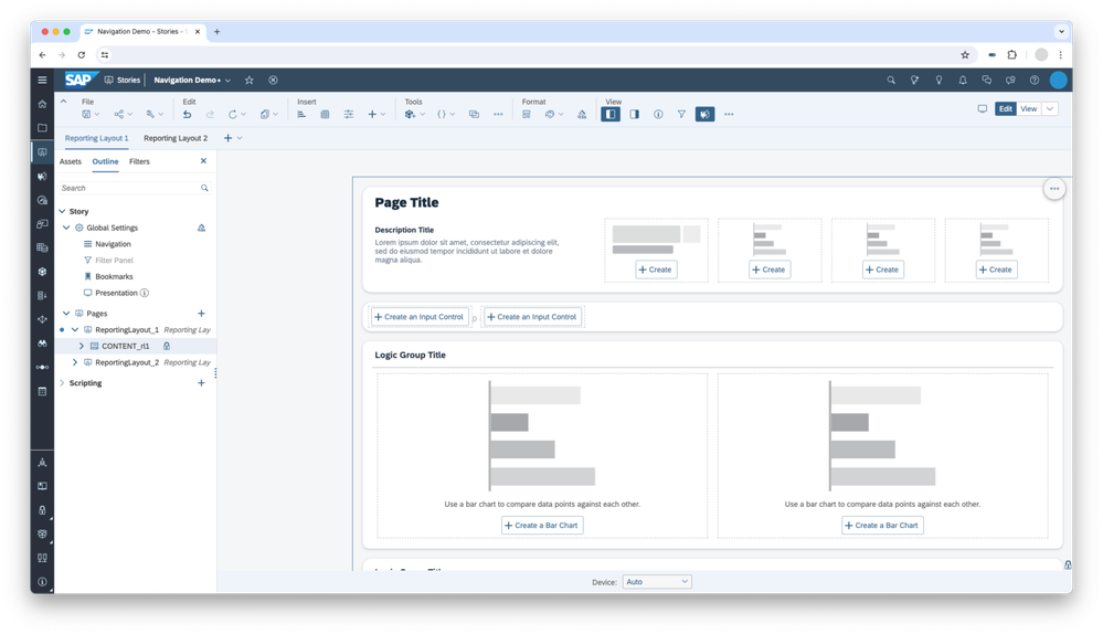
Step 2: Prepare the CSS Styling
You will next prepare some CSS classes for the menu items to ensure that styling is applied consistently to your side panel.
First, create two CSS classes that will style the background of the menu items to highlight the selected menu item. By applying a border to both the highlighted and unhighlighted menu items, you can keep the text position of the menu entry at the same place.
.mnu-item .sap-custom-panel-widget{
       background-color:transparent;
       border-left: 2px solid transparent;
}
.mnu-item-active .sap-custom-panel-widget{
       background-color:#DCF3FF;
       border-left: 2px solid #0064D9;
}
You can access the Story CSS editor by clicking Edit CSS in the Format section of the SAP Analytics Cloud toolbar.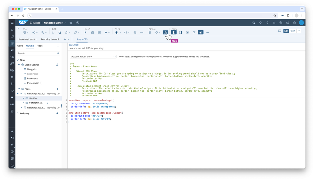
Step 3: Create the Shell Bar
Next, create a panel at the top of the content area to serve as a shell bar. The size and position settings for the shellbar are as follows:
width: auto, height: 50px, left: 0px, top: 0px, right: auto, bottom: auto
Add the CSS class shellBar (included in the Fiori Morning Horizon Story Theme file) to this panel.
Inside this panel, add a button that you will use later to expand and collapse the navigation panel. You can add an icon into the button.
If you want to learn more how to use UI5 icons in SAP Analytics Cloud, you can read the Using SAP Fiori Icons as a custom web font in SAP Analytics Cloud blog.
Now place a text widget for your desired title and your logo inside the shell bar. Your story should look something like this: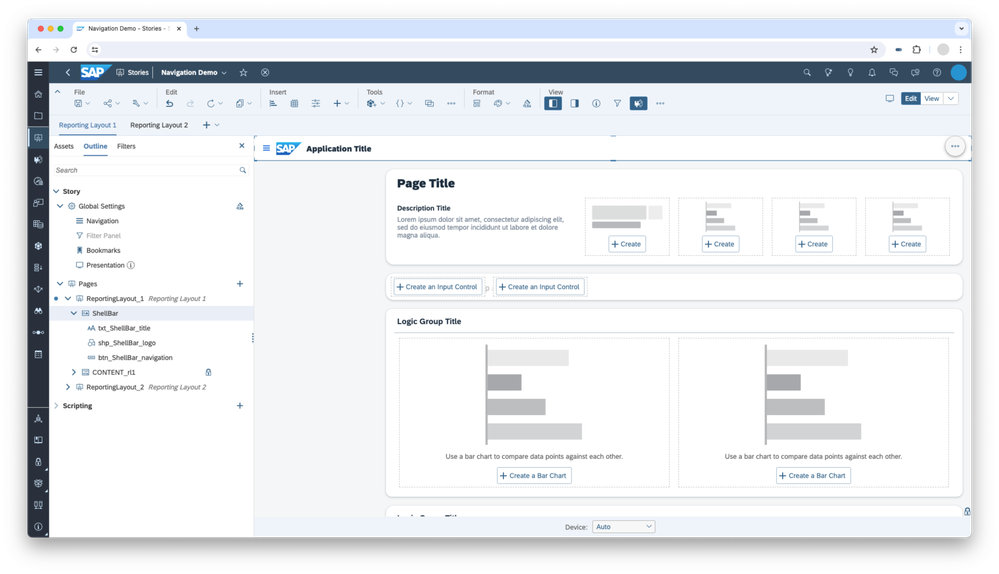
Step 4: Create the Side Panel
The next step is to create the foundation of the navigation side panel, which is made up of several panel objects that are nested into each other. Pay close attention to the Size, Position, and CSS Class Name settings for each panel.
Start with the first panel that represents the background of the sidepanel.
1. First, add a Panel called Navigation to represents the background, with the following size and position settings:
width: 250px, height: auto, left: 0px, top: 50px, right: auto, bottom: 0px
Apply the CSS class sidepanel to the panel. In the Widget section of the Styling Panel, set the Corner Radius to 0px.
2. Inside the Navigation panel, add a Flow Layout Panel called fpnl_NavigationLayout, with the following size and position settings:
width: auto, height: auto, left: 8px, top: 16px, right 8px, bottom: 16px
3. Inside the fpnl_NavigationLayout panel, add a Panel called pnl_MnuItem_1 to represent the first menu item, with the following size and position settings:
width: 100%, height: 32px
Apply the CSS Class name mnu-item-active to highlight the first menu item. In the Widget section of the Styling Panel, set the Corner Radius to 6px.
4. Inside the pnl_MnuItem_1 panel, add a Text object to specify the name of the menu item (to be updated later), with the following size and position settings:
width: auto, height: auto, left: 8px, top: 6px, right: 8px, bottom: 0px
Since you put the pnl_MnuItem_1 inside a Flow Layout Panel, you can duplicate the menu item, and it will automatically be added below. Repeat until you have created enough menu items for your use case.
For the menu items that are not initially active, apply the mnu-item CSS class.
Your story page should now look like this: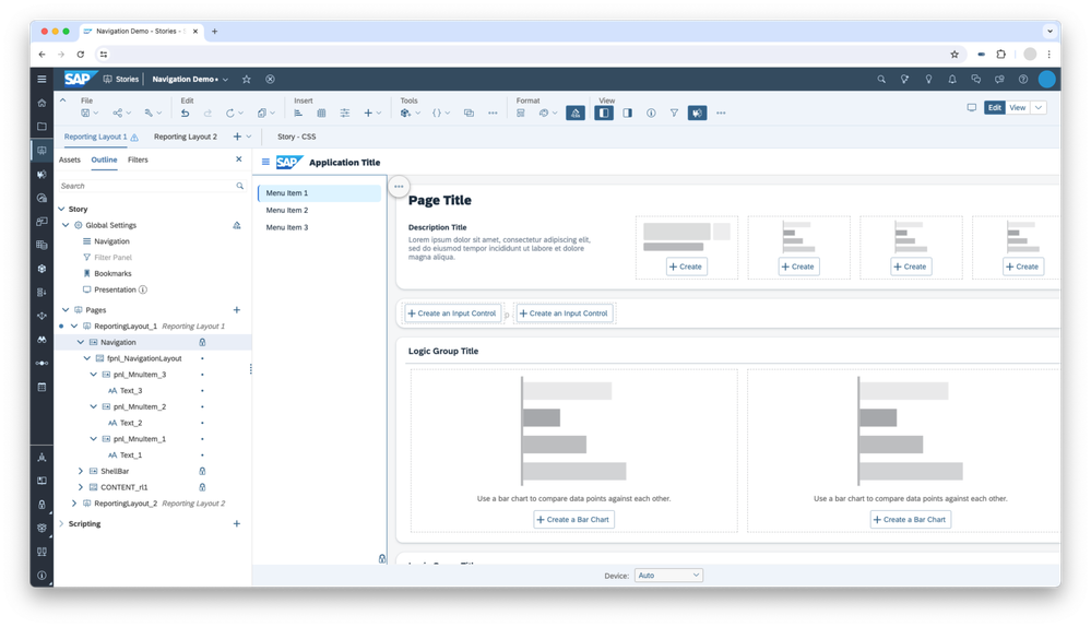
Step 5: Add Scripting to the Navigation Side Panel
To allow users to navigate using the menu items you just created, you will need to add the following script to each text widget inside the Navigation side panel:
NavigationUtils.openStory("StoryID", "PageID",[],false);
You can find more details on the Navigation Utils script function in the Optimized Story Experience API Reference. You can more easily select the Story ID and Page ID by using the value help in the script editor, which will allow you to select the story and page via a file browser.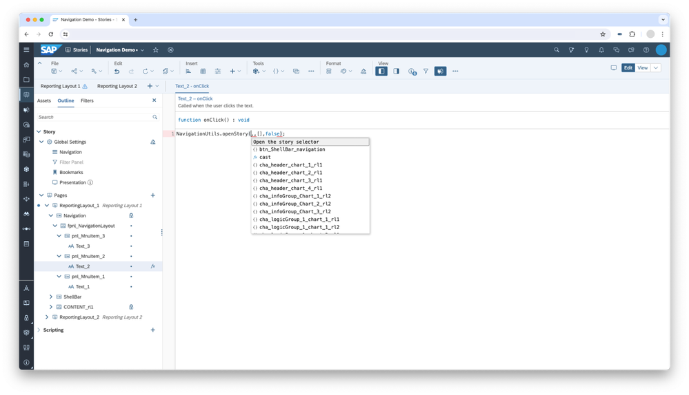
The second part of the scripting is to add the expand and collapse interaction to the navigation side panel. First the script will check if the panel is visible. Based on the visibility, the script then decides whether the panel will be shown or hidden when the button is clicked. Optionally, you can choose to have the content area resize so the user always sees all the content.
Add one of the following scripts to the onClick event of the button in the shellbar.
Option 1 resizes the content area:
if(Navigation.isVisible()===true){
      Navigation.setVisible(false);
      CONTENT_rl1.getLayout().setLeft(0);
} else {
      Navigation.setVisible(true);
      CONTENT_rl1.getLayout().setLeft(Navigation.getLayout().getWidth());
}
Option 2 overlays the content area:
if(Navigation.isVisible()===true){
      Navigation.setVisible(false);
} else {
      Navigation.setVisible(true);
}
Step 6: Add the Navigation Side Panel to Other Stories
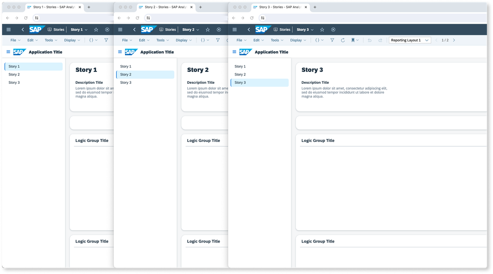
Your first story now contains the Navigation Side Panel. This story is represented by the first menu entry in the panel that is currently highlighted.
The other two menu entries in the Navigation Side Panel are not highlighted, but they contain the navigation script that enables you to navigate to the other stories.
The next step is to open your second story and copy the Navigation Side Panel, the shell bar and also the Story CSS you created in Step 2 to this second story. Inside the Navigation Side Panel, select the first menu entry and change the CSS class to mnu-item. Your second story is now represented by the second menu entry. To show that the user is in the second story, select the second menu entry and change the CSS class to mnu-item-active.
Repeat this step for the third story.
Below, you can see how your three example stories would look like. Each Story contains the Navigation Side Panel, and the highlighted menu entry shows the user which is the current story.
Further Considerations
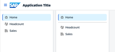
The above steps show you the basics of how you can create a first version of your custom navigation side panel. There are further steps that you can take to enhance your navigation side panel even more, such as adding icons to your menu entries or adding a line shape widget to create separators between logical sections.
You can also consider taking advantage of the new Composites feature in SAP Analytics cloud to create your Navigation Side Panel as a composite.
You must be a registered user to add a comment. If you've already registered, sign in. Otherwise, register and sign in.
-
ABAP CDS Views - CDC (Change Data Capture)
2 -
AI
1 -
Analyze Workload Data
1 -
BTP
1 -
Business and IT Integration
2 -
Business application stu
1 -
Business Technology Platform
1 -
Business Trends
1,658 -
Business Trends
104 -
CAP
1 -
cf
1 -
Cloud Foundry
1 -
Confluent
1 -
Customer COE Basics and Fundamentals
1 -
Customer COE Latest and Greatest
3 -
Customer Data Browser app
1 -
Data Analysis Tool
1 -
data migration
1 -
data transfer
1 -
Datasphere
2 -
Event Information
1,400 -
Event Information
69 -
Expert
1 -
Expert Insights
177 -
Expert Insights
328 -
General
1 -
Google cloud
1 -
Google Next'24
1 -
GraphQL
1 -
Kafka
1 -
Life at SAP
780 -
Life at SAP
13 -
Migrate your Data App
1 -
MTA
1 -
Network Performance Analysis
1 -
NodeJS
1 -
PDF
1 -
POC
1 -
Product Updates
4,575 -
Product Updates
374 -
Replication Flow
1 -
REST API
1 -
RisewithSAP
1 -
SAP BTP
1 -
SAP BTP Cloud Foundry
1 -
SAP Cloud ALM
1 -
SAP Cloud Application Programming Model
1 -
SAP Datasphere
2 -
SAP S4HANA Cloud
1 -
SAP S4HANA Migration Cockpit
1 -
Technology Updates
6,872 -
Technology Updates
459 -
Workload Fluctuations
1
- SAP BTP FAQs - Part 2 (Application Development, Programming Models and Multitenancy) in Technology Blogs by SAP
- How to export all script objects from an Optimized Story Experience? (open a .package export file) in Technology Q&A
- How to Customize SAC UI Themes: A Basic Guide in Technology Blogs by SAP
- What’s New in SAP Analytics Cloud Q2 2024 in Technology Blogs by SAP
- 10+ ways to reshape your SAP landscape with SAP Business Technology Platform – Blog 7 in Technology Blogs by SAP
| User | Count |
|---|---|
| 17 | |
| 10 | |
| 7 | |
| 6 | |
| 6 | |
| 6 | |
| 6 | |
| 6 | |
| 5 | |
| 4 |