


- SAP Community
- Products and Technology
- Technology
- Technology Blogs by SAP
- KPI-Dashboard with SAC and Datasphere
Technology Blogs by SAP
Learn how to extend and personalize SAP applications. Follow the SAP technology blog for insights into SAP BTP, ABAP, SAP Analytics Cloud, SAP HANA, and more.
Turn on suggestions
Auto-suggest helps you quickly narrow down your search results by suggesting possible matches as you type.
Showing results for
Product and Topic Expert
Options
- Subscribe to RSS Feed
- Mark as New
- Mark as Read
- Bookmark
- Subscribe
- Printer Friendly Page
- Report Inappropriate Content
11-21-2023
1:36 PM
Introduction
After a while it is time to start a new blog about my KPI-Dashboard. If you don’t know my Lumira-Blog, feel free to take a look: SDN
The reason of this blog is to give you an idea what is possible with our power couple SAP Analytics Cloud and SAP Datasphere. This dashboard covers the topics:
- SAC Story
- SAC Composites
- Mobile-Support
- SAC Planning
- Datasphere Integration with Catalog and Marketplace
Changelog:
- I added a geomap based on DSP (05.12.2023)
- Preview video of Just Ask (06.12.2023)
- Added the documentation for the usage report (02.01.2024)
- Added a new video about Just Ask (13.02.2024). Video is in german and covers the indexed models, rules and integration of Datasphere
- Added new screenshots with Horizon-theme (at the end of blog)
Video (click on the image below and turn the sound on):
SAC Story
The main concept of my dashboard is to show the data from a highly aggregated KPI to a very detailed level in one dashboard and in one system.
Overview
The Overview gives you highly aggregated view for your top KPIs. The most KPIs consists of a header, time selection, a unit and the actual-, plan- und delta-values. Represented as a bar-chart, numeric-chart, line-chart or a text-widget.

All master data and transactional data is stored in our SAP Datasphere. At the top of the story you find a toolbar for switching the tabs, a month selection and buttons to open the usage-story, the to open the planning story, export to excel and pdf and a link to the SAP Datasphere Catalog as the central point for documentation.

The tiles and the corresponding headers (HR, Sales, Finance…) are parts of a flow layout panel. But every single tile is also a flow layout panel:
 So why the flow layout panel? With the flow layout panel, you have the choice to hide objects at runtime if the screen size is too small. Panel_70 is the divider to the prior KPI. But in the mobile context we list all KPIs without a border to the lft, so that’s the reason why we want to hide the divider.
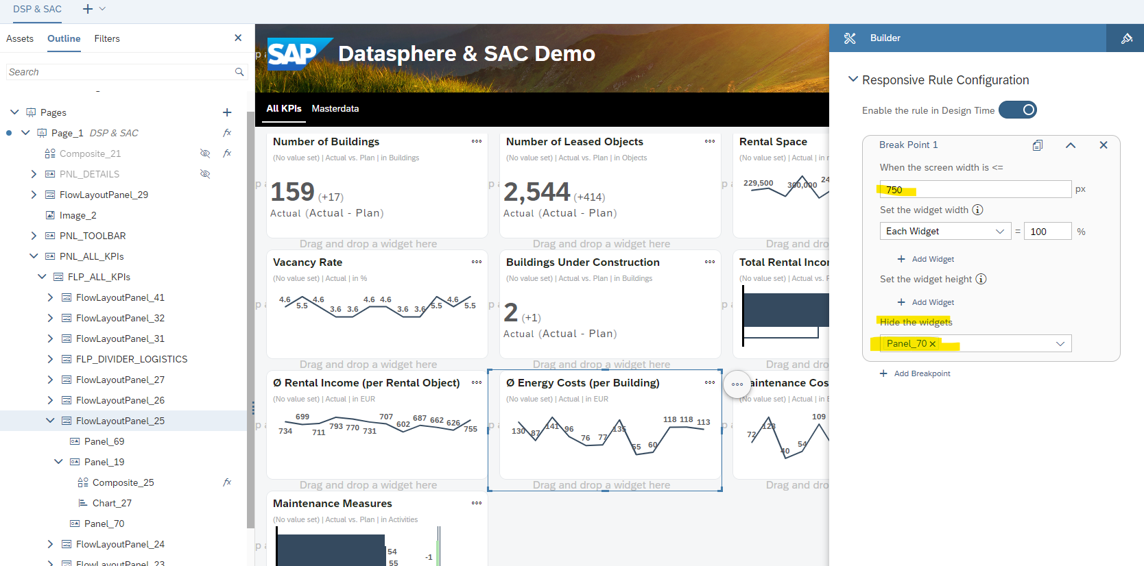
You can achieve the same by scripting but my solution is without script and if you script that, the user will see the initial state of the tile with the border. Only if the script has been executed the left border gets hidden.
If you use script instead of the flow layout panel it looks like:
At first the browser renders the charts and after that the OnInitialization script is executed and changes the width to 100%.
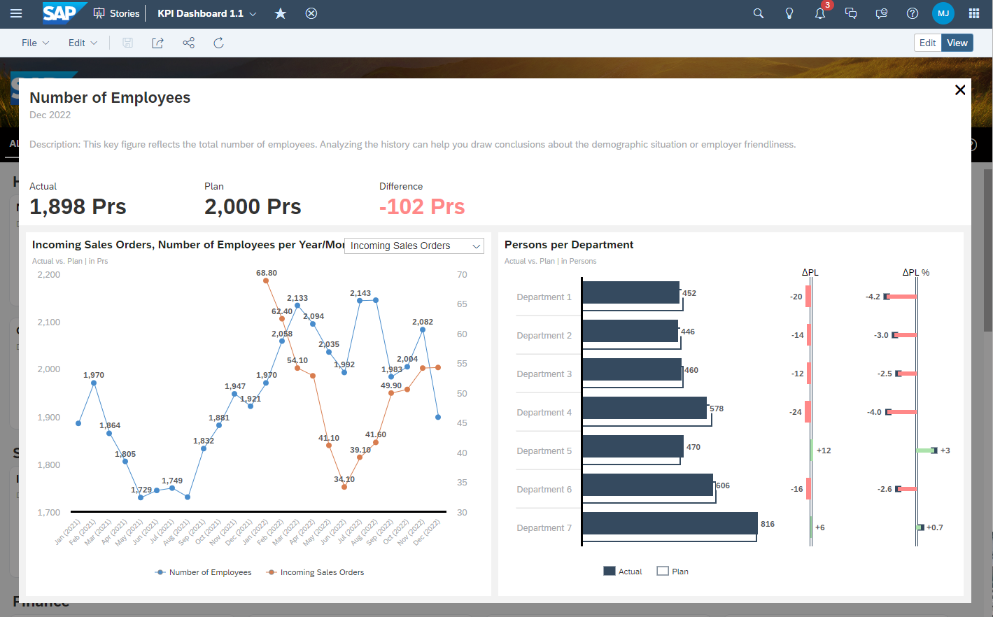
Details
If the user clicks on the button with the three dots it opens a detail-screen.
The details-screen consists of three areas:
- Header for the description, actual, plan and delta
- A time series chart for actual and plan
- A detailed chart for the specific KPI
The details-screen is very generic, the most elements are filled at runtime via script. All transactional data and master data like the description are stored in SAP Datasphere.

You can compare a kpi to another one by selecting the corresponding kpi in the drop-down box:

After selecting the KPI the time series switches to a line chart with an additional axis:
 The switch is needed because the time series is not supporting a second y-axis. The relationships are customizable via script for the details-screen. So, let’s have a look into the script which opens the detail-screen:
Application.showBusyIndicator();

if ( TBL_MASTERDATA.getDataSource().isRefreshPaused() === true){
	TBL_MASTERDATA.getDataSource().setRefreshPaused(PauseMode.Auto);
}

var kpi_name = "";
var kpi_description = "";
var kpi_value_actual = "";
var kpi_value_plan = "";
var kpi_value_difference = "";
//var ds = ip_DataSource;
//var masterdata = TBL_MASTERDATA.getDataSource();
var masterdataResultSet = TBL_MASTERDATA.getDataSource().getResultSet({"_V_MD_KPI∞0": ip_Key_KPI});
var unit = masterdataResultSet[0]["Unit"].id;
var deltaUnit = masterdataResultSet[0]["Delta_Unit"].id;
var condFormatting = masterdataResultSet[0]["Conditional_Formatting"].id;
var decimalPlaces = masterdataResultSet[0]["Decimal_Places"].id;

kpi_name = masterdataResultSet[0]["_V_MD_KPI∞0"].description;

// müsste vor das auslesen des Resultsets gesetzt werden... aber das resultset brauchen wir zum auslesen der decimal places
//TBL_MASTERDATA.getNumberFormat().setDecimalPlaces(ConvertUtils.stringToInteger(decimalPlaces),["Actual","Plan","Delta_PL"]);
var actual = masterdataResultSet[0][Alias.MeasureDimension].formattedValue;
var string_length = actual.length;
if (decimalPlaces === "0"){
	actual = actual.substr(0,string_length-3);
} else if (decimalPlaces === "1"){
	actual = actual.substr(0,string_length-1);
}
kpi_value_actual = actual + " " + unit;

var plan = masterdataResultSet[1][Alias.MeasureDimension].formattedValue;
string_length = plan.length;
if (decimalPlaces === "0"){
	plan = plan.substr(0,string_length-3);
} else if (decimalPlaces === "1"){
	plan = plan.substr(0,string_length-1);
}
kpi_value_plan = plan + " " + unit;

kpi_description = "Description: " + masterdataResultSet[0]["Description"].id;

var delta = masterdataResultSet[2][Alias.MeasureDimension].formattedValue;
string_length = delta.length;
if (decimalPlaces === "0"){
	delta = delta.substr(0,string_length-3);
} else if (decimalPlaces === "1"){
	delta = delta.substr(0,string_length-1);
}
var valueDelta = delta + " " + deltaUnit;
if (valueDelta.charAt(0) !== "-"){
	valueDelta = "+" + valueDelta;
}

kpi_value_difference = valueDelta;

if (condFormatting === "grey"){
	if (gv_isMobile === true){
		TXT_DETAILS_KPI_VALUE_DIFFERENCE.setCssClass("kpi_grey:mobile");
	} else {
		TXT_DETAILS_KPI_VALUE_DIFFERENCE.setCssClass("kpi_grey");
	}
} else if (condFormatting === "green" && valueDelta.charAt(0) === "+"){
	if (gv_isMobile === true){
		TXT_DETAILS_KPI_VALUE_DIFFERENCE.setCssClass("kpi_ok_mobile");
	} else {
		TXT_DETAILS_KPI_VALUE_DIFFERENCE.setCssClass("kpi_ok");
	}
} else if (condFormatting === "green" && valueDelta.charAt(0) === "-"){
	if (gv_isMobile === true){
		TXT_DETAILS_KPI_VALUE_DIFFERENCE.setCssClass("kpi_warning_mobile");
	} else {
		TXT_DETAILS_KPI_VALUE_DIFFERENCE.setCssClass("kpi_warning");
	}
} else if (condFormatting === "red" && valueDelta.charAt(0) === "+"){
	if (gv_isMobile === true){
		TXT_DETAILS_KPI_VALUE_DIFFERENCE.setCssClass("kpi_warning_mobile");
	} else {
		TXT_DETAILS_KPI_VALUE_DIFFERENCE.setCssClass("kpi_warning");
	}
} else if (condFormatting === "red" && valueDelta.charAt(0) === "-"){
	if (gv_isMobile === true){
		TXT_DETAILS_KPI_VALUE_DIFFERENCE.setCssClass("kpi_ok_mobile");
	} else {
		TXT_DETAILS_KPI_VALUE_DIFFERENCE.setCssClass("kpi_ok");
	}
}

// setDimension with id and description prevents roundtrip for reading description
CHT_DETAILS_TIME_SERIES.getDataSource().setDimensionFilter("_V_MD_KPI∞0", {id: ip_Key_KPI, description: kpi_name});

TXT_DETAILS_KPI_DESCRIPTION.applyText(kpi_description);
TXT_DETAILS_KPI_NAME.applyText(kpi_name);
TXT_DETAILS_KPI_VALUE_ACTUAL.applyText(kpi_value_actual);
TXT_DETAILS_KPI_VALUE_PLAN.applyText(kpi_value_plan);
TXT_DETAILS_KPI_VALUE_DIFFERENCE.applyText(kpi_value_difference);

PNL_DETAILS_CONTENT_BODY_STAFF_DEPARTMENT.setVisible(false);
PNL_DETAILS_CONTENT_BODY_STAFF_AGE.setVisible(false);
PNL_DETAILS_CONTENT_BODY_BUILDINGS.setVisible(false);
PNL_DETAILS_CONTENT_BODY_TRUCKS_INBOUND.setVisible(false);
PNL_DETAILS_CONTENT_BODY_TRUCKS_INTIME.setVisible(false);
PNL_DETAILS_CONTENT_BODY_WOMENS_QUOTA.setVisible(false);

Panel_9.setVisible(false);

if (ip_Key_KPI === "1001" || ip_Key_KPI === "1005" || ip_Key_KPI === "4001" || ip_Key_KPI === "7001" || ip_Key_KPI === "7002" || ip_Key_KPI === "1009"){
	//	PNL_DETAILS_CONTENT_BODY_TIME_SERIES.getLayout().setWidth(LayoutValue.create(49, LayoutUnit.Percent));
	//	PNL_DETAILS_CONTENT_BODY_TIME_SERIES.getLayout().setLeft(10);
	//	PNL_DETAILS_CONTENT_BODY_TIME_SERIES.getLayout().setRight(LayoutValue.create(0, LayoutUnit.Auto));
	Panel_9.setVisible(true);
	Panel_1.getLayout().setWidth(LayoutValue.create(50, LayoutUnit.Percent));
} else {
	// no details, fullscreen time series
	Panel_1.getLayout().setWidth(LayoutValue.create(100, LayoutUnit.Percent));
}

var compareKPIs = [["","",""]];
compareKPIs.pop();
compareKPIs.push(["1001","Number of Employees", "28122784-7412-4618-3955-288871600133"]);
compareKPIs.push(["1002","Number of Entries", "15976099-2438-4402-3561-125568796053"]);
compareKPIs.push(["1006","Overtime by Employee", "10898370-8422-4806-3781-184669621010"]);
compareKPIs.push(["1005","Average Age", "64048119-9715-4102-3302-623282230169"]);
compareKPIs.push(["1009","Women's Quota", "96379570-8179-4788-3757-204761531642"]);
compareKPIs.push(["1000","Sickness Rate", "16520085-1740-4256-3846-939884980273"]);
compareKPIs.push(["1003","Number of Leavers", "29834580-8222-4486-3173-915719655792"]);
compareKPIs.push(["1010","Potential Leavers", "11539133-8928-4619-3874-417978403661"]);
compareKPIs.push(["6000","Incoming Sales Orders", "25883988-1436-4498-3322-134722143097"]);
compareKPIs.push(["6001","Profit Margin", "24537276-5813-4446-3014-816170896452"]);
compareKPIs.push(["6002","Sales Order Fulfillment Issues", "39010661-9235-4095-3742-840937149622"]);
compareKPIs.push(["2000","Expense Coverage Level", "96143422-6177-4468-3721-147028468216"]);
compareKPIs.push(["2001","Equity Ratio", "40819202-7915-4565-3510-535245283032"]);
compareKPIs.push(["2002","Expense Coverage Level 2", "36525149-8178-4256-3111-157329596348"]);
compareKPIs.push(["2003","Deficit Rate", "23380654-9414-4331-3956-653644698425"]);
compareKPIs.push(["2004","Infrastructure Rate", "34576841-8014-4090-3117-540906569782"]);
compareKPIs.push(["7001","Trucks", "21569605-0639-4846-3227-393539252098"]);
compareKPIs.push(["7002","Trucks on time", "14453629-1536-4242-3024-559811062329"]);
compareKPIs.push(["7011","Picks", "10261043-3491-4300-3712-374623788822"]);

CHT_DETAILS_COMPARE.setVisible(false);
CHT_DETAILS_TIME_SERIES.setVisible(true);
Dropdown_2.setVisible(false);

if (ip_Key_KPI === "1000"){
	SO_FUNCTIONS.initializeCompareMode(ip_Key_KPI,["1001","1002", "1006", "1005", "1009", "1003", "1010", "6000", "6001", "6002", "7001", "7002","7011"]);
} else if (ip_Key_KPI === "1001"){
	PNL_DETAILS_CONTENT_BODY_STAFF_DEPARTMENT.setVisible(true);
	Chart_11.getDataSource().refreshData();
	SO_FUNCTIONS.initializeCompareMode(ip_Key_KPI,["1002", "1006", "1005", "1009", "1000", "1003", "1010", "6000", "6001", "6002", "7001", "7002", "7011"]);
}  else if (ip_Key_KPI === "1005"){
	PNL_DETAILS_CONTENT_BODY_STAFF_AGE.setVisible(true);
	Chart_12.getDataSource().refreshData();
	SO_FUNCTIONS.initializeCompareMode(ip_Key_KPI,["1001", "1002", "1006", "1009", "1000", "1003", "1010", "6000", "6001", "6002", "7001", "7002", "7011"]);
} else if (ip_Key_KPI === "1009"){
	PNL_DETAILS_CONTENT_BODY_WOMENS_QUOTA.setVisible(true);
	SO_FUNCTIONS.initializeCompareMode(ip_Key_KPI,["1001", "1002", "1006","1005", "1000", "1003", "1010", "6000","6001", "6002", "7001", "7002", "7011"]);
} else if (ip_Key_KPI === "4001"){
	PNL_DETAILS_CONTENT_BODY_BUILDINGS.setVisible(true);
	Chart_30.getDataSource().refreshData();
} else if (ip_Key_KPI === "7001"){
	PNL_DETAILS_CONTENT_BODY_TRUCKS_INBOUND.setVisible(true);
	Chart_41.getDataSource().refreshData();
	SO_FUNCTIONS.initializeCompareMode(ip_Key_KPI,["7002", "7011", "1001", "1003", "6000","6001", "6002"]);
} else if (ip_Key_KPI === "7002"){
	PNL_DETAILS_CONTENT_BODY_TRUCKS_INTIME.setVisible(true);
	Chart_42.getDataSource().refreshData();
	SO_FUNCTIONS.initializeCompareMode(ip_Key_KPI,["7001", "7011", "1001", "1003", "6000","6001", "6002"]);
}  else if (ip_Key_KPI === "7011"){
	SO_FUNCTIONS.initializeCompareMode(ip_Key_KPI,["7001", "7002", "1000" ,"1001", "1003", "6000","6001", "6002"]);
}

sv_TimeSeries_Subheader = "Actual vs. Plan | in " + unit;
// Funktioniert Stand 24.07.2023 nicht: > kommt Fehler im Script
// Funktioniert nur, wenn das Chart auf always refresh steht. Active Widgets Only führt zum Script-Fehler.
CHT_DETAILS_TIME_SERIES.getNumberFormat().setDecimalPlaces(ConvertUtils.stringToInteger(decimalPlaces),["Actual","Plan"]);


PNL_DETAILS.setVisible(true);

Application.hideBusyIndicator();
- Lines 3-5: Load Datasource if it’s not loaded already.
- Line 14: Read the resultset
- Lines 15-20: Get masterdata for the kpi
- Lines 24-56: Set the values for actual, plan and delta by respecting the decimals places.
- Lines 58-88: Set the conditional formatting of the delta-values. In Datasphere there is an attribute for that. If its set to green it means, that if the actual is higher than the plan it is good. If the value is red it means, that if the actual is higher than the plan it is red. Example: If the sickness rate is higher than plan it is not good, but if the revenue is higher than the plan it is good. If the value is set to grey no conditional formatting is needed/valid for the KPI. For the mobile-css classes I used the font-size 4vw and for desktop 32px.
- Lines 117-156: Sets the compare-kpis. All compare-kpis are restricted measures in the compare chart. So, the id, for example “28122784-7412-4618-3955-288871600133” is generated automatically by SAC. Additionally the relevant detail-area bottom-right is getting visible for the specific KPI.
If the user needs more detail about the data, the user can open the Data Analyzer:

In the Data Analyzer has the user the maximum flexibility to analyze the data in a more detail level.

Because the Data Analyzer is a standard feature there is no script needed to enable that. Only activate the feature on widget.
Update 05.12.2023:
I created a geomap based on my data:

You can also drill into the geomap:

If you drill into Germany you get the next level:

Video (click on the image below):
For that we need the latitude and the longitude to create a geo-column:

Latitude and longitude must be stored as decimal value.
I added the location to my department dimension view and here you need to create a geo-column:

This column can be used in the geomaps layers.
Composites
 I used the newly released composite feature to create a month picker. The month picker allows the user to switch the year and the month.
If we have a look into the widget itself, we see the structure of it:
 We see that it consists of buttons and some scripting. If the user clicks on OK or Cancel it fires a the event “cancel” or “submit”:
Composite.fireEvent("cancel");
There are some getter und setter-interface-functions, but not all are already implemented at the moment. Important are only:
- getCalMonth: to get the selected value as key.
- getCalMonthTxt: to get the selected value as text.
- setCalMonth: to set the initial selection.
- setCSSClass: to set the css class of the buttons.
To use CSS is possible in the current phase of composites. But you can’t use CSS-classes in the styling panel, but you can use css-classes via script. The css-classes must implemented in the story which consumed the composite because there is no css-area in the composite itself.
If a month-button is clicked by the user it fires the script “SO_DP>setMonth”:
SV_DP_selectedYear = calmonth.substring(0,4);

TXT_DP_YEAR.applyText(SV_DP_selectedYear);
SV_DP_selectedMonth = calmonth.substring(4,6);

var buttons = [BTN_DP_MONTH_01, BTN_DP_MONTH_02, BTN_DP_MONTH_03, BTN_DP_MONTH_04, BTN_DP_MONTH_05, BTN_DP_MONTH_06, BTN_DP_MONTH_07,
			  BTN_DP_MONTH_08, BTN_DP_MONTH_09, BTN_DP_MONTH_10, BTN_DP_MONTH_11, BTN_DP_MONTH_12];

for (var i = 0; i < buttons.length; i++){
	buttons[i].setCssClass("");
}

if (SV_DP_selectedMonth === "01"){
	BTN_DP_MONTH_01.setCssClass("btn_pressed");
} else if (SV_DP_selectedMonth === "02"){
	BTN_DP_MONTH_02.setCssClass("btn_pressed");
} else if (SV_DP_selectedMonth === "03"){
	BTN_DP_MONTH_03.setCssClass("btn_pressed");
} else if (SV_DP_selectedMonth === "04"){
	BTN_DP_MONTH_04.setCssClass("btn_pressed");
} else if (SV_DP_selectedMonth === "05"){
	BTN_DP_MONTH_05.setCssClass("btn_pressed");
} else if (SV_DP_selectedMonth === "06"){
	BTN_DP_MONTH_06.setCssClass("btn_pressed");
} else if (SV_DP_selectedMonth === "07"){
	BTN_DP_MONTH_07.setCssClass("btn_pressed");
} else if (SV_DP_selectedMonth === "08"){
	BTN_DP_MONTH_08.setCssClass("btn_pressed");
} else if (SV_DP_selectedMonth === "09"){
	BTN_DP_MONTH_09.setCssClass("btn_pressed");
} else if (SV_DP_selectedMonth === "10"){
	BTN_DP_MONTH_10.setCssClass("btn_pressed");
} else if (SV_DP_selectedMonth === "11"){
	BTN_DP_MONTH_11.setCssClass("btn_pressed");
} else if (SV_DP_selectedMonth === "12"){
	BTN_DP_MONTH_12.setCssClass("btn_pressed");
}
What happens in the script:
- Lines 1-6: reset css-class of every button.
- Lines 8-43: save the month in a global script variable.
- Line 45: Set the the css-class of the pressed button.
From the consumption perspective we have a button to open the month selection:

The button calls the following script:
Composite_21.setCSS();
Composite_21.setCalMonth(sv_timeSelection);
Composite_21.setVisible(true);
What happens:
- All CSS-Classes are deleted so no button is clicked anymore
- The initial time selection takes place and the corresponding year is selected and the corresponding month-button is “clicked” by setting the CSS-Class.
- The Composite gets visible
Next step for the composite is a set-function for setting the maximum low and high value. In my case i have only data for 2021 and 2022. A selection of 2023 should not be possible.
Mobile Support
There is no additional story for the mobile use case. It is all the same app, build with canvas. Here are some sreenshots of the iOS-App:
Using the flow layout panel, all KPIs are displayed one below the other and without spaces on the left and right side.
If you use the script (for example the onInit or in OnResize) the user will see the flickering app:
The SAP-logo gets hidden on the mobile use case. The flow layout was also used here to hide the logo. But there is some scripting needed, because not all topics are solved by the flow layout panel. In the “onInitialization” and “onResize” I implemented the following script:
if (Application.getInnerWidth().value < 850){
	SO_FUNCTIONS.setDetailsMax(true);
} else {
	SO_FUNCTIONS.setDetailsMax(false);
}
if(Application.getInnerWidth().value < 750) {
	SO_FUNCTIONS.setMobile(true);
	gv_isMobile = true;
} else {
	SO_FUNCTIONS.setMobile(false);
	gv_isMobile = false;
}
If the width of the window is less than 850 we fullscreen the details-screen, so no borders are displayed anymore. If the window width is less than 750px we are switching to mobile. But only some layout stuff like optimize the header on the details-screen and setting some borders.
 If you scroll down, you see the 2nd Chart.
 Composites are also working in mobile scenarios:

Usage Report
The user can open an usage report directly from the toolbar
 It opens the usage report with a time series chart:

You can find the standard model here:
 On the top left there is a toolbar for filtering, refreshing and switching to table view:
 The button for switching between chart and table is implemented as followed:
Chart_TimeSeries.setVisible(!Chart_TimeSeries.isVisible());
Table.setVisible(!Table.isVisible());
if (Chart_TimeSeries.isVisible() === true){
this.setText("");
this.setTooltip("Switch to Table");
BTN_NAVPANEL.setVisible(false);
} else {
this.setText("");
this.setTooltip("Switch to Chart");
BTN_NAVPANEL.setVisible(true);
}
If the users switches to table view a new button gets visible in the toolbar to activate the navigation panel:
 It is a simple script needed to add the navigation panel:
Table.openNavigationPanel();
SAC Planning
I use SAC Planning to give the user the option to maintain the plan data for the dashboard. It is a simple layout:

I know that is not a real-life planning scenario, but it shows how SAC Reporting, SAC Planning and SAP Datasphere interacts.
In the layout there are some buttons to save the plan data, revert the data or copy the actual to plan. Additionally, there is a filter-icon to open a side panel for filtering the area and the KPIs. So, the SAC Planning Model is very simple. I used to data locks to prevent inputs for the actuals.
The data is stored in the SAC Planning Model and imported to Datasphere via data flow:


You will find the model id in the url of your browser if you open the model in sac:

SAP Datasphere Integration
Catalog
If you click in the toolbar on the question mark you directly jump into the catalog-asset of Datasphere.
 Here you can describe the Dashboard-Artefact and manage the KPIs that are part of your Dashboard. Every single KPI is described by description, threshold, calculation, etc.

Lineage
If you open the Lineage you can see where the data is coming from and you can also see that the plan data of SAC is imported into the Datasphere.

Data Marketplace
I created an example for a data product to share the data internally with others:
 For the sample data a json file is needed. Here is an example:
{
"data":
[
 {
   "Vendor": "Vendor A",
   "in time": "no",
   "timecluster": "> 5min",
   "Arrival": "08:08:00",
   "Scheduled": "08:00:00",
   "deviation": "too late",
   "Number of Trucks": 1
 },
 {
   "Vendor": "Vendor A",
   "in time": "no",
   "timecluster": "> 15min",
   "Arrival": "08:10:00",
   "Scheduled": "08:30:00",
   "deviation": "to early",
   "Number of Trucks": 1
 }
]
}
Just Ask (Preview)
Just Ask is planned to be released in Q1 2024 - subject to change. But I have a quick demo for you to show how it works in a developer preview with integration in my dashboard (click on the image below, german audio):
For more information check out the roadmap-item under the following link: Link
My new video about Just Ask with german audio: Just Ask (QRC1 2024)
Horizon
Conclusion
Hopefully the blog has given you an overview of the possibilities of Datasphere and SAC. I plan to update this blog regularly so stay tuned.
We will try to provide you the download files for the datamodels for Datasphere and the stories in SAC, but there is a lot to do to make this possible.
If you have questions, suggestions for improvements or new ideas please do not hesitate to comment this blog.
9 Comments
You must be a registered user to add a comment. If you've already registered, sign in. Otherwise, register and sign in.
Labels in this area
-
ABAP CDS Views - CDC (Change Data Capture)
2 -
AI
1 -
Analyze Workload Data
1 -
BTP
1 -
Business and IT Integration
2 -
Business application stu
1 -
Business Technology Platform
1 -
Business Trends
1,658 -
Business Trends
93 -
CAP
1 -
cf
1 -
Cloud Foundry
1 -
Confluent
1 -
Customer COE Basics and Fundamentals
1 -
Customer COE Latest and Greatest
3 -
Customer Data Browser app
1 -
Data Analysis Tool
1 -
data migration
1 -
data transfer
1 -
Datasphere
2 -
Event Information
1,400 -
Event Information
67 -
Expert
1 -
Expert Insights
177 -
Expert Insights
301 -
General
1 -
Google cloud
1 -
Google Next'24
1 -
GraphQL
1 -
Kafka
1 -
Life at SAP
780 -
Life at SAP
13 -
Migrate your Data App
1 -
MTA
1 -
Network Performance Analysis
1 -
NodeJS
1 -
PDF
1 -
POC
1 -
Product Updates
4,577 -
Product Updates
346 -
Replication Flow
1 -
REST API
1 -
RisewithSAP
1 -
SAP BTP
1 -
SAP BTP Cloud Foundry
1 -
SAP Cloud ALM
1 -
SAP Cloud Application Programming Model
1 -
SAP Datasphere
2 -
SAP S4HANA Cloud
1 -
SAP S4HANA Migration Cockpit
1 -
Technology Updates
6,873 -
Technology Updates
429 -
Workload Fluctuations
1
Related Content
- How to add SAP Datasphere as a datastore in Cloud Integration for data services? in Technology Q&A
- Help Needed: Developing Reports on Invoices, Payments, and Inventory in SAP Datasphere in Technology Q&A
- SAP Datasphere's updated Pricing & Packaging: Lower Costs & More Flexibility in Technology Blogs by Members
- Quick & Easy Datasphere - When to use Data Flow, Transformation Flow, SQL View? in Technology Blogs by Members
- How can we use a odata connection of datasphere to create datasets or models on sac? in Technology Q&A
Top kudoed authors
| User | Count |
|---|---|
| 33 | |
| 17 | |
| 15 | |
| 13 | |
| 11 | |
| 9 | |
| 8 | |
| 8 | |
| 8 | |
| 7 |