Introduction
As we enter the fifth part of this blog series we will cover an important consultation based scenario focusing solely on customization of the Launchpad User Interface for the the SAP Fiori Launchpad on Portal. Perhaps one of the most important aspects of any Portal involvement within an organization is the tailoring of the UI in accordance to business requirements and user preferences. The SAP Fiori Launchpad on Portal is no different and offers a "fresher" means of customization and UI tailoring.

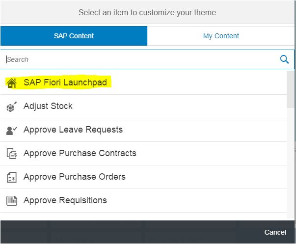
If we reference the Fiori Framework Page (FFP) we already know there are multiple aspects from the standpoint of display elements which can be edited, changed and tweaked.
Theme (UI Theme Designer)
Upon configuring the Fiori Framework Page to your own business requirements and preferences the default theme utilized in its presentation to end users if that of SAP Blue Crystal but this can be customized also if required through the UI Theme Designer. In relation to FIORI-applications Blue Crystal is the recommended theme to be utilized and as we mentioned it is the default theme setting for Fiori
- For UI5 applications Gold Reflection is really recommended.
In terms of theming the UI Theme Designer is the newly released and newly available platform for both editing and generation. In terms of functional enhancements with the UI Theme Designer they key terms here are:
- CSS
- LESS
- SAP UI5
- SAP NW AS ABAP
- SAP NW Portal
- Usability
- Flexibility
Screen Dimensions (Rendering Size)
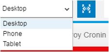
Now as we touched on above when you are performing visual customization in association to the SAP Fiori Launchpad on Portal the starting point will be with UI Theme Designer. Within the UI Theme Designer when you make a change to a device type:
- Desktop UI
- Phone UI
- Tablet UI
The UI Theme Designer will automatically change the Window Size for "Previews". In terms of how the "Preview" is rendered and displayed is dependent on the underlying User Interface Framework i.e. Fiori launchpad, Fiori & UI5.
Tailoring The Theme - Getting Started
The UI Theme Designer is the complete package in terms of being singular tool for theming and branding across many of SAP UI's. When you customize supported portal themes using the UI Theme Designer, you can preview changes you make to framework pages which is touched on above.
Let us complete a sample customization of the theme setup from an individual end-users perspective through "Personalization".
- Launch the UI Theme Designer > Content Administration > Portal Display > Portal Themes > UI Theme Designer
- Locate the them of interest and select > Edit
- Open the Preview Controls
- Select one of the supported Frameworks.

In the Quick Edit Menu you are various options to get started with the editing which include:
- Background Color
- Background Gradient Color
- Base Color
- Brand Color
- Highlight Color
- Font Link Color
- Text Color
- Image Background Image
- Company Logo
- Background Opacity
- Background Repeat
I've proceed to make some quick changes and tweaked the display to my favorite football team colors (who were once a great side) :smile: .
Desktop

Mobile

Implementing a Custom Launchpad UI
https://help.sap.com/saphelp_nw74/helpdata/en/11/50eb43a3b34866bb184dd95d59d0eb/content.htm
Embedding SAPUI5 Applications into the SAP Fiori Launchpad Application Container
https://help.sap.com/saphelp_nw74/helpdata/en/04/3ee7582b7e490ba79fe19174fc6d1d/content.htm?frameset...
