
- SAP Community
- Products and Technology
- Supply Chain Management
- SCM Blogs by SAP
- From Concept to Creation: UX, PM, and Dev's Role i...
Supply Chain Management Blogs by SAP
Expand your SAP SCM knowledge and stay informed about supply chain management technology and solutions with blog posts by SAP. Follow and stay connected.
Turn on suggestions
Auto-suggest helps you quickly narrow down your search results by suggesting possible matches as you type.
Showing results for
Advisor
Options
- Subscribe to RSS Feed
- Mark as New
- Mark as Read
- Bookmark
- Subscribe
- Printer Friendly Page
- Report Inappropriate Content
11-22-2023
2:41 PM
Let us first introduce ourselves. We are Laura Tozzo, Product Manager for SAP Integrated Business Planning (IBP) for Demand and AI, and sujatha.nair, UX Designer Lead for SAP IBP.
With this blog we want to tell you the story of how we completely changed the UI of an SAP IBP app, the Manage Product Lifecycle app, and what we learned from this long journey.
We are not the only ones who worked on this project. Here are all the main participants:
Everything started two years ago, when our Chief Product Owner (Rainer) realized that the whole product lifecycle management functionality in SAP IBP needed a makeover. It was clear that it was not providing our customers with everything they needed, but where were the pain points?
The first step was to interview seven customers using our software, coming from different industries, to understand what their process was, where they were seeing gaps in the functionality and what their wishes were. Already at this point there was the need for strict collaboration between UX and Product Management: as product managers we are in contact with the customers, but how to structure the interview to make sure that we could compare the feedback given by different customers? How to collect and analyze the feedback? These were the points that Sujatha helped us clarify.
Once the priorities were clear, we set out to work. There were two main areas we wanted to tackle in parallel: functionality improvements and UI improvements. In this blog, we are going to focus on the UI. Our customers clearly told us the usability of the app was not good, and that we needed to seriously work on that.
Also, from the very first interview it became clear that our customers had different personas using the same app.
The app provided already a decent UI for experts, but it was very difficult to handle for beginners. We started working on two concepts, one for experts, another for beginners, and we did another round of feedback gathering with our customers. They liked our general direction, but there was still a lot to do. Most of all, we could not develop both ideas at the same time, so we decided to concentrate on the use case that was not supported properly in the current app: the beginner use case.
Let us assume a demand planner needs to introduce a new product which is substituting an old one. To do this in the old app, they would have to first create a product assignment to tell the system that the new product is referencing the old one,
then they would have to define when the new product is going to be introduced to the market
Each of these steps felt separated and required a high number of clicks to get through the app, including going back and forth from the overview page. This was all very cumbersome for the demand planners and sometimes, they felt lost as to what to do next.
In our first feedback session with end users, each of the demand planners showed us how they worked with the app in their daily work. After each demo, they told us how confusing it was to understand what to do and which fields to fill, etc. It was clear we needed to revamp the old app with a kind of guided procedure so that the end users would be guided step by step and would need to maintain only the fields/information that they needed.
We went back to the drawing board and came back with a second version of the guided procedure after several internal iterations with the team. We also involved our User Assistance colleague (Zora) in this phase, to make sure that all the text that was appearing on screen had a reason to be there and the terms were clear. In this phase we also decided that the end-users should rely more on the in-app help (SAP Companion) for further clarification of the terms used in the app. We also decided to add a new use case, called Product Replacement, that would allow phase in of a new product and phase out of an old product at the same time, in contrast to the old app where the steps were some- what divided.
Once we were satisfied with the second version, we contacted the same end users again. The feedback was unanimous! They were very happy with what they saw as we had also worked their feedback into the concept. They also liked the usage of the SAP Companion. Generally, only a few minor adjustments needed to be made.
Both the first and second round of feedback were done via a detailed walkthrough: we would show the mockups ourselves, by clicking through them, explaining each step in detail and asking for feedback after each . . The Settings for Product Lifecycle app is a related app where administrators can define profiles for the users: in these profiles certain features can be turned on or off and default values can be defined depending on their business needs.
At this point, since our end users were happy with our concept demonstrated in the mockups, we started development.
That was the longest part of the project: making sure that the UI looked exactly like our mockups and that all the functionality available in the previous version of the app would also be available with the new UI was not easy and required constant testing. We had only one UI developer working full time on this project (Jan).
Once the development was done, and before the official release, we reached out to the same end users for a final validation. We gave them a test script focusing on the Product Replacement scenario (a new product replacing an old one) and let them test the beta version of the app themselves, meaning they actually had to reproduce what they would do in their daily job. This allowed us to confirm the usability of the app and to find a few bugs that were still hidden.
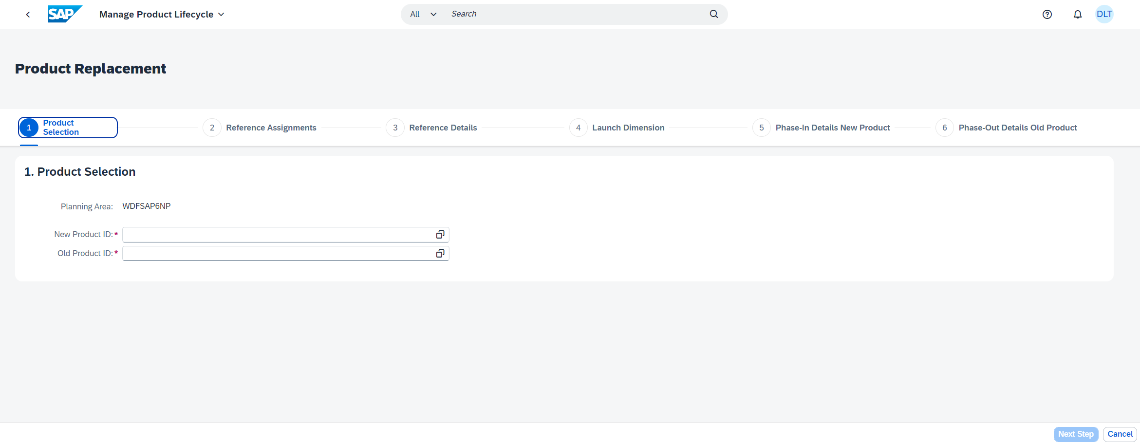
In the new UI, the user is now able to start the Product Replacement scenario (not available in the old app) and they are then guided step by step in one flow through all the necessary settings: referencing the old product, defining go to market dates for the new one and withdrawal dates for the old one.
If you want to see this in action, here is a demo video:
While the new guided procedure already improves the usability a lot, it works best when used together with a Settings for Product Lifecycle profile. This ensures that demand planners only see what they need to see based on their business requirements. To find out how to use the app, check the following videos:
So here are our lessons learned from this journey:
The new UI was released with SAP IBP 2311 and is now available in customers’ productive systems. Although there are still a few things we need to improve on (we will never stop improving!), the feedback we have received has been overwhelmingly positive.
Here are some quotes from our end users:
“It’s very clear and detailed step by step; what they [used to] struggle with is that they do not know what field to fill or to leave empty because it not self-explanatory. It is a lot easier to understand and maintain now. Planners only need one-time use to understand where to click, second time around they already know everything, and they go quite fast”
“I think the visual is very clean, it feels like you really focus on the things that matter.”
“UI is more friendly and easier to navigate. Much easier to use and understand also for inexperienced users. Before that we created guidelines for them to [teach them on how to] use the old app. Now it is easier to handle.”
“Very easy to use the product replacement instead of multiple product assignments. Overall, it looks great!”
A big thank you to the team for a successful project. Even if the journey was long, it was definitely worth it. For the next app, we are ready to go through the process all over again!
Also, a thank you to our customers for their continued cooperation. We could not have come this far without your feedback!
We hope this blog gave you an idea of what it is like to create a new UI for an existing app in SAP IBP. If you are an SAP IBP user, please go and check the new app out! And do not hesitate to contact us for any questions.
With this blog we want to tell you the story of how we completely changed the UI of an SAP IBP app, the Manage Product Lifecycle app, and what we learned from this long journey.

We are not the only ones who worked on this project. Here are all the main participants:
- Rainer Moritz (Chief Product Owner, SAP IBP for Demand)
- Ralph Moessner (Product Owner, SAP IBP Product Lifecycle Management)
- Jan Kellmereit (UI developer, SAP IBP Product Lifecycle Management)
- Zora Sturm (UA developer, SAP IBP)
- Natasha Haidl (UX Associate Designer, shadowing Sujatha in SAP IBP projects)
Everything started two years ago, when our Chief Product Owner (Rainer) realized that the whole product lifecycle management functionality in SAP IBP needed a makeover. It was clear that it was not providing our customers with everything they needed, but where were the pain points?
The start of the project
The first step was to interview seven customers using our software, coming from different industries, to understand what their process was, where they were seeing gaps in the functionality and what their wishes were. Already at this point there was the need for strict collaboration between UX and Product Management: as product managers we are in contact with the customers, but how to structure the interview to make sure that we could compare the feedback given by different customers? How to collect and analyze the feedback? These were the points that Sujatha helped us clarify.
After collecting all the feedback in a Mural, we proceeded to summarize the pain points and wishes that were mentioned by multiple customers and to prioritize according to their feedback and our knowledge of the product. The product owner for the apps in question (Ralph) were tightly involved in this process.
The product owner for the apps in question (Ralph) was tightly involved in this process.

Focus on one persona
Once the priorities were clear, we set out to work. There were two main areas we wanted to tackle in parallel: functionality improvements and UI improvements. In this blog, we are going to focus on the UI. Our customers clearly told us the usability of the app was not good, and that we needed to seriously work on that.
Also, from the very first interview it became clear that our customers had different personas using the same app.
The app provided already a decent UI for experts, but it was very difficult to handle for beginners. We started working on two concepts, one for experts, another for beginners, and we did another round of feedback gathering with our customers. They liked our general direction, but there was still a lot to do. Most of all, we could not develop both ideas at the same time, so we decided to concentrate on the use case that was not supported properly in the current app: the beginner use case.
How did the old UI work?
Let us assume a demand planner needs to introduce a new product which is substituting an old one. To do this in the old app, they would have to first create a product assignment to tell the system that the new product is referencing the old one,

then they would have to define when the new product is going to be introduced to the market

and finally, they would have to maintain the date from which the old product is going to be withdrawn from the market.

Each of these steps felt separated and required a high number of clicks to get through the app, including going back and forth from the overview page. This was all very cumbersome for the demand planners and sometimes, they felt lost as to what to do next.
Concept phase
First mockup and first round of feedback from customers
In our first feedback session with end users, each of the demand planners showed us how they worked with the app in their daily work. After each demo, they told us how confusing it was to understand what to do and which fields to fill, etc. It was clear we needed to revamp the old app with a kind of guided procedure so that the end users would be guided step by step and would need to maintain only the fields/information that they needed.
It was during this session that we showed them our first ideas. They liked the concept of a guided procedure, but there were still many points they did not agree with. It was at this stage that we had decided we would provide different use cases based on the business needs (phase-in, phase-out, references only).

Second mockup and second round of feedback from customers
We went back to the drawing board and came back with a second version of the guided procedure after several internal iterations with the team. We also involved our User Assistance colleague (Zora) in this phase, to make sure that all the text that was appearing on screen had a reason to be there and the terms were clear. In this phase we also decided that the end-users should rely more on the in-app help (SAP Companion) for further clarification of the terms used in the app. We also decided to add a new use case, called Product Replacement, that would allow phase in of a new product and phase out of an old product at the same time, in contrast to the old app where the steps were some- what divided.
Once we were satisfied with the second version, we contacted the same end users again. The feedback was unanimous! They were very happy with what they saw as we had also worked their feedback into the concept. They also liked the usage of the SAP Companion. Generally, only a few minor adjustments needed to be made.

How we ran our end user sessions
Both the first and second round of feedback were done via a detailed walkthrough: we would show the mockups ourselves, by clicking through them, explaining each step in detail and asking for feedback after each . . The Settings for Product Lifecycle app is a related app where administrators can define profiles for the users: in these profiles certain features can be turned on or off and default values can be defined depending on their business needs.
Development Phase
At this point, since our end users were happy with our concept demonstrated in the mockups, we started development.
That was the longest part of the project: making sure that the UI looked exactly like our mockups and that all the functionality available in the previous version of the app would also be available with the new UI was not easy and required constant testing. We had only one UI developer working full time on this project (Jan).
Validation Phase
Once the development was done, and before the official release, we reached out to the same end users for a final validation. We gave them a test script focusing on the Product Replacement scenario (a new product replacing an old one) and let them test the beta version of the app themselves, meaning they actually had to reproduce what they would do in their daily job. This allowed us to confirm the usability of the app and to find a few bugs that were still hidden.
In the new UI, the user is now able to start the Product Replacement scenario (not available in the old app) and they are then guided step by step in one flow through all the necessary settings: referencing the old product, defining go to market dates for the new one and withdrawal dates for the old one.

If you want to see this in action, here is a demo video:
The importance of the Settings for Product Lifecycle app
While the new guided procedure already improves the usability a lot, it works best when used together with a Settings for Product Lifecycle profile. This ensures that demand planners only see what they need to see based on their business requirements. To find out how to use the app, check the following videos:
- How to Create Settings Profiles and Assign users/User Groups in the Settings for product Lifecycle A...
- How to Make Product Assignment Settings in the Settings for Product Lifecycle App
- How to Make Phase-In and Phase-Out Settings in the Settings for Product Lifecycle App
Lessons learned
So here are our lessons learned from this journey:
- Start early: involve the in the very early stages of your product development.
- Take your time to create great products: the journey might seem long, but it is worth it.
- Always listen to your end users/customers: they know what they are missing! And it doesn't hurt to ask. Also, keep asking for feedback along the way. From our experience, end users want to be part of the process.
- Partnership and trust are key: a good product is never a one-person job. To get things done well, you need everybody onboard.
Conclusion
The new UI was released with SAP IBP 2311 and is now available in customers’ productive systems. Although there are still a few things we need to improve on (we will never stop improving!), the feedback we have received has been overwhelmingly positive.
Here are some quotes from our end users:
“It’s very clear and detailed step by step; what they [used to] struggle with is that they do not know what field to fill or to leave empty because it not self-explanatory. It is a lot easier to understand and maintain now. Planners only need one-time use to understand where to click, second time around they already know everything, and they go quite fast”
“I think the visual is very clean, it feels like you really focus on the things that matter.”
“UI is more friendly and easier to navigate. Much easier to use and understand also for inexperienced users. Before that we created guidelines for them to [teach them on how to] use the old app. Now it is easier to handle.”
“Very easy to use the product replacement instead of multiple product assignments. Overall, it looks great!”
A thank you message
A big thank you to the team for a successful project. Even if the journey was long, it was definitely worth it. For the next app, we are ready to go through the process all over again!
Also, a thank you to our customers for their continued cooperation. We could not have come this far without your feedback!
We hope this blog gave you an idea of what it is like to create a new UI for an existing app in SAP IBP. If you are an SAP IBP user, please go and check the new app out! And do not hesitate to contact us for any questions.
- Sujatha Nair, UX Designer sujatha.nair@sap.com
- Laura Tozzo, Product Manager laura.tozzo@sap.com
- SAP Managed Tags:
- SAP Integrated Business Planning for demand
Labels:
You must be a registered user to add a comment. If you've already registered, sign in. Otherwise, register and sign in.
Labels in this area
-
Business Trends
169 -
Business Trends
24 -
Catalog Enablement
1 -
Event Information
47 -
Event Information
4 -
Expert Insights
12 -
Expert Insights
39 -
intelligent asset management
1 -
Life at SAP
63 -
Product Updates
500 -
Product Updates
66 -
Release Announcement
1 -
SAP Digital Manufacturing for execution
1 -
Super Bowl
1 -
Supply Chain
1 -
Sustainability
1 -
Swifties
1 -
Technology Updates
187 -
Technology Updates
17
Related Content
- Preferred Alternative UoM for Warehouse Operation in EWM in Supply Chain Management Blogs by Members
- Advanced Shipping and Receiving – Go-live support insights in bgRFC based EWM-TM integration in Supply Chain Management Blogs by SAP
- The Benefits of Applying Semantic Visions’ Screening and Monitoring Services in Supply Chain Management Blogs by Members
- POD & Valuated Stock in Transit Configuration in Supply Chain Management Blogs by Members
- Premium Hub CoE – DSC Knowledge Bits – “A simple setup guide to integrate SAP TM with Hana Spatial Service (HSS)” in Supply Chain Management Blogs by SAP
Top kudoed authors
| User | Count |
|---|---|
| 8 | |
| 6 | |
| 5 | |
| 4 | |
| 4 | |
| 4 | |
| 3 | |
| 3 | |
| 3 | |
| 3 |