
- SAP Community
- Products and Technology
- Human Capital Management
- HCM Blogs by Members
- Creating Table Lists and Cross-Tab Tables in SAP S...
Human Capital Management Blogs by Members
Gain valuable knowledge and tips on SAP SuccessFactors and human capital management from member blog posts. Share your HCM insights with a post of your own.
Turn on suggestions
Auto-suggest helps you quickly narrow down your search results by suggesting possible matches as you type.
Showing results for
bellakong
Participant
Options
- Subscribe to RSS Feed
- Mark as New
- Mark as Read
- Bookmark
- Subscribe
- Printer Friendly Page
- Report Inappropriate Content
12-01-2023
2:30 PM
As we step into the future of SAP SuccessFactors, a recent release notice has heralded a significant change: Story Reports will be the sole reporting tool in SuccessFactors in 2024. In light of this exciting development, I'm launching a series of blogs dedicated to unraveling the intricacies of Story Reports. These posts not only aim to provide inspirations and sparks but also guide you through leveraging the full functionality of Story Reports. The series, rooted in common reporting needs, is designed to empower decision-makers with actionable insights. Whether you're a seasoned SuccessFactors enthusiast or an HR professional looking to elevate your story report technical skills, this guide is tailored to help you unlock the full potential of your data visualization in SAP SuccessFactors..
Prerequisites:
Before we embark on this journey, ensure you have the following prerequisites in place:
Access to SAP SuccessFactors with the necessary permissions for story report (editing) and field permissions from Employee Central or other models you want to report. If you are missing view or edit permissions on fields from the model, the contents are showing as ‘Null’ or ‘-’ in story and you are not able to see any results on analysis.
Familiarity with the data model relevant to your reporting needs, such as employment details and what job information has been configured in your system.
A clear understanding of the metrics and dimensions you wish to analyze. If the dimensions or needed metrics/measures are not directly from EC, then you need to create them in story query or in calculated measures.
In short, the definition of what is reported is the priority.
Creating a Table List: New hires in 2023 as an example
Let's start by creating a straightforward table list to display raw data. This can be used when migrate table report to story.
Create new report and select Story, in the query, select relevant data source. In the example, Job Information under Employment has been used to report counts. Select fields that will be used for the employee list by clicking the marked icon.
By default, the time filter for the first table in the query (Job Information in the example) is set to 'As of Today' (Dynamic). You can set it as a fixed date or change it to a time range
If you want to change the type of time filter into period, Remove current time filter first.
After removing the time filter, you are able to see 2 options for time filter.
Each of the joined data tables have their own time filter. It is important that you go through each of the data table in order to make sure the time of the data pulled in the report are exactly as you need.
Review the selected columns and save the query.
In story, there are 2 ways to pull table list:
If you have more than 1 data model in your story, make sure you select the correct data model in popouts.
In Designer, select List under Table Structure.
Non-Aggregated means there is no aggregation on the data, so the list will pull all the data records line by line.
Aggregated means the data will be aggregated based on the first column used in the list. In some case, if the query returns more than 1 line per employee, this may help downsize (remove the duplicates) the list as a line for each employee.
Drag and drop the required dimensions and measures into the Columns.
Customize the table by applying filters,
sorting options (it can be defined on each column),
and formatting preferences:
Show or hide options are from 3 dots on the right of the table.
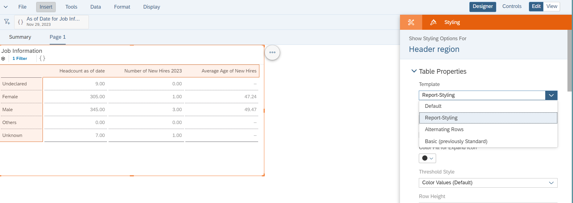
Or from Designer -->Styling. You are able to set the styling for each columns or measures used in the table.
Preview the table to ensure it accurately represents the desired dataset.
Remember to check Drill Limitable: by defaulting, the table limited to 500 rows and 60 Columns. This will prevent the list pull all the needed records. Change it if needed.
Cross-Tab Table (Similar to Pivot Analysis): New Hires in 2023 as an example
Now, let's take your reporting to the next level with Cross-tab tables. This method allows for dynamic pivot analysis, providing a comprehensive view of your data. Here's a step-by-step guide:
Data Preparation:
Ensure your dataset includes the necessary dimensions and measures for analysis. In Cross-tab table, you are able to report what is the measure per dimension option, i.e.
Building the Aggregated Table:
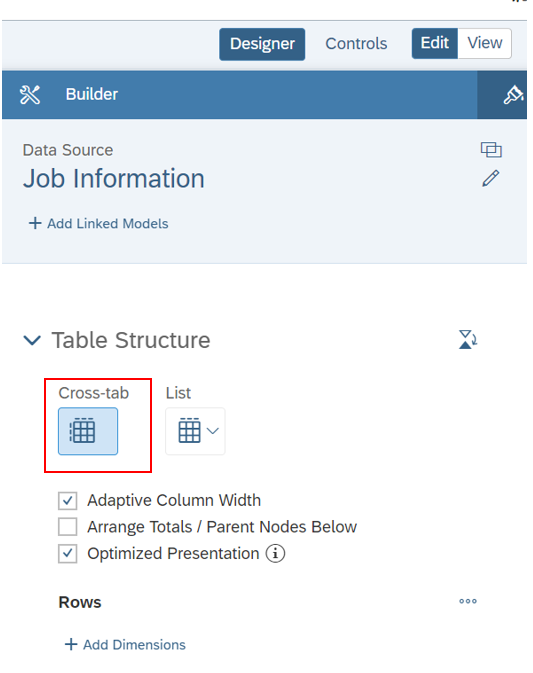
Same step as in table list until chose Table Structure, in this step, chose Cross-tab
Adaptive column width: Automatically resizes the columns when you resize the table.
Arrange totals / parents nodes below: Moves totals to the bottom of the table. This should be used only when you have set Show total in Rows which have been selected. Otherwise, total may not be displayed.
Optimized Presentation: Provides fast-loading In-Cell charts, pixel-level resizing of columns or rows, and smooth scrolling.
Add the dimension to the Rows. When hitting 3 dots on the selected dimension, you are able to find more options for the display, including Show Totals. You can add more than 1 Dimensions in Rows, it depends what is needed for the reporting.
Filter the measures used in Column. Measures created in query or fields saved as measure type in query or measures created in story can all be found here.
Customizing the Aggregated Table:
Explore additional features to enhance clarity.
Such as order of measures and name of the measure
Filter on Dimensions selected as Rows.
Filtering and Styling:
Apply filters to focus on specific subsets of data.
Use the Styling functionality to boost visualizations.
Incorporate color-coding, icons, and other visualization options for a more engaging experience.
In the end, switch it to View and review the data.
Best Practices:
Regularly save your work to avoid data loss.
It is much easier to validate calculations and measures in a table list on the same time, so you are able to see what data has been used in story calculations.
If you are facing errors, go back to query and preview the data source to observe what has been preventing data from delivering results.
There are still limitations and known gaps in story report, please refer the SAP help documents here
Important Things to Consider About Stories in People Analytics
Congratulations! With these insights, you are now one step closer to mastering the art of creating table lists and cross-tab tables in SAP SuccessFactors Story Reports. These techniques empower you to transform raw data into actionable insights, fostering informed decision-making within your organization
Feel free to share your experiences and insights in the comments below. If you have specific questions or challenges, don't hesitate to communicate. Happy reporting!
For more detailed instruction and definitions of story report, please refer this office learning materials for further dive. Designing Story Reports
Prerequisites:
Before we embark on this journey, ensure you have the following prerequisites in place:
Access to SAP SuccessFactors with the necessary permissions for story report (editing) and field permissions from Employee Central or other models you want to report. If you are missing view or edit permissions on fields from the model, the contents are showing as ‘Null’ or ‘-’ in story and you are not able to see any results on analysis.
Familiarity with the data model relevant to your reporting needs, such as employment details and what job information has been configured in your system.
A clear understanding of the metrics and dimensions you wish to analyze. If the dimensions or needed metrics/measures are not directly from EC, then you need to create them in story query or in calculated measures.
In short, the definition of what is reported is the priority.
Creating a Table List: New hires in 2023 as an example
Let's start by creating a straightforward table list to display raw data. This can be used when migrate table report to story.
Create new report and select Story, in the query, select relevant data source. In the example, Job Information under Employment has been used to report counts. Select fields that will be used for the employee list by clicking the marked icon.

Depending how the MDF has been configured in your system you are able to find all jointed data tabled linked to Job information by unfolding the joints icon marked in the screen shot:

By default, the time filter for the first table in the query (Job Information in the example) is set to 'As of Today' (Dynamic). You can set it as a fixed date or change it to a time range


If you want to change the type of time filter into period, Remove current time filter first.

After removing the time filter, you are able to see 2 options for time filter.
Each of the joined data tables have their own time filter. It is important that you go through each of the data table in order to make sure the time of the data pulled in the report are exactly as you need.
Review the selected columns and save the query.
In story, there are 2 ways to pull table list:
- create a Canvas to start reporting, chose Table. This means the table will be built along with other analysis such as chart.

2. Create a new page, select type of the page as Grid and insert a table. In this way, the whole page will be reported on a table. For visualization, this way will give a similar look as in legacy table report.

If you have more than 1 data model in your story, make sure you select the correct data model in popouts.

In Designer, select List under Table Structure.
Non-Aggregated means there is no aggregation on the data, so the list will pull all the data records line by line.
Aggregated means the data will be aggregated based on the first column used in the list. In some case, if the query returns more than 1 line per employee, this may help downsize (remove the duplicates) the list as a line for each employee.

Drag and drop the required dimensions and measures into the Columns.

Customize the table by applying filters,

sorting options (it can be defined on each column),

and formatting preferences:
Show or hide options are from 3 dots on the right of the table.

Or from Designer -->Styling. You are able to set the styling for each columns or measures used in the table.
Preview the table to ensure it accurately represents the desired dataset.
Remember to check Drill Limitable: by defaulting, the table limited to 500 rows and 60 Columns. This will prevent the list pull all the needed records. Change it if needed.

Cross-Tab Table (Similar to Pivot Analysis): New Hires in 2023 as an example
Now, let's take your reporting to the next level with Cross-tab tables. This method allows for dynamic pivot analysis, providing a comprehensive view of your data. Here's a step-by-step guide:
Data Preparation:
Ensure your dataset includes the necessary dimensions and measures for analysis. In Cross-tab table, you are able to report what is the measure per dimension option, i.e.
Building the Aggregated Table:
Same step as in table list until chose Table Structure, in this step, chose Cross-tab
Adaptive column width: Automatically resizes the columns when you resize the table.
Arrange totals / parents nodes below: Moves totals to the bottom of the table. This should be used only when you have set Show total in Rows which have been selected. Otherwise, total may not be displayed.
Optimized Presentation: Provides fast-loading In-Cell charts, pixel-level resizing of columns or rows, and smooth scrolling.
Add the dimension to the Rows. When hitting 3 dots on the selected dimension, you are able to find more options for the display, including Show Totals. You can add more than 1 Dimensions in Rows, it depends what is needed for the reporting.

Filter the measures used in Column. Measures created in query or fields saved as measure type in query or measures created in story can all be found here.


Customizing the Aggregated Table:
Explore additional features to enhance clarity.
Such as order of measures and name of the measure

Filter on Dimensions selected as Rows.

Filtering and Styling:
Apply filters to focus on specific subsets of data.
Use the Styling functionality to boost visualizations.

Incorporate color-coding, icons, and other visualization options for a more engaging experience.
In the end, switch it to View and review the data.

Best Practices:
Regularly save your work to avoid data loss.
It is much easier to validate calculations and measures in a table list on the same time, so you are able to see what data has been used in story calculations.
If you are facing errors, go back to query and preview the data source to observe what has been preventing data from delivering results.
There are still limitations and known gaps in story report, please refer the SAP help documents here
Important Things to Consider About Stories in People Analytics
Congratulations! With these insights, you are now one step closer to mastering the art of creating table lists and cross-tab tables in SAP SuccessFactors Story Reports. These techniques empower you to transform raw data into actionable insights, fostering informed decision-making within your organization
Feel free to share your experiences and insights in the comments below. If you have specific questions or challenges, don't hesitate to communicate. Happy reporting!
For more detailed instruction and definitions of story report, please refer this office learning materials for further dive. Designing Story Reports
- SAP Managed Tags:
- SAP SuccessFactors Employee Central,
- SAP SuccessFactors People Analytics
1 Comment
You must be a registered user to add a comment. If you've already registered, sign in. Otherwise, register and sign in.
Labels in this area
-
1H 2024 Product Release
5 -
2H 2023 Product Release
1 -
ACCRUAL TRANSFER
1 -
Advanced Workflow
1 -
Anonymization
1 -
BTP
1 -
Business Rules
1 -
Canvas Report
1 -
Career Development
1 -
Certificate-Based Authentication
1 -
Cloud Platform Integration
1 -
Compensation
1 -
Compensation Information Management
1 -
Compensation Management
1 -
Compliance
2 -
Content
1 -
Conversational AI
2 -
Custom Data Collection
1 -
custom portlet
1 -
Data & Analytics
1 -
Data Integration
1 -
Dayforce
1 -
deep link
1 -
deeplink
1 -
Delimiting Pay Components
1 -
Deprecation
1 -
Employee Central
1 -
Employee Central Global Benefits
1 -
Employee Central Payroll
1 -
employee profile
1 -
Employee Rehires
1 -
external terminal
1 -
external time events
1 -
Generative AI
2 -
Getting Started
1 -
Global Benefits
1 -
Guidelines
1 -
H2 2023
1 -
HR
2 -
HR Data Management
1 -
HR Transformation
1 -
ilx
1 -
Incentive Management Setup (Configuration)
1 -
Integration Center
2 -
Integration Suite
1 -
internal mobility
1 -
Introduction
1 -
learning
3 -
LMS
2 -
LXP
1 -
Massively MDF attachments download
1 -
Mentoring
1 -
Metadata Framework
1 -
Middleware Solutions
1 -
OCN
1 -
OData APIs
1 -
ONB USA Compliance
1 -
Onboarding
2 -
Opportunity Marketplace
1 -
Pay Component Management
1 -
Platform
1 -
portlet
1 -
POSTMAN
1 -
Predictive AI
2 -
Recruiting
1 -
recurring payments
1 -
Role Based Permissions (RBP)
2 -
SAP Build CodeJam
1 -
SAP Build Marketplace
1 -
SAP CPI (Cloud Platform Integration)
1 -
SAP HCM (Human Capital Management)
2 -
SAP HR Solutions
2 -
SAP Integrations
1 -
SAP release
1 -
SAP successfactors
5 -
SAP SuccessFactors Customer Community
1 -
SAP SuccessFactors OData API
1 -
SAP Workzone
1 -
SAP-PAYROLL
1 -
skills
1 -
Skills Management
1 -
sso deeplink
1 -
Stories in People Analytics
3 -
Story Report
1 -
SuccessFactors
2 -
SuccessFactors Employee central home page customization.
1 -
SuccessFactors Onboarding
1 -
successfactors onboarding i9
1 -
Table Report
1 -
talent
1 -
Talent Intelligence Hub
2 -
talents
1 -
Tax
1 -
Tax Integration
1 -
Time Accounts
1 -
Workflows
1 -
XML Rules
1
Related Content
- First Half 2024 Release: What’s New for SAP SuccessFactors Work Zone? in Human Capital Management Blogs by SAP
- 1H 2024 - Release highlights of SuccessFactors Career Development Planning in Human Capital Management Blogs by Members
- 3 key steps to kick-start your migration to Stories in People Analytics in Human Capital Management Blogs by Members
- 1H 2024 - Release highlights of SF compensation in Human Capital Management Blogs by Members
- Deep linking to SAP SuccessFactors Standard Portlets and Custom MDF portlets in Human Capital Management Blogs by Members
Top kudoed authors
| User | Count |
|---|---|
| 13 | |
| 12 | |
| 3 | |
| 3 | |
| 3 | |
| 1 | |
| 1 | |
| 1 | |
| 1 | |
| 1 |