
- SAP Community
- Products and Technology
- Technology
- Technology Blogs by SAP
- Using an FPM Application on a Touch Device
Technology Blogs by SAP
Learn how to extend and personalize SAP applications. Follow the SAP technology blog for insights into SAP BTP, ABAP, SAP Analytics Cloud, SAP HANA, and more.
Turn on suggestions
Auto-suggest helps you quickly narrow down your search results by suggesting possible matches as you type.
Showing results for
former_member19
Active Participant
Options
- Subscribe to RSS Feed
- Mark as New
- Mark as Read
- Bookmark
- Subscribe
- Printer Friendly Page
- Report Inappropriate Content
06-05-2019
8:53 AM
Introduction
Until now Web Dynpro for ABAP (WDA) and Floorplan Manager (FPM) did not offer full support for touch devices. There was some “conditional support” for the iPad (see note 1853087) and simply running an FPM application on a touch device somehow worked, but there were a lot of controls, which were more or less unusable and the screen design normally didn’t fit into the smaller touch screens.
This has changed now – as of SAP_UI 7.54 WDA is now touch enabled and it’s possible to build Web Dynpro Applications which offer good user experience and usability on touch devices.
Although building new WDA / FPM applications is also an option, the most important use-case is the touch enablement of existing FPM applications, which have been built with the intention to be used on a desktop.
In this blog I will show the options how an existing application can be adapted for better usability on touch devices. Everything I show here will leave the original application unchanged, so that for a desktop user nothing changes.
But first let me present the existing application, we will use for our touch enablement test.
Application “Search: EPM Sales Orders”
This application (technical name FPM_SADL_CRUD_TEST_EPM_SO) was delivered with SAP_BASIS in 2014 and hasn’t been changed since then. It’s therefore available with SAP_BASIS 7.40 SP12 and therefore in any system with SAP_UI 7.54 as well.
You can start the application by either
- Calling Transaction FPM_WB, then clicking on “FPM Test Suite” in section “Demo and Test Applications”, and finally launch “General Features” -> “SADL Integration” -> “EPM Sales Order”
- Or by calling transaction SE80, selecting “Workbench” -> “Edit Object”, entering FPM_SADL_CRUD_TEST_EPM_SO as “Development Object”, pressing Enter and then selecting “Web Dynpro Application” -> “Test” -> “In Browser” (F8)
This application allows to manage sales orders. It’s possible to search, display, create, change and delete them within this application. Although it’s only a test/demo application, it’s a good example for showing typical aspects of an FPM based business application:
- Multi page application
- Transactional and stateful
- Complex screens composed of multiple UIBBs (User Interface Building Blocks)
- Lot of business functionality
The application was designed for desktop-only use, nobody considered using it on a touch device. So this application is a good example for a typical desktop application, which shall be transformed to a mobile app.
 1 Initial Screen (Desktop)
 2 Sales Order Edit Page (Desktop)
 3 Sales Order Item Edit Page (Desktop)
Running the Application on a Tablet as it is
A huge effort has been made, to adjust WDA applications to the need of touch devices out-of-the-box, without any need to adjust. All controls where checked and improved to provide good touch usability[1].
To check we leave the application as it is and simply run it on a tablet – you observe that
- The application is still nicely rendered (see screenshots below)
- and it’s still fully functional. You can even make use of context menus (by long tap) or rearrange the table columns via drag & drop
In Screenshot 4 Init Screen (Tablet) you can see e.g. the changed rendering of the slider used for resizing the table. Also, there are adjustments to paddings and line heights for improved user experience.
 4 Init Screen (Tablet)
 5 Sales Order Edit Page (Tablet)
 6 Sales Order Item Edit Page (Tablet)
Device Type Specific Adaption of the Application
Although the out of the box adjustments are already pretty good, there are still issues caused by the fact, that the application was designed for screen sizes greater or equal 17”. When running it on a tablet with a 10” screen, there is simply not enough space available for proper rendering.
Some of the issues, which can be seen in the screenshots:
- A lot of table column headers are truncated
- The charts in Screenshot 4 Init Screen (Tablet) are a bit too large (legends are truncated)
- The currency input field in Screenshot 5 Sales Order Edit Page (Tablet) is so small, that only the ellipsis is visible
- …
There is a very powerful option in FPM allowing to provide adapted configurations for each device type. It’s based on Context Based Adaptations (CBA) and offers the possibility to change the application’s configurations for each class of device (Tablet/Phone). The great thing of this approach is that the original configurations remain completely untouched and that when running the app on a desktop nothing has changed.
In the remaining chapters I will show you how this can be used to improve the touch experience of the sales order app.
Enable CBA
As a first step we must transform the existing application to a CBA enabled one. Technically this implies creating a new application based on a wrapper component, which embeds the original application. Doing this manually would take some time and require you to understand in detail what’s happening. But don’t worry, there is a wizard, which does the work in less than a minute.
- Launch the FPM workbench (by calling transaction code FPM_WB).
- There you find the Application “Enable FPM Applications for Context-Based Adaptations” – Launch it.
- This will bring you to the first of two steps of the wizard
 7 CBA Enabler
Let me shortly explain what you must enter here:
- FPM Application to be Adapted: Here you must enter the application configuration ID of the application you want to enable for touch adaptations. In our example this is FPM_SADL_CRUD_TEST_EPM_SO
- Adaptation Settings – Adaptation Scheme: Simply choose FPM_DEVICE (Schema for Device-Type dependent Configurations).
The adaptation scheme defines the context for context-based applications. CBA is not only used for touch enablement – it allows generic adaptation dimensions for a lot of different use-cases. For touch enablement we need a context which contains one dimension of type FPM_DEVICE. Such a scheme is already delivered by SAP and is recommended if the only purpose of using CBA is touch enablement
- The last 2 mandatory input fields are arbitrary names needed to create new development objects. The first one is the name of a Web Dynpro component configuration, which will link the adaptation scheme to the application and the 2nd one is the name of the new touch-enabled application (if you don’t want to have a new application, then you can achieve this by switching the radio button “Origin of Adaptable Application Configuration”, but this implies modification of the original application). You can enter any name here, but it’s highly recommended to use the original name prefixed by some “namespace”
After pressing Next, you will see the “Assign Package and Transport Request” screen. If you don’t want to transport your development to other (productive) systems, you can leave everything as it is prefilled. Simply press Save and you are done.
We have now a new application (ZTOUCH_SADL_CRUD_TEST_EPM_SO). You can start it directly from the confirmation screen of the wizard. If you do this, you can see that there is no difference to our original application. The reason for this is quite simple – everything visible is the same. The only difference is that the original application’s content is now embedded in an invisible outer component. You can see this if you open the technical help (via context menu anywhere in the application) and form there click the link to the Application Configuration.
 8 Application Configuration
Screenshot 8 Application Configuration shows that the original floorplan configuration for component FPM_OVP_COMPONENT isn’t any longer the application’s root configuration. Instead a wrapper component FPM_ADAPTABLE_OVP is the root and FPM_OVP_COMPONENT is now embedded.
You will not see FPM_ADAPTABLE_OVP anywhere at runtime, it doesn’t contain any visible element. Its configuration contains only one attribute, the CBA Schema. If you click the link to the configuration of FPM_ADAPTABLE_OVP, the system will bring you to its configuration editor. And there you can see that the only item contained is
Schema: FPM_DEVICE
Nevertheless, this minor invisible change is enough to offer a completely new dimension of configurability.
The Adaptation Panel
Once an application is CBA enabled the FPM configuration editor (FLUID) offers additional functionality. Let’s launch FLUID:
 9 Launch Configure Page
Let’s go back to the running new application (or restart it). In the upper right corner, you will find a button-choice with an item “Configure Page” (see Screenshot 9 Launch Configure Page)[2]. Clicking it will bring you to FLUID.

In the toolbar you can see the icon to open the Adaptation Panel, which allows you to create and edit new context-based adaptations (In our use-case the context consists of a single dimension, the device type).
You will find the adaptation panel in the UIBB’s configurations as well. To get to a UIBB’s configuration you have different options:
Starting from FLUID:
- Select one of the UIBBs in the Overview Page Schema and Click Link “Configure UIBB”
- Move the mouse in the Preview Panel over one of the UIBBs. If the UIBB is configurable it will get a blue overlay with Icon
 in the upper right corner. Clicking this icon will bring you to the UIBB configuration
Starting from the Application:
- Click the Toolbar button-choice item “Show Configurable Areas” (see Screenshot 9 Launch Configure Page). All configurable areas will then be marked with an overlay. Clicking on one of the overlays will bring you to its configuration editor
Note: Other ways to launch the configuration editor (starting from SE80 or from technical help) will not work for CBA. The Adaptation Panel won’t be shown then. This is due to the fact, that only when the starting point is CBA enabled the system knows, that CBA should be activated.
Therefore, you should always use the above-mentioned ways to navigate to FLUID.
Adapt the Sales Order Item Table
Let’s try to adapt Sales Order Item Table (see Screenshot 5 Sales Order Edit Page (Tablet)) to better meet the needs of limited space. Let’s start FLUID for this UIBB[3] and open the adaptation panel if not already open.
 10 Adaptation Panel
To create a new adaptation, click on the + Icon. The Add Adaptation Dialog will show up:
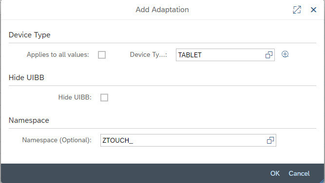
On this dialog uncheck “Applies to all values” and select “TABLET” as Device Type. Providing a namespace is recommended but not mandatory. Then press OK.
Next a Transport Popup will show up. If in doubt press “Local Object”.
That’s it. We created an adapted configuration which will be used whenever our new application is started on a tablet.
Now we can make changes to the adapted configuration. This works the same way we normally make changes to configuration or customizing, and the same options are available.
Let’s do the following changes:
- Set visibility of column “Product Description” to “Not visible”. This will hide the widest (and probably least needed) column, just to provide more space for the other ones (if the user needs the column he can still add it back via the table’s personalization dialog).
- Change “Table Height” to “Expand Container (UIBB) to Display All Rows in Table”. Although the “Resize Handler” used in the desktop version works for touch as well, it might be easier to have the full table with easy full page scrolling by swiping.
- Merge columns Product ID and Product Name to a single “Multi Cell Editor Column”
- Shorten the column header texts (“Currency” instead of “ISO Currency Code”, “Position” instead of “Sales Order Item Position”, …)
- Adjust the column widths a bit[4] (via Attribute UI Element Width of the columns)
You can see the result of these changes in Screenshot 11 Adapted Overview Page (Tablet)
Adapt the Sales Order Header Form
The form is already ok, there are only 2 minor issues:
- In edit mode the Currency Input Field get’s so small, that you don’t see the currency code
- When switching orientation (to portrait mode) labels get truncated, as well as the Company Name.
To fix these issues we create an adaptation for the form by following the same steps as for the table in the previous section.
Then let’s make the following changes:
- To make the form responsive: Switch the “Layout Type” to “16/2” and set “Minimum Column Width” to 400
- Move the Button Row to the right half of the form (Start column should be I)
- Reduce the width of the Amount Input Fields by one (so that they occupy now columns L to N)
- Increase the width of the 3 currency fields so that they occupy now the complete space right of the amount fields (columns O and P)
After saving restart the application on the tablet, navigate to the Sales Order Edit Page and switch to Edit Mode. The result should look like Screenshot 11 Adapted Edit Page (Tablet)
 11 Adapted Edit Page (Tablet)
Now let’s rotate the tablet to switch the orientation to portrait mode. If your tablet’s screen width is below 800px you should see that the form fields get rearranged: the two-column layout gets replaced by a one column layout (see Screenshot 12 Adapted Edit Page (Tablet in Portait Mode)) and there are no truncations anymore. To activate this responsive behavior, we had to switch the form layout to 16/2 and to provide the minimal column width. In case you used an iPad Pro or another larger sized tablet you won’t see this behavior as there is still enough space available to fit both columns side by side.
 12 Adapted Edit Page (Tablet in Portait Mode)
Adapt the Floorplan
Last change I will demonstrate is an adaptation of the floorplan. So far, we adjusted the individual parts of the application, but we left the general application structure as it is. But removing or rearranging the UIBBs to better fit to the touch-devices is a quite common use-case.
We will make 1 small change:
The application contains several initial pages. The desktop version starts with the Standard Sales Order Search Page, which offers several search input fields in the filter bar. You can switch however to a Sales Order Item Text Search Page offering a simple text search. For tablet use, we will switch the default, so that the application starts with the simpler Sales Order Item Text Search Page.
To create the adaptation, we must launch FLUID again. To do this (re-)start the application and call “Configure Page” (see Screenshot 9 Launch Configure Page). Once FLUID has opened, open the adaptation panel and create an adaptation for Device Type TABLET (this works the same way as it did for the List or the Form).
Once this is done, open the Navigation Panel and select Initial Page FPM_SADL_SEARCH. In the Attributes of this Page uncheck the checkbox “Default”. Then select Initial Page FPM_SADL_ITEM_TEXT_SEARCH and set it to “Default”.
After saving and starting the application on a tablet it should start with the Sales Order Item Text Search Page (see Screenshot 13 Adapted OVP (Tablet) )
 13 Adapted OVP (Tablet)
Creating Adaptations for the Phone
So far, all changes were made to fit the application to the needs of a tablet user. Sometimes it might even make sense to use existing applications on a phone.
To support this, you can create another set of adaptations - only choose “PHONE” as Device Type. This works the same way as for the TABLET. As screen sizes of phones are smaller than for tablets you probably will remove some more fields, columns or UIBBs.
I will not go into detail, but please have a look at Screenshot 14 Sales Order Edit Page (Phone) upper and lower part, to see how the Edit Page could look on a phone. Here is a list of the changes I made:
- Made the screen read-only except for Status Setting
- Switched Form Layout to 16/2 and introduced a minimum column width of 400, to get the one column layout
- Transformed the button row to button choice
- Reduced the font size of the company name text
- Shortened some labels
- Merged the Amount columns into one multi cell editor column
- Merged Product ID and Name into another multi cell editor column
- Replaced the Detail link with Show Icon
- Set Currency and Product description column to invisible
So, for the phone I reduced the functionality of the application. As I don’t expect anybody to create or edit a Sales order from his smartphone I removed these features and I only left single-tab options setting the status of existing sales orders. But this is probably everything what a user will do from his phone.
 14 Sales Order Edit Page (Phone) upper part and after scrolling down a bit
Summary
With the newest developments in Web Dynpro for ABAP and FPM it’s now possible to use a lot of existing applications on touch devices. Often they can be used out of the box without the need to adjust anything.
Nevertheless, most times there will be minor issues, caused by the fact, that all existing Web Dynpro ABAP and FPM applications were designed for large desktop screens. Running them on much smaller screens usually causes problems.
To overcome these problems the use of Context Based Adaptations (CBA) is a very powerful and easy-to-use option.
[1] This applies to themes based on Belize or newer SAP delivered themes
[2] If you don’t see this button you should add user parameter FPM_CONFIG_EXPERT to your user (see Documentation)
[3] In case you don’t know how to do launch FLUID for the Sales Order Item Table:
- Start the application and Press Go
- Click on of the Sales Order ID Links
- A new Window/Tab will open containing the Sales Order Item Table. Click the Toolbar button-choice item “Show Configurable Areas” (see Screenshot 9 Launch Configure Page).
- Now the configurable areas are decorated with an overlay. Click the overlay of the Sales Order Item Table
[4] I used the following widths: Actions 11%, Position 9%, Gross 11%, Net 11%, Tax 11% Currency 10% Status 9% and Product 28%
- SAP Managed Tags:
- UI Floorplan Manager for Web Dynpro ABAP,
- UI Web Dynpro ABAP,
- User Interface
Labels:
2 Comments
You must be a registered user to add a comment. If you've already registered, sign in. Otherwise, register and sign in.
Labels in this area
-
ABAP CDS Views - CDC (Change Data Capture)
2 -
AI
1 -
Analyze Workload Data
1 -
BTP
1 -
Business and IT Integration
2 -
Business application stu
1 -
Business Technology Platform
1 -
Business Trends
1,658 -
Business Trends
91 -
CAP
1 -
cf
1 -
Cloud Foundry
1 -
Confluent
1 -
Customer COE Basics and Fundamentals
1 -
Customer COE Latest and Greatest
3 -
Customer Data Browser app
1 -
Data Analysis Tool
1 -
data migration
1 -
data transfer
1 -
Datasphere
2 -
Event Information
1,400 -
Event Information
66 -
Expert
1 -
Expert Insights
177 -
Expert Insights
293 -
General
1 -
Google cloud
1 -
Google Next'24
1 -
Kafka
1 -
Life at SAP
780 -
Life at SAP
13 -
Migrate your Data App
1 -
MTA
1 -
Network Performance Analysis
1 -
NodeJS
1 -
PDF
1 -
POC
1 -
Product Updates
4,577 -
Product Updates
340 -
Replication Flow
1 -
RisewithSAP
1 -
SAP BTP
1 -
SAP BTP Cloud Foundry
1 -
SAP Cloud ALM
1 -
SAP Cloud Application Programming Model
1 -
SAP Datasphere
2 -
SAP S4HANA Cloud
1 -
SAP S4HANA Migration Cockpit
1 -
Technology Updates
6,873 -
Technology Updates
419 -
Workload Fluctuations
1
Related Content
- IoT - Ultimate Data Cyber Security - with Enterprise Blockchain and SAP BTP 🚀 in Technology Blogs by Members
- Part 2:- SAP Basis OS support on SUSE Linux for beginners in Technology Blogs by Members
- S/4HANA Cloud Public Edition - Security in Technology Q&A
- Enter the era of spatial computing for enterprise with SAP Build Code in Technology Blogs by SAP
- Optimized Design Experience in SAP Analytics Cloud - Building Containers in a no code Environment in Technology Blogs by SAP
Top kudoed authors
| User | Count |
|---|---|
| 35 | |
| 25 | |
| 14 | |
| 7 | |
| 7 | |
| 6 | |
| 6 | |
| 5 | |
| 4 | |
| 4 |