
- SAP Community
- Products and Technology
- Additional Blogs by SAP
- A Heatmap Paints a Thousand Words
Additional Blogs by SAP
Turn on suggestions
Auto-suggest helps you quickly narrow down your search results by suggesting possible matches as you type.
Showing results for
moyalynne
Active Contributor
Options
- Subscribe to RSS Feed
- Mark as New
- Mark as Read
- Bookmark
- Subscribe
- Printer Friendly Page
- Report Inappropriate Content
07-14-2006
2:23 PM
You've heard about Visual Composer, which is now generally available in NetWeaver 2004s SP Stack 8, but have you ever heard of heatmaps? I'm going dive a little deeper into Visual Composer's BI Integration Wizard to introduce you to the power of heatmaps and step you through how to create one. All you need is a relational data source and - of course - SAP NetWeaver Visual Composer.
What's in a Heatmap?
Inside the BI Integration Wizard in Visual Composer you'll find a selection of query templates, which use a step-by-step approach to help you visualize results of queries in different ways. One of these templates is a bit special and is called the Heatmap Template. What's a heatmap? We define Visual Composer's Heatmap in the following way:

Heatmaps are great for visualizing large result sets within boxes in a specifically constrained space, which makes it easy to compare the major factors within a result set at a glance. Both color intensity (shifting within a gradient) and size of the boxes indicate relative performance, helping you to easily spot trends or standouts in a quick overview. So how did we come to choose the term heatmap, you surely ask?
At SAP, believe it or not, we think and discuss long and hard about what to call things. These conversations, which typically span cultures, languages, and oceans, are all effortless and convivial and come rapidly to acceptable closure for all sides. Whoops! I mean, when we were developing BI integration in Visual Composer and creating this particular query visualization, we had, let's say, epic conversations about what to call it:
- Heatmap
Was this thing a heatmap, or did that term really imply a mapping of heat used, for instance, for geological purposes, making it therefore an inappropriate candidate? - Smartmap
This (or maybe SmartMap? smart map?) was another popular candidate. But didn't this term, in typical parlance, imply a level of interactivity that ours didn't? - Treemap
This was fun, but this typically implied a hierarchy tree perhaps with expand and collapse nodes. And to quote one of our team members, who shall remain nameless but has the initials Mario Herger, "I have - even in my wildest phantasies - no idea where I can see a tree in this chart type." - We also considered mosaic map, cluster map, hive chart, and mosaic plot ...
... and by now, well -- do you get the picture?
And the Envelope Goes To ...
I'm sure we didn't please everyone, but as far as I know all parties involved are still happy and well, and we finally repurposed, defined, and consistently standardized upon the term called heatmap, which is also not-so-coincidentally a chart type in the Web Application Designer.
And with that intro, now let me step you through how our heatmap does indeed map heat, paint a thousand words, and fuel the analyst's (if not the information developer's) fire when visualizing the results of relational queries.
How to Build a Heatmap
Let's get down to it:
- Got VC?
First, be sure you have SAP NetWeaver Visual Composer 2004s, which comes automatically with the EP usage type. - Got Systems?
On your portal, configure access to a relational database via one the relational BI Java Connectors:
- BI JDBC Connector (to access your JDBC-compliant database)
- BI SAP Query Connector (to access your SAP ERP system)
- Where's the Internet Graphics Server?
Heatmaps rely on the graphics capabilities of the Internet Graphics Server (IGS), so to use them you need to tell Visual Composer where to find it before you fire it up. You do this by configuring the vc.bi.igs property in the Visual Administrator. See the SAP NetWeaver Visual Composer Installation and Configuration Guide for details. - Start Your Engines
Now fire up Visual Composer and create a new model (or open an existing one). Create an iView, and drill into it. - The BI Integration Wizard
The BI Integration Wizard makes the rest easy.
- From the BI menu, choose BI Integration Wizard.
- Bypass the "Hello Everybody" welcome screen (Music Together, anyone?), and on the Select a System screen, expand the SAPQ or JDBC connections node to select your relational system.
- On the Select a Query Template screen, select the Heatmap template.
- On the Select Fields screen, you choose which fields (columns) will appear in the result. In our heatmap template, we visualize exactly four fields in relation to each other, two of which must be numeric, so select appropriately.
- You can bypass the optional Configure Joins, Configure Filters, and Specify Sort Order screens, if desired.
- Next you arrive at the Configure Heatmap Parameters screen. The field you select for primary grouping will construct the larger boxes in the heatmap, and the secondary grouping will fill smaller boxes, subsets inside of each primary box. Select a field "higher up" in the hierarchy for the primary grouping field. For example, in a hierarchy of products, select Category in the primary grouping field and Product in the secondary grouping field:

- On the Review Output screen, we give you an idea of what's going to appear in the heatmap, in tabular form. Press Finish to dismiss this screen, and you're basically all done!
- Tweak the Layout
Once you return to Storyboard, you see that the BI Integration Wizard has not only created a data service configured with the heatmap query, but also attached a start point for you and an HTML view on the service's URL port. Remember that heatmaps rely on the IGS for their graphic visualization, so we call a specially-concocted URL in a container called an HTML view to reference the IGS and display the heatmap:

If you go to the Layout tab, you'll see that this HTML container is a little small by default. You can change its size using a little trick:
- Back on the Design tab, double-click the URL port on the heatmap data service.
- On the Configure Element task panel, in the Output Fields section, double-click the URL field to modify it.
- In the Compute field, change the width and height parameters in the URL as desired:

- Now, make sure that the HTML view container and the heatmap container are the same size.To adjust the size of the HTML view, go to the Layout tab and grab its handles to resize it. Its width and height are displayed in the pane below:

- Deploy and Enjoy
Save your model, because you're all done. Go to the Deploy to Portal task panel, and click the Deploy button. Run your heatmap application and watch it pop up in the portal. Your heatmap appears:
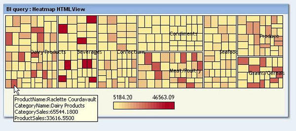
Hover your mouse over an individual smaller square to identify the field value it represents.
What's it All About?
In the heatmap above:
- Instances of Category are represented by the large, primary boxes.
- Instances of Product are represented by the smaller, colored boxes inside of each Category box.
- Instances of Category Sales are represented by the size of the boxes. The larger the box, the higher the sales.
- Instances of Product Sales are represented by the color of the boxes, in a gradient. The darker the color, the higher the sales.
Looks simple, right? But it would take me additional paragraphs to explain what you've probably already noticed just looking at the graphic. Since sizes of both the primary and secondary boxes are shown relative to each other, and colors of the smaller boxes indicate relative performance within a gradient, you compare how Category sales are doing relative to each other, as well as how individual Products are selling both relative to each other and to the Category as a whole. It is easy in a heatmap to note the hotspots within a large pool of data. In this result, your eyes are immediately drawn to them:
- The dark-colored beverage is the product with the most sales (a certain Côte de Blaye - anyone?).
- Despite that, Dairy Products trumps Beverages in category sales overall. In other words, you've gotta respect those cheeses.
- Grains and Cereals may not stand out as a category of sales, but that Gnocchi is pretty popular.
- Condiments, while weak individually, make a formidable sales category overall.
Note that to render this sort of information into a table or chart would be much more complicated and less visually intuitive, and to listen to me blather on about it at length is -- well, surely not boring, at least? -- and you start to see the purpose and power behind such a display. It's much more effective to intuit all this information with graphics and without having to read about it. And that is exactly the point of any good query visualization - particularly the heatmap. Now I trust you are marveling at how the mighty Visual Composer Heatmap does indeed paint one thousand words (actually, over 1500 and counting...). Check it out for yourself.
For reference documentation on the Heatmap template in Visual Composer see the SAP NetWeaver Visual Composer Reference Guide on http://help.sap.com.
5 Comments
Related Content
- Yet another Covid Dashboard - UK & England Data in Technology Blogs by SAP
- The MDP Salesforce Bulk API v2 Adapter for SAP Cloud Platform Integration in Technology Blogs by Members
- GRC Tuesdays: A Few Tips and Tricks on Making SAP Risk Management Even More Relevant For Your Organization in Financial Management Blogs by SAP
- GRC Tuesdays: What Makes a Good Report Template? in Financial Management Blogs by SAP
- SAP Analytics Cloud Live Data Connection to HANA on-premise using CORS in Technology Blogs by SAP