Introduction:
Analytics on API Portal provides a wealth of information captured through the use of API’s configured on the API Portal.
API’s usage are collected, analyzed and provided real time for the users of API Portal using Analytics. This Analytics section helps in statistically understanding lot of information and the same is visualized using different charts and Key Performance Indicators, as like:

KPI's
For an API Portal user, there can be numerous data of interest namely but not limited to:
- API Traffic
- Frequently used API’s
- Error Prone API’s
- Most Active developers
- Key Performance Indicator

Chart : Frequently used API's

Chart : API Traffic
These are some example use cases and a lot of other information is available in Analytics section for the API Portal users to analyze for their organization and interest.
Let’s Dive in:
The Analytic's is accessible as a menu option from the API Portal.

API Portal : Analytic's Dashboard
Let’s have a look on components of Analytic's on API Portal for its easy understanding:
1. Charts: Analytic's provide user with two set of charts, pre-configured charts and the custom charts. These charts are of different types also as like line, bar, pie.
All the charts on the API Portal can be resized or viewed in the detailed chart page by selecting the appropriate chart options from the top right corner in every chart container.
2. KPI’s: Key Performance indicators, they provides comparative indicators to the users to determine an overall picture of the API’s.
3. Views: There are three views present in the Analytic's, the view can be selected from the top left drop down. The views are :
- a. Performance view: This view provide the KPI’s and charts which provides performance overview of the API’s, Products, Applications and Developers.
- b. Error View: This view provides the KPI’s and charts which provides Error overview of the API’s and Applications.
- c. Custom View: This view gives a vast data in the hand of the API Portal users in form of custom charts which are created by API portal Admins as per their needs.
4. Time Interval: The user can view data within different intervals which are selectable from top middle pane.

Interval selection Pane
5. Analyse Data: Every API Portal Admin has unique data needs. This feature gives the user benefit of adding new charts. These charts are displayed in the Custom charts view.
Analyse Data is accessible by clicking Analyse Data button from the bottom right corner on the analytic's page
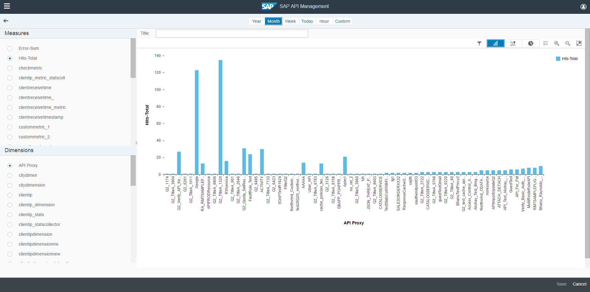
Custom Analyse Page
Step 1. Select a Measure: A list of static and custom(measures created using Statistics collector policy of an API) measures would be listed in left top panel. A Measure is plotted on vertical scale (Y Axis) of a chart.
Step 2. Select a Dimension: A list of static and custom(dimensions created using Statistics collector policy of an API) dimensions would be listed in left bottom panel. A Dimensions is plotted on horizontal scale (X Axis) of a chart.
Step 3. Select Time Interval: Admin can analyse data in multiple intervals, the interval could be selected from the interval selection pane from the top middle pane, by default the data is visualized for a month.
Step 4. Set Chart Filter: As per the requirement for data analysis, admin can apply filter on selected chart data (Data generated using selected measure, dimension and time interval) using filter button in the chart options in top right corner.
Filtering chart data with respect to particular API or developer can help in refined analysis.
Step 5. Select Chart Type: Every chart has a unique use , at times a Pie chart could help represent proportional data, a Line Charts is an excellent trend analysis tool, at other times a Column chart can populate an enormous data an give a bird's eye view.
Analytic's provide three charts: Column , Line and Pie Chart.
Chart types are selectable from the top right corner in charts container.
Step 6. Give Chart Title And Save. After clicking on Save, the chart is persisted and would be available for all the user of API Portal from the custom view in Analytic's Dashboard..
This blog is first in the series of the blogs on Analytic's on API Portal.
Please comment and share your feedback, we would be happy to read your experience with Analytic's on API Portal.
More details on SAP API Management is available in community
Co-author : Sunil Kumar Chhajer
