
- SAP Community
- Products and Technology
- Technology
- Technology Blogs by SAP
- Introduction to Data Models in SAP Analytics Cloud
Technology Blogs by SAP
Learn how to extend and personalize SAP applications. Follow the SAP technology blog for insights into SAP BTP, ABAP, SAP Analytics Cloud, SAP HANA, and more.
Turn on suggestions
Auto-suggest helps you quickly narrow down your search results by suggesting possible matches as you type.
Showing results for
former_member75
Participant
Options
- Subscribe to RSS Feed
- Mark as New
- Mark as Read
- Bookmark
- Subscribe
- Printer Friendly Page
- Report Inappropriate Content
03-18-2020
2:55 PM

Data modeling in SAP Analytics Cloud is a way to enhance your data and prepare it for analysis. You can bulk edit your data, define categories and set hierarchical relationships, and create custom formulas.
SAP Analytics Cloud’s business intelligence function has two main components:
- Models
- Stories
Models are where you do all your data modeling in preparation for analysis. Data modeling entails data wrangling, or cleaning, your dataset, defining your measures and dimensions, and enhancing your data by establishing hierarchies, setting units and currencies, and adding formulas.
Stories, on the other hand, are where your data comes to life. In Story mode, you can visualize your data with charts and graphs, giving you an entirely new way to look at your data and gain valuable insight about your business.
After you select 'Create' > 'Model' from the menu, you are given the option to connect your data. For this example, we'll import a file from our computer.

While you can skip data modeling altogether and head straight into Story mode, there are some benefits to taking some time in Modeler. If you want to quickly see what your data would look like in a chart, then you may want to go to Story mode right away.
However, when you start in Modeler view, you can really enhance your stories with data modeling. Once you’re in Modeler, your screen will look something like this.

The Modeler displays data in rows and columns, tabs, and has various tools for you to transform your data. To gain a fuller understanding of all these features, please visit our Help Portal.
In this article, we discuss the basics of data modeling and some of the more common uses of the Modeler, such as:
- Data wrangling
- Setting units and currencies
- Creating hierarchies
- Adding formulas
Data Wrangling
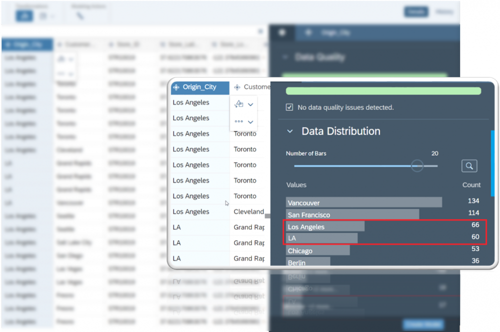
Often when we capture data, there are inaccuracies, which can affect your analysis. For instance, perhaps your dates may be in different formats, or there's typos, and so on. So before you begin your analysis, you'll want to ensure your data is wrangled properly.
In the example below, we have the same location spelled two different ways — i.e. ‘LA’ and ‘Los Angeles’. Obviously, we'll need to fix this. We can do this easily with the Find and Replace feature.
Find and replace / Combine
In our example above, we want to combine 'LA' with 'Los Angeles'. First, we need to find all instances of 'LA' and replace it with 'Los Angeles'. However, since LA was treated as a separate place, changing the name won't combine it with the existing Los Angeles data. For that, we need to combine the two sets of Los Angeles data. We can select any of the instances of Los Angeles, click the transform tool, and combine it with the other Los Angeles data.

Splitting Columns
Next, we have a category of that defines the city and the state. However, we want to split this into two separate dimensions. We can do this easily with the splitting feature.
- Select the column you want to split
- Click on one of the split options. This allows you to create new columns that are separated by spaces, dashes, commas, etc.
Combining two columns is just as easy.

Units & Currencies
Units & Currencies allows you to set the value type and display units. Select one of the following from the list:
- Blank — No unit will be specified
- Label — You can enter a text label up to 30 characters in length to define your own display units. This can be a unit of measure or a packaging unit such as 'Bottles'
- % — The percentage option displays the percentage symbol after the value
- Currency — Use this option for all monetary values
Hierarchy
Hierarchy is used to establish parent-child relationships within your data. For example, suppose you have sales data for the following:
- Global
- Continent
- Country
- State / Province
- City

You can create a hierarchical relationship by establishing Global sales as the parent, Continent as the child, and then continue to do this all the way down.
It would look something like this:
- Global
- Continent
- Country
- State / Province
- City
- State / Province
- Country
- Continent
Once in Story mode, your enriched charts will allow you to drill down to the different layers. To see this in action, check out our post all about hierarchies.
Formula
Formulas allow you to create new measures, which are convenient and save you time in your stories. For example, in our sample dataset, we have two measures — original sales price and discount. We can create a formula to give us a new measure called 'Revenue'.
For more details about Formulas, see our post — Working with Formulas in SAP Analytics Cloud.

- SAP Managed Tags:
- SAP Analytics Cloud,
- SAP Analytics Cloud for planning,
- Data and Analytics
Labels:
You must be a registered user to add a comment. If you've already registered, sign in. Otherwise, register and sign in.
Labels in this area
-
ABAP CDS Views - CDC (Change Data Capture)
2 -
AI
1 -
Analyze Workload Data
1 -
BTP
1 -
Business and IT Integration
2 -
Business application stu
1 -
Business Technology Platform
1 -
Business Trends
1,661 -
Business Trends
88 -
CAP
1 -
cf
1 -
Cloud Foundry
1 -
Confluent
1 -
Customer COE Basics and Fundamentals
1 -
Customer COE Latest and Greatest
3 -
Customer Data Browser app
1 -
Data Analysis Tool
1 -
data migration
1 -
data transfer
1 -
Datasphere
2 -
Event Information
1,400 -
Event Information
65 -
Expert
1 -
Expert Insights
178 -
Expert Insights
280 -
General
1 -
Google cloud
1 -
Google Next'24
1 -
Kafka
1 -
Life at SAP
784 -
Life at SAP
11 -
Migrate your Data App
1 -
MTA
1 -
Network Performance Analysis
1 -
NodeJS
1 -
PDF
1 -
POC
1 -
Product Updates
4,577 -
Product Updates
330 -
Replication Flow
1 -
RisewithSAP
1 -
SAP BTP
1 -
SAP BTP Cloud Foundry
1 -
SAP Cloud ALM
1 -
SAP Cloud Application Programming Model
1 -
SAP Datasphere
2 -
SAP S4HANA Cloud
1 -
SAP S4HANA Migration Cockpit
1 -
Technology Updates
6,886 -
Technology Updates
408 -
Workload Fluctuations
1
Related Content
- ABAP Cloud Developer Trial 2022 Available Now in Technology Blogs by SAP
- Top Picks: Innovations Highlights from SAP Business Technology Platform (Q1/2024) in Technology Blogs by SAP
- Unlocking Full-Stack Potential using SAP build code - Part 1 in Technology Blogs by Members
- SAP Successfactors Implementation and Maintenance in Projects in 2024 in Technology Blogs by Members
- Deep dive into Q4 2023, What’s New in SAP Cloud ALM for Implementation Blog Series in Technology Blogs by SAP
Top kudoed authors
| User | Count |
|---|---|
| 13 | |
| 10 | |
| 10 | |
| 9 | |
| 8 | |
| 7 | |
| 6 | |
| 5 | |
| 5 | |
| 5 |