Hello there!
Welcome to episode 3 of our mini blog series on modifying existing extensions to cater to your requirements. In this blog, we will cover how you can modify the axes of a chart (with axes, of course). This is not applicable to charts without axes. If you have a chart that has no axes and you would like to add them, please refer to the D3.js library documentation on how to add axes to a chart: SVG Axes · mbostock/d3 Wiki · GitHub
Here we will focus on how to modify a chart with already existing axes.
For most charts with axes, the axes ticks will have been defined according to the domains and ranges of the data measures and dimensions. We will not be touching these. Most of our extensions have been developed to enable automatic axes tick definitions depending on the data domains and ranges. We encourage that future extensions developed follow the same principle and avoid hard-coding axes labels and ticks to make the charts more flexible with different datasets.
Now what we really want to do is change the way the axes look. An example extension I will use here is the Extended Bubble Matrix. Let's look at the different options we have for modifying axes attributes:
COLORED AXES
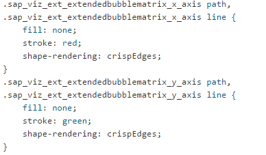
For example, if we want a colored X-Axis, we can go to the default.css file under the /style folder in the Web IDE project where we have copied all the source code from GitHub, for the particular extension you want to modify. In our example, we will go to where the axes have been styled in the default.css file.

We currently have black colored axes. Let's say we want to change our axes to a steel blue color:


Now let's say we want a red X- Axis and a green Y-Axis. In our example code, the attributes for both axes have been combined. We can separate them and style them as follows:
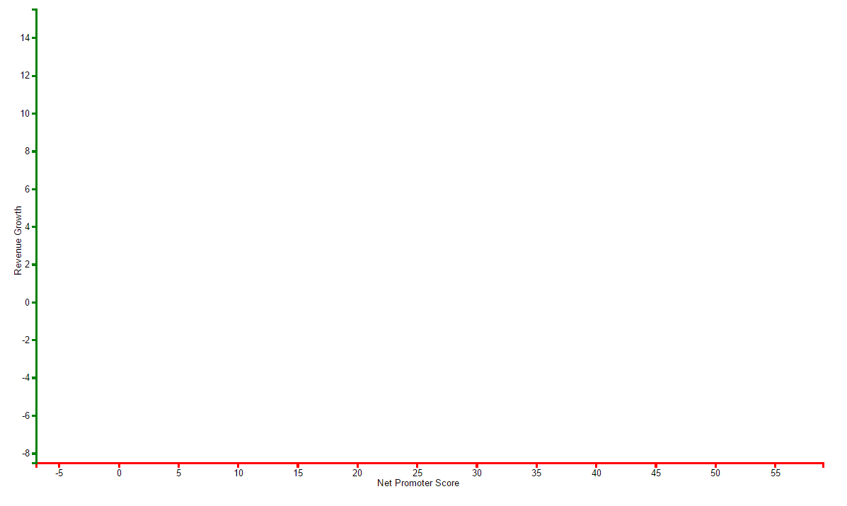
From this, we get the following outcome:

THICK AXES
Now let's say we want thicker axes. Add the following line of code to where the axes are styled:

You can define any width you want in pixels. If you want it thicker, you can go higher. If you want it thinner, you can go lower. Width pixels can also be defined as decimal values like 0.5px etc.

Let's apply this thickness to our previously colored axes.
DOTTED AXES
This isn't a very common attribute and does not look too easy to read on a chart either. However, if you do happen to have a chart where it may be applicable, you can add the following line to the styling function:

This is what we get:

Or with our previously formatted axes, we get:

AXES LABEL STYLE
Moving over to the axes labels, go to the section of the CSS that defines the styling of the text:

Now modify that with this code:

And we get:

Again, you can have unique styling for the labels of individual axes.
There are so many ways in which you can style the axes of your charts. Explore your imagination and creativity and see what you can do, and how you can tweak your own stuff!
Please feel free to reach out to me if you have any questions about this.
Next in our Lumira viz extension tweaking mini blog series: Chart title & legend!
Happy fixising (axis-fixing)! :smile:
