
- SAP Community
- Products and Technology
- Technology
- Technology Blogs by SAP
- Prediction Explanations For Classification Predict...
Technology Blogs by SAP
Learn how to extend and personalize SAP applications. Follow the SAP technology blog for insights into SAP BTP, ABAP, SAP Analytics Cloud, SAP HANA, and more.
Turn on suggestions
Auto-suggest helps you quickly narrow down your search results by suggesting possible matches as you type.
Showing results for
Product and Topic Expert
Options
- Subscribe to RSS Feed
- Mark as New
- Mark as Read
- Bookmark
- Subscribe
- Printer Friendly Page
- Report Inappropriate Content
06-17-2021
7:13 PM
Introduction
Thanks to the Predictive Scenarios you were already able to answer predictive questions like “which employees are at risk of leaving my company” (classification) or “how long will it take to get my invoices paid” (regression).
But sometimes, getting just the prediction is not enough, to take specific actions, you need more specific information about what led to that specific prediction. You are more likely to prevent the attrition of an employee if you take retentions actions based on what has increased the predicted probability of leaving for that specific employee. Similarly, you may want to adapt your recovery actions based on the factors that increased the most the predicted payment delay for a specific invoice.
Providing such explanations is a part of the Explainable AI domain called “local interpretability” or “post hoc interpretability”. Local interpretability not only provides additional business insights, but also helps increasing trust of the consumers of the predictions, by allowing them to understand how the predictive model came to these predictions. Local interpretability is complementary to “global interpretability” features (aiming at understanding the “global” logic of the model) such as the predictive model reports.
A local interpretability feature called "Prediction Explanations" has been introduced into the Predictive Scenarios in wave 2021.12 (2021 QRC3).
In this blog post you will learn
- How to interpret the explanations generated by a predictive model,
- How to use the generated explanation to build visualizations, like the one below, allowing to go beyond the sole probability.

The visualization you will learn to create in this blog post
Interpreting The Explanations
Measuring the Impact of an Influencer Using the Strength
Before we start explaining how to build this visualization, let’s explain how it should be interpreted.
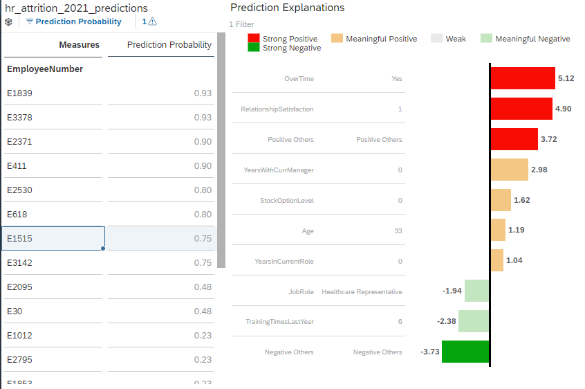
First, it is important to emphasize that the bar chart represents a set of explanations for the prediction of a single specific entity only (in this example, the employee selected in the left table, E1515).
Each bar represents an influencer (a variable that explains the predicted target), the value associated to that influencer in the application dataset and the measure of their impact on the prediction (the “strength”). For convenience, we will refer to this triplet (influencer, influencer value, strength) as an “explanation” of the prediction.
The higher the absolute value of the strength the greater the impact on the prediction. The impact of the explanation can be either positive or negative:
- For a binary prediction (classification), influencers with a positive strength tend to increase the predicted probability, while influencers with a negative strength tend to decrease the predicted probability.
- For a numeric prediction (regression), influencer with a positive strength tend to lead to a higher predicted value, while influencers with a negative strength tend to make the predicted value lower.
So, the example above tells us that the factor that makes employee E1515 the most likely to leave is the fact that he does overtime work. The fact that his relationship satisfaction level with the company is low also significantly increased the predicted probability to leave. On the other hand, there are also a few factors such as the high number of training he had last year or his role as a healthcare representative that slightly decreased the predicted probability to leave the company.
It’s important to emphasize that the “strength” is a normalized measure of the contribution and hence must not be interpreted in the target space:
- In the context of a classification, the strength is not a probability (when summed the strengths for a prediction are not equal to the predicted probability)
- In the context of a regression, the strength is not a “part” of the predicted value (when summed the strengths for a prediction are not equal to the predicted value). For the regression models a “contribution” value that can be interpreted as a “part” of the predicted value is also provided. This will be detailed in a future blog post.
How is The Strength Calculated?
The strength, as previously mentioned is a measure of the impact of the explanation on the prediction. It’s a normalization of the contribution of the influencer and is calculated as follows:
![]()

The contribution of the influencers is measured using SHAP values. If you are interested you can find a very good introduction to the SHAP values here, but at a very high level you can think about the SHAP value of an influencer as the amount of information that would be lost if the influencer was not used to generate the prediction. A SHAP value can be either positive or negative and the higher the absolute value of the SHAP value is the more contributive the influencer is.
Discretizing the Strength
Most people won’t be interested in the exact strength value and would prefer interpreting the strength in more qualitative terms associated to some color coding.
We recommend using the following ranges of value:
| Range | Interpretation of the explanation impact on the prediction |
| ]3; +∞[ | Strong positive impact |
| [1;3[ | Medium positive impact |
| [-1; 1] | Low impact (not significant) |
| [-3; -1[ | Medium negative impact |
| ]-∞; -3[ | String negative impact |
Where do these ranges come from?
Thanks to the 1/ 𝜎 factor, the strength can be interpreted as the distance to the average expressed in “number of standard deviations”. A contribution which is 1 standard deviation lower than the average contribution leads to a strength value of -1, a contribution which 2 standard deviations higher than the average contribution leads to a strength of 2…
In statistics, it’s usual to measure the distance to from the average using the standard deviation as distance unit. Referring to the chart below, we can see that for a normal distribution most values (68.2%) would be at less than one deviation from the average. These values are not significantly different from the average and a strength between -1 and 1 can be regarded as “neutral”, the impact is neither significantly positive nor significantly negative. On the other hand only few values are expected to lie further than 3 standard deviations (0.4% of the values), so a strength higher than 3 and lower than -3 can be regarded as strong.

How the strength thresholds relate to the normal distribution
Using -3, -1, 1 and 3 as threshold is only a recommendation. It may make sense for your specific use case to differentiate neutral positive and neutral negative, to add one more threshold at -2 and 2…
Positive Others & Negative Others
It may be difficult to have a synthetic view of what influenced the prediction if too much information is provided. More explanations lead to more data points, which may be more difficult to read and interpret. So, the choice was made to limit the number of generated explanations to 10 per prediction.
But a predictive model can obviously use more than 10 influencers. So, to comply with the 10 explanations limit while keeping the provided information “complete”, we have introduced the Positive Others and Negative Others influencers.
There is always a maximum of 10 explanations in total, including the Positive Others and Negative Others generated influencers. Depending on how the positive and negative explanations are balanced, Positive Others and Negative Others may exist alone.
Because they are aggregating several individual explanations, the strength of Positive Others and Negative Others can be significant while the aggregated individual strengths may be small.
Referring to our previous example, we can see that there is a Positive Others generated influencer associated to the strength 3.72 and a Negative Others generated influencer associated to the strength -3.73. It means that:
- there were more than 10 influencers used to generate the prediction
- a set of explanation with a small positive individual impact have been aggregated into Positive Others.
- a set of explanation with a small negative individual impact have been aggregated into Negative Others.

Positive Others and Negative Others: Grouping of the Weak Explanations
Using the Explanations Step-By-Step
Scenario
We would like to take some actions to reduce the attrition in the company. To do so we need to predict who are the employees at risk of leaving the company in the coming twelve months. But, to take the best retention decisions, we also would like to know, for each prediction what are the reasons that led Smart Predict to generate that specific prediction (concretely, what are the factors that increase or decrease the probability for this employee to leave).
We have prepared two datasets that you can download (click the link then save the file using CTRL-s) if you want to recreate this example:
- hr_attrition_2021_training.csv: a training dataset that contains all the employees that were working for the company at the beginning of 2020. The target column “attrition” contains “No” if the employee was still working for the company at the end of 2020 and “Yes” if the employee has left the company in the course of 2020.
- hr_attrition_2021_apply.csv: this dataset contains all the employees that were still working for the company at the beginning of 2021. The prediction is telling us whether these employees have a risk to leave in the course of 2021.
Please refer to this help page if you need help about how to create a dataset.
Generating the Explanations
Please refer to this blog post if you need help about how to use Predictive Scenarios.
Let's build a Smart Predict classification model using the hr_attrition_2021_training.csv dataset and the settings shown below:

Predictive Model Training Settings
The Predictive Model needs to know the column that uniquely identifies an employee.
Now, we can generate the predictions using the “Apply Predictive Model” button.

To identify the employees the most likely to leave we will generate the Prediction Probability.
By default, the prediction explanations are not generated, we must enable the option explicitly. So, let’s enable the option Prediction Explanations in the Statistics & Predictions section.
Finally, let’s click Apply to generate the predictions.

Use hr_attrition_2021_apply as input and write the predictions to hr_attrition_2021_predictions (new dataset)
Setting Up an Employee Selector
First let’s create a new story.

Let’s import the hr_attrition_2021_predictions dataset in in a story.


Select the dataset where you have generated the predictions (hr_attrition_2021_predictions in our example).
We want to see a list of the employees the most likely to leave the company, in a table. This table will allow us to select a specific employee and get explanations of the prediction for that employee.

Add an employee selection table to the story.

Settings of the selection table.
We only need the Prediction Probability measure to be selected in the Measures selector.
At this stage, you should see table like the one below.

Employee Selection Table
We want this table to act as a selector. The way to achieve this in SAP Analytics Cloud is by using the “Linked Analysis” option.

Setting up a linked analysis (1/2)

Setting up a linked analysis (2/2)
Setting Up the Explanations Visualization
Now, let’s setup the explanation visualization itself.
There are plenty of way you could visualize the prediction explanations in a story. In this blog post we will focus on visualizing the prediction explanations as a bar chart, with a setup that we find is convenient, but you are obviously not limited to that specific setup.
In all the cases the setup is as follows:
- Measure: Explanation Strength
- Dimensions: Explanation Influencer, Explanation Influencer Value

Add a new chart in the story.

Select Bar Chart as chart type.

Setup the bar chart to display the explanations.
For a more convenient reading of the chart, we would like the bars to be ordered by decreasing influencer impact:

Sorting the explanation by decreasing impact.
Finally, select one specific employee of your choice in the table you have created previously.
You should now see a bar chart like the one below.

Basic display of the explanations.
Adding Strength Color Coding
The consumer of the story may not know how the strength value should be interpreted. Adding some user-friendly discretization and color coding would make the explanations easier to consume by everyone.
We recommend using the following thresholds (explained in the Interpreting the Explanations>Discretizing the Strength section of this post):
| strength >= 3 | Strong Positive |
| 1 <= strength < 3 | Meaningful/Medium Positive |
| -1 <= strength < 1 | Weak |
| -3 <= strength < -1 | Meaningful/Medium Negative |
| -3 < strength | Strong Negative |
First, let’s add a “Threshold” to our visualization.

Add thresholds to the bar chart
Select Explanation Strength as threshold measure and defines the thresholds as below:

Threshold ranges.
Finally, your explanations visualization should look like the screenshot below:
Individual Prediction Explanations With Color Coding
Please note that the results (strength values and influencers order) may be different depending on the evolutions of the Smart Predict classification algorithm, so you may not see the exact same results as visible on this screenshot.
Conclusion
In this blog post, you learned how to leverage the Prediction Explanations to better understand the predictions of a classification model at an individual level. There is a lot of insights you can get thanks to this option. This other blog post explains how to leverage the prediction explanations for regression models to display the prediction explanations as a waterfall chart.
I hope this blog post was helpful to you. If you appreciated reading this, I’d be grateful if you left a comment to that effect, and don’t forget to like it as well. Thank you.
Do you want to learn more on Predictive Planning?
- You can read our other blog posts.
- You can also explore our learning track.
- You can also go hands-on and experience SAP Analytics Cloud by yourself.
Find all Q&A about SAP Analytics Cloud and feel free to ask your own question here: https://answers.sap.com/tags/67838200100800006884
Visit your community topic page to learn more about SAP Analytics Cloud: https://community.sap.com/topics/cloud-analytics
- SAP Managed Tags:
- SAP Analytics Cloud,
- SAP Analytics Cloud, augmented analytics
Labels:
1 Comment
You must be a registered user to add a comment. If you've already registered, sign in. Otherwise, register and sign in.
Labels in this area
-
ABAP CDS Views - CDC (Change Data Capture)
2 -
AI
1 -
Analyze Workload Data
1 -
BTP
1 -
Business and IT Integration
2 -
Business application stu
1 -
Business Technology Platform
1 -
Business Trends
1,661 -
Business Trends
88 -
CAP
1 -
cf
1 -
Cloud Foundry
1 -
Confluent
1 -
Customer COE Basics and Fundamentals
1 -
Customer COE Latest and Greatest
3 -
Customer Data Browser app
1 -
Data Analysis Tool
1 -
data migration
1 -
data transfer
1 -
Datasphere
2 -
Event Information
1,400 -
Event Information
64 -
Expert
1 -
Expert Insights
178 -
Expert Insights
281 -
General
1 -
Google cloud
1 -
Google Next'24
1 -
Kafka
1 -
Life at SAP
784 -
Life at SAP
11 -
Migrate your Data App
1 -
MTA
1 -
Network Performance Analysis
1 -
NodeJS
1 -
PDF
1 -
POC
1 -
Product Updates
4,577 -
Product Updates
330 -
Replication Flow
1 -
RisewithSAP
1 -
SAP BTP
1 -
SAP BTP Cloud Foundry
1 -
SAP Cloud ALM
1 -
SAP Cloud Application Programming Model
1 -
SAP Datasphere
2 -
SAP S4HANA Cloud
1 -
SAP S4HANA Migration Cockpit
1 -
Technology Updates
6,886 -
Technology Updates
408 -
Workload Fluctuations
1
Related Content
- New Machine Learning features in SAP HANA Cloud in Technology Blogs by SAP
- Forecast Local Explanation with Automated Predictive (APL) in Technology Blogs by SAP
- Revolutionizing Business through the Power of SAP’s Artificial Intelligence Superheroes in Technology Blogs by SAP
- Pioneering Datasphere: A Consultant’s Voyage Through SAP’s Data Evolution in Technology Blogs by Members
- Global Explanation Capabilities in SAP HANA Machine Learning in Technology Blogs by SAP
Top kudoed authors
| User | Count |
|---|---|
| 13 | |
| 10 | |
| 10 | |
| 7 | |
| 6 | |
| 5 | |
| 5 | |
| 5 | |
| 5 | |
| 4 |