

- SAP Community
- Products and Technology
- Technology
- Technology Blogs by SAP
- Dataset Linking in SAP Lumira - Part 2
Technology Blogs by SAP
Learn how to extend and personalize SAP applications. Follow the SAP technology blog for insights into SAP BTP, ABAP, SAP Analytics Cloud, SAP HANA, and more.
Turn on suggestions
Auto-suggest helps you quickly narrow down your search results by suggesting possible matches as you type.
Showing results for
Former Member
Options
- Subscribe to RSS Feed
- Mark as New
- Mark as Read
- Bookmark
- Subscribe
- Printer Friendly Page
- Report Inappropriate Content
12-03-2015
9:08 PM
Now that SAP Lumira 1.29 is available to our customers, I would like to share with you additional uses cases that are now possible using the power of Dataset Linking (blending).
If this is your first time looking into Dataset linking, I recommend that you have a quick read through my original blog on this topic where I covered the functionality introduced in Lumira 1.27 and 1.28. For the exercises below, you can use the sample dataset that ships with Lumira desktop called BestRunCorp_Retail. In addition I've attached a spreadsheet to this blog that needs to be renamed to CA Sales.xlsx. This should give us the baseline to mimic the blending scenarios in Lumira.
First let's start with a summary of enhancements to Dataset Linking in the 1.29 release:
- Suggest possible dimensions to link and blend on
- Browse through a sample of values in Dataset Linking dialog
- Set the linking context with “Active Linked Dimensions”
- Use “Calculate Result As” to control the roll up of measure values
- Display the union list of values when filtering linked datasets
Scenario 1: Linking the common dimensions and Exclude Active Linked Dimensions
Goal: Compare my Canada's sales figures with the United States sales figure
Start by opening the sample dataset BestRunCorp_Retial.xlsx by clicking on the "Try with Samples" button in the Home page of Lumira (Hint: you will need to close any open document to get to the Home page).

In the Add New Dataset dialog, click on Create to import the dataset and start a new document

In the Visualize room, click on crosstab to start a crosstab visualization. Add the Sales Revenue to the Measures and City to the Rows of the chart feeder.
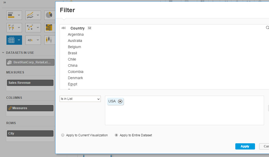
Next, click on the Add Filter button in the filter bar and select Country. Include USA and click Apply.
To compare Canadian cities values with USA values, we need to blend with the dataset attached to this article. If you haven't done so already, download the attachment CA Sales.txt and rename it to CA Sales.xlsx.
Acquire the data of CA Sales.xlsx

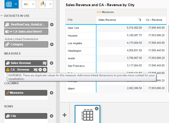
Once you are back in the Visualize room, CA Sales dimensions and measures should be available in the Object Picker on the left panel to select from. Now we are able to drag the CA Revenue measure into the existing crosstab's Measure feeder to display side by side with the USA Sales Revenue.
However at this stage, we are prompted to define a link between these datasets. In Lumira 1.29, you can now hover over the different dimensions from the left or the right dataset to browse through sample values to help identify common dimensions with similar data. I do notice that Category and City appear to be in both datasets but we will only select Category for the time being since we know that there are no common cities between these datasets as Canadian data is not present in BestRunCorpRetail dataset.

Once Category is selected, a light bulb appear on the bottom right field. When we click on the light bulb, 2 dimensions are suggested as potential common dimensions. We will select Category with 74% match between these datasets rather than the 3% with the Line dimension.
Click OK to continue

Now the CA - Revenue values are shown side by side with Sales Revenue of the US cities.
Notice how Lumira adds a warning beside CA - Revenue. If you hover over this warning, a message is given letting the user know that the measure values are duplicated across the city rows. In the example below, I'm sorting the results on Sales Revenue.
Now that Lumira 1.29 allows users to link on dimensions that are not included in the visualization, the tool will need to roll up the values based on the context of the visualization which in this case is grouped by City and linked using Left outer join on Category.
Since we filtered the visualization originally to only include the country USA, the tool is rolling up the CA - Revenue values for the common categories that are sold to all the Canadian cities and displaying the value 17,695... for every US city.
We need to link on additional dimensions to achieve the right granular level in order to display the City Revenue for Canada and US side by side.
From the Dataset selector, click on Link Datasets to display the Dataset Linking dialog.

Link on City even though there are no common values between them

Insure that the City is selected within the Datasets In Use, Active Linked Dimensions feeder. You may need to expand the Dataset In Use feeder and click on the + button within the Active Linked Dimensions to add City to the visualization linking context. The purpose of the Active Linked Dimensions feeder is to allow us to adjust the linking context for this visualization to reach the proper level of aggregation across the datasets. Note: this is typically not an issue in the case of Merge since Merge forces the user to select a unique key.

Since we know that the cities are not common, change the link on the CA Sales dataset from Left outer to Full Outer join. This is need to display the cities available in both datasets.

Notice how we are still only seeing US cities. This is due to the fact that our filter is only including US cities. Once a visualization includes a blend of datasets, the filters impact the result set of the visualization. In this particular scenario, this is not what we want. We could filter on City and select every Canadian and US city to achieve the proper selection but this prone to user error.
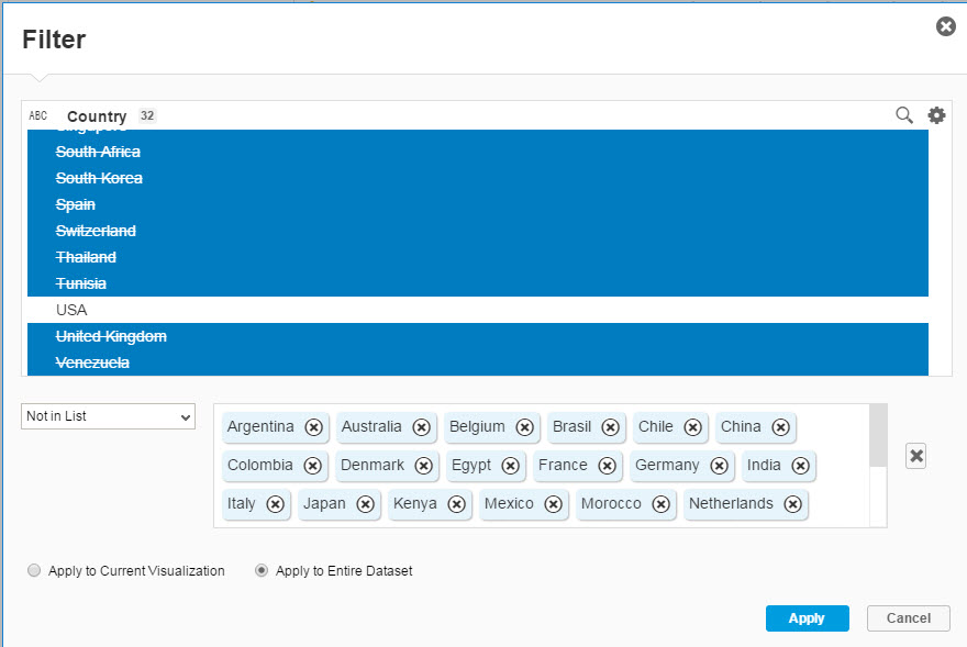
Ideally we can simply select USA and Canada but since the list of values of the Country dimension in BestRunCorpRetail does not include Canada, we will exclude all the countries except for US. This would return US and Canadian cities from the blended datasets.
To do so, click on the existing Country filter token and remove the USA selection. Next change the operator to Not in List and Shift select all the values within the Country dimension. Finally scroll to the bottom of the list of values and unselect USA to insure that it is not excluded.
Now the crosstab allows us to display the results of both countries side by side. Removing the sort on Sales Revenue will display the Cities of both countries in alphabetical order.

Scenario 2: Filter using the union list of values
Goal: Filter the visualization to Toronto and New York city
I'm interested in digging little deeper into the revenue values of Toronto and New York city. From the Add Filter button in the filter toolbar, select City and include Toronto and New York. When filtering, it doesn't matter which dataset you select City from since linked dimensions by default are combined into one list of values. In the case where the join type is Full outer join, a union of the list of values is done by default. This explains why Lumira provided us with Canadian and US cities in one list.

If you are only interested in selecting values from the primary dataset, you can disable the Show Values From Linked Datasets within the cog menu of the Filter dialog. This toggle is only relevant for linked dimensions that are set to full outer join

The following visualization answers the business question we are after.

Alternatively , we can swap the Category dimension with the City dimension in the rows chart feeder to analyze by category the revenue figures of Toronto and New York.

Scenario 3: Calculate Results As
Goal: Manipulate the rollup operation
Remove the Category dimension from the rows of the chart feeder and replace back with City.
The totals shown for Revenue represent the rollup of all the categories of New York and Toronto since Category is part of the linking context. This rollup operation is done at the resultset level and not at the fact level/dataset level. Therefore it is an aggregation on top of the original (Sum) aggregation of Revenue defined at the dataset level.
It is possible in Lumira 1.29 to manipulate this rollup operation where it makes sense. This can be done by selecting the Calculate Total As options from the measure cog within the Measure chart feeder. Also this option is only visible when Lumira is forced to do a rollup as a result of dataset linking.
Select the Calculate Total As, Count(Distinct) for CA - Revenue.

The number 25 represents the 25 categories sold in Toronto.
Select the Calculate Total As, Average for CA - Revenue.

Now the value shown for Toronto is the average Revenue of all the categories sold in Toronto which translates to << Sum{Revenue}/25>>. This average is not the same as the average Revenue per City which equates to << Sum {Revenue} / # of records where {City} = "Toronto">>.

Note: please be careful how and when average is used as it is processed at the result set in the example above and not at the fact level.
I know that the examples above are not straight forward but I wanted to show how powerful Dataset Linking could be especially when the datasets being blended do not align very well. Also I hope the point is made that Dataset linking and blending whether it is in Lumira or other tools is a feature and a concept that can get complex very quickly and not many end users can grasp it easily. This where as an analyst and content creator, you would want to use the Merge feature of Lumira where possible to hide some of these complexity from your end users.
- SAP Managed Tags:
- SAP Lumira
3 Comments
You must be a registered user to add a comment. If you've already registered, sign in. Otherwise, register and sign in.
Labels in this area
-
ABAP CDS Views - CDC (Change Data Capture)
2 -
AI
1 -
Analyze Workload Data
1 -
BTP
1 -
Business and IT Integration
2 -
Business application stu
1 -
Business Technology Platform
1 -
Business Trends
1,661 -
Business Trends
87 -
CAP
1 -
cf
1 -
Cloud Foundry
1 -
Confluent
1 -
Customer COE Basics and Fundamentals
1 -
Customer COE Latest and Greatest
3 -
Customer Data Browser app
1 -
Data Analysis Tool
1 -
data migration
1 -
data transfer
1 -
Datasphere
2 -
Event Information
1,400 -
Event Information
64 -
Expert
1 -
Expert Insights
178 -
Expert Insights
273 -
General
1 -
Google cloud
1 -
Google Next'24
1 -
Kafka
1 -
Life at SAP
784 -
Life at SAP
11 -
Migrate your Data App
1 -
MTA
1 -
Network Performance Analysis
1 -
NodeJS
1 -
PDF
1 -
POC
1 -
Product Updates
4,577 -
Product Updates
325 -
Replication Flow
1 -
RisewithSAP
1 -
SAP BTP
1 -
SAP BTP Cloud Foundry
1 -
SAP Cloud ALM
1 -
SAP Cloud Application Programming Model
1 -
SAP Datasphere
2 -
SAP S4HANA Cloud
1 -
SAP S4HANA Migration Cockpit
1 -
Technology Updates
6,886 -
Technology Updates
403 -
Workload Fluctuations
1
Related Content
- Harnessing Multi-Model Capabilities with Spotify – Processing Semi-Structured Data with SAP HANA Cloud/SAP Datasphere – Part 6 in Technology Blogs by SAP
- A Guide to Advanced RAG Techniques for Success in Business Landscape in Technology Blogs by SAP
- Using Build Apps to Create a List Report with Charts ,Tables and Pagination in Technology Blogs by SAP
- Unveiling SAP BusinessObjects BI 4.3 SP04 ! in Technology Blogs by SAP
- Generative AI for SAP. Part V: Models and Knowledge Graphs (KG) in Technology Blogs by Members
Top kudoed authors
| User | Count |
|---|---|
| 12 | |
| 10 | |
| 9 | |
| 7 | |
| 7 | |
| 7 | |
| 6 | |
| 6 | |
| 5 | |
| 4 |