
- SAP Community
- Products and Technology
- Technology
- Technology Blogs by SAP
- Your First Extension: Part 3b - Adding the Arc's P...
Technology Blogs by SAP
Learn how to extend and personalize SAP applications. Follow the SAP technology blog for insights into SAP BTP, ABAP, SAP Analytics Cloud, SAP HANA, and more.
Turn on suggestions
Auto-suggest helps you quickly narrow down your search results by suggesting possible matches as you type.
Showing results for
 david_stocker
Advisor
Options
- Subscribe to RSS Feed
- Mark as New
- Mark as Read
- Bookmark
- Subscribe
- Printer Friendly Page
- Report Inappropriate Content
11-02-2015
5:22 AM
This is part of a tutorial series on creating extension components for Design Studio.
Now that we have a basic grasp of the properties that we'll need to start making a configurable arc in D3, we need to get these properties into the component. Over the next few installments, we'll do the following:
- Add the properties sheet, so that the designer can set them.
- Take a tour of the lifecycle of a property and its agency on both the client and server side. This will later prove useful when we want to access the values defined in the properties sheet, or change them at runtime.
- Access these properties from the client side, so that we can use them to draw the gauge.
- Add getters and setters for these properties in the BIAL scripting language, so that we can manipulate the gauge at runtime, via scripting.
The Property Element
To define a basic property in the properties sheet, we add a <property> element to component.xml. These elements go immediately after the xxxInclude elements (stdInclude, jsInclude and cssInclude). For basic property definition, we'll need to define mandatory three attributes per property:
- id - This is the technical name of the property and what'll we'll be using to reference it later.
- title - This is the text that goes in the label in the properties sheet.
- type - the technical type of the property. The allowed types are boolean, Color, float, int, ResultCell, ResultCellList, ResultCellSet, ResultSet, ScriptText, String, Text and Url. Pay attention to the spelling. The types are case sensitive and yes, some do start with lower case letters, while others start upper case. Choosing a particular data type may enforce validation of values entered by the designer (e.g. they can't write a novel in float and int areas). With other data types, additional infrascructure might be enabled. E.g. the ResultXXX types will enable data selection dialogsWe'll cover each property type in turn, but start with the simple types today.
Additionally, we have four optional attributes:
- group - If you wish to put the property into a specific group in the properties pane, this is the attribute that you'll want to use. If you don't set this attribute, the property will show up in the Display group. For the sake of simplicity in the component.xml today, we'll leave it out and accept that our properties will land in the Display group.
- bindable - Can the attribute be bound to data from the backend. This attribute that enables data binding on the property. If left out, the default value is false. We'll be covering data binding in a later installment and won't bother with the bindable property today.
- tooltip - Do you want a mouseover tooltip on the property in the properties pane? If so, here is your chance to write the text for it.
- visible - This attribute controls the visibility of the property in the properties pane. There may be situations where you want the designer to set the property via the Additional Properties Sheet, via script only, or perhaps not at all (you may have a special use planned for the property). If so, then add this attribute and set it to false. The default value is true. We want to hide the centerpoint and outer radius from the designer, because we'll be calculating them from other properties; so we'll be making them invisible. The rest will be visible.
The properties that we defined in the last section will be of three types, floating point numbers, integers and colors. The property types are distributed as follows:
float
startAngleDeg
endAngleDeg
innerRad
outerRad
int
offsetLeft (the y-axis component of the centerpoint)
offsetDown (the x-axis component if the centerpoint)
paddingTop
paddingBottom
paddingLeft
paddingRight
Color
colorCode
Here is an example of a float property with only the mandatory attributes assigned, startAngleDeg:
<property
id="startAngleDeg"
title="Start Angle"
type="float"/>
Here is an example of an int property with visible set to false, offsetLeft:
<property
id="offsetLeft"
title="Centerpoint Offset X-Axis"
type="int"
visible="false"/>
Note that although title is the display title for the properties pane and won't actually be seen, it is still mandatory and needs to be present. We'll write a proper, descriptive title to document the component for later reference and we never know if we'll change our minds and want to set visible to true.
The <initialization> element
Sometimes, we'll want to pre fill the values in the properties pane with something. Usually, we'll want to do this when we need to have a value there. You've probably seen this many times in components that you've used. E.g. the height and width of components nearly always have a default value of height and width. Immediately following all of the properties elements comes a single <initialization> element. This element is optional, but may only appear a single time if added. Inside the <initialization> element, we may add any number (including 0) <defaultValue> elements. Each defaultValue element has a single, mandatory attribute, property. This defines the property that is targeted. The value of the element is the default value. Below are some examples of technically valid initialization elements. The first two (empty ones are not examples of best-practice, as it is always a good idea to define height and width, if nothing else:
An empty initialization element
<initialization/>
Another empty initialization element
<initialization>
</initialization>
The minimal scope best practice, pre-filling height and width (yes, these mandatory properties are all uppercase)
<initialization>
<defaultValue property="WIDTH">100</defaultValue>
<defaultValue property="HEIGHT">100</defaultValue>
</initialization>
Pre-filling a handful of properties, start angle, end angle and making the arc blue by default.
<initialization>
<defaultValue property="WIDTH">100</defaultValue>
<defaultValue property="HEIGHT">100</defaultValue>
<defaultValue property="startAngleDeg">-90.0</defaultValue>
<defaultValue property="endAngleDeg">90.0</defaultValue>
<defaultValue property="colorCode">blue</defaultValue>
</initialization>
The complete component.xml
Let's add all of the properties and use the last example initialization element from above. The completed component.xml should now look as follows:
<?xml version="1.0" encoding="UTF-8"?>
<sdkExtension
eula=""
id="com.sap.sample.scngauge"
title="SCN Tutorial Gauge"
vendor="SAP"
version="15.1"
xmlns="http://www.sap.com/bi/zen/sdk"
xmlns:xsi="http://www.w3.org/2001/XMLSchema-instance"
xsi:schemaLocation="http://www.sap.com/bi/zen/sdk http://www.sap.com/bi/zen/sdk ">
<license>license</license>
<component
databound="false"
group=""
handlerType="div"
icon="res/gauge.png"
id="SCNGauge"
propertySheetPath="res/additional_properties_sheet/additional_properties_sheet.html"
title="Gauge"
tooltip=""
visible="true">
<stdInclude kind="d3"/>
<jsInclude>res/js/component.js</jsInclude>
<cssInclude>res/css/component.css</cssInclude>
<property
id="startAngleDeg"
title="Start Angle"
type="float"/>
<property
id="endAngleDeg"
title="End Angle"
type="float"/>
<property
id="innerRad"
title="Inner Radius"
type="float"/>
<property
id="outerRad"
title="Outer Radius"
type="float"
visible="false"/>
<property
id="offsetLeft"
title="Centerpoint Offset X-Axis"
type="int"
visible="false"/>
<property
id="offsetDown"
title="Centerpoint Offset Y-Axis"
type="int"
visible="false"/>
<property
id="paddingTop"
title="Top Padding"
type="int"/>
<property
id="paddingBottom"
title="Bottom Padding"
type="int"/>
<property
id="paddingLeft"
title="Left Padding"
type="int"/>
<property
id="paddingRight"
title="Right Padding"
type="int"/>
<property
id="colorCode"
title="Color"
type="Color"/>
<initialization>
<defaultValue property="WIDTH">100</defaultValue>
<defaultValue property="HEIGHT">100</defaultValue>
<defaultValue property="startAngleDeg">-90.0</defaultValue>
<defaultValue property="endAngleDeg">90.0</defaultValue>
<defaultValue property="colorCode">blue</defaultValue>
</initialization>
</component>
</sdkExtension>
Testing
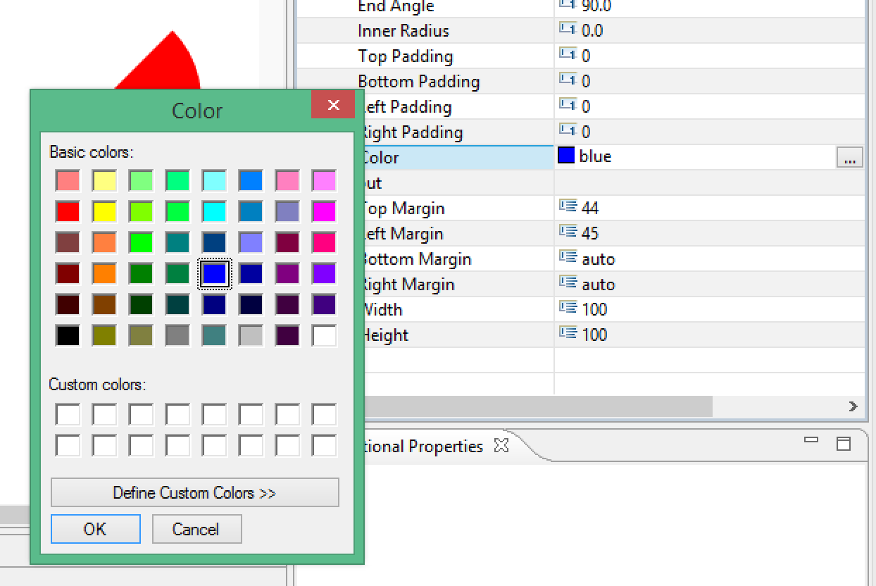
We've not changed our component.js file since we last edited it in step 2b.5. Therefore, we'll expect it to look and act the same, but we will also expect the visible properties to show up in the properties pane, even if they don't actually do anything yet. When we launch Design Studio and add our SCNGauge component to an app, this is what we see:

The visible properties are visible. The prefilled properties are prefilled and the color picker works. For example, we can use to set the color property to red.


As always, the completed extension (as of part 3) is available as a Github repository.
Next time, we'll look into the life cycle of a property, so that we'll be able to make use of it both on the client and server side.
- SAP Managed Tags:
- SAP BusinessObjects Design Studio
1 Comment
You must be a registered user to add a comment. If you've already registered, sign in. Otherwise, register and sign in.
Labels in this area
-
ABAP CDS Views - CDC (Change Data Capture)
2 -
AI
1 -
Analyze Workload Data
1 -
BTP
1 -
Business and IT Integration
2 -
Business application stu
1 -
Business Technology Platform
1 -
Business Trends
1,658 -
Business Trends
91 -
CAP
1 -
cf
1 -
Cloud Foundry
1 -
Confluent
1 -
Customer COE Basics and Fundamentals
1 -
Customer COE Latest and Greatest
3 -
Customer Data Browser app
1 -
Data Analysis Tool
1 -
data migration
1 -
data transfer
1 -
Datasphere
2 -
Event Information
1,400 -
Event Information
66 -
Expert
1 -
Expert Insights
177 -
Expert Insights
296 -
General
1 -
Google cloud
1 -
Google Next'24
1 -
Kafka
1 -
Life at SAP
780 -
Life at SAP
13 -
Migrate your Data App
1 -
MTA
1 -
Network Performance Analysis
1 -
NodeJS
1 -
PDF
1 -
POC
1 -
Product Updates
4,577 -
Product Updates
342 -
Replication Flow
1 -
RisewithSAP
1 -
SAP BTP
1 -
SAP BTP Cloud Foundry
1 -
SAP Cloud ALM
1 -
SAP Cloud Application Programming Model
1 -
SAP Datasphere
2 -
SAP S4HANA Cloud
1 -
SAP S4HANA Migration Cockpit
1 -
Technology Updates
6,873 -
Technology Updates
420 -
Workload Fluctuations
1
Related Content
- Support for API Business Hub Enterprise in Actions Project in Technology Blogs by SAP
- What’s new in Mobile development kit client 24.4 in Technology Blogs by SAP
- Handle the behavior of extension field by toggle button using SDK UI designer. in Technology Blogs by Members
- Embracing TypeScript in SAPUI5 Development in Technology Blogs by Members
- Accelerate Business Process Development with SAP Build Process Automation Pre-Built Content in Technology Blogs by SAP
Top kudoed authors
| User | Count |
|---|---|
| 36 | |
| 25 | |
| 17 | |
| 13 | |
| 8 | |
| 7 | |
| 7 | |
| 6 | |
| 6 | |
| 6 |