
- SAP Community
- Products and Technology
- Technology
- Technology Blogs by SAP
- Your First Extension: Part 1 - Project Creation
Technology Blogs by SAP
Learn how to extend and personalize SAP applications. Follow the SAP technology blog for insights into SAP BTP, ABAP, SAP Analytics Cloud, SAP HANA, and more.
Turn on suggestions
Auto-suggest helps you quickly narrow down your search results by suggesting possible matches as you type.
Showing results for
 david_stocker
Advisor
Options
- Subscribe to RSS Feed
- Mark as New
- Mark as Read
- Bookmark
- Subscribe
- Printer Friendly Page
- Report Inappropriate Content
09-29-2015
2:08 PM
This is part of a tutorial series on creating extension components for Design Studio.
Update! Parts 1.9, 1.10c and 1.10d are obsolete as of Design Studio 1.6. They will still work and we recommend that you go through the tutorial exactly as it is written here. Please refer to the comments for more information.
Currently, there is no project wizard for creating Design Studio extensions. Likewise, creating projects by hand from scratch is not recommended - due to complexity of configuration. Yes, it is theoretically possible to create an Eclipse plugin project by hand, that attaches to the Design Studio extension point, but it is an order of magnitude more complex that what we'll be doing here. The normal, recommended workflow is to start with an existing project, clone it and modify the clone. In this instalment, we'll create our gauge project, using the clone method. We will have to do some Eclipse Plugin housekeeping and some Design Studio Extension specific housekeeping in this instalment; but after this, you should be able to develop content.
Step 1.1 - Copy/Paste a project (e.g. com.sap.sample.coloredbox) and rename it. Let's call it "com.sap.sample.scngauge".


Mea Culpa: I spelled gauge incorrectly in that screenshot. 😉
Step 1.2 - In the new project, open the file ../res/additional_properties_sheet/additional_properties_sheet.html in the editor and empty it. At a later time, we'll be creating a new Additional Properties Sheet (APS) page from scratch.
Step 1.3 - Open the file ../res/additional_properties_sheet/additional_properties_sheet.js in the editor and empty it.
Step 1.4 - You should be staring at an empty additional_properties_sheet.js Before we starting adding anything back to it, let's take a moment to explain the method to the madness. Behind the scenes, in the SDK framework, there is a Javascript class, called sap.designstudio.sdk.PropertyPage. This class will contains a function called subclass(). This subclass function is your hook for modifying sap.designstudio.sdk.PropertyPage. The constructor takes two input variables; a "class name" and an anonymous function. Behind the scenes, the Design Studio will be monkey patching your code into an instance of the master class, but the dev team decided to try and increase the usability of the SDK and not force you to do it yourself.
The "class name" variable can be anything you want. By convention, the SDK samples follow the convention of using "<ComponentName>PropertyPage", so that's what we'll use here and call our class "com.sap.sample.coloredbox.ColoredBoxPropertyPage", but you are free to call it "Ralph" if that pleases you.
The anonymous function will be the subject of future discussion, but we'll just leave it "blank" (i.e. function() {} ) for now. If you don't know what anonymous functions are, here is a good article on the subject. Tl:dr; "Anonymous" functions are functions that you stick in place of variables; sort of a "here, execute this code" thing.
The file should look like:
sap.designstudio.sdk.PropertyPage.subclass("com.sap.sample.scngauge.SCNGaugePropertyPage", function() {
});
Step 1.5 - Leave the component.css alone for now 😉 We'll cover css usage in a later instalment.
Step 1.6 - Editing the manifest file is part of the Eclipse Plugin housekeeping that you must do. In the manifest file (../META-INF/MANIFEST.MF), edit ID and Name.
ID = com.sap.sample.scngauge
Name = SCN Tutorial Gauge
Leave the version alone for now

Step 1.7 - Design Studio extensions can include new script commands. Open the file ../contribution.ztl. ZTL stands for Zen Template Language (Zen being the original development codename for Design Studio). This file is where we'll be defining our gauge components BIAL script functions in future instalments. For now though, we won't be defining any functions, but we'll go over the basics of how it is structured.
Digression:
Suppose that we have an extension, named com.sap.sample.myextension, that this extension contains a component, called "MyComponent" and that MyComponent has a string property called "something". Suppose as well, that we'd like a getter function, in BIAL, allowing us to get the value of something in our scripts and that we'll want to call this function getSomething().
class com.sap.sample.myextension.MyExtension extends Component {
/* Comment. */
String getSomething() {*
return this.something;
*}
}
The ZTL looks for a Java style class declaration for the component and matches it up with the proper component.
Comments within this "class" become viewable in the BIAL editor's value help.
The ZTL parser also searches within the class for function declarations (they have the format <Returntype> <FunctionName()> and monkeypatches the new function into the ZTL library for this component type.
You might notice the "{* <JavaScript> *}" syntax. The curly-brace/star combination is the escape sequence for nesting Javascript code into the function.

For now, simply declare the "class", but don't add any BIAL functions.
class com.sap.sample.scngauge.SCNGauge extends Component {
}
Step 1.8 - Right click on ../res/icon.png and select Delete.

Download the attached file, gauge.png. Copy it into your ../res folder. Right click on the project and select Refresh.
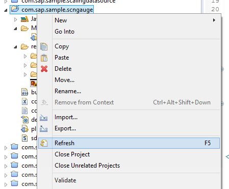
There should now be one file in the ../res folder, gauge.png.

Step 1.9 - (Update! Still works but is deprecated. See comments) We need to add our JavaScript bootstrapping infrastructure. Design Studio's SDK framework monkey patches the runtime, client-side Javascript code the same way that it does with the additional properties sheet. The only real difference it that it is sap.designstudio.sdk.Component that will be subclassed this time. ../res/js/component.js is where we'll be putting our client side Javascript code in. This file will be the core of any nontrivial extension. For starters, it should just have a subclass declaration, with a name and an empty anonymous function as parameters.
sap.designstudio.sdk.Component.subclass("com.sap.sample.scngauge.SCNGauge", function() {
});
Before we continue, we want to a small edit to our component.js file. Itis an acknowledgment that during the usage of this code, the scope may not always consistent. this may refer to the component, but we can't always be certain. We do know that this is the component at bootstrap time. So we add the line "var that = this;". Now, we can refer to that and know that it is the component, even if this is not anymore. Our component.js should now look like this:
sap.designstudio.sdk.Component.subclass("com.sap.sample.scngauge.SCNGauge", function() {
var that = this;
});
Step 1.10 - Last, but certainly not least (some of the other steps were prerequisites), we start working on the the extension and component metadata. To do this, we'll need to edit ../contribution.xml. You can use the Eclipse XML editor's design mode if you want, but we'll be using the Source tab and hand editing the xml.
Step 1.10a - Define the main, Extension metadata; the attributes of the sdkExtension element.
eula= We won't bother with an EULA, as it is outside the scope of this tutorial series.. You can leave this attribute blank, remove it or write whatever you want.
id= It is very, very, VERY important that the id here matches the ID defined in the MANIFEST.MF file. You can copy and paste. If the two Ids don't match, your extension won't work. Note - If you extension won't load, this attribute (and title, below) should be the first place you check when troubleshooting.
title= The same issue with ID is also present with title/name. The title attribute in contribution.xml must be an exact match to the Name property in MANIFEST.MF, or the extension won't load properly. Again, you can copy and paste.
In contribution.xml, edit id and title
vendor= and version= can also be copied over from MANIFEST.MF.
Xml namespace information can simply be left as is.
Step 1.10b - Our extension will have a single component, called "SCNGauge". We will define the metadata for this component as attributes in a component element.
databound="false" Setting this attribute to true, bunds the component to a data source and we don't want to do this just yet.
group= can be left blank for now. We'll add a group later. If no groups have been defined, the component will land in a group called Custom Components.
handlerType="div" There are multiple options.
- Use "datasource" if the component that you are building is a custom data source. Since this project is a visual component and not a datasource, we won't use this option.
- Use "sapui5" if the component is going to be using the SAP UI5 library. I'm a big fan of UI5, as it allows you to quickly build complex user interfaces. In this project, we'll be running a closer to the metal, so we won't be using UI5. Note - as of 1.5,we only support the commons (desktop) version of UI5 in SDK extensions and not yet m (Mobile).
- Use "cvom" if it is a chart that uses the CVOM (Lumira Visualizations). This feature will be available in 1.6.
- Use "div" for anything else. This provides you with a div container in the app and you can do anything you want inside it. Since we will be building our gauge with the D3 library, we will use div.
icon="res/gauge.png" This is the image file that we added in step 1.8.
id="SCNGauge"
newInstancePrefix="SCNGAUGE_INSTANCE" If you don't want the component aliases of your gauges in Design Studio apps to be SCNGAUGE_1, SCNGAUGE_2, etc. and prefer them to be called <somethingelse>_1, <somethingelse>_2, etc., you can define that here. If you leave this property in, but blank, your component aliases will be _1, _2, etc. Let's add a value, such as "SCNGAUGE_INSTANCE". (You can also remove it entirely and its alias will be SCNGAUGE_1, SCNGAUGE_2, etc.)
propertySheetPath="res/additional_properties_sheet/additional_properties_sheet.html", presuming that is what you called in in step 1.2.
title="Gauge" This is the title that the designer will see in the pallette.
tooltip="" You can leave this blank, or write a novel. If this was anything other than a tutorial, we'd be sure to enter a helpful clause or sentence.
visible="true" We certainly don't want our gauge being invisible.
Step 1.10c - (Update! Still works but is deprecated. See comments) Insert an stdInclude element, before the jsInclude element. This element allows you to tell the DS SDK that it needs to include a standard library. You don't need to add a stdInclude element for Jquery. JQuery is always included. Likewise, if sapui5 is the handler type, the ui5 library is also automatically included. Note that if you want to use D3, you should include it via stdInclude. You might be tempted to include it via jsInclude (see 1.9d, below), in order to get the latest and greatest version of D3. You'd regret doing this, as D3 does not play nice with Require.js. The D3 copy included in the DS SDK has been modified to play nice with Require.js.
Javascript was not originally meant to be a normal programming language, but was always intended to be self contained scripting for web pages. As such, it does not include any include/import mechanism of pulling in libraries on its own and requires the web browser to handle library imports (via the HTML script element). Require.js brings the classic "include/import", common to most programming languages.
Step 1.10d - (Update! Still works but is deprecated. See comments) Leave the jsInclude and cssInclude elements as is. You will only need to change their values if your JavaScript file is not component.js or your CSS file is not component.css. If you wish to import another library - that is not part of the DS SDK Framework, then you can add one (or more) additional jsInclude element(s).
Step 1.10e - Remove the property elements. We'll be adding properties in later instalments, but for now, we'll only use default properties.
Step 1.10f - Look in the initialization element, at its defaultValue child elements. WIDTH and HEIGHT are default properties, inherited from the master component template. You can leave them as is, or change their values. Delete any other defaultValue elements, if there are any.
Step 1.10g - If you are in source mode (at the bottom of the editor, the Source tab is selected), your component.xml should now look like the following:
<?xml version="1.0" encoding="UTF-8"?>
<sdkExtension
eula=""
id="com.sap.sample.scngauge"
title="SCN Tutorial Gauge"
vendor="SAP"
version="15.1"
xmlns="http://www.sap.com/bi/zen/sdk"
xmlns:xsi="http://www.w3.org/2001/XMLSchema-instance"
xsi:schemaLocation="http://www.sap.com/bi/zen/sdk http://www.sap.com/bi/zen/sdk ">
<license>license</license>
<component
databound="false"
group=""
handlerType="div"
icon="res/gauge.png"
id="SCNGauge"
newInstancePrefix="SCNGAUGE_INSTANCE"
propertySheetPath="res/additional_properties_sheet/additional_properties_sheet.html"
title="Gauge"
tooltip=""
visible="true">
<stdInclude kind="d3"/>
<jsInclude>res/js/component.js</jsInclude>
<cssInclude>res/css/component.css</cssInclude>
<initialization>
<defaultValue property="WIDTH">100</defaultValue>
<defaultValue property="HEIGHT">100</defaultValue>
</initialization>
</component>
</sdkExtension>
If you are in design mode, it should look like the following:

Step 1.11 - Now you are ready to test your project. Right click on the project. Select Run As -> Eclipse Application. Design studio should now be launched, so that you can debug the component.
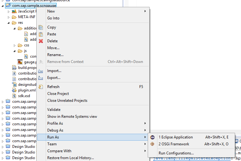
Step 1.12 - When Design Studio starts up, create a new application. Name your app SCNGAUGETEST and click on Finish. It should be noted here that your normal workspace is not being used, but rather a workspace associated with Eclipse. This means that you won't be able to see apps that you created when you started Design Studio normally and apps created within debug sessions (i.e. you started Design Studio from Eclipse) won't be visible when you start Design Studio the normal way.

Step 1.13 - Look in the Custom Components group of the palette (remember, we did not define a groups or assign the component to any specific groups yet). Here you will find a green arc, with the label Gauge.

Step 1.14 - Drag the new Gauge component into the canvass and have a look at it in the properties sheet. Here you should see all of the default properties that your component has (and that most of the default properties are bindable).

Step 1.15 - Run the app. Your component won't be visible, as it is just an empty div, but it should be error free. Now your are ready to start filling in the blanks and building an actual component.
The completed extension (as of part 1) is available as a Github repository.
- SAP Managed Tags:
- SAP BusinessObjects Design Studio
7 Comments
You must be a registered user to add a comment. If you've already registered, sign in. Otherwise, register and sign in.
Labels in this area
-
ABAP CDS Views - CDC (Change Data Capture)
2 -
AI
1 -
Analyze Workload Data
1 -
BTP
1 -
Business and IT Integration
2 -
Business application stu
1 -
Business Technology Platform
1 -
Business Trends
1,661 -
Business Trends
88 -
CAP
1 -
cf
1 -
Cloud Foundry
1 -
Confluent
1 -
Customer COE Basics and Fundamentals
1 -
Customer COE Latest and Greatest
3 -
Customer Data Browser app
1 -
Data Analysis Tool
1 -
data migration
1 -
data transfer
1 -
Datasphere
2 -
Event Information
1,400 -
Event Information
65 -
Expert
1 -
Expert Insights
178 -
Expert Insights
280 -
General
1 -
Google cloud
1 -
Google Next'24
1 -
Kafka
1 -
Life at SAP
784 -
Life at SAP
11 -
Migrate your Data App
1 -
MTA
1 -
Network Performance Analysis
1 -
NodeJS
1 -
PDF
1 -
POC
1 -
Product Updates
4,577 -
Product Updates
330 -
Replication Flow
1 -
RisewithSAP
1 -
SAP BTP
1 -
SAP BTP Cloud Foundry
1 -
SAP Cloud ALM
1 -
SAP Cloud Application Programming Model
1 -
SAP Datasphere
2 -
SAP S4HANA Cloud
1 -
SAP S4HANA Migration Cockpit
1 -
Technology Updates
6,886 -
Technology Updates
408 -
Workload Fluctuations
1
Related Content
- Kyma Integration with SAP Cloud Logging. Part 2: Let's ship some traces in Technology Blogs by SAP
- ModuleError: failed to load 'unit/unitTests.qunit.js' in Technology Q&A
- Top Picks: Innovations Highlights from SAP Business Technology Platform (Q1/2024) in Technology Blogs by SAP
- WebIDE: Extending Create Purchase Requisition New (F1643A) in Technology Q&A
- Building custom app at SAP S/4 public cloud in Technology Q&A
Top kudoed authors
| User | Count |
|---|---|
| 13 | |
| 11 | |
| 10 | |
| 9 | |
| 9 | |
| 7 | |
| 6 | |
| 5 | |
| 5 | |
| 5 |