For those who have visited sap.com website recently, you may have noticed that our logo has been quietly changed to gold letters with transparent background. You may have seen the white letters with golden background variation somewhere too.
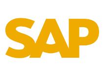

The square+triangle shape of our old logo is gone now.
Not sure if I am in love it yet.
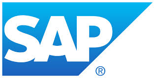
Still remember when I joined SAP in early 2000, we went through a big change to our logo at that time. As a result, we had the "smiling A" with a merged square and triangle shape for the last 10 years or so. At that time, most of us liked the idea to make our appearance a bit more "softened" by changing from a plain A to a smiling A.
Time flies, ten years are gone and it seems time again for another change. This time, we are moving completely out of the blue and the shape, the only commonality with the old logo is the three letter "SAP".
Is it too much? I don't know. I am still used to the well recognized iconic blue logo, it's probably not the mostly likable shape, but when people see it, they immediately know it's SAP, the software company. With the blue background and the iconic shape, it's hard for people to miss the "German seriousness" of our culture, and for many of our customers, it means the "good engineering" of our products.
Well, it may be just me, I would assume the gold/white theme is more appealing to the younger generations?
The funny thing is how fast time can erase the trace of changes. I did a search for SAP logo in Google images. You know what? It's hard to find a copy of the grand-old "not-smiling/plain-faced" logo any more. Among hundreds of smiling A's, I only found one straight A logo in the archival.
No matter what's changed and what's going to change, for good or for bad, maybe it's time for us to save a copy of our "oldies" before they disappear even from Google searches.


If you have more variations of the old-old logo, please send to me a copy or add a link to the comments section. Hopefully together we can keep a trace of our logo from time to time. It would be interesting to look back in 10 years again and see how things have changed with the company we love and respect so deeply.
Oh, BTW, the three letter SAP is not only used by our company. In the same Google search, I came across a few other logos with "SAP" letters. It reminded me that I actually saw a kid at Disney a couple of years ago wearing a t-shirt with the school-age-program logo below.

Without the background shape in the new logo, hoepfully people can still recoganize us as a software company just by the logo without having to get help from the context.
Wish SAP the best, as always.
