
- SAP Community
- Products and Technology
- Technology
- Technology Blogs by SAP
- Fundamental Library Styles version 0.10.0 is out
Technology Blogs by SAP
Learn how to extend and personalize SAP applications. Follow the SAP technology blog for insights into SAP BTP, ABAP, SAP Analytics Cloud, SAP HANA, and more.
Turn on suggestions
Auto-suggest helps you quickly narrow down your search results by suggesting possible matches as you type.
Showing results for
 deno
deno
Advisor
Options
- Subscribe to RSS Feed
- Mark as New
- Mark as Read
- Bookmark
- Subscribe
- Printer Friendly Page
- Report Inappropriate Content
06-01-2020
2:04 AM
Another Fundamental Library Styles milestone has been achieved - version 0.10.0 has been released!
There are new and completely refactored components included in this release in order to make them match the latest and greatest Fiori 3, support accessibility and theming.
Here is the list of the components:
The panel is a container for grouping and displaying information. It can be collapsed to save space on the screen. You can use the component when you need to group or display information; when you want to give users the options of hiding this information; or want to show additional information on demand.
Expandable (collapsed) panel
Expanded panel
Fixed panel
The Layout Panel are used to encapsulate part of content, form elements, lists, collections, etc., on a page.
Generic Tiles can be used to represent an app similar to the SAP Fiori launchpad home page. They can display different types of content, which are based on the data supplied by the app. They can contain an icon, a title, an informative text, KPIs, counters and charts.
The tiles have 2 sizes: large(11 x 11rem) and small(9.25 x 9.25rem)
The generic tile control supports two tile dimensions - 1×1 (default) and 2×1:
Launch Tile With Numeric Content and Launch Icon
Launch Tile With Combined Header and Content
Launch Tile (Profile)
Launch Tile (Logo)
Key Performance Indicators (KPIs) are used to measure and monitor a company’s performance at a strategic and operational level. The KPI Tile control supports a limited number of digits which varies depending on the size of the tile.
KPI Tile with L-Size Numeric Content
KPI Tile with M-Size Numeric Content
KPI Tile with S-Size Numeric Content
The Feed tile can be used to show new notification content in a news feed.
Badges are used to display very short and important information. Use a badge on a Tile if the Tile is new or has been newly added to a page. Tiles do not display badges in action/edit mode.
The Slide Tile contains a news headline, a background image, the news source, and a time stamp. A start and pause button are always displayed on touch devices and can be revealed by hovering the mouse over the tile on desktop devices. The dots on the bottom of each tile identify the number of pages they contain.
In action mode view, the close button is displayed on the top right-hand corner of the Tile. The action icon is only an indicator and is displayed on the bottom right-hand corner. The click/touch area fills the entire Tile, excluding the click/touch area reserved for the close button.
The line tiles are a text only version of a launch tile. It acts as a link agglomeration in one container. The title is mandatory while the subtitle is optional.
The toolbar enables the user to change the UI or trigger an action. For example, the toolbar allows the user to change views, manipulate data or objects, navigate to another page, perform generic actions, and so on. It is most commonly used to display buttons, labels, selects and various other input controls.
Toolbar offers few design types (solid, transparent, auto, info, and title.
The component also offers 2 types of spacers (auto and fixed). You can add also separators between the items.
The Overflow toolbar can be used to add additional elements when extra space is required.
The step input component allows the user to change the input values in predefined increments (steps). You can use the step input if you want the user to adjust amounts, quantities, or other values quickly, or toadjust values for a specific step (for example, in a shopping cart).
When it comes to accessibility guidelines we take the task very seriously and work hard to meet those guidelines. Delivering accessible applications is a task that involves all the layers and roles during the design and development phases. We can only achieve this if we work together. It requires the design language and guidelines to reflect certain qualities such as color and contrasts. It requires the components to be accessible and respect the ARIA specifications. It requires keyboard support, and many other requirements.
Accessibility cannot be achieved only by one team or one library.
Fundamental Library's team is working with design teams, application teams, accessibility experts. Fundamental Library Styles is applying the Fiori 3 design which is created with accessibility in mind. The library is also trying to apply the right ARIA attributes so the components are accessible.
The full release notes can be find here.
More cool and new things to come. We are more than excited to keep this momentum.
Stay tuned for more updates. Want to read more blog posts about Fundamental Library? Check these out.
Feel free to raise any questions or try our libraries in case you didn’t have a chance.
There are new and completely refactored components included in this release in order to make them match the latest and greatest Fiori 3, support accessibility and theming.
Here is the list of the components:
Panel
The panel is a container for grouping and displaying information. It can be collapsed to save space on the screen. You can use the component when you need to group or display information; when you want to give users the options of hiding this information; or want to show additional information on demand.

Expandable (collapsed) panel

Expanded panel

Fixed panel
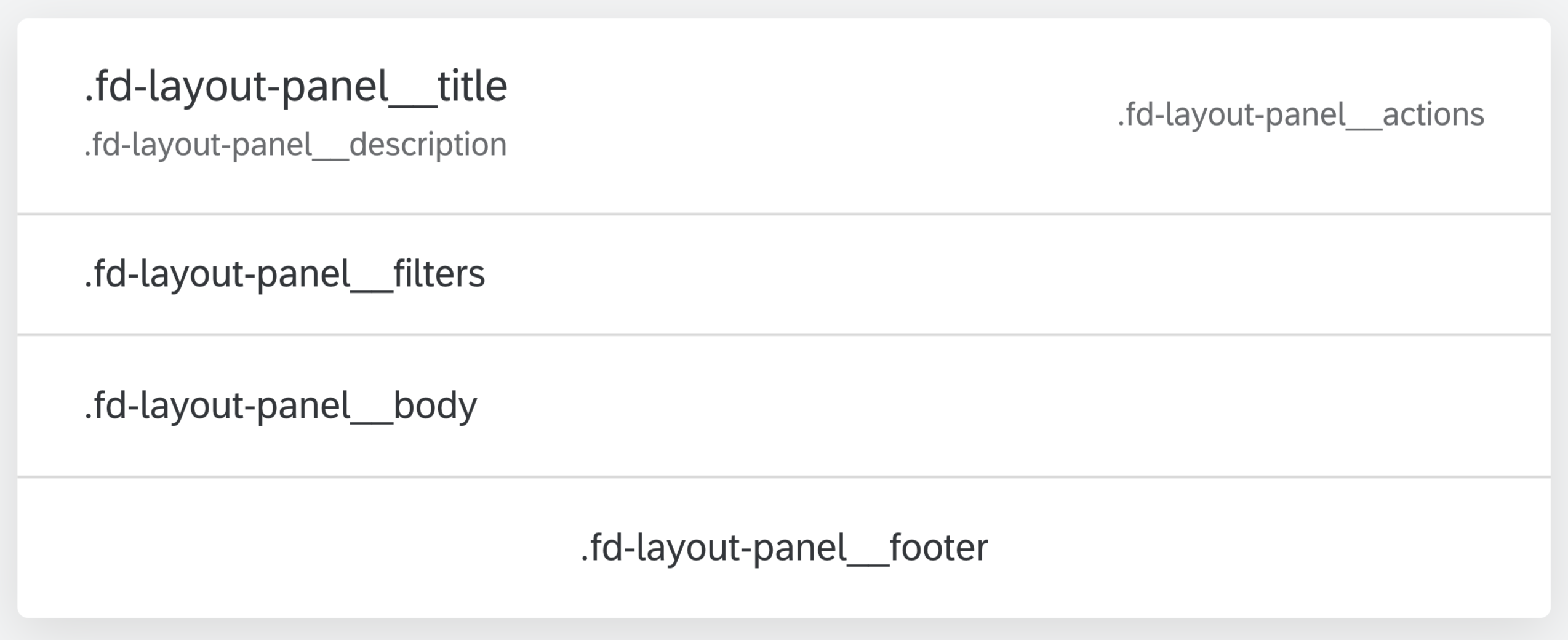
Layout Panel
The Layout Panel are used to encapsulate part of content, form elements, lists, collections, etc., on a page.
Tiles
Generic Tile
Generic Tiles can be used to represent an app similar to the SAP Fiori launchpad home page. They can display different types of content, which are based on the data supplied by the app. They can contain an icon, a title, an informative text, KPIs, counters and charts.
The tiles have 2 sizes: large(11 x 11rem) and small(9.25 x 9.25rem)

The generic tile control supports two tile dimensions - 1×1 (default) and 2×1:
- Large Tile (1 x 1) - 11 x 11rem
- Large Tile (2 x 1) - 22.5 x 11rem
- Small Tile (1 x 1) - 9.25 x 9.25rem
- Small Tile (2 x 1) - 19 x 9.25rem

Launch Tile

Launch Tile With Numeric Content and Launch Icon

Launch Tile With Combined Header and Content

Launch Tile (Profile)

Launch Tile (Logo)
KPI Tile with Numeric Content
Key Performance Indicators (KPIs) are used to measure and monitor a company’s performance at a strategic and operational level. The KPI Tile control supports a limited number of digits which varies depending on the size of the tile.

KPI Tile with L-Size Numeric Content

KPI Tile with M-Size Numeric Content

KPI Tile with S-Size Numeric Content
Feed Tile
The Feed tile can be used to show new notification content in a news feed.

Badge Tile
Badges are used to display very short and important information. Use a badge on a Tile if the Tile is new or has been newly added to a page. Tiles do not display badges in action/edit mode.


Slide Tile
The Slide Tile contains a news headline, a background image, the news source, and a time stamp. A start and pause button are always displayed on touch devices and can be revealed by hovering the mouse over the tile on desktop devices. The dots on the bottom of each tile identify the number of pages they contain.


Tile in Action Mode
In action mode view, the close button is displayed on the top right-hand corner of the Tile. The action icon is only an indicator and is displayed on the bottom right-hand corner. The click/touch area fills the entire Tile, excluding the click/touch area reserved for the close button.


Line Tile
The line tiles are a text only version of a launch tile. It acts as a link agglomeration in one container. The title is mandatory while the subtitle is optional.

Toolbar and Overflow Toolbar
The toolbar enables the user to change the UI or trigger an action. For example, the toolbar allows the user to change views, manipulate data or objects, navigate to another page, perform generic actions, and so on. It is most commonly used to display buttons, labels, selects and various other input controls.
Toolbar offers few design types (solid, transparent, auto, info, and title.
The component also offers 2 types of spacers (auto and fixed). You can add also separators between the items.
The Overflow toolbar can be used to add additional elements when extra space is required.


Step Input
The step input component allows the user to change the input values in predefined increments (steps). You can use the step input if you want the user to adjust amounts, quantities, or other values quickly, or toadjust values for a specific step (for example, in a shopping cart).

Accessibility
When it comes to accessibility guidelines we take the task very seriously and work hard to meet those guidelines. Delivering accessible applications is a task that involves all the layers and roles during the design and development phases. We can only achieve this if we work together. It requires the design language and guidelines to reflect certain qualities such as color and contrasts. It requires the components to be accessible and respect the ARIA specifications. It requires keyboard support, and many other requirements.
Accessibility cannot be achieved only by one team or one library.
Fundamental Library's team is working with design teams, application teams, accessibility experts. Fundamental Library Styles is applying the Fiori 3 design which is created with accessibility in mind. The library is also trying to apply the right ARIA attributes so the components are accessible.
The full release notes can be find here.
More cool and new things to come. We are more than excited to keep this momentum.
Stay tuned for more updates. Want to read more blog posts about Fundamental Library? Check these out.
Feel free to raise any questions or try our libraries in case you didn’t have a chance.
- SAP Managed Tags:
- SAP Fiori,
- Open Source
Labels:
You must be a registered user to add a comment. If you've already registered, sign in. Otherwise, register and sign in.
Labels in this area
-
ABAP CDS Views - CDC (Change Data Capture)
2 -
AI
1 -
Analyze Workload Data
1 -
BTP
1 -
Business and IT Integration
2 -
Business application stu
1 -
Business Technology Platform
1 -
Business Trends
1,661 -
Business Trends
88 -
CAP
1 -
cf
1 -
Cloud Foundry
1 -
Confluent
1 -
Customer COE Basics and Fundamentals
1 -
Customer COE Latest and Greatest
3 -
Customer Data Browser app
1 -
Data Analysis Tool
1 -
data migration
1 -
data transfer
1 -
Datasphere
2 -
Event Information
1,400 -
Event Information
65 -
Expert
1 -
Expert Insights
178 -
Expert Insights
280 -
General
1 -
Google cloud
1 -
Google Next'24
1 -
Kafka
1 -
Life at SAP
784 -
Life at SAP
11 -
Migrate your Data App
1 -
MTA
1 -
Network Performance Analysis
1 -
NodeJS
1 -
PDF
1 -
POC
1 -
Product Updates
4,577 -
Product Updates
330 -
Replication Flow
1 -
RisewithSAP
1 -
SAP BTP
1 -
SAP BTP Cloud Foundry
1 -
SAP Cloud ALM
1 -
SAP Cloud Application Programming Model
1 -
SAP Datasphere
2 -
SAP S4HANA Cloud
1 -
SAP S4HANA Migration Cockpit
1 -
Technology Updates
6,886 -
Technology Updates
408 -
Workload Fluctuations
1
Related Content
- SAP Fiori Frontend 6.0 App installation and connection to SAP Business Suite in Technology Q&A
- GenAI HUB SDK missing Model in Technology Q&A
- Cloud Integration: Manually Sign / Verify XML payload based on XML Signature Standard in Technology Blogs by SAP
- Loading Reuse S1 Component from Manage Material coverage app gives errors in Technology Q&A
- SAP Cloud Integration: Understanding the XML Digital Signature Standard in Technology Blogs by SAP
Top kudoed authors
| User | Count |
|---|---|
| 13 | |
| 10 | |
| 10 | |
| 9 | |
| 8 | |
| 7 | |
| 6 | |
| 5 | |
| 5 | |
| 5 |