From the end of April through to mid-June 2014, we had the pleasure of delivering the openSAP course Sustainability and Business Innovation. Though we moved away from technology to an exclusively business focused topic we were very curious to see if and how this would affect the general course statistics.
By mid-May, when the course was ongoing, I already posted a blog with some preliminary course statistics here on SCN. Now I can outline how these numbers evolved until course end and provide some further details:
- The course was held from April 29 through June 17, 2014.
- 10,418 learners were enrolled on day 1 of the course.
- In the middle of the course 13,011 learners were enrolled*
- When the final exam ended, this number had increased to 15,942.
- 2,837 learners actively participated in the course.
- We issued 1,803 graded Records of Achievement.
- 71,885 video lectures were watched.
- 66,831 self-tests were conducted.
- 941 posts were created in the discussion forum.
- 85.5 % of the course participants came from outside SAP
- The female to male ratio of course participants was 1:3.4
I would like to highlight some interesting facts from these overall numbers here:
- SAP internal and external enrollments: 85.5 % of the course participants came from outside SAP. This demonstrates a huge external interest in the topic. In comparison to most other openSAP courses the rate is slightly lower, the reason is quite simple: We had a lot of internal campaigns to attract even more SAP internal interest in the sustainability topic.
- Gender: ~23% of the course participants were female, which is significantly higher than in other openSAP courses. This is welcome news and we hope this becomes a trend.
Enrollment Dynamic
With the following graph I respond directly to a wish from the comment section of the blog article with the preliminary results. It shows when people enrolled after the course was announced.
To provide some fix points I inserted a few course milestones like the first announcement, course start, final exam and course end. You see that most people enrolled between the first announcement and the first lecture, but even after course start there was continuous interest.
After week 2 and 3 the number of new enrollments decreased; I think this is mainly caused by the fact that if you join 3 weeks after the course has started, the chance to successfully complete it with a Record of Achievement is lower.
And even after the final exam ended, we continue to have daily enrollments, many people want to self-study the course materials without participating in the weekly assignments or final exam.
Another aspect: If you look on the several week days, you will realize the minus peak mostly on Saturdays and Sundays 🙂
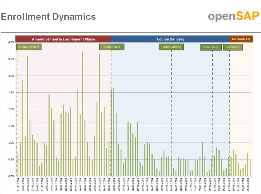
When did participants enroll for the course?
Geographical Distribution
The following graphic visualizes the geographical distribution of course participants:
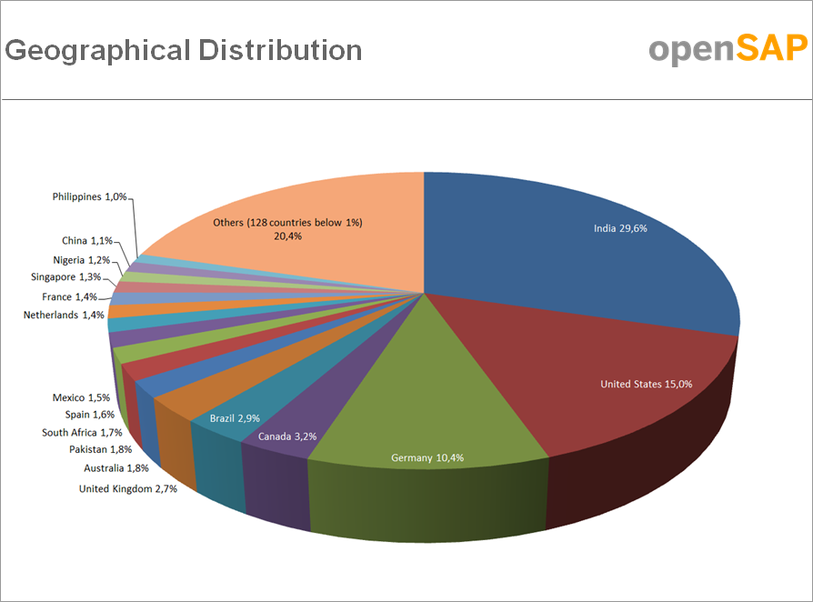
Course participants came from 145 different countries, and 17 countries are above the 1 % threshold.
Three countries account for 55% of all enrollments for this course. As you can see the three countries with the highest enrollment % are India, the United States and Germany.
This is consistent with other openSAP courses to date but I think it is quite remarkable that India contributes almost 30%, which is ~5-10% higher than with previous courses.
Additionally I want to highlight that South Africa and Nigeria are for the first time above the 1% threshold - welcome on board!
Participants by Age
The next diagram shows the participants by age:

You see that most course participants are from age 20 to 50, and that there is a peak between 22 and 34. This differs in comparison to previous openSAP courses where the distribution of age was broader. Obviously the topic Sustainability and Business Innovation attracted many learners from the so called Millennial Generation.
Discussion Forum
Within this course we piloted a new collaborative learning element: Each week, our instructor Peter started a new “Point of View” discussion to encourage participants to share their views and experiences on sustainable strategies.
As you can see in the graph below participants engaged very well in these guided forum discussions. Most discussion posts were created in the weekly “Point of View”, while posts about other content or administrative aspects played a minor role with 21% of the overall number of posts (941).
We are happy to see these impressive numbers. The collaborative element obviously worked well. Even more impressive is to read and learn from so many interesting and valuable posts in the forum.

Distribution of posts in the discussion forum
Active Participation & Success Completion Rate
Last but not least I want to conclude this blog article with a view on the active participation rate and the distribution of overall scores:
We count 2,837 as active participants. This means that 21.8 % of enrolled participants* completed weekly assignments or collaborated in the discussion forums. This is a very good rate in comparison to other MOOC offerings outside openSAP.
* We decided to use the number of enrollments we counted in the middle of the course. Why? Because we say that all people that enroll until the middle of a course have (still) a realistic chance to complete it with a Record of Achievement.
Overall Scores
In this graph you see the distribution of overall scores:

The minimum score to receive a Record of Achievement was 180 points. The maximum score possible was 360 points.
From the 2,837 active participants, 1,803 learners earned a Record of Achievement for the course - with almost 64% this is a very good result.
To be part of the top 5% course participants needed to earn 94.5% of the maximum score, for the top 10% they needed 92% and for the top 20% they needed 88.3%.
Please be aware that this blog post conveys my own, personal interpretation of the metrics we have gathered. How do you interpret the facts and figures I share here? I look forward to your comments.
