We are more than happy to announce that
Fundamental Library Styles released version
0.7.0.
In parallel of the migration of the existing components to the latest Fiori 3.0 component specifications, we have introduced new components such Info Label. Let's take a look what is part of version
0.7.0:
Dialog
Dialog is a container displayed in a response to a user action. It forces a decision or a confirmation that needs to be signed off by the user.
The main sections of the dialog are
header, sub-header, body, loader and
footer. Not all of them are mandatory at the same time.
Here is an example combining all the sections represented with text placeholders:

The library supports 4 options for horizontal paddings (default, small, medium, large, and extra large).
The mobile version of the dialog is shown in full screen.
Here are 3 examples with different padding:

The dialog has styling for resizing (handle on the bottom right corner) and also has draggable mode(only for desktop) where the mouse pointer became hand:

The latest implementation of the dialog allows the application developers to create dialogs showing a select component, in busy state.
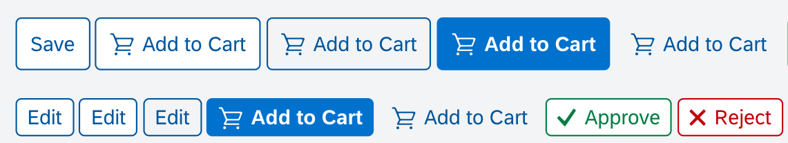
Button
The
Button has been restyled to support all the latest Fiori 3 buttons types like
simple button(for one action),
segmented button(for a group of options)
, and
menu buttons(for a group of actions)
.
The supported design types:

Segmented button

Group a series of buttons together on a single line with the segmented button.
Menu Button
The Menu Button allows for multiple actions. There are two different types of menu buttons. Both can contain items with submenus.
Regular Menu Button
When the user activates the button, the menu opens.


Split Menu Button

The split menu button can have two different behaviours. The button always triggers the default action set by the app developer. When the user selects a different action, this user action becomes the default, and the button text label changes accordingly.
The button support cozy and compact form factors:
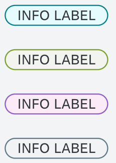
Info Label
The info label is a non-interactive, non-semantic, text-based control. The label highlights a characteristic of an object or item (such as a state, type, quantity, or condition). You can use it in tables, headers, custom tiles, and display forms.

There are 3 options: alpha-numeric, icons, and both.
There are 9 available colors:

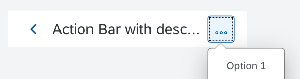
Action Bar
This
component is displayed at the top of the page and it is used mainly for page titles and main actions related to the content of that page.

Action Bar with title, subtitle(description), and actions.

Action Bar with title, subtitle(description), actions, and
back button


Mobile Variants for Select, Combobox and MultiInput
In this release the mobile variants for
Select,
Combobox, and
MultiInput have been included. The guidelines is that those components on mobile are displayed on full width and full height.
An example with combobox:

Stay tuned for more updates. Want to read more blog posts about Fundamental Library? Check these
out.
Feel free to raise any questions or try our libraries in case you didn’t have a chance.
