
- SAP Community
- Groups
- Interest Groups
- Application Development
- Blog Posts
- Getting started with Fundamental Library Styles in...
Application Development Blog Posts
Learn and share on deeper, cross technology development topics such as integration and connectivity, automation, cloud extensibility, developing at scale, and security.
Turn on suggestions
Auto-suggest helps you quickly narrow down your search results by suggesting possible matches as you type.
Showing results for
 mariusobert
Developer Advocate
Options
- Subscribe to RSS Feed
- Mark as New
- Mark as Read
- Bookmark
- Subscribe
- Printer Friendly Page
- Report Inappropriate Content
07-14-2023
1:16 PM
This text was derived from the book SAP UI Frameworks for Enterprise Developers: A Practical Guide by Marius Obert and vobu.
When it comes to web development, striking the right balance between functionality and visual appeal is crucial. Developers often face the challenge of creating visually engaging user interfaces without getting bogged down by complex design systems or sacrificing performance. This is where Fundamental Library Styles comes into the picture as a game-changing technology.
This tutorial will show you how to get started with this new technology.

A UI built with Fundamental Library Styles
Intro to Fundamental Library Styles
Fundamental Library Styles is an open-source library to bring the visual appearance of SAP Fiori to web applications. It provides a collection of Cascading Style Sheet (CSS) classes, offering developers a lightweight approach to styling their projects. Unlike other UI libraries or frameworks, Fundamental Library Styles does not include any accompanying JavaScript code, which makes it exceptionally light and flexible.
One of the key advantages of Fundamental Library Styles is its simplicity. Developers can easily apply consistent, enterprise-proven styles to their user interface components. Buttons, date pickers, and file uploaders, among other common elements, can be quickly enhanced with sleek and modern designs without the need for extensive coding or customization.
Furthermore, Fundamental Library Styles provides maximum flexibility for developers and designers alike. It doesn’t impose a specific programming model, allowing developers to use their preferred web development frameworks. This means you can leverage the power and familiarity of your favorite tools while enjoying the benefits of Fundamental Library Styles’ lightweight styling capabilities.
Notably, Fundamental Library Styles finds its place alongside other popular CSS frameworks like Bootstrap, Materialize CSS, and Tailwind CSS. These frameworks share a common approach of providing foundational styles and classes, shielding developers from the complexities of cross-browser compatibility and class definitions.
So let’s build our first web application with Fundamental Library Styles and without any SPA framework — just plain old JavaScript.
Prerequisites
- To get started, you’ll need to install Node.js, a JavaScript runtime, which will allow you to run JavaScript code outside the browser. Visit the official Node.js website and download the appropriate installer for your operating system. Once the download is complete, run the installer and follow the on-screen instructions. After successful installation, open your command prompt or terminal and type
node -vto verify that Node.js is installed correctly. You should see the version number displayed, confirming a successful installation. - Visual Studio Code (VS Code) is a popular code editor that provides a rich and customizable environment for web development. Start by downloading VS Code and selecting the installer for your operating system. Run the installer and follow the prompts to complete the installation.
Bootstrap the Project
To start, use npm and Vite to bootstrap a new project
npm init vite When prompted for a project name, use fundamental-library-styles-demo and make sure to select Vanilla for the framework and JavaScript for the variant. This command will create the structure of the project. Now, run these commands to install the initial dependencies and start a dev server:
cd fundamental-library-styles-demo

npm install

npm run dev
You will see a message that a server is running on localhost. Open this URL in the browser of your choice. You’ll see that Vite generated a page with some content for us.
To start from a spotless plate, open VS Code and remove the following files:
public/vite.svgcounter.jsjavascript.svg
Override the content of main.js so it only contains this line:
import "./style.css";Then, open this style.css file and override the entire content with these lines.
body {

 margin: 0;

 min-width: 320px;

 min-height: 100vh;

}


#page {

 margin: 0 auto;

 max-width: 95%;

}
Add Content to the Page
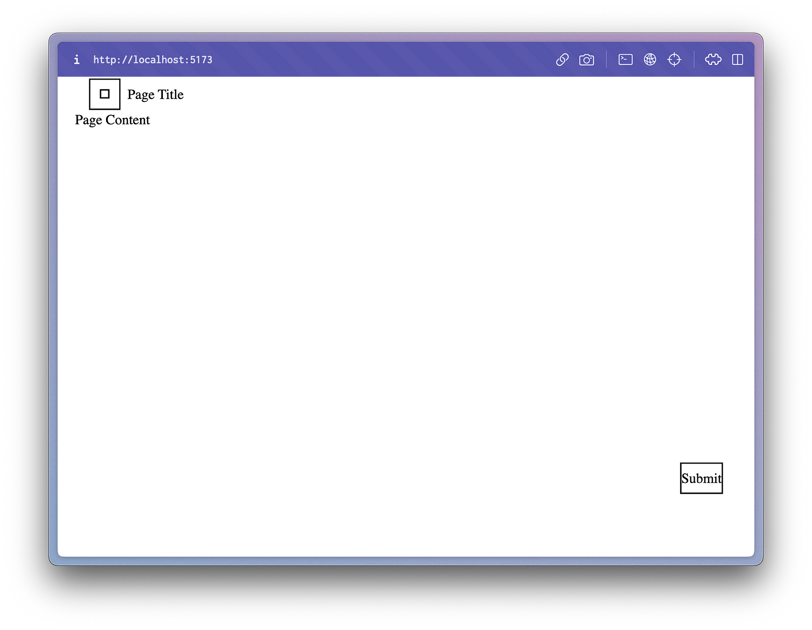
Add your first Fundamental Library Styles component (a Page) to the index.html and remove all other nodes. Optionally, you can also change the page title, as done here.
<!DOCTYPE html>

<html lang="en">

  <head>

    <meta charset="UTF-8" />

    <link rel="icon" type="image/svg+xml" href="/vite.svg" />

    <meta name="viewport" content="width=device-width, initial-scale=1.0" />

    <title>Fundamental Library Styles App</title>

  </head>

  <body>

    <div id="page" dir="ltr">

      <main class="fd-page">

        <header>

          <div class="fd-bar fd-bar--page fd-bar--header">

            <div class="fd-bar__left">

              <div class="fd-bar__element">

                <button

                  class="fd-button fd-button--transparent"

                  aria-label="Go back"

                >

                  <i class="sap-icon--navigation-left-arrow"></i>

                </button>

              </div>

              <div class="fd-bar__element">Page Title</div>

            </div>

          </div>

        </header>

        <div class="fd-page__content" role="region">

          <div style="height: 400px">Page Content</div>

        </div>

        <footer>

          <div class="fd-bar fd-bar--page fd-bar--footer">

            <div class="fd-bar__right">

              <div class="fd-bar__element">

                <button class="fd-button fd-button--emphasized">Submit</button>

              </div>

            </div>

          </div>

        </footer>

      </main>

    </div>


    <script type="module" src="/main.js"></script>

  </body>

</html>
You should now see a screen like this one — so there is obviously something missing.

Style the Markup
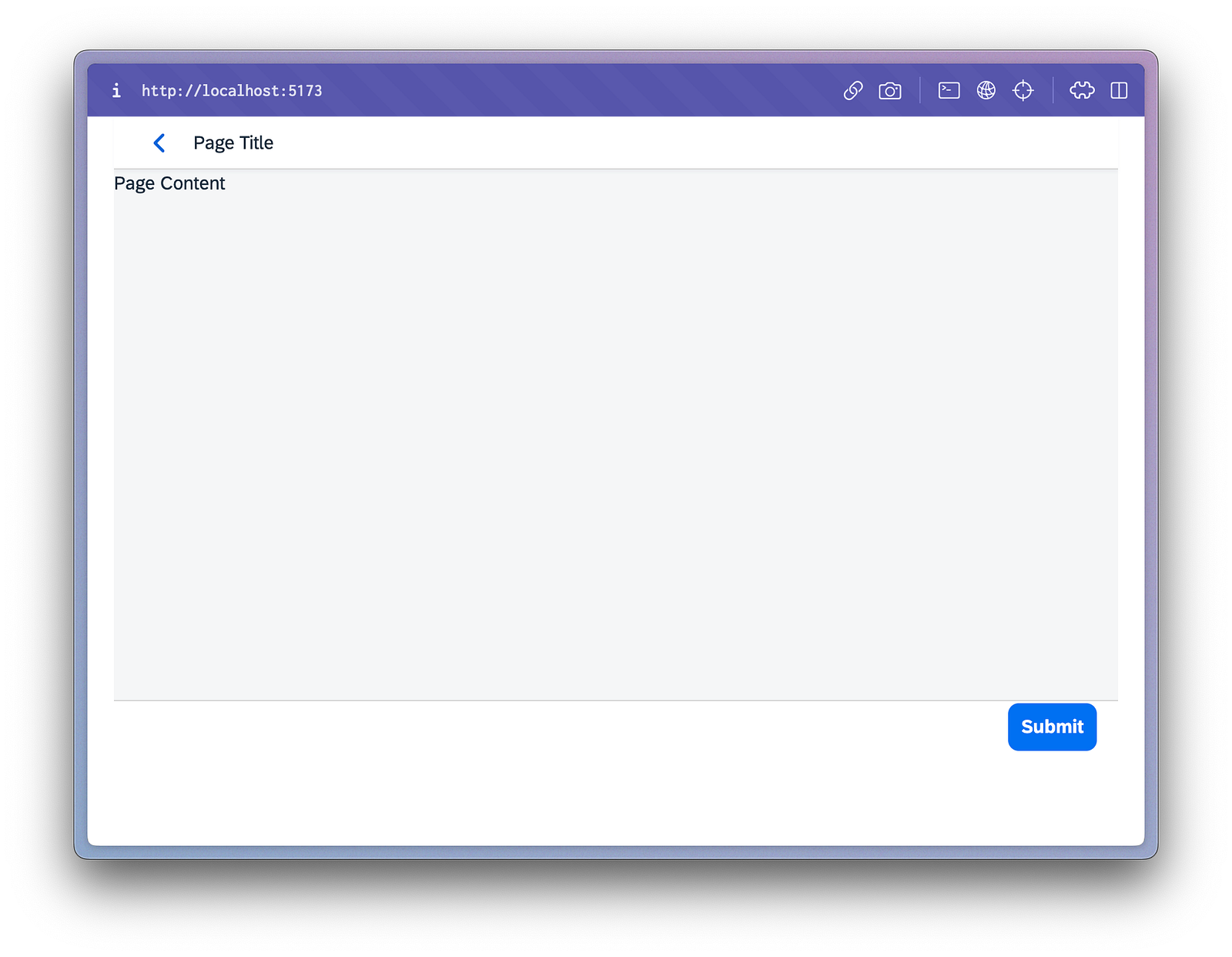
The first step to add Fundamental Library Styles to any project is to install the required packages with a package manager. Run the following command in a new terminal session to add basic Fundamental modules.
npm add fundamental-styles @fundamental-styles/common-cssNow it’s time to import the style sheets. Go to the main.js file and append these imports under the other import directives.
import "fundamental-styles/dist/button.css";

import "fundamental-styles/dist/page.css";

import "fundamental-styles/dist/bar.css";

import "fundamental-styles/dist/icon.css";
This should look slightly better, but there is still something missing.
This happened because there are two aspects missing:
- The imported class makes use of CSS variables that are still undefined
- The browser is not yet aware of the web fonts that are used for characters and icons
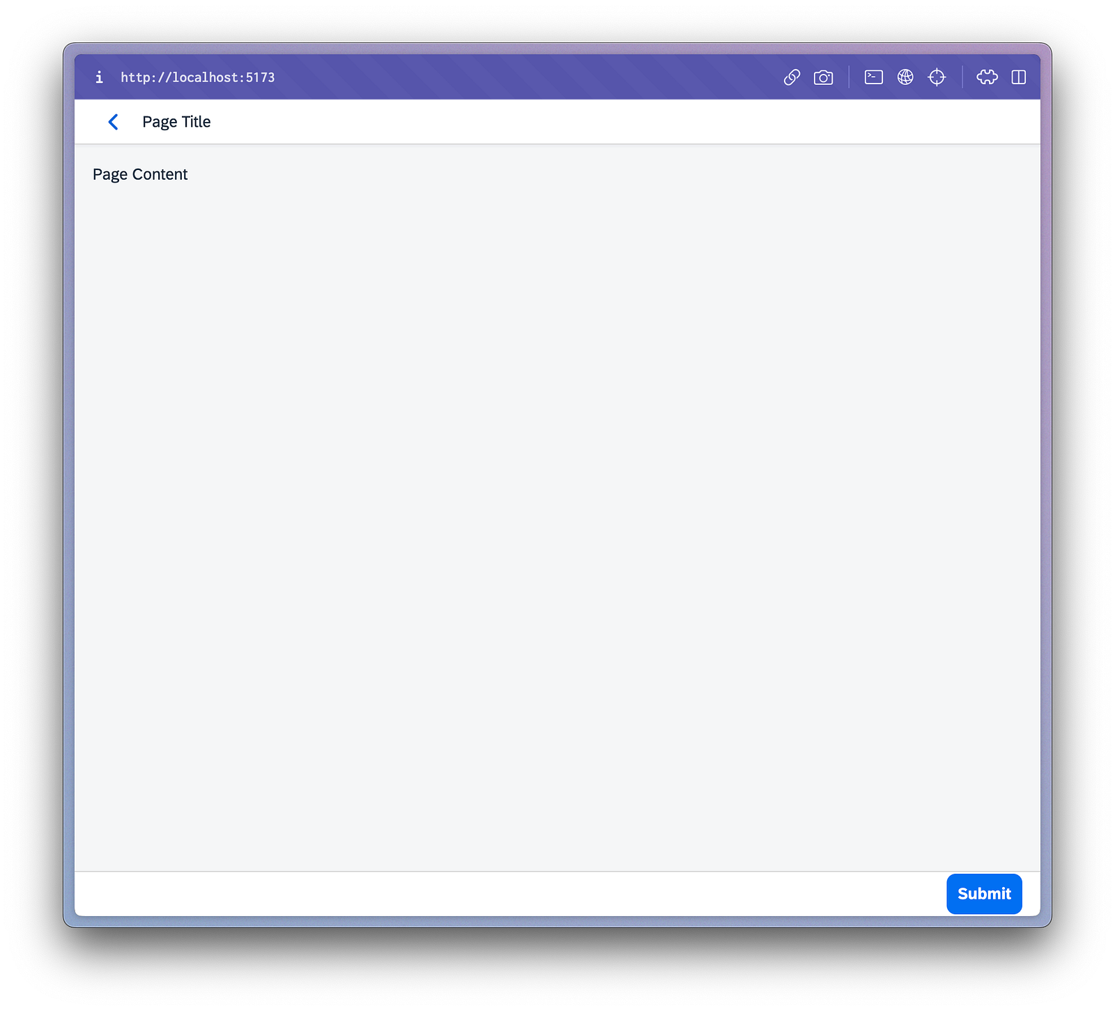
Let’s start with the CSS variables and the theme.
To import the style of the theme SAP Horizon, add the two import statements to main.js.
import “fundamental-styles/dist/theming/sap_horizon.css”;

import “@sap-theming/theming-base-content/content/Base/baseLib/sap_horizon/css_variables.css”;
For the second line, you also need to install the respective node package. This package contains, among others, the font “72” of the SAP Fiori design system.
npm add @sap-theming/theming-base-contentAs mentioned above, the second step is to use this font in the web app for text and icons. To load them, append these lines at the end of the style.css :
@font-face {

  font-family: "72";

  src: url("@sap-theming/theming-base-content/content/Base/baseLib/baseTheme/fonts/72-Regular-full.woff")

    format("woff");

  font-weight: normal;

  font-style: normal;

}


@font-face {

  font-family: "72";

  src: url("@sap-theming/theming-base-content/content/Base/baseLib/baseTheme/fonts/72-Bold-full.woff")

    format("woff");

  font-weight: 700;

  font-style: normal;

}


@font-face {

  font-family: "72";

  src: url("@sap-theming/theming-base-content/content/Base/baseLib/baseTheme/fonts/72-Light-full.woff")

    format("woff");

  font-weight: 300;

  font-style: normal;

}


@font-face {

  font-family: "SAP-icons";

  src: url("@sap-theming/theming-base-content/content/Base/baseLib/baseTheme/fonts/SAP-icons.woff")

    format("woff");

  font-weight: normal;

  font-style: normal;

}


@font-face {

  font-family: "BusinessSuiteInAppSymbols";

  src: url("@sap-theming/theming-base-content/content/Base/baseLib/baseTheme/fonts/BusinessSuiteInAppSymbols.woff")

    format("woff");

  font-weight: normal;

  font-style: normal;

}


@font-face {

  font-family: "SAP-icons-TNT";

  src: url("@sap-theming/theming-base-content/content/Base/baseLib/baseTheme/fonts/SAP-icons-TNT.woff")

    format("woff");

  font-weight: normal;

  font-style: normal;

}
Now, you should see the page we would expect based on the markdown we provided above.
Use Sass Mixins
The components might still look a bit off. For example, the page doesn’t fill the full height of the browser, and, therefore, the page footer isn’t always positioned correctly.
This problem can be addressed with the right style definitions.
So far, we have only focused on the component-related features of Fundamental Library Styles. But this is not the only aspect that improves the lives of SAP UI developers. You might remember that you also installed the package @fundamental-styles/common-css earlier without knowing its purpose. It provides CSS rules based on SAP Fiori design guidelines, which, by the way, can also be used to bring layouting to UI5 Web Components apps. Further customization is possible by using the Sassy Cascading Style Sheets (SCSS) mixins and providing user-defined values as parameters.
As Sass is a superset of CSS, this switch can be done by changing the filename style.css to style.scss. At the same time, you need to adjust the import statement in main.js accordingly.
import "./style.scss"By default, Vite doesn’t handle Sass files. Luckily, these can be changed when you add the development dependency.
npm add -D sass A restart of the Vite development server will be necessary after this addition. The rest of the Sass magic happens in this style.scss file. The first thing that we need to do is importing the mixins from the @fundamental-styles/common-css package. Then, we use the sap-set-margin-all and sap-flex mixins to turn the entire web application into a full-height flex box, with flex-direction: column, that has no margins. The second selector will make sure that both the page components and the page content use the flex: auto property to expand their height as much as possible.
Replace everything, but the code defining the fonts, in style.scss with this code.
@import "node_modules/@fundamental-styles/common-css/dist/sass/_common-mixins.scss";


html,

body,

#page {

  height: 100%;

  @include sap-set-margin-all;

  @include sap-flex(column);

}


.fd-page {

  @include sap-flex-child(auto);


  & .fd-page__content {

    @include sap-flex-child(auto);

    @include sap-set-margin-all(1rem);

  }

}
The web application should look different once you saved this file. The page now covers the full height, so you can enjoy the improved style of your first application that uses Fundamental Library Styles.
Build and Deployment
The build process doesn’t need any further modification and can be triggered with the npm script that came with the Vite setup:
npm run build All generated files will be in the output folder, dist/ by default. From here, it’s up to you to include further modifications in the vite.config.js file or serve these files from your web server.
The Road from Here
In conclusion, Fundamental Library Styles offers web developers a lightweight and flexible solution for enriching web apps with the visual appeal of SAP Fiori without sacrificing performance. This tutorial provided a brief introduction to getting started with Fundamental Library Styles, from project setup to styling customization using Sass mixins. With this knowledge, you can start creating visually engaging web applications while leveraging your preferred web development frameworks.
If you enjoyed this post and would like to learn more about the usage of Fundamental Library Styles and other web-based UI technologies from SAP, check out Volker and my book:
SAP UI Frameworks for Enterprise Developers: A Practical Guide

- SAP Managed Tags:
- User Experience,
- User Interface,
- Open Source
1 Comment
You must be a registered user to add a comment. If you've already registered, sign in. Otherwise, register and sign in.
Labels in this area
-
A Dynamic Memory Allocation Tool
1 -
ABAP
10 -
ABAP 7.4
1 -
abap cds
1 -
ABAP CDS Views
14 -
ABAP class
1 -
ABAP Cloud
1 -
ABAP Development
5 -
ABAP in Eclipse
2 -
ABAP Keyword Documentation
2 -
ABAP OOABAP
3 -
ABAP Programming
1 -
abap technical
1 -
ABAP test cockpit
7 -
ABAP test cokpit
1 -
Adobe Form
1 -
ADT
1 -
Advanced Event Mesh
1 -
AEM
1 -
AI
1 -
ALV
1 -
alv oo
1 -
API and Integration
1 -
APIs
9 -
APIs ABAP
1 -
App Dev and Integration
1 -
Application Development
2 -
application job
1 -
archivelinks
1 -
Automation
4 -
B2B Integration
1 -
BTP
1 -
CAP
1 -
CAPM
1 -
Career Development
3 -
CL_GUI_FRONTEND_SERVICES
1 -
CL_SALV_TABLE
2 -
Cloud Extensibility
8 -
Cloud Native
7 -
Cloud Platform Integration
1 -
CloudEvents
2 -
CMIS
1 -
Connection
1 -
container
1 -
Customer Portal
1 -
Debugging
2 -
Developer extensibility
1 -
Developing at Scale
3 -
DMS
1 -
dynamic logpoints
1 -
Dynpro
1 -
Dynpro Width
1 -
Eclipse ADT ABAP Development Tools
1 -
EDA
1 -
Event Mesh
1 -
Expert
1 -
Field Symbols in ABAP
1 -
Fiori
1 -
Fiori App Extension
1 -
Forms & Templates
1 -
General
1 -
Getting Started
1 -
IBM watsonx
2 -
Integration & Connectivity
10 -
Introduction
1 -
JavaScripts used by Adobe Forms
1 -
joule
1 -
NodeJS
1 -
ODATA
3 -
OOABAP
4 -
Outbound queue
1 -
ProCustomer
1 -
Product Updates
1 -
Programming Models
14 -
Restful webservices Using POST MAN
1 -
RFC
1 -
RFFOEDI1
1 -
SAP BAS
1 -
SAP BTP
1 -
SAP Build
1 -
SAP Build apps
1 -
SAP Build CodeJam
1 -
SAP CodeTalk
1 -
SAP Odata
2 -
SAP SEGW
1 -
SAP UI5
1 -
SAP UI5 Custom Library
1 -
SAPEnhancements
1 -
SapMachine
1 -
security
3 -
SM30
1 -
Table Maintenance Generator
1 -
text editor
1 -
Tools
18 -
translation
1 -
User Experience
6 -
Width
1
Top kudoed authors
| User | Count |
|---|---|
| 4 | |
| 3 | |
| 3 | |
| 3 | |
| 2 | |
| 2 | |
| 1 | |
| 1 | |
| 1 | |
| 1 |