
- SAP Community
- Products and Technology
- Technology
- Technology Blogs by SAP
- Designing Responsive Layout in the New Optimized S...
Technology Blogs by SAP
Learn how to extend and personalize SAP applications. Follow the SAP technology blog for insights into SAP BTP, ABAP, SAP Analytics Cloud, SAP HANA, and more.
Turn on suggestions
Auto-suggest helps you quickly narrow down your search results by suggesting possible matches as you type.
Showing results for
 former_member45
Employee
Options
- Subscribe to RSS Feed
- Mark as New
- Mark as Read
- Bookmark
- Subscribe
- Printer Friendly Page
- Report Inappropriate Content
05-22-2023
3:44 AM
Introduction
Welcome to the latest innovation in designing responsive layouts with the Optimized Story Experience!
With an abundance of powerful features at your fingertips, we've made it even easier for designers and app developers to create visually appealing and functional stories that adapt seamlessly to various viewport sizes. And worry not, designers coming from a classic story background - you'll find a familiar experience for starting a new responsive page. In this blog post, we will explore the technical aspects, highlight its benefits for story designers and app developers, and share tips and tricks to help you master the new responsive page settings. So, let's dive in and unlock the full potential of the Optimized Story Experience.
Technical Background and Advantages for Story Designers and App Developers
The responsive page is based on a grid system, where each row has a fixed 36 grids. Widget dimensions are specified in grid units, for example, a width of 16 grid units and a height of 10 grid units. The grid width is calculated based on the device's viewport width and grid spacing. Consequently, the grid height adjusts according to the grid width, enabling widgets to scale proportionally based on the size of the viewport.
Designers coming from a classic story background will have a similar experience with the same entry points for starting a new responsive page, adding or removing a lane, and leveraging new features to create a more visually appealing story experience. The familiarity of the experience helps ease the transition and minimizes the learning curve.
New features, such as Responsive Rule Configuration, allow for customization of responsive behavior per device. This includes setting widget size, position, and visibility per device, and even allowing widgets to overlap for a more attractive design. Live Preview at Design Time streamlines the design process and minimizes the need for switching between design and preview modes.
For app developers using Analytics Designer, the recommended approach is to use the new responsive page, as building responsive layouts with Flow Layout Widget on canvas is only recommended for backward compatibility. The new responsive page offers enhanced features like responsive rule configuration and live preview, along with auto-growing lane heights, eliminating the need to worry about vertical scrollbars. Additionally, pixel-based Panel Containers can be nested within grid-based lanes for further customization, and scripting is supported in the responsive page.
Responsive Rule Configuration
Story Designers are not required to configure responsive rules. When a story is created with a responsive page, the widgets are automatically resized to fit the device's viewport, and a default configuration has been established for mobile phones.
However, if the default behavior does not meet your requirements, you may find it beneficial to customize the responsive behavior yourself. The responsive rule configuration provides a straightforward and code-free method for adapting the responsive behavior of your story to various devices. By adjusting the position, size, and visibility of widgets, you can create an optimal user experience across multiple platforms.
1. How to get access to the responsive rule configuration
To access the responsive rule configuration, follow these steps:
- Select a lane on the responsive page.
- Go to the Builder panel of the lane. To open it, from View in the toolbar, select Right Side Panel.
- Responsive Rule Configuration appears, with the selected device and corresponding screen width.
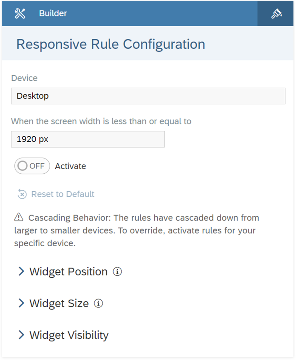
2. Activate the rule configuration
To initiate responsive rule configuration, enable the Activate option.
Keep in mind that responsive rules automatically cascade from Auto or larger devices down to smaller ones. This means it's not always necessary to configure responsive rules for each device if the rules defined on Auto or larger devices cascade effectively.
Override cascaded rules by activating a rule for a specific device type only when needed.
Tips:
- It's recommended to establish a default rule for the Auto device, which will automatically cascade down to other devices until you decide to override it for a specific device.
- Predefined rules are available for mobile phones, ensuring that each widget takes up 100% of the width. However, you can modify or deactivate these rules as needed.
3. Set the widget position
You can adjust the widget placement using either of these options:
Free Positioning: This enables you to freely position and arrange widgets within the lane, including the ability to overlap them, which was previously unattainable in the classic story. This option is ideal for customizing the widget placement and is the default option.
Auto-Flow: With this option, widgets are automatically arranged in a top-to-bottom, left-to-right sequence, and manual adjustments via mouse movements are disabled. This is particularly useful for mobile phone displays, where each widget occupies 100% of the width and you simply want them to flow one after another.
You can switch between these two options at any time. When switching from free positioning to auto-flow, the widgets will be repositioned based on the grid's row or column order.

Tip: You can also combine both options by selecting auto-flow for all widgets, while still allowing specific widgets to be freely positioned. To do this, remove the desired widgets from auto-flow and adjust the space on their top and left sides to place them in a specific location.
4. Set the widget size

You can adjust the widget's dimensions by specifying its width and height. To set the width, input an integer ranging from 1 to 36, with the corresponding percentage displayed to help you gauge the widget's screen coverage. For the height, choose an integer between 1 and 200.
This feature is particularly handy for optimizing widget sizes across various devices, such as enlarging the chart on a small mobile phone to eliminate vertical scrolling and ensure all data is visible.
Live device preview at design time
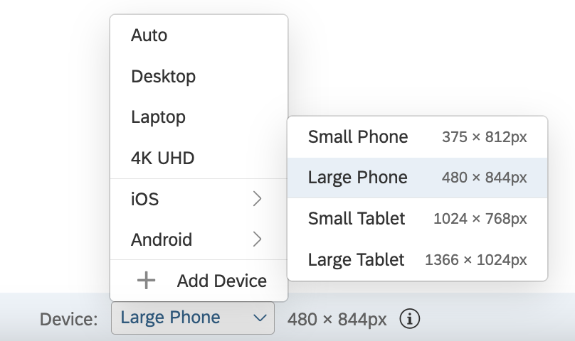
Easily preview and adjust your layout in real-time on a target device without switching tabs. If your device isn't listed, simply add it by selecting "Add Device" and inputting the dimensions in pixels.
Note: For iOS and Android phones and tablets, device preview doesn't include the view time toolbar. When designing your stories, take account of the vertical space of the toolbar, so that they fit into these devices.
Examples of Responsive Layout Design
Here are some examples of designing responsive layouts in the new optimized story experience without the need for scripting:
1. Overlapping Widgets
To create a visually appealing layout, you can place one widget on top of another. It was previously only available on Canvas pages, but now you can also achieve this on responsive pages.

There are two approaches to overlap widgets:
- Default approach: Simply create a new responsive page, and you can immediately overlap widgets by moving one on top of the other.
Tip: Note that you may need to adjust the settings for mobile devices to maintain the overlapping appearance. There is a built-in responsive rule for mobile, and the widget position is set to Auto-Flow. You can adjust it by selecting the widget, removing it from auto-flow, and setting its top and left.

- Advanced approach: Add a Panel or Flow Layout Panel Container into the Grid Lane and move the desired overlapping widgets into the container. This method allows for precise alignment of the widgets and is recommended for experienced users. Refer to the advanced usage below.
Tip: If you find a scrollbar on the container on smaller screens, you may need to add a responsive rule on the Grid Lane to enlarge the container’s size to avoid the scrollbar.
2. Dynamic Visibility
Dynamic visibility is a powerful feature that allows you to set responsive rules for a widget's visibility on different devices. For example, on a larger device like a tablet or a desktop, you might want to display detailed data. However, on a smaller device like a smartphone, there might not be enough space for all that information. In this case, you can use dynamic visibility to show only a chart with aggregated data on smaller screens.
Check out this video for an example.
3. Advanced Usage: Nested with a Panel or Flow Layout Panel Container
Responsive pages are grid-based, and a widget’s dimensions are expressed in grid units. The grid width and height adjust based on different devices, allowing the widget on the grid to scale proportionally.
This approach works in most cases, but sometimes, you may want to set the size and position of certain widgets with exact pixel values. For example, you might want a company logo to maintain its exact size on all screen sizes. In this case, you can add a Panel container into the grid lane. Inside the panel container, sizes and positions are based on pixels, not grid units. Wrapping widgets inside the Panel container allows you to set exact pixel values for a widget's size and position.
Demo Video
Video demonstration included in the QRC2/2023 Release video, starting at 7 minutes and 43 seconds.
Q&A
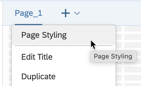
1. Where can I find the settings for page padding, grid visibility, and grid spacing?
Answer: These options are available in the "Page" dropdown menu, specifically under "Page Styling."
2. Can scripting be used in responsive pages?
Answer: Yes, responsive pages created since the QRC2/2023 Release support scripting.
3. What should be done if a responsive page created prior to the QRC2/2023 Release does not support scripting?
Answer: We are planning to support the migration of these responsive pages to the latest responsive layout in the H2/2023 release. (refer to Jie Deng's blog)
4. If a widget has a size and position set in the Styling panel and a responsive rule, which setting takes priority?
Answer: The setting in the responsive rule takes priority. When a responsive rule applies, the size and position setting in the Styling panel will not take effect.
Conclusion
The advancement of responsive layouts in the Optimized Story Experience has significantly improved the design process for designers and app developers. It ensures a consistent and visually engaging user experience on a variety of devices. By becoming proficient in the use of responsive page settings, rule configuration, and live preview features, you can craft attractive and efficient stories that adapt seamlessly to diverse viewport sizes. Leverage the capabilities of this advanced responsive framework to elevate your story designs.
Labels:
4 Comments
You must be a registered user to add a comment. If you've already registered, sign in. Otherwise, register and sign in.
Labels in this area
-
ABAP CDS Views - CDC (Change Data Capture)
2 -
AI
1 -
Analyze Workload Data
1 -
BTP
1 -
Business and IT Integration
2 -
Business application stu
1 -
Business Technology Platform
1 -
Business Trends
1,658 -
Business Trends
91 -
CAP
1 -
cf
1 -
Cloud Foundry
1 -
Confluent
1 -
Customer COE Basics and Fundamentals
1 -
Customer COE Latest and Greatest
3 -
Customer Data Browser app
1 -
Data Analysis Tool
1 -
data migration
1 -
data transfer
1 -
Datasphere
2 -
Event Information
1,400 -
Event Information
66 -
Expert
1 -
Expert Insights
177 -
Expert Insights
293 -
General
1 -
Google cloud
1 -
Google Next'24
1 -
Kafka
1 -
Life at SAP
780 -
Life at SAP
13 -
Migrate your Data App
1 -
MTA
1 -
Network Performance Analysis
1 -
NodeJS
1 -
PDF
1 -
POC
1 -
Product Updates
4,577 -
Product Updates
340 -
Replication Flow
1 -
RisewithSAP
1 -
SAP BTP
1 -
SAP BTP Cloud Foundry
1 -
SAP Cloud ALM
1 -
SAP Cloud Application Programming Model
1 -
SAP Datasphere
2 -
SAP S4HANA Cloud
1 -
SAP S4HANA Migration Cockpit
1 -
Technology Updates
6,873 -
Technology Updates
419 -
Workload Fluctuations
1
Related Content
- Top Picks: Innovations Highlights from SAP Business Technology Platform (Q1/2024) in Technology Blogs by SAP
- Unlocking Full-Stack Potential using SAP build code - Part 1 in Technology Blogs by Members
- Sneak Peek in to SAP Analytics Cloud release for Q2 2024 in Technology Blogs by SAP
- Recap - SAP ALM at SAP Insider Las Vegas 2024 in Technology Blogs by SAP
- Elevating Customer Engagement: Harnessing the Power of SAP Chatbots for a Personalized Experience in Technology Blogs by Members
Top kudoed authors
| User | Count |
|---|---|
| 35 | |
| 25 | |
| 14 | |
| 7 | |
| 7 | |
| 6 | |
| 6 | |
| 5 | |
| 4 | |
| 4 |