


- SAP Community
- Products and Technology
- Technology
- Technology Blogs by SAP
- What’s new in Mobile development kit client 23.4
Technology Blogs by SAP
Learn how to extend and personalize SAP applications. Follow the SAP technology blog for insights into SAP BTP, ABAP, SAP Analytics Cloud, SAP HANA, and more.
Turn on suggestions
Auto-suggest helps you quickly narrow down your search results by suggesting possible matches as you type.
Showing results for
 Jitendra_Kansal
Product and Topic Expert
Options
- Subscribe to RSS Feed
- Mark as New
- Mark as Read
- Bookmark
- Subscribe
- Printer Friendly Page
- Report Inappropriate Content
04-26-2023
7:10 AM
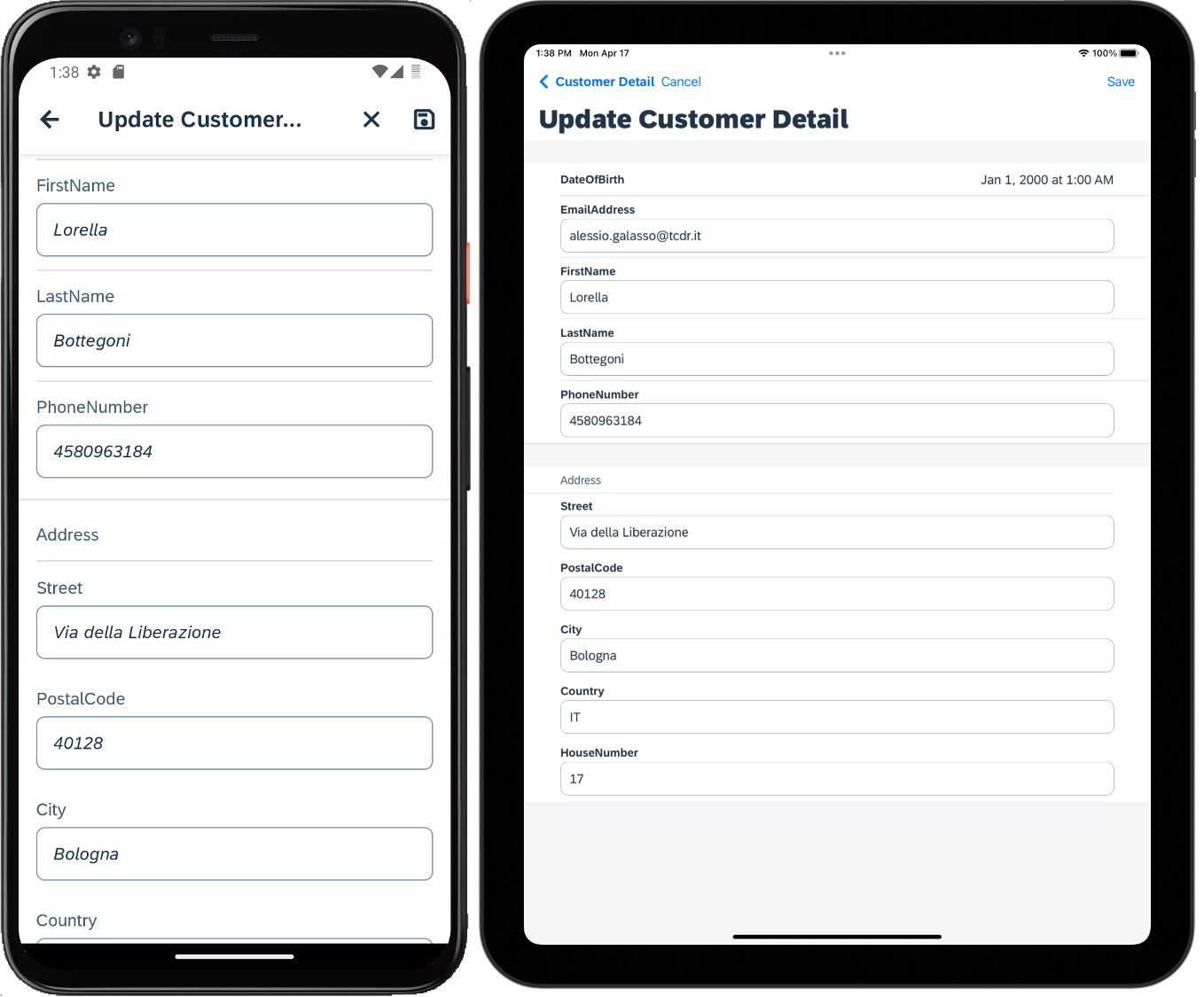
I am happy to announce that a new release of the Mobile Development Kit is now available for all Mobile Services customers and can be downloaded on the SAP Software Center and community Download page. SAP Mobile Services Client has also been updated in Google Play Store and in Apple app store.
Please note, this release changes numbering to cloud numbering going forward (YY.M.Patch).
SAP Mobile Development Kit enables developers and technical business users to build multi-channel applications. It allows you to build your application once, in an integrated development environment (SAP Business Application Studio/ VSCode extension) and run it natively on Mobile (Android & iOS) and as a web application (online) in the browser.
This release includes the following:
Editable Data Table Control
Data Table (a scrollable table that supports showing more columns in a table and scrolling to view data off page) has been further enhanced to support editing the entries in the table directly without having to open the full object edit view. Editable Data Table supports the inline edit mode using Simple Property, List Picker, Duration Picker, Time Picker and Date Picker Form Cell controls.
In addition to defining the metadata for the editable data table, developers also need to add buttons on the page with the necessary rules using the new APIs to, at a minimum, provide a save option to get the changes and save the changes to the backend service. Additional buttons can also be added to switch between display only and edit mode for the data table.
Below are the new APIs added to enable the editing features:
iOS Segmented Tabs Option
We have enhanced existing Tabs control (part of a Tabs page) to show Tabs as Segments in iOS platform to display different views in each segment.
Please note
For more information, please see documentation.
Optional Separator in Sections
To provide more flexibility with rendering of controls and sections, you can now show or hide separator lines in the following places:
For more information, see documentation for setting the visibility of separators lines in a section and below Form cell control in Form Cell section.
Section Header Enhancements
Section Header control has been enhanced to support additional elements
You can use the Styles property to apply various styling options for Header and Footer in Section controls.
For more information, see Header (Label, Icon and Button) and Footer styling documentation.
Reset API for Side Drawer
MDK already supports resetting navigation stack to the initial page when calling it from the active side drawer item via its ResetIfPressedWhenActive property. In this release, a new API is introduced to reset a specific side drawer menu frame’s navigation stack even when it’s not the active one. This can help in resetting a business flow in that frame when user completes the process in another side drawer menu’s frame.
MDK now provides ability to overrides the default behaviour of back button. One of the use cases is to prompt the user to confirm if they really want to navigate back in case navigation would result in losing unsaved changes.
You can define a OnBackButtonPressed event at page level that will be triggered when user presses the back button in the action bar.
For more information, see documentation.
New MDK Icon
MDK icon for public store client (SAP Mobile Services Client) and the default icon for all branded clients created with the MDK SDK have been updated.
Blue icon has been designed and reserved for the public store client (app name as Mobile Svcs) and the grey monochrome icon is the default icon for the branded clients built using MDK SDK and Cloud Build service.
Icon in the Migration view and the default placeholder icon for MDK controls in BAS editor have also been updated.
Signed QR code for Onboarding
MDK now supports validating digitally signed QR code during onboarding in both Android and iOS clients. Using the digitally signed QR code increases the security of the onboarding process.
Please note to consider below information:
For more information on Signed QR code, see documentation.
Follow these tutorials to get started and learn more about Mobile development kit!
I am looking forward to your feedback/comments.
Jitendra
Please note, this release changes numbering to cloud numbering going forward (YY.M.Patch).
SAP Mobile Development Kit enables developers and technical business users to build multi-channel applications. It allows you to build your application once, in an integrated development environment (SAP Business Application Studio/ VSCode extension) and run it natively on Mobile (Android & iOS) and as a web application (online) in the browser.
This release includes the following:
- New UI enhancements
- Editable Data Table Control
- iOS Segmented Tabs Option
- Optional Separator in Sections
- Section Header Enhancements
- Section Header and Footer Styling Support
- API and Syntax enhancements
- General enhancements
- New UI enhancements
Editable Data Table Control
Data Table (a scrollable table that supports showing more columns in a table and scrolling to view data off page) has been further enhanced to support editing the entries in the table directly without having to open the full object edit view. Editable Data Table supports the inline edit mode using Simple Property, List Picker, Duration Picker, Time Picker and Date Picker Form Cell controls.

Data Table control in MDK Page Editor

Editable Data Table example in MDK Mobile clients
In addition to defining the metadata for the editable data table, developers also need to add buttons on the page with the necessary rules using the new APIs to, at a minimum, provide a save option to get the changes and save the changes to the backend service. Additional buttons can also be added to switch between display only and edit mode for the data table.
Below are the new APIs added to enable the editing features:
IDataTableSectionProxy
- getEditMode(): returns current edit mode of Data Table control
let currentEditMode = context.getControl('SectionedTable0').getSection('SectionDataTable0').getEditMode();
- getEditMode(): returns current edit mode of Data Table control
- setEditMode: allows to set the edit mode of Data Table control
context.getControl('SectionedTable0').getSection('SectionDataTable0').setEditMode('Inline');
- setEditMode: allows to set the edit mode of Data Table control
- getChanges: provides the data that has been modified. This is applicable to the data that are bound to backend properties
let changedObjects = context.getControl('SectionedTable0').getSection('SectionDataTable0').getChanges();
let message = JSON.stringify(changedObjects);
- getChanges: provides the data that has been modified. This is applicable to the data that are bound to backend properties
- getCell: provides access to a cell
let cell = context.getControl('SectionedTable0').getSection('SectionDataTable0').getCell(0, 0);
alert(cell.getValue());
- getCell: provides access to a cell
- reset: reset the data changes to previous state. This is applicable only to data changes which are not yet saved or submitted
context.getControl('SectionedTable0').getSection('SectionDataTable0').reset();
- reset: reset the data changes to previous state. This is applicable only to data changes which are not yet saved or submitted
IDataTableCellProxy
- getParent : returns the DataTableSection proxy
context.getControl('SectionedTable0').getSection('SectionDataTable0').getCell(0, 0).getParent();
- getParent : returns the DataTableSection proxy
- getColumnIndex(): returns the column index of a cell
context.getControl('SectionedTable0').getSection('SectionDataTable0').getCell(0, 0).getColumnIndex();
- getColumnIndex(): returns the column index of a cell
- getRowIndex(): returns the row index of a cell
context.getControl('SectionedTable0').getSection('SectionDataTable0').getCell(0, 0).getRowIndex();
- getRowIndex(): returns the row index of a cell
- getValue(): returns the cell value
context.getControl('SectionedTable0').getSection('SectionDataTable0').getCell(0, 0).getValue();
- getValue(): returns the cell value
- setValue : set the value in the cell
let currentCell = context.getControl('SectionedTable0').getSection('SectionDataTable0').getCell(0, 0);
const newValue = "My Product";
currentCell.setValue(newValue);
- setValue : set the value in the cell
IDataTableListPickerCellProxy
Below methods are applicable to a cell which has EditType property set to List.
- getCaption() : returns the caption of the cell
context.getControl('SectionedTable0').getSection('SectionDataTable0').getCell(0, 1).getCaption();
- getCaption() : returns the caption of the cell
- setCaption : Set the caption property of the cell
let currentCell = context.getControl('SectionedTable0').getSection('SectionDataTable0').getCell(0, 1);
let caption = "New Caption";
currentCell.setCaption(caption);
- setCaption : Set the caption property of the cell
- getTargetSpecifier() : Get a target specifier from this cell
let currentCell = context.getControl('SectionedTable0').getSection('SectionDataTable0').getCell(0, 1);
const targetSpecifier = currentCell.getTargetSpecifier();
let message = 'ReturnValue = ' + targetSpecifier.getReturnValue() + '\n' +
'DisplayValue = ' + targetSpecifier.getDisplayValue() + '\n' +
'Service = ' + targetSpecifier.getService() + '\n' +
'EntitySet = ' + targetSpecifier.getEntitySet() + '\n' +
'QueryOptions = ' + targetSpecifier.getQueryOptions();
alert(message);
- getTargetSpecifier() : Get a target specifier from this cell
- setTargetSpecifier : set the target specifier on a cell
let currentCell = context.getControl('SectionedTable0').getSection('SectionDataTable0').getCell(0, 1);
const targetSpecifier = currentCell.getTargetSpecifier().setQueryOptions("$top=5");
currentCell.setTargetSpecifier(targetSpecifier);
- setTargetSpecifier : set the target specifier on a cell
iOS Segmented Tabs Option
We have enhanced existing Tabs control (part of a Tabs page) to show Tabs as Segments in iOS platform to display different views in each segment.
"TabStripType": "Segmented" Please note
- This feature is not applicable for Android and web platforms. The TabStripType property will be ignored and Tabs appear as “Normal” type in these platforms.
- Icon will be ignored in this mode.
- All tabs will be shown on the page, it is not scrollable, and the tab text may possibility be truncated.
- TabStrip will use the full width of the screen and each tab will get divided into equal portions based on the number of tabs.
- Same Tab styling applies to the new segmented Tab type.

Segmented Tabs example in iOS client
For more information, please see documentation.
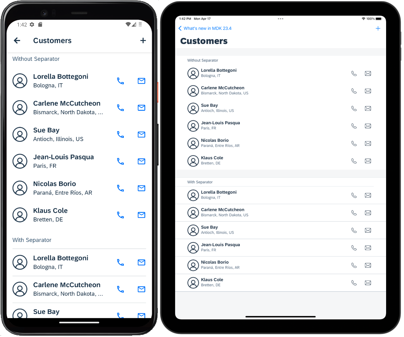
Optional Separator in Sections
To provide more flexibility with rendering of controls and sections, you can now show or hide separator lines in the following places:
- Above and below Sections
- Between sections
- Between Header and Section
- Between Section and Footer
- Between Controls within a section for collection sections
- Between Form Cell Sections
- Between Form Cell Section Header and Controls
- Between Controls in a Form Cell Section
Contact Table with and without Separator lines in MDK Mobile clients
Contact Table with and without Separator lines in MDK Web app
"Sections": [{

        ....

        ....

        "Separators": {

            "TopSectionSeparator": false,

            "BottomSectionSeparator": false,

            "HeaderSeparator": false,

            "FooterSeparator": false,

            "ControlSeparator": false

        },

        "_Type": "Section.Type.ContactCell",

        .....

        .....

    ],
Form Cell controls in Sectioned Table with and without Separator lines in MDK Mobile clients

Form Cell controls in Sectioned Table with and without Separator lines in MDK Web app
"Controls": [{

	"_Type": "Control.Type.SectionedTable",

	"_Name": "SectionedTable",

	"Sections": [{

		"Separators": {

			"TopSectionSeparator": false,

			"BottomSectionSeparator": false,

			"HeaderSeparator": true,

			"FooterSeparator": false,

			"ControlSeparator": false

		},

		"Controls": [{

				"Value": "{Street}",

				"_Type": "Control.Type.FormCell.SimpleProperty",

				"_Name": "Street",

				"Caption": "Street",

				"Separator": true


			},


		],

		"_Type": "Section.Type.FormCell",

		"_Name": "SectionFormCell1"

	}]

}],
For more information, see documentation for setting the visibility of separators lines in a section and below Form cell control in Form Cell section.
Section Header Enhancements
Section Header control has been enhanced to support additional elements
- Header now supports left and right element, that can be an Icon, Label and button in header.
- The each Icon or button can have its own OnPress event.
- The header as a whole also now supports OnPress event.

Section Header enhancements in MDK mobile clients

Section Header enhancements in MDK Web app
"Header": {

	"_Name": "SectionHeader4",

	"AccessoryType": "none",

	"UseTopPadding": true,

	"OnPress": {

		"Name": "/MDK2304/Actions/Misc/GenericMessageBox.action",

		"Properties": {

			"Message": "Message from Header Bar"

		}

	},

	"Caption": "Test caption",

	"Items": [{

			"_Type": "SectionHeaderItem.Type.Label",

			"_Name": "label2",

			"Position": "Left",

			"Title": "Label 2"

		},

		{

			"_Name": "button2",

			"Title": "Button 2",

			"Position": "Right",

			"_Type": "SectionHeaderItem.Type.Button",

			"OnPress": {

				"Name": "/MDK2304/Actions/Misc/GenericMessageBox.action",

				"Properties": {

					"Message": "Message from button2"

				}

			}

		},

		{

			"_Name": "buttonextra",

			"Title": "Button Extra",

			"Position": "Right",

			"_Type": "SectionHeaderItem.Type.Button",

			"OnPress": {

				"Name": "/MDK2304/Actions/Misc/GenericMessageBox.action",

				"Properties": {

					"Message": "Message from button"

				}

			}

		}

	]

},
Section Header and Footer Styling Support
You can use the Styles property to apply various styling options for Header and Footer in Section controls.
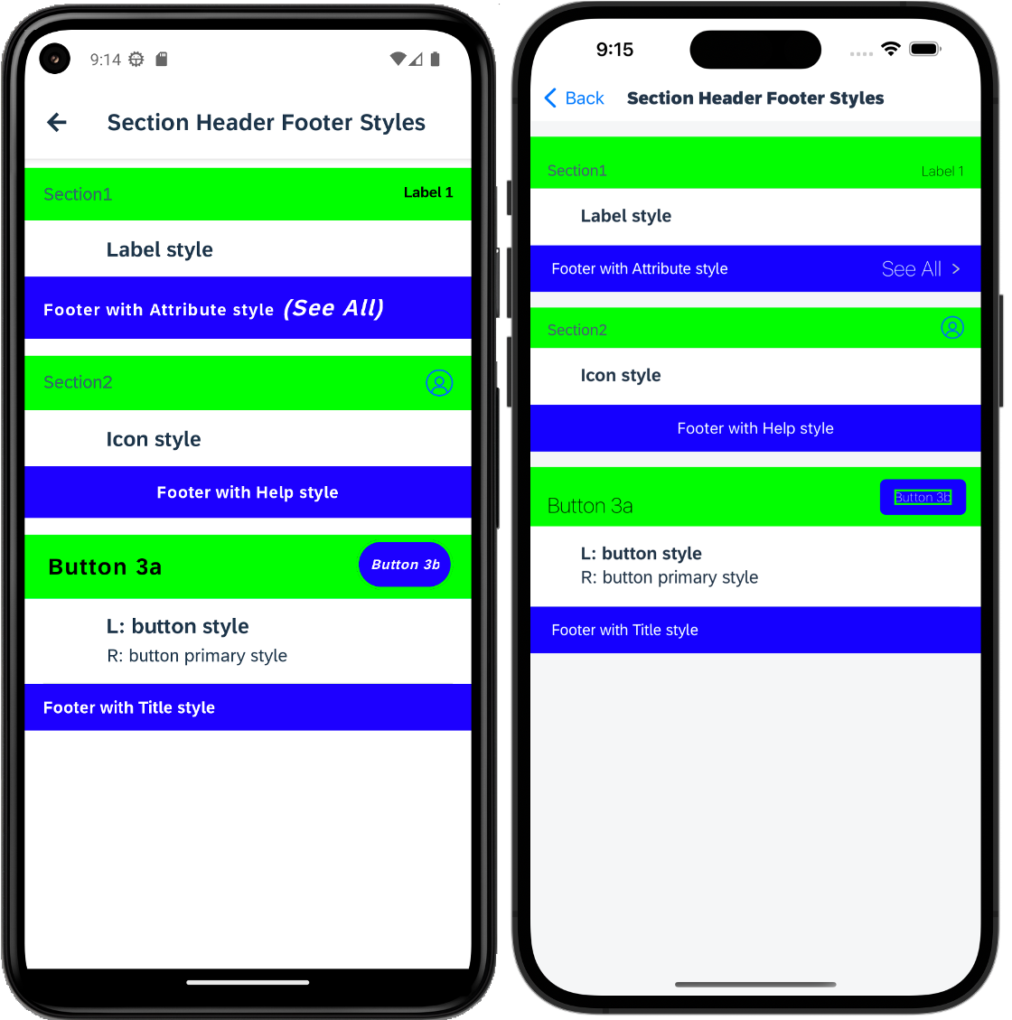
Section Header and Footer styling in MDK mobile clients
Section Header and Footer styling in MDK Web app
For more information, see Header (Label, Icon and Button) and Footer styling documentation.
Reset API for Side Drawer
MDK already supports resetting navigation stack to the initial page when calling it from the active side drawer item via its ResetIfPressedWhenActive property. In this release, a new API is introduced to reset a specific side drawer menu frame’s navigation stack even when it’s not the active one. This can help in resetting a business flow in that frame when user completes the process in another side drawer menu’s frame.
- getMenuItem(name: string): returns a single SideDrawerMenuItemProxy instance of the menu item that is identified by the provided name
- reset(): resets the specified SideDrawerMenuItem’s navigation stack, and returns a promise of the current page proxy
const MENU_NAME = 'WorkOrders';

export default function ResetWorkOrdersMenu(context) {

    //Get the global side drawer control proxy

    var sideDrawerControlProxy = context.getPageProxy().getGlobalSideDrawerControlProxy();

    //get a single SideDrawerMenuItemProxy instance of the menu item

    var menuItem = sideDrawerControlProxy.getMenuItem(MENU_NAME);

    if (menuItem == null) {

        alert(`Can not find menu [${MENU_NAME}]`);

    } else {

        menuItem.reset().then((currentPageProxy) => {

            console.log("current page proxy is " + currentPageProxy);

            var currentPageCaption = currentPageProxy.getCaption();

            console.log("Current page caption is " + currentPageCaption);

            //   alert(`Reset menu [${MENU_NAME}] success, the current page caption is [${currentPageCaption}]`);

        }).catch(() => {

            alert(`Reset menu [${MENU_NAME}] fail`);

        });

    }

}
Support Overriding Back Button
MDK now provides ability to overrides the default behaviour of back button. One of the use cases is to prompt the user to confirm if they really want to navigate back in case navigation would result in losing unsaved changes.
You can define a OnBackButtonPressed event at page level that will be triggered when user presses the back button in the action bar.

OnBackButtonPressed event option in MDK editor
Overriding Back Button example in MDK Mobile Clients
Overriding Back Button example in MDK Web app
export default function OnBackButtonPressed(context) {

    return context.executeAction('/DemoSampleApp/Actions/MessageBox.action').then((result) => {

      return result.data;

    });

  }


//MessageBox.action

{

    "_Type": "Action.Type.Message",

    "ActionResult": {

        "_Name": "MessageBox"

    },

    "Message": "Are you sure want to navigate back?",

    "Title": "Confirmation",

    "OKCaption": "OK",

    "CancelCaption": "Cancel"

}
For more information, see documentation.
New MDK Icon
MDK icon for public store client (SAP Mobile Services Client) and the default icon for all branded clients created with the MDK SDK have been updated.
Blue icon has been designed and reserved for the public store client (app name as Mobile Svcs) and the grey monochrome icon is the default icon for the branded clients built using MDK SDK and Cloud Build service.
Icon in the Migration view and the default placeholder icon for MDK controls in BAS editor have also been updated.
MDK Editor in SAP Business Application Studio
Signed QR code for Onboarding
MDK now supports validating digitally signed QR code during onboarding in both Android and iOS clients. Using the digitally signed QR code increases the security of the onboarding process.
Please note to consider below information:
- This feature is available in BTP Cloud Foundry environment only.
- To configure digitally signed QR code for on-boarding, enable QR Code Signature under the app security in the Mobile Services cockpit.

SAP Mobile Services admin cockpit
- You can use Mobile Services to generate the keys or you can provide your own keys. The Public key is used in the MDK client to verify the digital signature whereas private key is used in the mobile services to sign the QR code being displayed.
- Create a new file named as SignedQRCodePublicKey.pem file
- Copy the public key from Mobile services and paste it in this file
- Add the SignedQRCodePublicKey.pem file under .mdkproject/App_Resources/Android/src/main/assets and .mdkproject/App_Resources/iOS

- Edit the BrandedSettings.json and add the SignedQRCodeOption property in ConnectionSettings block. This property accepts one of the following values:
- SignedOnly – MDK client accepts only signed QR codes
- UnsignedOnly - MDK client accepts only unsigned QR codes
- Both - MDK client can accept both signed and unsigned QR codes
"ConnectionSettings": {
"EnableOverrides": true,
...
"SignedQRCodeOption": "SignedOnly",
...
},
For more information on Signed QR code, see documentation.
New to MDK development?
Follow these tutorials to get started and learn more about Mobile development kit!
I am looking forward to your feedback/comments.
Jitendra
Labels:
12 Comments
You must be a registered user to add a comment. If you've already registered, sign in. Otherwise, register and sign in.
Labels in this area
-
ABAP CDS Views - CDC (Change Data Capture)
2 -
AI
1 -
Analyze Workload Data
1 -
BTP
1 -
Business and IT Integration
2 -
Business application stu
1 -
Business Technology Platform
1 -
Business Trends
1,658 -
Business Trends
91 -
CAP
1 -
cf
1 -
Cloud Foundry
1 -
Confluent
1 -
Customer COE Basics and Fundamentals
1 -
Customer COE Latest and Greatest
3 -
Customer Data Browser app
1 -
Data Analysis Tool
1 -
data migration
1 -
data transfer
1 -
Datasphere
2 -
Event Information
1,400 -
Event Information
66 -
Expert
1 -
Expert Insights
177 -
Expert Insights
297 -
General
1 -
Google cloud
1 -
Google Next'24
1 -
Kafka
1 -
Life at SAP
780 -
Life at SAP
13 -
Migrate your Data App
1 -
MTA
1 -
Network Performance Analysis
1 -
NodeJS
1 -
PDF
1 -
POC
1 -
Product Updates
4,577 -
Product Updates
343 -
Replication Flow
1 -
RisewithSAP
1 -
SAP BTP
1 -
SAP BTP Cloud Foundry
1 -
SAP Cloud ALM
1 -
SAP Cloud Application Programming Model
1 -
SAP Datasphere
2 -
SAP S4HANA Cloud
1 -
SAP S4HANA Migration Cockpit
1 -
Technology Updates
6,873 -
Technology Updates
420 -
Workload Fluctuations
1
Related Content
- Consuming SAP with SAP Build Apps - Mobile Apps for iOS and Android in Technology Blogs by SAP
- Recommended approach for Fiori Adapt UI in S/4H On-Premise system (Customizing client) with no data in Technology Q&A
- What’s new in Mobile development kit client 24.4 in Technology Blogs by SAP
- ABAP Cloud Developer Trial 2022 Available Now in Technology Blogs by SAP
- New Machine Learning features in SAP HANA Cloud in Technology Blogs by SAP
Top kudoed authors
| User | Count |
|---|---|
| 37 | |
| 25 | |
| 17 | |
| 13 | |
| 7 | |
| 7 | |
| 7 | |
| 6 | |
| 6 | |
| 6 |