
- SAP Community
- Products and Technology
- Technology
- Technology Blogs by SAP
- Latest Releases of SAP Fiori for Android 6.0 & iOS...
Technology Blogs by SAP
Learn how to extend and personalize SAP applications. Follow the SAP technology blog for insights into SAP BTP, ABAP, SAP Analytics Cloud, SAP HANA, and more.
Turn on suggestions
Auto-suggest helps you quickly narrow down your search results by suggesting possible matches as you type.
Showing results for
 EmilVoutta
Advisor
Options
- Subscribe to RSS Feed
- Mark as New
- Mark as Read
- Bookmark
- Subscribe
- Printer Friendly Page
- Report Inappropriate Content
03-28-2023
8:47 AM
Unlock Apple iOS and Google Android Capabilities for Your Business and Users
SAP remains fully committed to provide business users the best tools to get their job done – also on the go. Therefore, we are continuously improving our mobile app portfolio, design system, and mobile technology offerings. SAP’s mobile design system and the SAP BTP software development kits for iOS and Android are essential to the creation of enterprise ready mobile apps, especially in regard to managing the total cost of ownership, as-well-as ensuring development efficiency.

Examples of SAP Fiori mobile components
Now with SAP Fiori for Android 6.0 & iOS 9.1, we are excited to provide the latest enhancements and improvements also to our mobile community.
New in SAP Fiori for Android 6.0
With the latest releases of our mobile design system and software development kit for Android, we have enhanced our existing UI components and added new ones to support an even better mobile user experience.
Navigation Bar
Navigation bar with three destinations, one of them being highlighted by the active indicator and the filled icon
The navigation bar is a new UI component that provides fast access to two to five core destinations in an app. This helps users switch between the main pages on their mobile app. When they tap on a destination or if one is focused on the navigation bar, they are directed to the navigation destination associated with that icon. To improve accessibility, navigation between destinations is visually highlighted by an active indicator and filled icon. Check out the Navigation Bar article in our SAP Fiori for Android guidelines to find out more about this component.
Navigation Drawer

Modal navigation drawer (left) and standard navigation drawer (right)
Another addition to our navigation UI components is the navigation drawer. It provides access to different destinations in an app. The navigation drawer can either be permanently visible or opened and closed by tapping a menu icon. See Navigation Drawer to learn more.
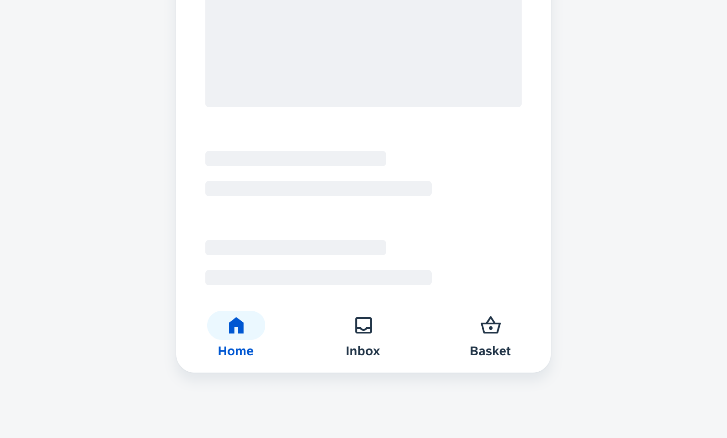
Navigation Rail

Navigation rail with floating action button, profile, and four destinations
Along with the navigation drawer, we have added the navigation rail to our components. The navigation rail provides a top-level navigation to three to seven core destinations in an app. On larger screens, such as tablet or desktop devices, it can be used as the sole navigation component. To learn more, see Navigation Rail.
Data Table Card

Collection of data table cards on mobile (left) and tablet (right)
The data table card is a new addition to our card components that is providing a preview of current and historic data in a table format. This card type is also used as an entry point to a data table or to another defined location. Currently, data table cards display up to four rows and two columns that can be customized to fit a variety of use cases. See Data Table Card to learn more about this UI component.
Onboarding

Splash screen with light and dark background color
Apart from improving existing UI components and adding new ones, we have also updated the onboarding pattern. For the end user license agreement (EULA), which is required to move forward in the onboarding process, we have implemented a dark theme with a dark background color. Additionally, we’ve added some guidance on using a splash screen and updated the launch screen with a new optional EULA flow for China to comply with their legal requirements. To round it off, we have increased the content width for tablets and large screens. Check out the SAP Fiori for iOS design guidelines articles for Single-User Onboarding and Multi-User Onboarding.
Banners

Sample banner error state
For our banner component that shows a short and concise message displayed at the top of the screen, we have added error states. A banner error state can be used to provide a page-level error message. See Banners to learn more.
Data Table

Inline edit mode activation and selection of a text cell
The data table component has been further enhanced with an inline edit mode. This allows users to edit multiple lines without opening the key object cell view. As of now, the inline edit mode works for text, list pickers, and time pickers. To find out more about this enhancement, see Inline Edit.
Progress Indicators

Linear progress indicator (determinate)
The linear progress indicator, a variation of our progress indicator component that informs users about the status of ongoing processes, has been updated to the latest SAP Fiori for Android visual style and now supports error and success states. See Linear Progress Indicator.
Switches

Enabled switch form cells
The switch control that is used to mimic a physical switch allowing users to turn individual settings on or off also got a style update with improved accessibility for users. To get more information about this control, see Switches.
New in SAP Fiori for iOS 9.1
With the latest release of both our design system and SDK for iOS, we have created and improved the following components and patterns.
Quick Sort

Quick sort example
Quick sort is a new contextual sorting pattern that allows users to change the sort criteria of a component. It can be implemented on component level to sort list cards or to preview table views. To learn more, check out the Quick Sort article in the SAP Fiori for iOS design guidelines.
Semantic Buttons

Semantic buttons example
Semantic buttons are now available for iOS. The tint button style can emphasize available actions and encourage users to interact with them. The negative button style indicates destructive actions and warns users to take extra precautions when interacting with the buttons. Take a look at the Buttons article to learn more.
Tab Bar

Tab bar with four different tab items, including one tab item in active state and one tab item with a notification badge
We have updated the tab bar – one of our main navigation elements that is located at the bottom of a screen and helps users switch between the main pages within an app. It now offers variations and covers two to five destinations with an optional notification badge. To improve accessibility, we have added tint color and filled icons in active state and haptic feedback for selecting a tab. Read the corresponding article about the Tab Bar in our SAP Fiori for iOS design guidelines.
Navigation Bar

Navigation bar with long press on “Back” button displaying contextual menu with previously visited pages
The navigation bar is an integral part of the screen that indicates the position of the user within the app. It contains page-level control actions and enables users to navigate through a hierarchy of content. As an enhancement, an additional row can now be displayed, for example, a search bar or linear progress indicator. Additionally, a long press on the back button shows users a contextual menu with previously visited pages. Find out more about the Navigation Bar and its variations.
Stepper Form Cell

Stepper form cell in inactive state (left) and while typing (right)
A stepper is a control that allows users to incrementally increase or decrease a select value. The value sits in the middle of the two-touch segments. Once the minimum value is reached, the respective touch target gets disabled. We have updated the stepper form cell in a way that it now bolds text to align with the buttons. If you want to know more about this form cell control, take a look at the Stepper article.
Switch Form Cell

Switch form cell in disabled state, enabled state, and greyed out
We have redesigned the switch form cell, which is used to toggle two mutually exclusive states – on and off – and added a disabled state. Colors, stroke, and shadow have also been updated. See Switch Form Cell to learn more about this form cell control.
Slider Form Cell

Slider form cell with input of maximum value (left) and slider form cell with input of minimum and maximum values (right)
A slider form cell displays a continuous range of values along a track. The updated slider form cell has a new input field that allows users a precise input of minimum and maximum values. We have also added some changes in label color and label font to match other form cells. Check out the Slider Form Cell article if you want to get more information about this form cell control.
Sort and Filter Form
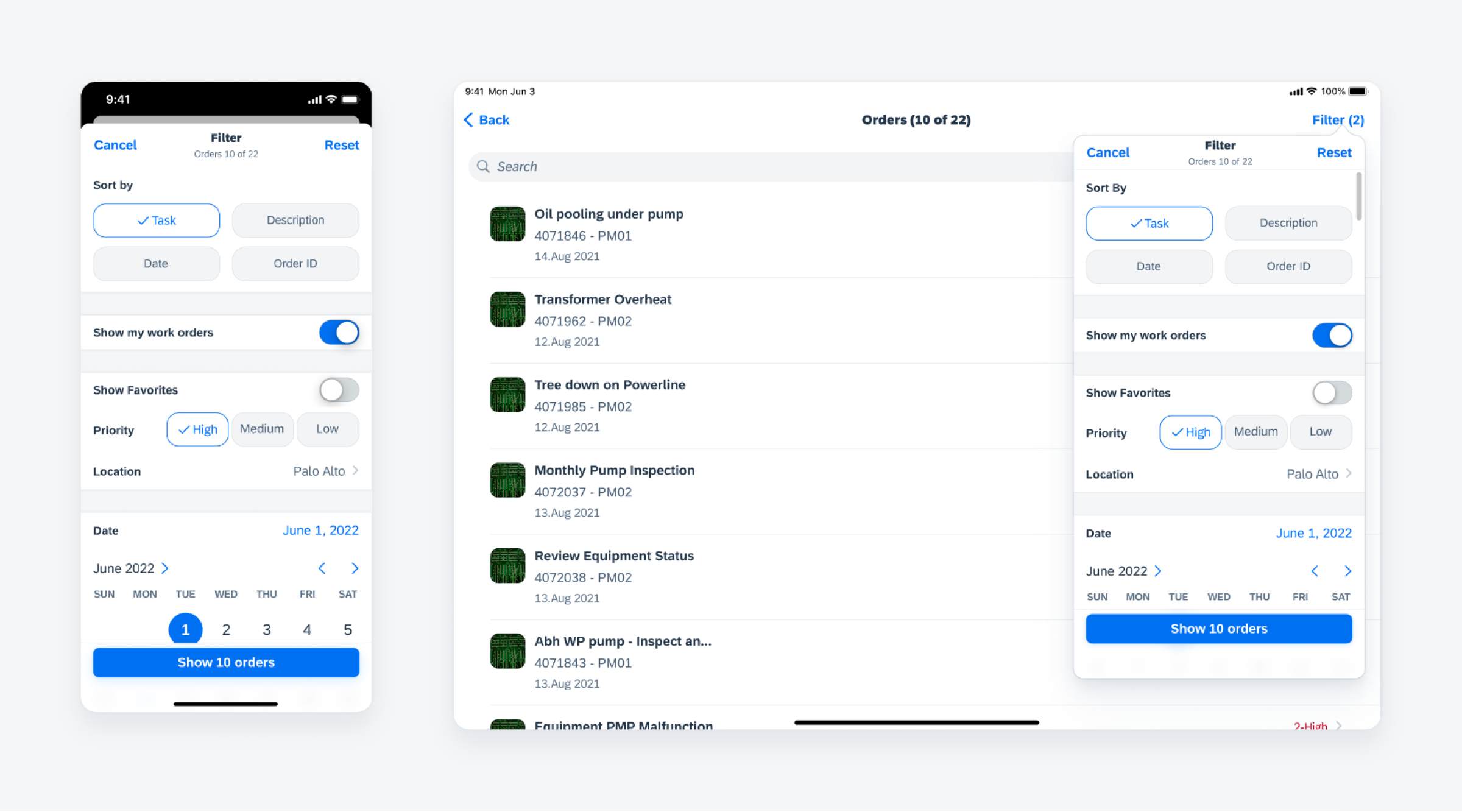
Sort and filter form with search results button in filter view
The sort and filter pattern allows users to narrow down results from a large set of data by setting complex sort and filter criteria in a fullscreen modal. The updated sort and filter form shows the number of search results in filter view, has a more prominent reset button, and additional read-only variants. Get more information about this updated pattern in the Sort & Filter article in our SAP Fiori for iOS design guidelines.
Analytic Data Table Card

Analytic data table card
The analytic data card got a visual update. Additionally, the height is now flexible, and the card can contain up to three entries from the data table. It is also possible to show a thumbnail image in the header. To learn more, refer to Analytic Data Table Card.
Data Table

Data table on iPhone (left) and iPad (right)
As an enhancement, the data table now comes with interaction behavior that enables inline editing, which is triggered by tapping the “Edit” button in the navigation bar. Take a look at the Data Table article to learn more.
Empty State View
Empty state view examples
We have added new illustrations to the empty state view, which is a feedback component that provides information to users when there is no data to display. See Empty State View.
Timeline View

Compact width timeline view on iPhone (left) and regular-readable width on iPad (right)
In an effort to improve user experience, we have enhanced the visual cues for the timeline view, which displays a list of items such as tasks, events, or meetings in chronological order. Users can now distinguish between past, current, and future items based on the color of the nodes. Additionally, a blue background highlights current items. See Timeline View to learn more about this component.
Timeline Preview

Compact width timeline preview on iPhone (left) and regular-readable width on iPad (right)
Along with the timeline view, we have also visually enhanced and redesigned the timeline preview. To learn more, see Timeline Preview.
Toolbar

Toolbar in compact (left) and regular width (right)
The toolbar also got a makeover with a new button style, an overflow menu with multiple actions, and a new button alignment on iPads. To learn more, see Toolbar.
Iconography

Examples from SAP icon library
On both Android and iOS, we have redesigned the SAP icons for the Horizon visual theme with a fresh, friendly, and bold style. The new icons maintain consistency of size, stroke, and visual balance and are tailored for simple and direct user interaction, using metaphors that are easy to understand in an enterprise setting. On iOS, we have also introduced 300 of the most frequently used icons from the SAP icon library that are now part of the SDK as custom symbols. These icons come in 9 different weights and 3 scales as well as typographical alignment, which allows better adjustment to text, accessibility features, and UI context. Check out the Iconography article to learn more.
Resources
Design Guidelines

SAP Fiori Mobile Design Guidelines for Android and iOS
A detailed documentation on component anatomy, behavior, and interactions allows you to use components that match your use case. Crosslinks to Google’s Material Design Guidelines for Android and Apple’s Human Interface Guidelines for iOS, as well as links to development documentation, help you navigate to these resources. Additionally, you can find a feedback function on each guideline article that allows you to provide feedback.
SAP Fiori for Android Design Guidelines | SAP Fiori for iOS Design Guidelines
Figma UI Design Kits

Figma UI Design Kit
With the updated SAP Fiori for Android and iOS Figma UI design kits, it’s now easier than ever to use the latest components and patterns in your mobile design. By using the design kits, you can quickly create a consistent user experience that enables app implementations at scale.
SAP Fiori for Android 6.0 UI Design Kits | SAP Fiori for iOS 9.0 UI Design Kits
SAP Fiori Mentor App

SAP Fiori Mentor App for Android and iOS
The SAP Fiori Mentor app is an interactive playground that allows you to explore the flexibility of mobile components and patterns available through the SAP BTP SDKs for Android and iOS. By adjusting component settings within the app, the behavior, interaction, and features of components can be previewed live. If you’re a developer, you can export code samples with predefined settings into your preferred development tool. If you’re a designer, you can easily understand the scope of functionality for a specific component and specify your designs with applicable parameters, and hand over the respective code snippets to your development partners. To provide some tangible examples of the actual UI component usage in apps, the best practices section provides a selection of app design examples. By highlighting specific areas, each app design indicates which UI components are used, so you can deep dive into their additional features.
Apple App Store | Google Play Store
Software Development Kits

SAP BTP SDKs for Android and iOS
The SAP BTP SDK for iOS and SAP BTP SDK for Android include the SAP Fiori framework that contains user interface components. These frameworks are standalone and do not have a dependency on other parts of the SDK. These libraries make it easier to create applications that conform to the SAP Fiori design language. On iOS, the SAP BTP SDK offers “SAP Fiori framework“ and the “Fiori” controls extend Apple’s UIKit/SwiftUI. These controls can be used programmatically or through storyboard files. On Android, the SAP BTP SDK UI components are contained in the “Fiori” library and extend Material Design controls.
SAP BTP SDK for iOS | SAP BTP SDK for Android
- SAP Managed Tags:
- SAP Fiori,
- SAP Mobile Services,
- SAP BTP SDK for Android,
- SAP BTP SDK for iOS,
- SAP Mobile Platform SDK,
- Mobile,
- User Experience
Labels:
You must be a registered user to add a comment. If you've already registered, sign in. Otherwise, register and sign in.
Labels in this area
-
ABAP CDS Views - CDC (Change Data Capture)
2 -
AI
1 -
Analyze Workload Data
1 -
BTP
1 -
Business and IT Integration
2 -
Business application stu
1 -
Business Technology Platform
1 -
Business Trends
1,658 -
Business Trends
93 -
CAP
1 -
cf
1 -
Cloud Foundry
1 -
Confluent
1 -
Customer COE Basics and Fundamentals
1 -
Customer COE Latest and Greatest
3 -
Customer Data Browser app
1 -
Data Analysis Tool
1 -
data migration
1 -
data transfer
1 -
Datasphere
2 -
Event Information
1,400 -
Event Information
66 -
Expert
1 -
Expert Insights
177 -
Expert Insights
299 -
General
1 -
Google cloud
1 -
Google Next'24
1 -
Kafka
1 -
Life at SAP
780 -
Life at SAP
13 -
Migrate your Data App
1 -
MTA
1 -
Network Performance Analysis
1 -
NodeJS
1 -
PDF
1 -
POC
1 -
Product Updates
4,577 -
Product Updates
345 -
Replication Flow
1 -
RisewithSAP
1 -
SAP BTP
1 -
SAP BTP Cloud Foundry
1 -
SAP Cloud ALM
1 -
SAP Cloud Application Programming Model
1 -
SAP Datasphere
2 -
SAP S4HANA Cloud
1 -
SAP S4HANA Migration Cockpit
1 -
Technology Updates
6,873 -
Technology Updates
425 -
Workload Fluctuations
1
Related Content
- SAP Build Process Automation Pre-built content for Finance Use cases in Technology Blogs by SAP
- Customer & Partner Roundtable for SAP BTP ABAP Environment #12 in Technology Blogs by SAP
- Start page of SAP Signavio Process Insights, discovery edition, the 4 pillars and documentation in Technology Blogs by SAP
- Consuming SAP with SAP Build Apps - Mobile Apps for iOS and Android in Technology Blogs by SAP
- Demystifying the Common Super Domain for SAP Mobile Start in Technology Blogs by SAP
Top kudoed authors
| User | Count |
|---|---|
| 40 | |
| 25 | |
| 17 | |
| 14 | |
| 8 | |
| 7 | |
| 7 | |
| 7 | |
| 6 | |
| 6 |