
- SAP Community
- Groups
- Interest Groups
- Application Development
- Blog Posts
- Five Tips to Improve Your Design Skills – Part 2 (...
Application Development Blog Posts
Learn and share on deeper, cross technology development topics such as integration and connectivity, automation, cloud extensibility, developing at scale, and security.
Turn on suggestions
Auto-suggest helps you quickly narrow down your search results by suggesting possible matches as you type.
Showing results for
former_member59
Explorer
Options
- Subscribe to RSS Feed
- Mark as New
- Mark as Read
- Bookmark
- Subscribe
- Printer Friendly Page
- Report Inappropriate Content
03-07-2023
1:11 PM
In Part 1 of this series, I discussed the problem of having too much content in a design, which can lead to confusion and distraction. In this post, I’ll delve further by introducing the concept of white space, also known as negative space, which refers to the empty areas in a design. While some may view white space as wasted space, I aim to persuade you that when used correctly, it can greatly enhance the visual appeal and effectiveness of design.
Let’s start with an example. Have a look at the living room wall in the figures below. In Figure 1, an entire wall is filled with artwork, resulting in a cluttered appearance, and making it difficult for any single piece to stand out.
In Figure 2, there are three pieces arranged in a balanced way. It’s easier to identify a focal point, and the empty space around the paintings is known as white space.
We instinctively understand that the wall in Figure 2, is a common representation of a living room’s décor. However, when it comes to slide design and user interface design in the workplace, we tend to create designs that resemble the cluttered wall in Figure 1, taking up most of the canvas (the entire slide or page).
People often shy away from using white space, fearing that the design may not convey enough information. This is particularly evident in PowerPoint slides, where presenters/creators often try to cram most of their talking points on a single slide. I’m sure you’ve sat through those types of presentations. Were you able to focus on anything in particular?
So what should you do instead?
If you took the effort to reduce content from a design, organize the remaining content and design elements into themes. If you want to highlight a specific piece of information, place it in an area surrounded by ample white space.
Have a look at the credit card flow in Figure 5. Notice how there are a lot of elements on the screen. Do you notice any content that doesn’t belong? Do you think there is a lot of white space? A crammed user interface creates a poor user experience (how easy it is to use) and makes it difficult to pinpoint what information is required and what actions the user should take. There is a poor sense of hierarchy which inhibits the eye from flowing through the interface. Effective spacing helps structure the layout to encourage a logical path to follow.
Now have a look at Figure 6. First, unnecessary content has been removed. A technique to remove content is to break it up into flows or steps. Also, the form inputs of First and Last Name are reduced to Card Holder. This simplifies and reduces the amount of real estate and inputs required. Second, notice the amount of padding around the main card image and button. Padding is white space, or the space around an element. The images and buttons are also in their right proportions without having to stretch to the margins. Finally, notice the large amount of white space between the form and button. You might be inclined to think the button should be moved up but leaving it with lots of space and towards the bottom can create an easily recognizable location as an action button or next step.
Summary
Harnessing the power of white space, can create more effective, sophisticated, and memorable designs. As discussed in Part 1, sometimes less is more. The next time you create a Power Point slide, a user interface, or any type of design, remember to consider the importance of white space. Of course, even something like white space can be overdone so use your best judgement to ensure your designs don't look to empty or sparse. Think back to the living room example and use your intuition.
Next Steps:
So far in this series, we’ve talked about reducing content and incorporating white space. Stay tuned for my next post as I’ll explore the use of color.
Have you seen a slide or UI with too much clutter? Leave a comment with how it made you feel? Or do you struggle with removing content or creating white space? Leave a comment with some of your reasons or concerns.
Let’s start with an example. Have a look at the living room wall in the figures below. In Figure 1, an entire wall is filled with artwork, resulting in a cluttered appearance, and making it difficult for any single piece to stand out.

Figure 1: Cluttered Wall
In Figure 2, there are three pieces arranged in a balanced way. It’s easier to identify a focal point, and the empty space around the paintings is known as white space.

Figure 2: Balanced wall with surrounding white space

Figure 3: The empty space around the paintings is called white space
We instinctively understand that the wall in Figure 2, is a common representation of a living room’s décor. However, when it comes to slide design and user interface design in the workplace, we tend to create designs that resemble the cluttered wall in Figure 1, taking up most of the canvas (the entire slide or page).

Figure 4: Dos and Donts of White Space
People often shy away from using white space, fearing that the design may not convey enough information. This is particularly evident in PowerPoint slides, where presenters/creators often try to cram most of their talking points on a single slide. I’m sure you’ve sat through those types of presentations. Were you able to focus on anything in particular?
So what should you do instead?
If you took the effort to reduce content from a design, organize the remaining content and design elements into themes. If you want to highlight a specific piece of information, place it in an area surrounded by ample white space.
Have a look at the credit card flow in Figure 5. Notice how there are a lot of elements on the screen. Do you notice any content that doesn’t belong? Do you think there is a lot of white space? A crammed user interface creates a poor user experience (how easy it is to use) and makes it difficult to pinpoint what information is required and what actions the user should take. There is a poor sense of hierarchy which inhibits the eye from flowing through the interface. Effective spacing helps structure the layout to encourage a logical path to follow.
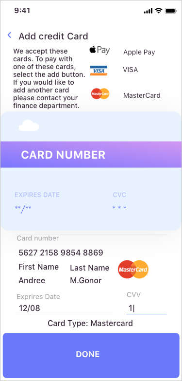
Figure 5: A busy mobile Add Credit Card user interface
Now have a look at Figure 6. First, unnecessary content has been removed. A technique to remove content is to break it up into flows or steps. Also, the form inputs of First and Last Name are reduced to Card Holder. This simplifies and reduces the amount of real estate and inputs required. Second, notice the amount of padding around the main card image and button. Padding is white space, or the space around an element. The images and buttons are also in their right proportions without having to stretch to the margins. Finally, notice the large amount of white space between the form and button. You might be inclined to think the button should be moved up but leaving it with lots of space and towards the bottom can create an easily recognizable location as an action button or next step.

Figure 6: Improving the user-interface by incorporating white space
Summary
Harnessing the power of white space, can create more effective, sophisticated, and memorable designs. As discussed in Part 1, sometimes less is more. The next time you create a Power Point slide, a user interface, or any type of design, remember to consider the importance of white space. Of course, even something like white space can be overdone so use your best judgement to ensure your designs don't look to empty or sparse. Think back to the living room example and use your intuition.
Next Steps:
So far in this series, we’ve talked about reducing content and incorporating white space. Stay tuned for my next post as I’ll explore the use of color.
Have you seen a slide or UI with too much clutter? Leave a comment with how it made you feel? Or do you struggle with removing content or creating white space? Leave a comment with some of your reasons or concerns.
- SAP Managed Tags:
- User Experience,
- User Interface
You must be a registered user to add a comment. If you've already registered, sign in. Otherwise, register and sign in.
Labels in this area
-
A Dynamic Memory Allocation Tool
1 -
ABAP
8 -
abap cds
1 -
ABAP CDS Views
14 -
ABAP class
1 -
ABAP Cloud
1 -
ABAP Development
4 -
ABAP in Eclipse
1 -
ABAP Keyword Documentation
2 -
ABAP OOABAP
2 -
ABAP Programming
1 -
abap technical
1 -
ABAP test cockpit
7 -
ABAP test cokpit
1 -
ADT
1 -
Advanced Event Mesh
1 -
AEM
1 -
AI
1 -
API and Integration
1 -
APIs
8 -
APIs ABAP
1 -
App Dev and Integration
1 -
Application Development
2 -
application job
1 -
archivelinks
1 -
Automation
4 -
BTP
1 -
CAP
1 -
CAPM
1 -
Career Development
3 -
CL_GUI_FRONTEND_SERVICES
1 -
CL_SALV_TABLE
1 -
Cloud Extensibility
8 -
Cloud Native
7 -
Cloud Platform Integration
1 -
CloudEvents
2 -
CMIS
1 -
Connection
1 -
container
1 -
Debugging
2 -
Developer extensibility
1 -
Developing at Scale
4 -
DMS
1 -
dynamic logpoints
1 -
Eclipse ADT ABAP Development Tools
1 -
EDA
1 -
Event Mesh
1 -
Expert
1 -
Field Symbols in ABAP
1 -
Fiori
1 -
Fiori App Extension
1 -
Forms & Templates
1 -
IBM watsonx
1 -
Integration & Connectivity
10 -
JavaScripts used by Adobe Forms
1 -
joule
1 -
NodeJS
1 -
ODATA
3 -
OOABAP
3 -
Outbound queue
1 -
Product Updates
1 -
Programming Models
13 -
Restful webservices Using POST MAN
1 -
RFC
1 -
RFFOEDI1
1 -
SAP BAS
1 -
SAP BTP
1 -
SAP Build
1 -
SAP Build apps
1 -
SAP Build CodeJam
1 -
SAP CodeTalk
1 -
SAP Odata
1 -
SAP UI5
1 -
SAP UI5 Custom Library
1 -
SAPEnhancements
1 -
SapMachine
1 -
security
3 -
text editor
1 -
Tools
17 -
User Experience
5
Top kudoed authors
| User | Count |
|---|---|
| 5 | |
| 2 | |
| 2 | |
| 2 | |
| 2 | |
| 1 | |
| 1 | |
| 1 | |
| 1 | |
| 1 |