

- SAP Community
- Products and Technology
- Technology
- Technology Blogs by SAP
- Data Analysis Tool
Technology Blogs by SAP
Learn how to extend and personalize SAP applications. Follow the SAP technology blog for insights into SAP BTP, ABAP, SAP Analytics Cloud, SAP HANA, and more.
Turn on suggestions
Auto-suggest helps you quickly narrow down your search results by suggesting possible matches as you type.
Showing results for
Product and Topic Expert
Options
- Subscribe to RSS Feed
- Mark as New
- Mark as Read
- Bookmark
- Subscribe
- Printer Friendly Page
- Report Inappropriate Content
02-20-2023
8:22 AM
Overview
The Data Analysis Tool is a html+javascript based utility used by administrators, tuning experts, support engineers and consultants to create professional graphs based various types of input data.
The tool is fully automatic and significantly faster than Excel at creating scatterplots, bar charts and line plots together with histogram analysis for almost any column separated input data such as NMON (CPU_ALL, MEM, MEM_NEW, PROC, LPAR, PAGE), VMSTAT, SDFMON, TAANA, ABAPMETER, MHTML, NIPING, NFSIOSTAT and XLSX.

DataAnalysis.HTML will run in all modern web browsers like Chrome, Edge, Firefox, Opera, Safari (Windows / Linux / MacOS / iPadOS).
Even very large files of 100MB like NMON, NIPING, SDFMON can be opened in a few seconds.
Technically Data Analysis is a HTML page with Javascript which can open local files. The data is then visualized using the open-source JavaScript charting library plotly.js v2.29.1 - (C)opyright 2012-2019, Plotly, Inc. Licensed under the MIT license (view the source on GitHub.).
The purpose of this document is providing some additional screenshots and details explaining the usage of Data Analysis.
Content
Prerequisites
Data Analysis can only handle local files and does not allow any direct connection to any database. The data to be analyzed must be downloaded beforehand to a local PC.
The SDFMON version of Data Analysis is also integrated in the latest support package SP22 of ST-PI (see transaction /SDF/SMON_DISPLAY).
Download
Data.Analysis.offline.v15.11.zip can be downloaded via SAP Note 3169320 - Data Analysis
Documentation
The full documentation of Data Analysis is attached to SAP Note 3169320 - Data Analysis

Usage Instruction
Select Input Data
Data.Analysis.HTML allows to open and concatenate multiple input files, it will detect automatically the column separator (tab, semicolon, comma..) - any character not included in 0..9, A..Z, a..z or space will be detected. To load data into the Data Analysis tool you have three options:
- Use the "Choose Files" button and select one or multiple files (press Ctrl Key to toggle between file and folder selection - if folder is active DA will select all files in a folder)
- Drag and Drop one or multiple files over the "Choose files" button
- Copy & Paste any column separated data into the input box
- In some cases when many large numbers with thousand delimiter are included a wrong column separator, typically , or . might be selected - in that case we need to specify the separator manually (use S for space, T for tab or specify any other character /|\,.;:-)
- Specify Decimal format (point or comma - if numbers are too small it cannot determined automatically)

If files are too big to load you can try to remove white spaces using the following command sequence before opening the file with Data Analysis:
1. open power shell, then execute command bash
2. execute command: tr -d '[:blank:]' < inputfile > outputfile (for a 2GB file this should take around 1min, which is faster than most editors)
Review Input Data
On the second screen one can review the data (if required specify the date format) and edit the column headers if required or go directly to the graphic display.

The last line in the table is indicating what type of data has been detected and how many distinct values exist in each column - the format is <type> / <number>
- text value
d date
t time
n numeric
The user has some options to manipulate the input data (the buttons are only available if the user is putting the cursor into the header line of a column)
- Find and/or Replace values.
- Sort Data
- Delete Values
- Split or Delete Columns
- Perform basic arithmetic operations between columns
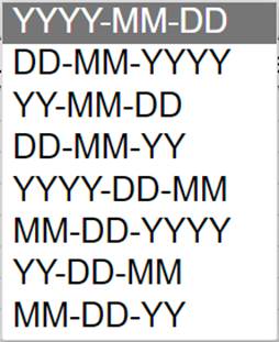
In some occasions the program might not be able to determine the date format automatically, in that case the user can choose from different date formats.
Additionally, the user can download the data (tab separated text file with extension .xls). To reduce the amount of data, columns which do not contain significant information (all values identical) can be removed. If files are too big then the user can also remove every 2nd data row.
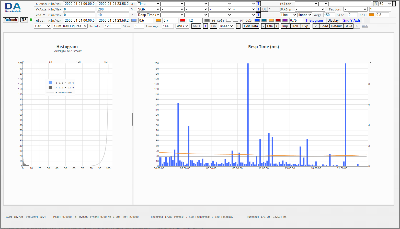
Customize Graphic Output
Below the various options to customize the graphic output

- Specify the fields for the X-Axis. Available are non-numeric fields (date, time, server names...) and all numerical fields
- Specify the fields for the Y-Axis. Available are only numerical fields (integer or float)Important: Certain fields for the X-Axis like Date/Time are automatically proposed - for the Y Axis the DataAnalysis will default CPU User, CPU System, Resp.Time...Optional
- Activate 2nd Y-Axis and specify fields, chart type...
- Select the chart type - available options are:
- Scatter Plot
- Line Chart
- Bar Chart
- Area Chart - If multiple key figures are select for the Y-Axis specify if those values should be summarized, stacked over each other or shown independently.
- Summarize Key Figures
- Stack Key Figures
- Independent Key Figures - Select if any key figures should be used to group/stack the data. Each different value for the selected Stack variable will be shown in a different color. One can specify if only the first n values should be considered. A graph can only be stacked with this option if for each x-value there are an equal number of y-values available. If any x-value will have a different number of y-values this x-value will not be shown (this might happen if x-values (time) differ by a few seconds - as workaround one can try to activate rounding)
Additional Options
- Specify data range and color for the histogram (3rd line)
- Specify point size (also line width in points, default = 3)
- Specify color for the 1st, 2nd, 3rd and 4th select Y-Value. If a stack/group variable is used this for color will specify the color range used.
- Select background and chart color
- Show/Hide the histogram
- Set Chart & Axis Title (supported are the modifiers: <b> Bold </b>, <I> italic <I>, <sub> subscript </sub>, <sup> superscript </sup>, and line breaks <br> )
- logarithmic or linear scale (y-axis)
- Autohide the chart options (that will make the charts bigger if the cursor is moved over them, the menu is shown again if the cursor is moved to the top)
- Maximum number of points to be drawn - if the data contains after aggregation m points and only x point should be drawn then only every nth = m/x points will be drawn
- Select how many data points should be aggregated (calculate average of n points)
- Specify how data points get connected in a line chart (linear, spline, or steps)
- Specify calculation type if multiple data points are cumulated - default is AVG (average), available options are: SUM, MAX, MIN, AVG
- Filter by selected x-value (== x-values equal selected values; <> x-values not equal selected values; multiple conditions can be combined with ||, wildcard * allowed)
- Round time figures (select R to activate) to multiple of 1, 5, 10, 15 ... 60 ... 3600 seconds
- Specify if data points not present in all stack groups should be added or eliminated
- Prevent banding (if the measurements like CPU usage is only available with limited decimals values the graph will look unnatural because all values are on discrete lines. With button S one can add to each key figure a random value r between -d/2 < r < d/2 where d is the smallest detected difference between the y values.
- Export select data (selected fields for X-Axis and Y-Axis)
- Specify minimum/maximum value for calculation of histogram (vertical orange lines) - one can also single click to the graph to position those lines
- Revert or forward in the history of changes within the settings
- Load / Save settings
- Set Default Settings
- Download Graphs (Main + Histogram) as lossless SVG vector graphic
- Calculate Linear Regression Trendline (NEW)
Graph Options (available when cursor is above graph)
On the graphic screen one can select multiple fields for the x-axis and y-axis, specify the number of points, colors, scaling and color coding intervals for the histogram. Both the x and y axis can be scaled interactively. Additional functionality is available if you hover the mouse over the graphic.
 |
|
Chart Options
Available graph options are:
 |  |  |
| Scatter plot | Bar chart | Line chart |
 |  |  |
| Multi Line Charts | Area Charts | Stacked Area Charts |
 |  |  |
| Grouped Line Charts (SDFMON per Date) | Stacked Bar Charts (SDFMON per Appl.Server) | Stacked Area Charts SDFMON per Appl.Server) |
Additional Information
Number of Data Points and Averages
Some data sources (NIPING, SDFMON...) might contain more data points than can be drawn on a chart without losing information because the points/lines/bars will overlap each other. Therefore, one can limit the number of points (by default this limit is set to 10000). If one wants to display more data points in the scatterplot you can specify the point size as shown in the example below
 |  |
| 1000 data points each 5pt | 30000 data points each 3pt |
Line and bar charts with too many points cannot resolve properly - to smooth the data one can specify the number of data points for which and average should be calculated.
 |  |  |
| Bar Chart (120 Data Points 12min average) | Area Chart (5 min average with 288 data points) | Line Chart (30 sec. average with 2880 data points) |
Performance
Depending on the file type, record length, number of columns the Data Analysis tool can load and parse approximately 140.000 records per second. The throughput of the graphic engine depends on the number of operations and fields but typically Data Analysis can calculate and draw around 15.000 measurement points per second. We can estimate the average total processing time T of the Data Analysis tool by T (ms) = R/1000 * 7 + P/1000 * 60 where R is the total number of records loaded, P the number of data points in the graphic.
Example(s):
- We process 5 NIPING files (with 1 sec frequency) which contain a total of 432.000 records - from those records we plot 20.000 data points. The estimated total processing time will be at 432 * 5 + 20 * 60 = 4224 ms (4.2 seconds).
- A single NIPING file of 86.400 records with 10k data point will be ready in 0.60 + 0.60 = 1.2 seconds.
- We open 30 nmon files (24h capture, snapshot very 5min, 57 CPU cores, each file with 150.000 records) with the nmon analyzer to extract CPU_ALL, PROC, LPAR, MEM, MEM_NEW then each file takes about 1 minute of processing time. If we merge all files together with the nmon analyzer the process takes around 30 minutes. The Data Analysis tool can load and display the same data in less than 10 seconds.
Browser Performance:
There are minor differences between the various browsers (Safari, Chrome, Firefox, Opera, Edge) - on MacOS Safari is not recommended when loading more than 3GB of data. Since MacOS BigSur Safari has problems with memory usage - seems that GC does not work as good as in the other chromium-based browsers. However, for smaller files Safari is faster.
nmon Files: When very large amount of big nmon files need to be analyzed, consider using nmon compressor which can remove data records which are not needed for the analysis. The tool nmon compressor can achieve a data reduction of up to 80-90% resulting in significantly faster loading times with data analysis or nmon analyzer.
Performance load test on MacOS BigSur with 172 nmon files (661 MB with total of 247000 records and 10.000 data points in the graphic), Memory test with 207 nmon files with a total size of 7.1 GB
| Browser | Load Time (sec) | Graphic refresh (ms) | Peak Memory usage (loading 7.1 GB of nmon files) |
| Safari | 12.3 | 1146 | > 8.2 GB (crashed during loading because of high memory usage) |
| Chrome | 14.2 | 1379 | 4.36 GB all files loaded in 62 seconds |
| Edge | 14.6 | 1301 | 4.56 GB all files loaded in 66 seconds |
| Opera | 14.8 | 1578 | 4.26 GB all files loaded in 66 seconds |
| Firefox | 13.3 | 1281 | 5.06 GB all files loaded in 108 seconds |
Memory Usage:
The memory usage of Data Analysis tool depends on the file size and number of data points to be displayed. When we open a SDFMON file with 1.586.920 records the initial memory consumption reached 1GB of memory. During the creation of the graphic the total memory consumption of the browser (opera) increased to 11.5 GB of memory drawing all 1.586.920 data points (runtime 75 seconds). When we limit the number of data points to 200.000 the memory consumption reached only 2.1GB. The memory consumption scales with the number of data points drawn in the graphic and can be estimated at about 5-10 kB per data point.
Conclusion
Hope you find the blog helpful. The intention of this blog is to give an overview of the Data Analysis tool which can save a lot of time generating a graphic representation of performance data collected by SAP administrators especially when multiple files need to be processed.
While Data Analysis does not intend or claim to replace other professional tools like Excel, it offers a free alternative to visualize data, especially if the data structure itself is not in a tabular format like nmon, niping, trex... which would otherwise require a complex and time-consuming pre-processing and parsing.
Stay tuned for further enhancements and updates.
- SAP Managed Tags:
- ABAP Development
Labels:
8 Comments
You must be a registered user to add a comment. If you've already registered, sign in. Otherwise, register and sign in.
Labels in this area
-
ABAP CDS Views - CDC (Change Data Capture)
2 -
AI
1 -
Analyze Workload Data
1 -
BTP
1 -
Business and IT Integration
2 -
Business application stu
1 -
Business Technology Platform
1 -
Business Trends
1,661 -
Business Trends
88 -
CAP
1 -
cf
1 -
Cloud Foundry
1 -
Confluent
1 -
Customer COE Basics and Fundamentals
1 -
Customer COE Latest and Greatest
3 -
Customer Data Browser app
1 -
Data Analysis Tool
1 -
data migration
1 -
data transfer
1 -
Datasphere
2 -
Event Information
1,400 -
Event Information
65 -
Expert
1 -
Expert Insights
178 -
Expert Insights
280 -
General
1 -
Google cloud
1 -
Google Next'24
1 -
Kafka
1 -
Life at SAP
784 -
Life at SAP
11 -
Migrate your Data App
1 -
MTA
1 -
Network Performance Analysis
1 -
NodeJS
1 -
PDF
1 -
POC
1 -
Product Updates
4,577 -
Product Updates
330 -
Replication Flow
1 -
RisewithSAP
1 -
SAP BTP
1 -
SAP BTP Cloud Foundry
1 -
SAP Cloud ALM
1 -
SAP Cloud Application Programming Model
1 -
SAP Datasphere
2 -
SAP S4HANA Cloud
1 -
SAP S4HANA Migration Cockpit
1 -
Technology Updates
6,886 -
Technology Updates
408 -
Workload Fluctuations
1
Related Content
- Enabling Support for Existing CAP Projects in SAP Build Code in Technology Blogs by Members
- ABAP Cloud Developer Trial 2022 Available Now in Technology Blogs by SAP
- Hack2Build on Business AI – Highlighted Use Cases in Technology Blogs by SAP
- SAP Partners unleash Business AI potential at global Hack2Build in Technology Blogs by SAP
- It’s Official - SAP BTP is Again a Leader in G2’s Reports in Technology Blogs by SAP
Top kudoed authors
| User | Count |
|---|---|
| 13 | |
| 11 | |
| 10 | |
| 9 | |
| 9 | |
| 7 | |
| 6 | |
| 5 | |
| 5 | |
| 5 |