Readability is an important and recurring guideline in dashboard design principles. The readability of your interface helps you to better deliver your information.
Introduction
When we talk about dashboardfrequently mentioned topic because the principle of interaction design is to serve the content. Similarly, the primary goal of dashboard design is to serve the content. If the essence of readability is neglected because of aesthetics, the design is meaningless.
1 A good dashboard speaks
Many novices start designing their dashboards by falling into the misconception of putting all the information evenly in one screen and then decorating it with all the features they can use.
We understand the need for sufficient information in the dashboard. But be aware that high information density and lots of color can make a dashboard less readable.
Here, we use the sales dashboard of a fictional company "The Best Run Juice Company" as a case study. In this dashboard, the designer wants to show the gross margin, net income, and the contribution of each origin and product to the gross margin from Q1 2014 to Q4 2016. (Figure 1)

Figure 1
But when we first look at Figure 1, we are often overwhelmed and you don't know what to look at or where to focus your attention. At first glance, it looks very information-dense, showing lots of detail, size and rich color with a mix of bar graphs, line graphs and more.
But unfortunately, the designers neglected readability for information.
So how to solve this problem?

Figure 2
When we use the same data set to create the dashboard in Figure 2, we can see where Figure 1 fails.
It is often said that a good dashboard can convey information to you in less than 5 seconds, and Figure 2 does this very well.
First of all, in the color scheme, it uses two simple and typical sets of colors:

Warning color
 The color scheme of red, yellow and green is the color that contains the meaning of warning. Just like the traffic lights we see on the road. Using such a color scheme allows our data to clearly communicate the current major weaknesses and strengths.

Figure 3
For example, for Figure 3, California is the main contributor to product sales margin.
Blue color
 The blue color palette is calm and sensible, using it to tell the story in quiet detail without becoming the focus of the image.
 Figure 4
In Figure 4, we can see how the authors illustrate the main contributors in the data by varying the concentration of the same color. When the concentration of a color corresponds to the magnitude of a set of values, the abstract concept is easily conveyed.
2 Approach to Dashboard information hierarchy
The two prevailing dashboard design principles in the SAP analytics cloud are the Fiori standard and the International Business Communication Standard (IBCS). The main dashboard involved are: the monitoring page, the planning page, and the reporting page. Today, we will focus on how to arrange the order of information on the reporting pages.

Reporting page information layout
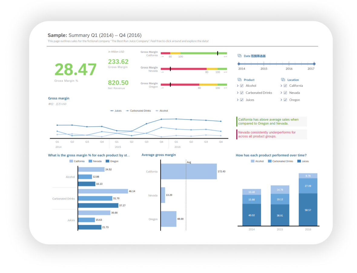 Figure 5 Reporting page
For human reading habits, there are two main patterns of listing information on the reporting page:
1. Important information on the left (top alignment)
2. Important information in the middle (top alignment)

Figure 6 Left-aligned layout
When the information is on the left side (top-aligned), we follow the book's reading style, arranging the information boxes from left to right, top to bottom, as shown in Figure 6, numbers 1-8 in order.
 Figure 7 Middle-aligned layout
When the main message is in the middle (top-aligned), the order of the messages is arranged around the main message, as in Figure 7.
Operation column layout

Figure 8 Operation bar
For panels that require interaction, we generally place the page to be manipulated on the right and align it at the top (Figure 8), which frees up the main information display area on the left and improves the experience for right-handed mouse users (and vice versa). It is also important to note that it is best to have the action bar flush (horizontally or vertically aligned) with the data bar being manipulated so that the operator can more easily notice the connection between the two.
After reading this article, I'm believe your guys have some idea of what "readability" means and how to arrange colors and information in a readable dashboard. Practice makes perfect, so I hope you could kindly apply what you've learned to your dashboard design.
For more information, please follow the SAP Analysis Cloud topic page (
SAP Analytics Cloud | SAP Community), post questions and answers (
All Questions in SAP Analytics Cloud | SAP Community) and read other posts on the topic
(SAP Analytics Cloud | SAP | SAP Blogs).
For more information on dashboard design, stay tuned to this channel and follow me, I'll see you next time.
By the way, this is my first blog posted on community, I look forward to your feedback and opinions in the comments, which are very important to me!
(All rights reserved for the images used in this blog. No part of this blog may be reproduced or transmitted in any form or for any purpose without the express permission of SAP SE or an SAP affiliate company.)
