
- SAP Community
- Products and Technology
- Technology
- Technology Blogs by SAP
- ***TEAM WDA***: Get your Web Dynpro applications r...
Technology Blogs by SAP
Learn how to extend and personalize SAP applications. Follow the SAP technology blog for insights into SAP BTP, ABAP, SAP Analytics Cloud, SAP HANA, and more.
Turn on suggestions
Auto-suggest helps you quickly narrow down your search results by suggesting possible matches as you type.
Showing results for
 Sabine_Kissner
Advisor
Options
- Subscribe to RSS Feed
- Mark as New
- Mark as Read
- Bookmark
- Subscribe
- Printer Friendly Page
- Report Inappropriate Content
11-25-2022
10:54 AM
Why is it important?
Your applications should be usable by ALL people – independent of their abilities. The WCAG standards from W3C specify how to achieve this goal. The Web Dynpro team together with the Unified Rendering team implemented this standard within the control library and the Web Dynpro framework. As application developer you can further improve your application to support that standard fully. This will be highlighted in this blog.
What has changed?
The new standard is based on ARIA attributes. These additional HTML attributes are added to each control. They describe the role of the control (eg. button, grid, list…), how to use it, how it is labelled or described. This information is always added and utilized by the screen reader.
The blind user can explore the UI in two modi:
- in reading focus, where the navigation is done via the cursor keys, each element is reached and read.
- in keyboard focus the user accesses only interactive elements via the tab key (even if the interaction is disabled). Elements supporting no actions like text views are not in the tab chain. The keyboard focus allows a quick execution of tasks.
Most of the attributes are automatically set by the control library and the Web Dynpro framework. But some of the attributes require semantic knowledge of the screen, which can only be provided by the application developer.
Precondition
Most of the features highlighted here are available not only in the current release but have been downported to SAP_UI 7.54. Check out note 2460246 for details.
Run your applications with accessibility standard ‘ARIA1.1’ (see note 3237473).
What can you do?
The WCAG requirements can be simplified to four essential principles – Web applications should be Perceivable, Operable, Understandable, and Robust (POUR principles). Demo application WDR_DEMO_ACC_RESPONSIVE (available with SAP_UI 7.56) is used for the illustration of examples.
Perceivable
Announce visible changes on the UI. Represent dependencies and hierarchies of controls not only visually. Provide text alternatives for any non-text content.
- Alerts - Invisible Messages
When a user works with the application, the screen can change, eg. fields become visible or vanish, tables show new data. For a blind person these changes must be announced.
For this you can raise alerts via the method
IF_WD_MESSAGE_MANAGER->REPORT_INVISIBLE_ALERT_MESSAGE( )
The screenshot shows the announcement by the screen reader for the number of hits in the value help:

Alert in Value Help Dialog
- ‘Described By’ dependencies
Use this for input fields with validation texts, eg. connect an input field for customer number with the textview for the customer name, or connect a button with a textview describing the function. The element and the assigned text are read together by the screen reader.
This can be defined for CL_WD_INPUT_FIELD, CL_WD_DROPDOWN_BY_KEY, CL_WD_DROPDOWN_BY_IDX, CL_WD_DROP_DOWN_LIST_BOX, CL_WD_BUTTON, CL_WD_TOOLBAR_BUTTON via method SET_DESCRIBED_BY.
- No text views instead of titles
To build a proper hierarchy use the titles and captions of structuring elements like element CL_WD_SECTION_HEADER for transparent container or property HEADER for a group. Never use text views as titles, since they are ignored for the hierarchy and not read in keyboard focus. - Ensure images/icons show tooltips
Though icons of the standard library have already standard tooltips, own icons have not. You need to set the tooltip explicitly.
Operable
Each interaction must be available via keyboard.
- Access Keys and Hotkeys
Access keys are now generally available via key Alt+<first letter in label or button> and announced. By pressing this key the focus is set to this element. The shortcut is depending on the operating system. You can find additional info in note 3059358. Define hotkeys for triggering important functions (use method SET_HOTKEY for supporting elements). - Message Area
All visible messages are additionally announced as aria alerts. The hotkey Ctrl+Shift+Alt+M is available to toggle from the current cursor position to the message area and back. - Keyboard support of control library
You can find the keyboard documentation for our controls in the online documentation.
Understandable
Presented information and operation of your application must be understandable.
- Use UI elements which are designed for the task
Each element has a role which is announced when the element is accessed. Ensure that you use the right element for your purpose, eg. use links for navigations and buttons for functions. If you have several checkboxes use a checkbox group, as there is an additional counter announced. More examples are explained in our FAQ note. - Keep the focus
Ensure that the focus is reset to the expected element after each roundtrip. You can achieve this with methods from IF_WD_VIEW or IV_WD_VIEW_CONTROLLER. - Provide labels/descriptions
Make sure labels and/or instructions (AccessibilityDescriptions) are provided to users whenever content requires user input, e.g. in forms. - No redundant texts
As for each tab several texts are concatenated, make sure that texts are not duplicated, eg. don’t provide a tooltip which is already announced as label, as both texts are read together. As the role of the element is already announced, don’t use the role name again in the tooltip or accessibility description.
- Announce empty cells in tables
If your table/cTable contains empty cells, they should be read as ‘EMPTY’. To achieve this,
you need to remove the cell editor in this cell. The procedure is described in the FAQ note.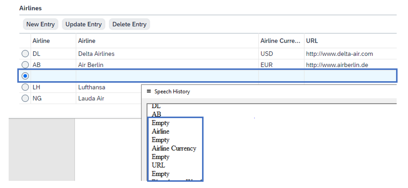
- Embed accessible graphics
Not all graphic UI elements are accessible. You need to replace graphics displayed via CL_WD_CHART or C_WD_BUSINESS_GRAPHICS by CL_WD_VIZFRAME. - Set landmarks
ARIA offers landmark roles to structure the page. The landmarks build a table of content for the blind user and enable a quick navigation. These roles can be set in different elements like, CL_WD_GROUPS, CL_WD_TRANSPARENT_CONTAINER. Some elements use a fix landmark role, like the message area.
This screenshot shows the landmarks visualized by a browser extension. This screenshot shows the landmarks, as they are read by the screen reader
Robust
Support different browser, browser sizes, devices, screen reader. Build responsive applications (without truncations) as your user might need a big zoom factor. Avoid an overall horizontal scrollbar.
- Choose responsive layouts
Re-design the layout of your application using responsive layouts like CL_WD_TILE_LAYOUT or CL_WD_FORM_LAYOUT_ADVANCED. Some ideas can be found in demo application WDR_DEMO_ACC_RESPONSIVE.
- Wrap texts and labels
Use the property WRAPPING in CL_WD_LABEL and CL_WD_TEXT_VIEW - Build toolbars with overflow and prioritized toolbar elements
Allow a toolbar overflow and define the sequence of toolbar elements moving into the overflow by the property ITEM_OVERFLOW_PRIORITY - Allow tables with own horizontal scrollbar
Ensure that the content in your table columns is not truncated. To avoid truncation you can allow a horizontal scrollbar for the table. You need to define fix widths for the columns (eg. in px). Set your table width to 100%. This feature is offered best as personalization setting.
One UI for all
In former releases blind user need to set an accessibility flag to request a special rendering of the application. An application developer could access this flag via IF_WD_APPLICATION->GET_IS_ACCESSIBLE and adapt the application, eg. replacing graphics by tables. With the new standard this special rendering is no longer necessary – the same rendering should fit all user. Check your application for accessibility specific rendering and remove it. Dependent on the shell (like FLP) the user has no longer the option to set such a flag.
Summary
Web Dynpro ABAP is accessible - with your support. Implementing the suggested improvements will be not only beneficial for people with low vision but for everyone. The usability of your application will be improved for ALL. Check out all recommendations in our FAQ note, which will be updated regularly.
- SAP Managed Tags:
- UI Floorplan Manager for Web Dynpro ABAP,
- UI Web Dynpro ABAP,
- Accessibility,
- User Interface
Labels:
You must be a registered user to add a comment. If you've already registered, sign in. Otherwise, register and sign in.
Labels in this area
-
ABAP CDS Views - CDC (Change Data Capture)
2 -
AI
1 -
Analyze Workload Data
1 -
BTP
1 -
Business and IT Integration
2 -
Business application stu
1 -
Business Technology Platform
1 -
Business Trends
1,661 -
Business Trends
88 -
CAP
1 -
cf
1 -
Cloud Foundry
1 -
Confluent
1 -
Customer COE Basics and Fundamentals
1 -
Customer COE Latest and Greatest
3 -
Customer Data Browser app
1 -
Data Analysis Tool
1 -
data migration
1 -
data transfer
1 -
Datasphere
2 -
Event Information
1,400 -
Event Information
64 -
Expert
1 -
Expert Insights
178 -
Expert Insights
281 -
General
1 -
Google cloud
1 -
Google Next'24
1 -
Kafka
1 -
Life at SAP
784 -
Life at SAP
11 -
Migrate your Data App
1 -
MTA
1 -
Network Performance Analysis
1 -
NodeJS
1 -
PDF
1 -
POC
1 -
Product Updates
4,577 -
Product Updates
330 -
Replication Flow
1 -
RisewithSAP
1 -
SAP BTP
1 -
SAP BTP Cloud Foundry
1 -
SAP Cloud ALM
1 -
SAP Cloud Application Programming Model
1 -
SAP Datasphere
2 -
SAP S4HANA Cloud
1 -
SAP S4HANA Migration Cockpit
1 -
Technology Updates
6,886 -
Technology Updates
408 -
Workload Fluctuations
1
Related Content
- 10+ ways to reshape your SAP landscape with SAP BTP - Blog 4 Interview in Technology Blogs by SAP
- 10+ ways to reshape your SAP landscape with SAP Business Technology Platform – Blog 4 in Technology Blogs by SAP
- SAP BTP SDK for Android 24.4.0 is now available in Technology Blogs by SAP
- SAP Build Code - Speed up your development with Generative AI Assistant - Joule in Technology Blogs by SAP
- What’s New in SAP Analytics Cloud Release 2024.07 in Technology Blogs by SAP
Top kudoed authors
| User | Count |
|---|---|
| 13 | |
| 10 | |
| 10 | |
| 8 | |
| 7 | |
| 6 | |
| 5 | |
| 5 | |
| 5 | |
| 4 |