
- SAP Community
- Products and Technology
- Technology
- Technology Blogs by Members
- On Responsible AI: SHAP of you
Technology Blogs by Members
Explore a vibrant mix of technical expertise, industry insights, and tech buzz in member blogs covering SAP products, technology, and events. Get in the mix!
Turn on suggestions
Auto-suggest helps you quickly narrow down your search results by suggesting possible matches as you type.
Showing results for
leojmfrancia
Explorer
Options
- Subscribe to RSS Feed
- Mark as New
- Mark as Read
- Bookmark
- Subscribe
- Printer Friendly Page
- Report Inappropriate Content
10-27-2022
12:42 AM
Interesting fact: SHAP (more on this below) and Ed Sheeran's "Shape of you" (needs no introduction) were both released in 2017.
An even more interesting fact: Christian Klein recently spoke about Responsible AI, emphasizing that while AI addresses the greatest challenges of our time like carbon footprint minimization and scaling of aid, we need to ensure that it is used in a fair, transparent, and compliant way. You can find more details on SAP's Global AI Ethics Policy here.
This blog might be interesting to you if:
Explainable AI can be defined as being able to understand the predictions made by AI. A sample case is being able to see why a predictive model has assessed that a group of students will most likely fail the school year based on assessments of school work, attendance, background, etc. Responsible AI, on the other hand, is identifying what could go wrong early in the design phase, i.e. a premortem. Back to the student example, the initial use case can cause discrimination or even worsen the situation for the student; the use case can be changed into an automated creation of study materials or activities that students may consider to improve their grades. Explainable AI can also be responsible AI when values such as sustainability and human-centric design are considered early in the process.
There are tools that provide explainable AI, with SHAP (SHapley Additive exPlanations) being one of the approaches in identifying correlations/explanations on outcomes of predictions. With SHAP, think about each output of a prediction as a game with variables (e.g. duration, quantity, frequency, etc.) as the players. The SHAP output for an observation shows which players made the most impact on the game result (e.g. in a positive or negative in a binary classification).
An example of a SHAP plot can be seen below on customer churn, i.e. if a customer will discontinue their phone plans (image credit: Yifei Huang). You can click on the image to enlarge the text. In summary, the SHAP plot shows:
There are great SAP Blogs that talk about SHAP in technical detail (see section 3). The remainder of this blog talks about the implications of using SHAP and our responsibility to build on top of it to provide the best outcome to our customers and achieve responsible AI.
So how does SHAP help in achieving responsible AI?
When I was working on a customer churn business problem for a global business, one of the initial models we created had country and region as the variables. We anticipated that this would be an issue; as anecdotally, we have observed that one region showed high churn rates. With our suspicions backed by our testing, we removed variables such as country and region as these are areas that we cannot take action on. The model was heavily biased to predict engagements associated with a certain country or region as churning. Instead, we focused on areas such as service availability, ticket resolution times, utilization of products, etc.
SHAP helped us identify the variables that were resulting in biases in the predictive model; i.e. areas that neither customer nor the service provider can take action on.
I have discussed understanding and evaluating SAP AI/ML tools in my previous blog posts. Let us now deep-dive into how each of the tools provides explainable AI, specifically via SHAP.
SHAP is accessible via libraries in SAP AI/ML tools. There are a few ways you can access this as described in the blog posts below:
As seen in reports such as this from Forbes, dependency on AI alone, without human judgment can result in negative impacts in areas such as Diversity, Equity, and Inclusion (DEI). We also need to take caution with the fact that tools such as SHAP provide insight into correlations, not causation.
To better understand the causation of the variables involved, consider performing appropriate causal experiments. These experiments take time but it is inappropriate to make important decisions using correlation results alone.
For example, the SHAP correlations of a certain model show that faster ticket resolution times may cause better customer retention even if current resolution times meet Service Level Agreements (SLAs) >99% of the time. We want to be sure that in the real world, faster ticket resolution times can indeed help retain customers.
An A/B Test on customers up for renewal in the next 2 quarters can be performed in this case. This type of test splits the customers identified into mutually exclusive groups to establish causality. In the example below, assume we are improving the resolution times to be half the current average:
If after applying the action to prevent churn, i.e. improving ticket resolution times, we get the following:
This shows that the action, i.e. improving ticket resolution times, reduces the churn by 50% in groups that have been identified to churn, i.e. Groups A and B. Improving resolution times for customers predicted to not churn made no difference, i.e. Groups C and D. This establishes the causality of improved ticket response times to reducing customer churn and opens up for more analyses that can be done for Groups C and D to identify what are other causes for not churning.
In the sample scenario, it is not sustainable to improve existing >99% SLA-compliant ticket resolution times to be half of the current average across the global business; but one may think about doing that using the SHAP output alone. Instead, adding more capacity to improve ticket resolution times only to customers identified to churn 2 quarters before their renewal will focus efforts and will be a more responsible approach.
This is a simplistic scenario to emphasize that explainability is not only about the SHAP output. The setup is also shown in the diagram below.
I hope this blog has given a view and concrete examples of using responsible and explainable AI, specifically in the SAP context. Understanding correlations is just the start of the journey in providing explainable AI. Identifying causation is not only rewarding but can also drive business value through AI.
There are other explainable AI tools such as LIME. Do share your views and experiences in using explainable AI in the comments section. If you have questions or suggestions - I would appreciate it if you can post them as well.
Do follow my profile, leojmfrancia, for upcoming posts on Data Science, AI, and ML.
Invariably stochastically yours,
Leo
An even more interesting fact: Christian Klein recently spoke about Responsible AI, emphasizing that while AI addresses the greatest challenges of our time like carbon footprint minimization and scaling of aid, we need to ensure that it is used in a fair, transparent, and compliant way. You can find more details on SAP's Global AI Ethics Policy here.
This blog might be interesting to you if:
- You want to read more about responsible AI, and how it can be delivered through explainable AI
- You would like to see some examples and watch-outs in using explainable AI, specifically SHAP (more on this below)
- Most importantly, you are curious how you can use and extend SHAP explanations in enterprise use cases
1. Explainability Explained
Explainable AI can be defined as being able to understand the predictions made by AI. A sample case is being able to see why a predictive model has assessed that a group of students will most likely fail the school year based on assessments of school work, attendance, background, etc. Responsible AI, on the other hand, is identifying what could go wrong early in the design phase, i.e. a premortem. Back to the student example, the initial use case can cause discrimination or even worsen the situation for the student; the use case can be changed into an automated creation of study materials or activities that students may consider to improve their grades. Explainable AI can also be responsible AI when values such as sustainability and human-centric design are considered early in the process.
There are tools that provide explainable AI, with SHAP (SHapley Additive exPlanations) being one of the approaches in identifying correlations/explanations on outcomes of predictions. With SHAP, think about each output of a prediction as a game with variables (e.g. duration, quantity, frequency, etc.) as the players. The SHAP output for an observation shows which players made the most impact on the game result (e.g. in a positive or negative in a binary classification).
An example of a SHAP plot can be seen below on customer churn, i.e. if a customer will discontinue their phone plans (image credit: Yifei Huang). You can click on the image to enlarge the text. In summary, the SHAP plot shows:
- Scaled values (0 as lowest, 1 as highest) of the variables in the dataset, i.e. pink for high and blue for low. For example, if total_day_charge has 100 as the highest, it will be plotted as a pink dot in and if the lowest value is 1, it will be plotted as a blue dot. Values in-between will follow the color gradient shown on the right
- Variable values that influence churn, by looking at the dots on the positive X-axis (on the right)
- Variable values that influence not churning, by looking at the dots on the negative X-axis (on the left)
- As an example, high values of total_day_charge (pink dots) are correlated to customer churn (plotted on the right, positive X-axis)

Sample SHAP plot
There are great SAP Blogs that talk about SHAP in technical detail (see section 3). The remainder of this blog talks about the implications of using SHAP and our responsibility to build on top of it to provide the best outcome to our customers and achieve responsible AI.
So how does SHAP help in achieving responsible AI?
2. Explainability Encountered
When I was working on a customer churn business problem for a global business, one of the initial models we created had country and region as the variables. We anticipated that this would be an issue; as anecdotally, we have observed that one region showed high churn rates. With our suspicions backed by our testing, we removed variables such as country and region as these are areas that we cannot take action on. The model was heavily biased to predict engagements associated with a certain country or region as churning. Instead, we focused on areas such as service availability, ticket resolution times, utilization of products, etc.
SHAP helped us identify the variables that were resulting in biases in the predictive model; i.e. areas that neither customer nor the service provider can take action on.
3. Explainability Enumerated
I have discussed understanding and evaluating SAP AI/ML tools in my previous blog posts. Let us now deep-dive into how each of the tools provides explainable AI, specifically via SHAP.
SHAP is accessible via libraries in SAP AI/ML tools. There are a few ways you can access this as described in the blog posts below:
| Tool / Solution | Blog Article | Author |
| HANA APL, also applicable in SAP Data Intelligence | SHAP-explained models with APL Hands-On Tutorial: APL in SAP HANA Cloud On Machine Learning Without Location Data | marc.daniau andreas.forster mathias.kemeter |
| SAP Analytics Cloud (SAC) | Explanations For Classification Models in SAC Explanations for Regression Models in SAC SAP分析云中分类预测模型的预测解读 (in Chinese) | david.serre david.serre hzy5765 |
4. Explainability Extended
As seen in reports such as this from Forbes, dependency on AI alone, without human judgment can result in negative impacts in areas such as Diversity, Equity, and Inclusion (DEI). We also need to take caution with the fact that tools such as SHAP provide insight into correlations, not causation.
To better understand the causation of the variables involved, consider performing appropriate causal experiments. These experiments take time but it is inappropriate to make important decisions using correlation results alone.
For example, the SHAP correlations of a certain model show that faster ticket resolution times may cause better customer retention even if current resolution times meet Service Level Agreements (SLAs) >99% of the time. We want to be sure that in the real world, faster ticket resolution times can indeed help retain customers.
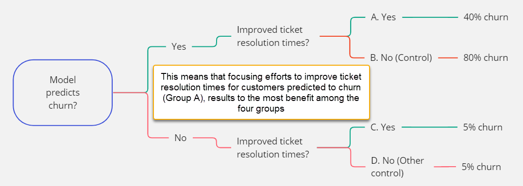
An A/B Test on customers up for renewal in the next 2 quarters can be performed in this case. This type of test splits the customers identified into mutually exclusive groups to establish causality. In the example below, assume we are improving the resolution times to be half the current average:
- Group A is predicted to churn, with intervention to improve ticket resolution times
- Group B is predicted to churn, with no intervention to improve ticket resolution times
- Group C is predicted to not churn, with intervention to improve ticket resolution times
- Group D is predicted to not churn, with no intervention to improve ticket resolution times
If after applying the action to prevent churn, i.e. improving ticket resolution times, we get the following:
- Group A has a 40% churn after 2 quarters
- Group B has an 80% churn after 2 quarters
- Group C has a 5% churn after 2 quarters
- Group D has a 5% churn after 2 quarters
This shows that the action, i.e. improving ticket resolution times, reduces the churn by 50% in groups that have been identified to churn, i.e. Groups A and B. Improving resolution times for customers predicted to not churn made no difference, i.e. Groups C and D. This establishes the causality of improved ticket response times to reducing customer churn and opens up for more analyses that can be done for Groups C and D to identify what are other causes for not churning.
In the sample scenario, it is not sustainable to improve existing >99% SLA-compliant ticket resolution times to be half of the current average across the global business; but one may think about doing that using the SHAP output alone. Instead, adding more capacity to improve ticket resolution times only to customers identified to churn 2 quarters before their renewal will focus efforts and will be a more responsible approach.
This is a simplistic scenario to emphasize that explainability is not only about the SHAP output. The setup is also shown in the diagram below.
Sample experiment design to establish causality
Wrapping up
I hope this blog has given a view and concrete examples of using responsible and explainable AI, specifically in the SAP context. Understanding correlations is just the start of the journey in providing explainable AI. Identifying causation is not only rewarding but can also drive business value through AI.
There are other explainable AI tools such as LIME. Do share your views and experiences in using explainable AI in the comments section. If you have questions or suggestions - I would appreciate it if you can post them as well.
Do follow my profile, leojmfrancia, for upcoming posts on Data Science, AI, and ML.
Invariably stochastically yours,
Leo
- SAP Managed Tags:
- Machine Learning,
- SAP Analytics Cloud,
- SAP Data Intelligence,
- SAP HANA Cloud,
- Artificial Intelligence,
- SAP AI Core,
- SAP HANA
4 Comments
You must be a registered user to add a comment. If you've already registered, sign in. Otherwise, register and sign in.
Labels in this area
-
"automatische backups"
1 -
"regelmäßige sicherung"
1 -
"TypeScript" "Development" "FeedBack"
1 -
505 Technology Updates 53
1 -
ABAP
14 -
ABAP API
1 -
ABAP CDS Views
2 -
ABAP CDS Views - BW Extraction
1 -
ABAP CDS Views - CDC (Change Data Capture)
1 -
ABAP class
2 -
ABAP Cloud
2 -
ABAP Development
5 -
ABAP in Eclipse
1 -
ABAP Platform Trial
1 -
ABAP Programming
2 -
abap technical
1 -
absl
2 -
access data from SAP Datasphere directly from Snowflake
1 -
Access data from SAP datasphere to Qliksense
1 -
Accrual
1 -
action
1 -
adapter modules
1 -
Addon
1 -
Adobe Document Services
1 -
ADS
1 -
ADS Config
1 -
ADS with ABAP
1 -
ADS with Java
1 -
ADT
2 -
Advance Shipping and Receiving
1 -
Advanced Event Mesh
3 -
AEM
1 -
AI
7 -
AI Launchpad
1 -
AI Projects
1 -
AIML
9 -
Alert in Sap analytical cloud
1 -
Amazon S3
1 -
Analytical Dataset
1 -
Analytical Model
1 -
Analytics
1 -
Analyze Workload Data
1 -
annotations
1 -
API
1 -
API and Integration
3 -
API Call
2 -
Application Architecture
1 -
Application Development
5 -
Application Development for SAP HANA Cloud
3 -
Applications and Business Processes (AP)
1 -
Artificial Intelligence
1 -
Artificial Intelligence (AI)
5 -
Artificial Intelligence (AI) 1 Business Trends 363 Business Trends 8 Digital Transformation with Cloud ERP (DT) 1 Event Information 462 Event Information 15 Expert Insights 114 Expert Insights 76 Life at SAP 418 Life at SAP 1 Product Updates 4
1 -
Artificial Intelligence (AI) blockchain Data & Analytics
1 -
Artificial Intelligence (AI) blockchain Data & Analytics Intelligent Enterprise
1 -
Artificial Intelligence (AI) blockchain Data & Analytics Intelligent Enterprise Oil Gas IoT Exploration Production
1 -
Artificial Intelligence (AI) blockchain Data & Analytics Intelligent Enterprise sustainability responsibility esg social compliance cybersecurity risk
1 -
ASE
1 -
ASR
2 -
ASUG
1 -
Attachments
1 -
Authorisations
1 -
Automating Processes
1 -
Automation
2 -
aws
2 -
Azure
1 -
Azure AI Studio
1 -
B2B Integration
1 -
Backorder Processing
1 -
Backup
1 -
Backup and Recovery
1 -
Backup schedule
1 -
BADI_MATERIAL_CHECK error message
1 -
Bank
1 -
BAS
1 -
basis
2 -
Basis Monitoring & Tcodes with Key notes
2 -
Batch Management
1 -
BDC
1 -
Best Practice
1 -
bitcoin
1 -
Blockchain
3 -
bodl
1 -
BOP in aATP
1 -
BOP Segments
1 -
BOP Strategies
1 -
BOP Variant
1 -
BPC
1 -
BPC LIVE
1 -
BTP
12 -
BTP Destination
2 -
Business AI
1 -
Business and IT Integration
1 -
Business application stu
1 -
Business Application Studio
1 -
Business Architecture
1 -
Business Communication Services
1 -
Business Continuity
1 -
Business Data Fabric
3 -
Business Partner
12 -
Business Partner Master Data
10 -
Business Technology Platform
2 -
Business Trends
1 -
CA
1 -
calculation view
1 -
CAP
3 -
Capgemini
1 -
CAPM
1 -
Catalyst for Efficiency: Revolutionizing SAP Integration Suite with Artificial Intelligence (AI) and
1 -
CCMS
2 -
CDQ
12 -
CDS
2 -
Cental Finance
1 -
Certificates
1 -
CFL
1 -
Change Management
1 -
chatbot
1 -
chatgpt
3 -
CL_SALV_TABLE
2 -
Class Runner
1 -
Classrunner
1 -
Cloud ALM Monitoring
1 -
Cloud ALM Operations
1 -
cloud connector
1 -
Cloud Extensibility
1 -
Cloud Foundry
4 -
Cloud Integration
6 -
Cloud Platform Integration
2 -
cloudalm
1 -
communication
1 -
Compensation Information Management
1 -
Compensation Management
1 -
Compliance
1 -
Compound Employee API
1 -
Configuration
1 -
Connectors
1 -
Consolidation Extension for SAP Analytics Cloud
1 -
Control Indicators.
1 -
Controller-Service-Repository pattern
1 -
Conversion
1 -
Cosine similarity
1 -
cryptocurrency
1 -
CSI
1 -
ctms
1 -
Custom chatbot
3 -
Custom Destination Service
1 -
custom fields
1 -
Customer Experience
1 -
Customer Journey
1 -
Customizing
1 -
cyber security
3 -
Data
1 -
Data & Analytics
1 -
Data Aging
1 -
Data Analytics
2 -
Data and Analytics (DA)
1 -
Data Archiving
1 -
Data Back-up
1 -
Data Governance
5 -
Data Integration
2 -
Data Quality
12 -
Data Quality Management
12 -
Data Synchronization
1 -
data transfer
1 -
Data Unleashed
1 -
Data Value
8 -
database tables
1 -
Datasphere
2 -
datenbanksicherung
1 -
dba cockpit
1 -
dbacockpit
1 -
Debugging
2 -
Delimiting Pay Components
1 -
Delta Integrations
1 -
Destination
3 -
Destination Service
1 -
Developer extensibility
1 -
Developing with SAP Integration Suite
1 -
Devops
1 -
digital transformation
1 -
Documentation
1 -
Dot Product
1 -
DQM
1 -
dump database
1 -
dump transaction
1 -
e-Invoice
1 -
E4H Conversion
1 -
Eclipse ADT ABAP Development Tools
2 -
edoc
1 -
edocument
1 -
ELA
1 -
Embedded Consolidation
1 -
Embedding
1 -
Embeddings
1 -
Employee Central
1 -
Employee Central Payroll
1 -
Employee Central Time Off
1 -
Employee Information
1 -
Employee Rehires
1 -
Enable Now
1 -
Enable now manager
1 -
endpoint
1 -
Enhancement Request
1 -
Enterprise Architecture
1 -
ETL Business Analytics with SAP Signavio
1 -
Euclidean distance
1 -
Event Dates
1 -
Event Driven Architecture
1 -
Event Mesh
2 -
Event Reason
1 -
EventBasedIntegration
1 -
EWM
1 -
EWM Outbound configuration
1 -
EWM-TM-Integration
1 -
Existing Event Changes
1 -
Expand
1 -
Expert
2 -
Expert Insights
1 -
Fiori
14 -
Fiori Elements
2 -
Fiori SAPUI5
12 -
Flask
1 -
Full Stack
8 -
Funds Management
1 -
General
1 -
Generative AI
1 -
Getting Started
1 -
GitHub
8 -
Grants Management
1 -
groovy
1 -
GTP
1 -
HANA
6 -
HANA Cloud
2 -
Hana Cloud Database Integration
2 -
HANA DB
2 -
HANA XS Advanced
1 -
Historical Events
1 -
home labs
1 -
HowTo
1 -
HR Data Management
1 -
html5
8 -
HTML5 Application
1 -
Identity cards validation
1 -
idm
1 -
Implementation
1 -
input parameter
1 -
instant payments
1 -
Integration
3 -
Integration Advisor
1 -
Integration Architecture
1 -
Integration Center
1 -
Integration Suite
1 -
intelligent enterprise
1 -
iot
1 -
Java
1 -
job
1 -
Job Information Changes
1 -
Job-Related Events
1 -
Job_Event_Information
1 -
joule
4 -
Journal Entries
1 -
Just Ask
1 -
Kerberos for ABAP
8 -
Kerberos for JAVA
8 -
KNN
1 -
Launch Wizard
1 -
learning content
2 -
Life at SAP
1 -
lightning
1 -
Linear Regression SAP HANA Cloud
1 -
local tax regulations
1 -
LP
1 -
Machine Learning
2 -
Marketing
1 -
Master Data
3 -
Master Data Management
14 -
Maxdb
2 -
MDG
1 -
MDGM
1 -
MDM
1 -
Message box.
1 -
Messages on RF Device
1 -
Microservices Architecture
1 -
Microsoft Universal Print
1 -
Middleware Solutions
1 -
Migration
5 -
ML Model Development
1 -
Modeling in SAP HANA Cloud
8 -
Monitoring
3 -
MTA
1 -
Multi-Record Scenarios
1 -
Multiple Event Triggers
1 -
Neo
1 -
New Event Creation
1 -
New Feature
1 -
Newcomer
1 -
NodeJS
2 -
ODATA
2 -
OData APIs
1 -
odatav2
1 -
ODATAV4
1 -
ODBC
1 -
ODBC Connection
1 -
Onpremise
1 -
open source
2 -
OpenAI API
1 -
Oracle
1 -
PaPM
1 -
PaPM Dynamic Data Copy through Writer function
1 -
PaPM Remote Call
1 -
PAS-C01
1 -
Pay Component Management
1 -
PGP
1 -
Pickle
1 -
PLANNING ARCHITECTURE
1 -
Popup in Sap analytical cloud
1 -
PostgrSQL
1 -
POSTMAN
1 -
Process Automation
2 -
Product Updates
4 -
PSM
1 -
Public Cloud
1 -
Python
4 -
Qlik
1 -
Qualtrics
1 -
RAP
3 -
RAP BO
2 -
Record Deletion
1 -
Recovery
1 -
recurring payments
1 -
redeply
1 -
Release
1 -
Remote Consumption Model
1 -
Replication Flows
1 -
research
1 -
Resilience
1 -
REST
1 -
REST API
1 -
Retagging Required
1 -
Risk
1 -
Rolling Kernel Switch
1 -
route
1 -
rules
1 -
S4 HANA
1 -
S4 HANA Cloud
1 -
S4 HANA On-Premise
1 -
S4HANA
3 -
S4HANA_OP_2023
2 -
SAC
10 -
SAC PLANNING
9 -
SAP
4 -
SAP ABAP
1 -
SAP Advanced Event Mesh
1 -
SAP AI Core
8 -
SAP AI Launchpad
8 -
SAP Analytic Cloud Compass
1 -
Sap Analytical Cloud
1 -
SAP Analytics Cloud
4 -
SAP Analytics Cloud for Consolidation
2 -
SAP Analytics Cloud Story
1 -
SAP analytics clouds
1 -
SAP BAS
1 -
SAP Basis
6 -
SAP BODS
1 -
SAP BODS certification.
1 -
SAP BTP
21 -
SAP BTP Build Work Zone
2 -
SAP BTP Cloud Foundry
6 -
SAP BTP Costing
1 -
SAP BTP CTMS
1 -
SAP BTP Innovation
1 -
SAP BTP Migration Tool
1 -
SAP BTP SDK IOS
1 -
SAP Build
11 -
SAP Build App
1 -
SAP Build apps
1 -
SAP Build CodeJam
1 -
SAP Build Process Automation
3 -
SAP Build work zone
10 -
SAP Business Objects Platform
1 -
SAP Business Technology
2 -
SAP Business Technology Platform (XP)
1 -
sap bw
1 -
SAP CAP
2 -
SAP CDC
1 -
SAP CDP
1 -
SAP CDS VIEW
1 -
SAP Certification
1 -
SAP Cloud ALM
4 -
SAP Cloud Application Programming Model
1 -
SAP Cloud Integration for Data Services
1 -
SAP cloud platform
8 -
SAP Companion
1 -
SAP CPI
3 -
SAP CPI (Cloud Platform Integration)
2 -
SAP CPI Discover tab
1 -
sap credential store
1 -
SAP Customer Data Cloud
1 -
SAP Customer Data Platform
1 -
SAP Data Intelligence
1 -
SAP Data Migration in Retail Industry
1 -
SAP Data Services
1 -
SAP DATABASE
1 -
SAP Dataspher to Non SAP BI tools
1 -
SAP Datasphere
9 -
SAP DRC
1 -
SAP EWM
1 -
SAP Fiori
2 -
SAP Fiori App Embedding
1 -
Sap Fiori Extension Project Using BAS
1 -
SAP GRC
1 -
SAP HANA
1 -
SAP HCM (Human Capital Management)
1 -
SAP HR Solutions
1 -
SAP IDM
1 -
SAP Integration Suite
9 -
SAP Integrations
4 -
SAP iRPA
2 -
SAP Learning Class
1 -
SAP Learning Hub
1 -
SAP Odata
2 -
SAP on Azure
1 -
SAP PartnerEdge
1 -
sap partners
1 -
SAP Password Reset
1 -
SAP PO Migration
1 -
SAP Prepackaged Content
1 -
SAP Process Automation
2 -
SAP Process Integration
2 -
SAP Process Orchestration
1 -
SAP S4HANA
2 -
SAP S4HANA Cloud
1 -
SAP S4HANA Cloud for Finance
1 -
SAP S4HANA Cloud private edition
1 -
SAP Sandbox
1 -
SAP STMS
1 -
SAP successfactors
3 -
SAP SuccessFactors HXM Core
1 -
SAP Time
1 -
SAP TM
2 -
SAP Trading Partner Management
1 -
SAP UI5
1 -
SAP Upgrade
1 -
SAP Utilities
1 -
SAP-GUI
8 -
SAP_COM_0276
1 -
SAPBTP
1 -
SAPCPI
1 -
SAPEWM
1 -
sapmentors
1 -
saponaws
2 -
SAPS4HANA
1 -
SAPUI5
4 -
schedule
1 -
Secure Login Client Setup
8 -
security
9 -
Selenium Testing
1 -
SEN
1 -
SEN Manager
1 -
service
1 -
SET_CELL_TYPE
1 -
SET_CELL_TYPE_COLUMN
1 -
SFTP scenario
2 -
Simplex
1 -
Single Sign On
8 -
Singlesource
1 -
SKLearn
1 -
soap
1 -
Software Development
1 -
SOLMAN
1 -
solman 7.2
2 -
Solution Manager
3 -
sp_dumpdb
1 -
sp_dumptrans
1 -
SQL
1 -
sql script
1 -
SSL
8 -
SSO
8 -
Substring function
1 -
SuccessFactors
1 -
SuccessFactors Platform
1 -
SuccessFactors Time Tracking
1 -
Sybase
1 -
system copy method
1 -
System owner
1 -
Table splitting
1 -
Tax Integration
1 -
Technical article
1 -
Technical articles
1 -
Technology Updates
1 -
Technology Updates
1 -
Technology_Updates
1 -
terraform
1 -
Threats
1 -
Time Collectors
1 -
Time Off
2 -
Time Sheet
1 -
Time Sheet SAP SuccessFactors Time Tracking
1 -
Tips and tricks
2 -
toggle button
1 -
Tools
1 -
Trainings & Certifications
1 -
Transport in SAP BODS
1 -
Transport Management
1 -
TypeScript
2 -
ui designer
1 -
unbind
1 -
Unified Customer Profile
1 -
UPB
1 -
Use of Parameters for Data Copy in PaPM
1 -
User Unlock
1 -
VA02
1 -
Validations
1 -
Vector Database
2 -
Vector Engine
1 -
Visual Studio Code
1 -
VSCode
1 -
Web SDK
1 -
work zone
1 -
workload
1 -
xsa
1 -
XSA Refresh
1
- « Previous
- Next »
Related Content
- SAP CAP: Controller - Service - Repository architecture in Technology Blogs by Members
- Getting Response from GSP but that is not getting converted/consumed to SAP System in Technology Q&A
- Analyze Expensive ABAP Workload in the Cloud with Work Process Sampling in Technology Blogs by SAP
- 10+ ways to reshape your SAP landscape with SAP Business Technology Platform – Blog 4 in Technology Blogs by SAP
- SAP Workflow Management - OData response headers in Technology Q&A
Top kudoed authors
| User | Count |
|---|---|
| 12 | |
| 11 | |
| 7 | |
| 5 | |
| 5 | |
| 4 | |
| 4 | |
| 3 | |
| 3 | |
| 3 |