
- SAP Community
- Products and Technology
- Technology
- Technology Blogs by SAP
- Uplift Modeling with APL Gradient Boosting
Technology Blogs by SAP
Learn how to extend and personalize SAP applications. Follow the SAP technology blog for insights into SAP BTP, ABAP, SAP Analytics Cloud, SAP HANA, and more.
Turn on suggestions
Auto-suggest helps you quickly narrow down your search results by suggesting possible matches as you type.
Showing results for
Advisor
Options
- Subscribe to RSS Feed
- Mark as New
- Mark as Read
- Bookmark
- Subscribe
- Printer Friendly Page
- Report Inappropriate Content
10-05-2022
4:50 PM
Marketing campaigns need to be relevant for the recipient, and worthwhile for the sender. It is not worth sending a promotional offer about a product or service if you know that your customer will buy it anyway. It is not worth calling a subscriber to persuade him to maintain his subscription if you know he will stay or leave regardless of being contacted. Marketers must identify which customers their upsell or retention campaign can influence positively. Uplift modeling provides them a solution to do just that.
Uplift modeling is a generic technique to predict how individuals will respond to an action or a treatment. The dataset must contain a group of treated individuals, plus a control group with non-treated individuals. In this blog we will cover two uplift methods: S-Learner and Y star transform. Both methods require building only one predictive model. We will walk you through an example to estimate a treatment effect with the APL Gradient Boosting algorithm in Python.
This blog leverages work done by my colleague Yann LE BIANNIC from SAP Labs and his student intern Jonathan DAO. A big thank-you to them.
Kevin Hillstrom made available a dataset of 64000 customers who last purchased within twelve months. These customers were involved in two e-mail campaigns. We want here to apply uplift modeling on one of these campaigns.
Let’s start by a few data preparation steps.
We expect the dataset when prepared to have three special columns:
We need to turn the Hillstrom bunch object ...
into a Pandas dataframe.
Visit will be our target column. Visit equals to 1 when the customer visited the company website in the last two weeks, and 0 otherwise.
We delete all the rows related to the treatment: Men’s E-Mail.
Two values are left:
A treatment flag is added ...
and redundant columns are removed.
We create an SAP HANA dataframe from the Pandas dataframe.
The Hillstrom dataset happens not to have a primary key. We add one.
We check the distribution of the treatment flag.
The two distinct values are distributed roughly half-half, but a balanced distribution is not mandatory for the S-Learner method, nor for the Y star transform method.
It is time to split the data into Training and Test. We use the stratified partition method to preserve the treatment distribution.
We persist the two partitions as tables in the database ...
so that these tables can be used later in a separate notebook as follows:
We can now get to the heart of the matter.
Our target “visit” is a 0/1 outcome, therefore we will use a binary classification. We train an APL Gradient Boosting model on the dataset that includes the two groups: treated individuals and non-treated individuals.
We display the variables ranked by their importance (aka contribution).
The variable “treated” at rank 2 contributes to predict the customer visit, but to know whether customers react to the treatment, and if so, if they react favorably or unfavorably, we need to estimate the uplift value.
This first phase to get our model trained is somehow very ordinary. The unconventional part starts now with the prediction phase. In the S-Learner method, the classification model must be applied twice.
We predict a first time using unseen data (our test dataset) with the treatment flag forced to 1.
We predict a second time using the same individuals but with the treatment flag forced to 0.
The uplift is estimated by calculating:
When the APL prediction is 0, we must transform the probability by doing: 1 - Probability
The uplift can be plotted as an Area Under the Uplift Curve.
By only targeting the first half of the population (4000 customers who are the most likely to visit the website because of the campaign e-mail they received) we reach near the maximum uplift.
The Y star method consists of transforming the target so that the gradient boosting model directly predicts the uplift. Here is the transformation:
For our Hillstrom case, Y is the visit column and W the treated column. As for p, it is the proportion of treated individuals. When the distribution of the treated column is half and half (p=0.5), the Y star transform gives the following results:
With that method we must build a regression model where Y* is the variable to predict.
First, we add the proportion column to our training dataframe.
Then we add the Y* column.
We check its values on different pairs (visit, treated).
We fit the training data with the APL Gradient Boosting regressor. The treatment flag is removed from the features list because this information is now included in the y_star variable.
Using the same code snippet from the previous section we display the variables contribution.
The Y* star model shows different contributions simply because it predicts uplift, not visit. The most important variable by far (67%) is a flag telling if the customer purchased women's merchandise in the past year. Remember the treatment, it is a campaign for women.
Newbie, a feature indicating if the customer was acquired in the past twelve months, shows as the least important variable to predict uplift, while it is the most important to predict the customer visit according to the S-Learner model.
The prediction phase is straightforward.
Here is the area curve.
The AUC value here is the same AUC value we saw previously in the S-Learner uplift curve. The results from the two uplift modeling methods are equivalent in the case of the Hillstrom dataset.
You may want to try these two methods on your own dataset and compare their AUC values. If they are equivalent, the Y* model is preferable since it directly provides the SHAP explanations (global and local) on the uplift.
To know more about APL SHAP explanations
Uplift modeling is a generic technique to predict how individuals will respond to an action or a treatment. The dataset must contain a group of treated individuals, plus a control group with non-treated individuals. In this blog we will cover two uplift methods: S-Learner and Y star transform. Both methods require building only one predictive model. We will walk you through an example to estimate a treatment effect with the APL Gradient Boosting algorithm in Python.
This blog leverages work done by my colleague Yann LE BIANNIC from SAP Labs and his student intern Jonathan DAO. A big thank-you to them.
Preparing the Training and Test datasets
Kevin Hillstrom made available a dataset of 64000 customers who last purchased within twelve months. These customers were involved in two e-mail campaigns. We want here to apply uplift modeling on one of these campaigns.
Let’s start by a few data preparation steps.
We expect the dataset when prepared to have three special columns:
key_col = 'id'

target_col = 'visit'

treatment_flag = 'treated'
We need to turn the Hillstrom bunch object ...
from sklift.datasets import fetch_hillstrom

bunch_local = fetch_hillstrom()
into a Pandas dataframe.
import pandas as pd

df_local = pd.DataFrame(data = bunch_local.data)

df_local['treatment'] = bunch_local.treatment

df_local[target_col] = bunch_local.target

df_local.head(6)
Visit will be our target column. Visit equals to 1 when the customer visited the company website in the last two weeks, and 0 otherwise.
We delete all the rows related to the treatment: Men’s E-Mail.
df_local.drop(df_local[df_local.treatment == 'Mens E-Mail'].index, inplace=True)Two values are left:
- Women’s E-Mail (the treated group)
- No E-Mail (the control group).
A treatment flag is added ...
import numpy as np

df_local['treated'] = np.where(df_local['treatment'] == 'No E-Mail', 0, 1)
and redundant columns are removed.
df_local.drop('history_segment', axis=1, inplace=True)

df_local.drop('treatment', axis=1, inplace=True)

df_local.head(6)
We create an SAP HANA dataframe from the Pandas dataframe.
from hana_ml import dataframe as hd

conn = hd.ConnectionContext(userkey='MYHANACLOUD')


df_remote = hd.create_dataframe_from_pandas(connection_context=conn,

                pandas_df= df_local,

                table_name='HILLSTROM_VISITS',

                force=True,

                drop_exist_tab=True,

                replace=False)
The Hillstrom dataset happens not to have a primary key. We add one.
df_remote = df_remote.add_id(id_col= key_col)We check the distribution of the treatment flag.
df_remote.agg([('count', 'treated', 'rows')], group_by='treated').collect()
The two distinct values are distributed roughly half-half, but a balanced distribution is not mandatory for the S-Learner method, nor for the Y star transform method.
It is time to split the data into Training and Test. We use the stratified partition method to preserve the treatment distribution.
from hana_ml.algorithms.pal.partition import train_test_val_split

hdf_train, hdf_test, hdf_valid = train_test_val_split(

training_percentage= 0.8, testing_percentage= 0.2, validation_percentage= 0,

id_column= key_col, partition_method= 'stratified', stratified_column= treatment_flag, data= df_remote )
We persist the two partitions as tables in the database ...
hdf_train.save(('HILLSTROM_TRAIN'), force = True)

hdf_test.save(('HILLSTROM_TEST'), force = True)
so that these tables can be used later in a separate notebook as follows:
sql_cmd = 'select * from HILLSTROM_TRAIN order by 1'

hdf_train = hd.DataFrame(conn, sql_cmd)


sql_cmd = 'select * from HILLSTROM_TEST order by 1'

hdf_test  = hd.DataFrame(conn, sql_cmd)
We can now get to the heart of the matter.
S-Learner
Our target “visit” is a 0/1 outcome, therefore we will use a binary classification. We train an APL Gradient Boosting model on the dataset that includes the two groups: treated individuals and non-treated individuals.
predictors_col = hdf_train.columns

predictors_col.remove(key_col)

predictors_col.remove(target_col)


from hana_ml.algorithms.apl.gradient_boosting_classification import GradientBoostingBinaryClassifier

apl_model = GradientBoostingBinaryClassifier()

apl_model.set_params(other_train_apl_aliases={'APL/LearningRate':'0.025'})

apl_model.fit(hdf_train, label=target_col, key=key_col, features=predictors_col)
We display the variables ranked by their importance (aka contribution).
my_filter = "\"Contribution\">0"

df = apl_model.get_debrief_report('ClassificationRegression_VariablesContribution').filter(my_filter).collect()

df.drop('Oid', axis=1, inplace=True)

df.drop('Method', axis=1, inplace=True)

format_dict = {'Contribution':'{:,.2f}', 'Cumulative':'{:,.2f}'}

df.style.format(format_dict).hide(axis='index')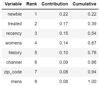
The variable “treated” at rank 2 contributes to predict the customer visit, but to know whether customers react to the treatment, and if so, if they react favorably or unfavorably, we need to estimate the uplift value.
This first phase to get our model trained is somehow very ordinary. The unconventional part starts now with the prediction phase. In the S-Learner method, the classification model must be applied twice.
We predict a first time using unseen data (our test dataset) with the treatment flag forced to 1.

apply_in = hdf_test.drop([target_col])

apply_in = apply_in.drop([treatment_flag])

apply_in = apply_in.add_constant(treatment_flag, 1)

apply_out = apl_model.predict(apply_in)


apply_out = apply_out.rename_columns({'PREDICTED':'pred_trt1','PROBABILITY':'proba_trt1'})

apply_out.save(('#apply_out_trt1'), force = True)

apply_out_trt1  = conn.table('#apply_out_trt1')
We predict a second time using the same individuals but with the treatment flag forced to 0.

apply_in = hdf_test.drop([target_col])

apply_in = apply_in.drop([treatment_flag])

apply_in = apply_in.add_constant(treatment_flag, 0)

apply_out = apl_model.predict(apply_in)


apply_out = apply_out.rename_columns({'PREDICTED':'pred_trt0','PROBABILITY':'proba_trt0'})

apply_out.save(('#apply_out_trt0'), force = True)

apply_out_trt0  = conn.table('#apply_out_trt0')
The uplift is estimated by calculating:
![]()
When the APL prediction is 0, we must transform the probability by doing: 1 - Probability
joined_outputs = apply_out_trt1.set_index("id").join(apply_out_trt0.set_index("id"))


hdf_uplift = joined_outputs.select('*', ("""

Case When "pred_trt1" = 1 Then "proba_trt1" else 1-"proba_trt1" End -

Case When "pred_trt0" = 1 Then "proba_trt0" else 1-"proba_trt0" End

""", 'uplift'))


hdf_uplift.head(5).collect()
The uplift can be plotted as an Area Under the Uplift Curve.
from sklift.viz.base import plot_uplift_curve, plot_qini_curve


plot_uplift_curve(

    hdf_test.collect()[target_col],

    hdf_uplift.collect()['uplift'],

    hdf_test.collect()[treatment_flag],

    random=True, perfect=False)
By only targeting the first half of the population (4000 customers who are the most likely to visit the website because of the campaign e-mail they received) we reach near the maximum uplift.
Y star Transform
The Y star method consists of transforming the target so that the gradient boosting model directly predicts the uplift. Here is the transformation:
![]()
For our Hillstrom case, Y is the visit column and W the treated column. As for p, it is the proportion of treated individuals. When the distribution of the treated column is half and half (p=0.5), the Y star transform gives the following results:

With that method we must build a regression model where Y* is the variable to predict.
First, we add the proportion column to our training dataframe.
prop_trt1 = hdf_train.filter(f'"{treatment_flag}" = 1').shape[0] / hdf_train.shape[0]

hdf_train = hdf_train.add_constant("prop_trt1", prop_trt1)

hdf_train = hdf_train.cast('prop_trt1', 'FLOAT')
Then we add the Y* column.
hdf_train = hdf_train.select('*', (f"""

"{target_col}" *  ( ("{treatment_flag}" - "prop_trt1") / "prop_trt1" / (1 - "prop_trt1") )

"""

,'y_star'))
We check its values on different pairs (visit, treated).
hdf_train.filter('"id" in (2, 3, 5, 13)').collect()
We fit the training data with the APL Gradient Boosting regressor. The treatment flag is removed from the features list because this information is now included in the y_star variable.
predictors_col = hdf_train.columns

predictors_col.remove(key_col)

predictors_col.remove(target_col)

predictors_col.remove('y_star')

predictors_col.remove(treatment_flag)


from hana_ml.algorithms.apl.gradient_boosting_regression import GradientBoostingRegressor

apl_model = GradientBoostingRegressor()

apl_model.set_params(other_train_apl_aliases={'APL/LearningRate':'0.025'})

apl_model.fit(hdf_train, label= 'y_star', key= key_col, features= predictors_col)
Using the same code snippet from the previous section we display the variables contribution.

The Y* star model shows different contributions simply because it predicts uplift, not visit. The most important variable by far (67%) is a flag telling if the customer purchased women's merchandise in the past year. Remember the treatment, it is a campaign for women.
Newbie, a feature indicating if the customer was acquired in the past twelve months, shows as the least important variable to predict uplift, while it is the most important to predict the customer visit according to the S-Learner model.
The prediction phase is straightforward.
apply_in = hdf_test.drop([target_col])

apply_out = apl_model.predict(apply_in)


apply_out.head(5).collect()
Here is the area curve.
plot_uplift_curve(

    hdf_test.collect()[target_col],

    apply_out.collect()['PREDICTED'],

    hdf_test.collect()[treatment_flag],

    random=True, perfect=False)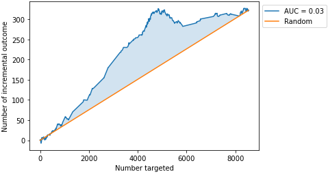
The AUC value here is the same AUC value we saw previously in the S-Learner uplift curve. The results from the two uplift modeling methods are equivalent in the case of the Hillstrom dataset.
You may want to try these two methods on your own dataset and compare their AUC values. If they are equivalent, the Y* model is preferable since it directly provides the SHAP explanations (global and local) on the uplift.
To know more about APL SHAP explanations
- SAP Managed Tags:
- Machine Learning,
- SAP HANA Cloud,
- Python,
- SAP Predictive Analytics,
- SAP HANA
Labels:
5 Comments
You must be a registered user to add a comment. If you've already registered, sign in. Otherwise, register and sign in.
Labels in this area
-
ABAP CDS Views - CDC (Change Data Capture)
2 -
AI
1 -
Analyze Workload Data
1 -
BTP
1 -
Business and IT Integration
2 -
Business application stu
1 -
Business Technology Platform
1 -
Business Trends
1,661 -
Business Trends
88 -
CAP
1 -
cf
1 -
Cloud Foundry
1 -
Confluent
1 -
Customer COE Basics and Fundamentals
1 -
Customer COE Latest and Greatest
3 -
Customer Data Browser app
1 -
Data Analysis Tool
1 -
data migration
1 -
data transfer
1 -
Datasphere
2 -
Event Information
1,400 -
Event Information
65 -
Expert
1 -
Expert Insights
178 -
Expert Insights
280 -
General
1 -
Google cloud
1 -
Google Next'24
1 -
Kafka
1 -
Life at SAP
784 -
Life at SAP
11 -
Migrate your Data App
1 -
MTA
1 -
Network Performance Analysis
1 -
NodeJS
1 -
PDF
1 -
POC
1 -
Product Updates
4,577 -
Product Updates
330 -
Replication Flow
1 -
RisewithSAP
1 -
SAP BTP
1 -
SAP BTP Cloud Foundry
1 -
SAP Cloud ALM
1 -
SAP Cloud Application Programming Model
1 -
SAP Datasphere
2 -
SAP S4HANA Cloud
1 -
SAP S4HANA Migration Cockpit
1 -
Technology Updates
6,886 -
Technology Updates
408 -
Workload Fluctuations
1
Related Content
- Data Fairness in the Age of Generative AI in Technology Blogs by SAP
- AI Foundation on SAP BTP: Q4 2023 Release Highlights in Technology Blogs by SAP
- SAP HANA Cloud Introduces Fairness in Machine Learning in Technology Blogs by SAP
- SAP BTP Innobytes – December 2023 in Technology Blogs by SAP
- What’s New in SAP HANA Cloud – December 2023 in Technology Blogs by SAP
Top kudoed authors
| User | Count |
|---|---|
| 13 | |
| 10 | |
| 10 | |
| 7 | |
| 6 | |
| 5 | |
| 5 | |
| 5 | |
| 4 | |
| 4 |