This article helps you to plot & understand some basic visualization of the below examples for CPQ using QuickChart. Quickchart is an open-source Chart image library for building user interfaces or UI components. Chart.JS is a free open- source JavaScript library for data visualization, which supports 8 chart types..
Generate chart images with a simple, open API
All the details related to QuickChart is provided below for you as a reference to know more about it.

Background
Basically, I personally had a question going on my mind several times and also other customers asked before during my CPQ Implementation.. Why there are no standard Dashboards kind of features or data Visualizations provided in CPQ ..
Data visualization is an essential for CPQ Admins or Sales reps as it seeks to grab interest and keep their eyes on their sales quotes to see how their performing or Profitability Check or Margin check or watch KPI or metrics ....etc
so I thought of sharing you something experimented recently and working perfectly to offer this solution to you as well..
Why Data Visualization?
You might ask ‘why is this important?’ or “why don’t we just view the data in its tabular form?”. Well, I think it is quite important for a couple of reasons.
Data visualization is important because:
- It makes it easier to spot trends in the data than having to go through rows of data to spot them, like counting the number of quote history in a table of 50,000 rows.
- It makes the information easier to understand when compared to going through rows of data. A pie chart lets you easily know the greater of two variables at a glance.
- It simplifies the most complex datasets, any data would fit in a small pie chart.
Introduction
Quickchart aims to provide beautiful and eye-catching graphs and charts that are easy to use and incorporate into your SAP CPQ responsive templates.
Quickchart documentation provides lots of examples with different options for server-side image rendering.
What do YOU need to know to get started?
I would say nothing, except your CPQ Ironpython Scripting, API knowledge, a browser, and some knowledge of HTML, CSS, and JavaScript.
Once you have all those, you are ready to go. Let’s dive in
Building & Rendering QuickChart in SAP CPQ
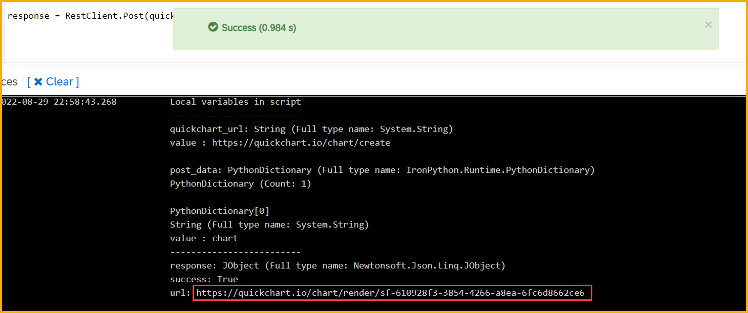
Once you execute the script, you can pick the URL and try to see the chart in browser now and later you can incorporate it in your RD template as html tag
Example 1 - Bar Chart
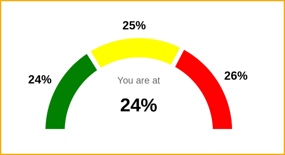
Example 2 - Radial Gauge
Example 3 - Progress Bar
Example 4 - Doughnut
Add this HTML Tag
<img width='800px' height='400px' id='lineChart' src="https://quickchart.io/chart/render/sf-610928f3-3854-4266-a8ea-6fc6d8662ce6">
And there you have it, your very first web-based data visualization done in some very simple steps, even though the chart looks a bit not what you expected. I’m guessing you expected it to be more colorful.

Profitability check chart rendered
Note
In above examples, used my own dummy data in API and you can add further additional cpq scripting lines to your data need for charts to render |
Summary
At this point, you must have learned a lot about data visualization and Quickchart and must be quite comfortable working with QuickChart. Should you want to learn more, read the official documentation below
QuickChart Gallery
https://quickchart.io/gallery/
QuickChart Documentation
https://quickchart.io/documentation/
QuickChart Github Repo
https://github.com/typpo/quickchart
The End
If you have any questions or relevant great advice, please leave them in the comments section.
