
- SAP Community
- Products and Technology
- Technology
- Technology Blogs by SAP
- Creating architecture diagrams with code
Technology Blogs by SAP
Learn how to extend and personalize SAP applications. Follow the SAP technology blog for insights into SAP BTP, ABAP, SAP Analytics Cloud, SAP HANA, and more.
Turn on suggestions
Auto-suggest helps you quickly narrow down your search results by suggesting possible matches as you type.
Showing results for
Developer Advocate
Options
- Subscribe to RSS Feed
- Mark as New
- Mark as Read
- Bookmark
- Subscribe
- Printer Friendly Page
- Report Inappropriate Content
06-29-2022
6:34 AM
In this blog post, I will share how you can leverage an open source project called Diagrams to create architecture diagrams with code.

Code to architecture diagram
When explaining to others how a system works or communicates with its different parts, it is generally easier to do it visually, e.g. using an architecture diagram. I've done many architecture diagrams in the past, for which I've used different tools, e.g. Draw.io, Omnigraffle, even Microsoft PowerPoint, and although it is possible to get the job done using this tools, I sometimes found it frustrating how complicated it was to do a minor change in the architecture, rearranging things (PowerPoint 👀), starting from scratch or worrying about using the right icon/colour. These diagrams also change frequently and a new version meant copying the existing file and adding a suffix in the file, e.g. _v1.pptx, _v2.pptx, _v3.pptx. So I was quite happy when last week I found out about Diagrams (https://diagrams.mingrammer.com/).
Diagrams is an open source project which lets you draw architecture diagrams using Python 🐍. Under the hood, Diagrams uses Graphviz (https://www.graphviz.org/gr) to create the diagrams, which is something that I explored before to generate entity-relationship (ER) diagrams from a JSON structure, see Generating Entity-Relationship diagrams from the SAP Ariba Analytical Reporting API metadata. There are various cloud providers included in Diagrams: AWS, Azure, GCP, Kubernetes, Alibaba Cloud and Oracle Cloud. Which got me thinking…. what if we could include the SAP Business Technology Platform Solution Diagrams and Icons, which are publicly available, as part of Diagrams?
⚠️ This is not officially supported by SAP. This is just an exploration of how the official SAP BTP icons can be used within Diagrams.
I forked the original repository and included the SAP BTP icons. Below a sample of how we can use Python + Diagrams with the SAP BTP icons to create your architecture diagrams.
At the moment of writing, the changes proposed to add SAP as a provider in Diagrams have not been merged to the main repository - See pull request 717. In the forked repo, the changes are in the sap-icons branch.
Code sample:
# tech-byte-diagram.py

from diagrams import Cluster, Diagram, Edge

from diagrams.aws.storage import S3

from diagrams.sap.other import Placeholder_Circle

from diagrams.sap.integration import ProcessIntegration_Circle

from diagrams.sap.database_datamanagement import SAPHANAService_Circle

from diagrams.sap.database_datamanagement import ObjectStore_Circle


with Diagram("SAP Tech Byte - Exploring the SAP Audit Log service", show=False):

    with Cluster("SAP Business Technology Platform"):

        with Cluster("Subaccount"):

            cloud_integration = ProcessIntegration_Circle("Cloud Integration")

            object_store = ObjectStore_Circle("Object Store")


            Placeholder_Circle("Audit Log service") << Edge(label="Retrieves entries") << \

            cloud_integration >> Edge() >> SAPHANAService_Circle("HANA Cloud")

            cloud_integration >> Edge() >> object_store


    with Cluster("AWS"):

        object_store >> Edge(label="uses", style="dotted") >> S3("S3 Bucket")
The code above will generate the following diagram:
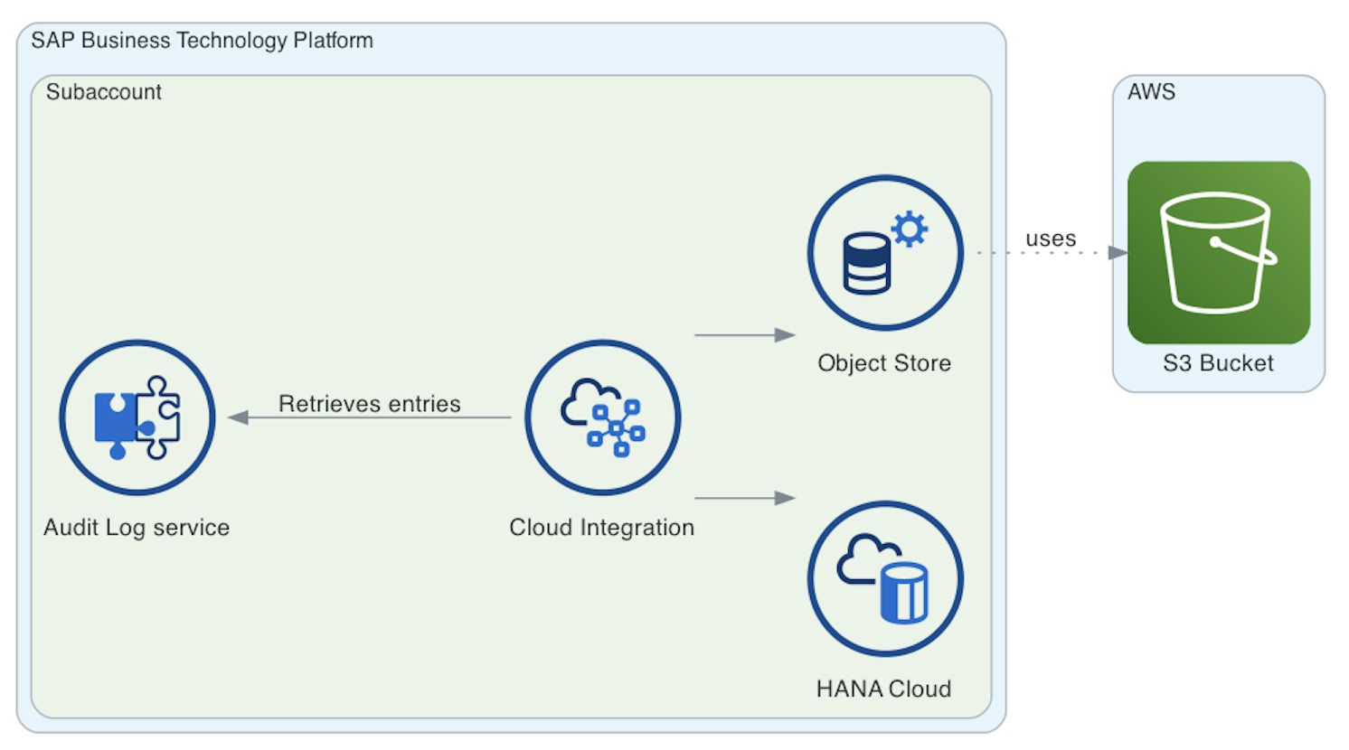
SAP Tech Byte diagram
❓ In case you wonder where under diagrams.sap.* you can find a particular service.... I set up the SAP services in Diagrams so that it resembles the capabilities that have been defined in the SAP Discovery Center. Therefore, if you find the service under DevOps in the SAP Discovery Center, then it is likely that it will be under diagrams.sap.devops.
Now, the diagram above looks great but the colours used by the clusters does not follow the colours specified in the SAP Business Technology Platform Solution Diagrams and Icons guidelines. What if we want to use the colours specified in the guidelines? How would the diagram look? Let’s see…..
Code sample:
# tech-byte-diagram.py

from diagrams import Cluster, Diagram, Edge

from diagrams.aws.storage import S3

from diagrams.sap.other import Placeholder_Circle

from diagrams.sap.integration import ProcessIntegration_Circle

from diagrams.sap.database_datamanagement import SAPHANAService_Circle

from diagrams.sap.database_datamanagement import ObjectStore_Circle


# SAP BTP Solution Diagrams and Icons guidelines colors

L0_BLUE_COLOUR = "#316CCA"

L1_BLUE_COLOUR = "#074D92"

FIX_GREY_COLOUR = "#7F7F7F"

NON_SAP_AREA_COLOUR = "#595959"


with Diagram("SAP Tech Byte - Exploring the SAP Audit Log service", show=False):

    with Cluster("SAP Business Technology Platform", graph_attr= {"bgcolor": "white", "pencolor": L0_BLUE_COLOUR}):

        with Cluster("Subaccount", graph_attr= {"bgcolor": "white", "pencolor": L1_BLUE_COLOUR}):

            cloud_integration = ProcessIntegration_Circle("Cloud Integration")

            object_store = ObjectStore_Circle("Object Store")


            Placeholder_Circle("Audit Log service") << Edge(label="Retrieves entries", color=FIX_GREY_COLOUR) << \

            cloud_integration >> Edge(color=FIX_GREY_COLOUR) >> SAPHANAService_Circle("HANA Cloud")

            cloud_integration >> Edge(color=FIX_GREY_COLOUR) >> object_store


    with Cluster("AWS", graph_attr= {"bgcolor": "white", "pencolor": NON_SAP_AREA_COLOUR}):

        object_store >> Edge(label="uses", color=FIX_GREY_COLOUR, style="dotted") >> S3("S3 Bucket")
The code above will generate the following diagram, which uses the colours mentioned in the guidelines.

SAP Tech Byte diagram following colour guidelines
Want to get it running in your local machine?
Below the steps required to run it on a Mac.
# Utilities

$ brew install virtualenvwrapper graphviz poetry


# Clone the forked repository

$ git clone git@github.com:ajmaradiaga/diagrams.git


# Switch to the directory

$ cd diagrams


# Switch to the sap-icons branch

$ git checkout sap-icons


# Build the project using poetry

$ poetry build


# Prepare your Python virtual environment

$ mkvirtualenv sap-diagrams


# Install the package in your virtual environment

$ poetry install --no-dev


# Now you can run one of scripts above locally. This will generate a png file with the output.

$ python tech-byte-diagram.py
That’s it folks! Thanks for making it this far. I really like how fast and easy it is to create simple and complex diagrams using Diagrams + Python. Something that surprised me is that I find the code very easy to read and follow. So much that I believe that someone that is not that familiar with Python, will be able to create and generate architecture diagrams using Diagrams.
- SAP Managed Tags:
- Python,
- Open Source,
- SAP Business Technology Platform
Labels:
15 Comments
You must be a registered user to add a comment. If you've already registered, sign in. Otherwise, register and sign in.
Labels in this area
-
ABAP CDS Views - CDC (Change Data Capture)
2 -
AI
1 -
Analyze Workload Data
1 -
BTP
1 -
Business and IT Integration
2 -
Business application stu
1 -
Business Technology Platform
1 -
Business Trends
1,661 -
Business Trends
88 -
CAP
1 -
cf
1 -
Cloud Foundry
1 -
Confluent
1 -
Customer COE Basics and Fundamentals
1 -
Customer COE Latest and Greatest
3 -
Customer Data Browser app
1 -
Data Analysis Tool
1 -
data migration
1 -
data transfer
1 -
Datasphere
2 -
Event Information
1,400 -
Event Information
65 -
Expert
1 -
Expert Insights
178 -
Expert Insights
280 -
General
1 -
Google cloud
1 -
Google Next'24
1 -
Kafka
1 -
Life at SAP
784 -
Life at SAP
11 -
Migrate your Data App
1 -
MTA
1 -
Network Performance Analysis
1 -
NodeJS
1 -
PDF
1 -
POC
1 -
Product Updates
4,577 -
Product Updates
330 -
Replication Flow
1 -
RisewithSAP
1 -
SAP BTP
1 -
SAP BTP Cloud Foundry
1 -
SAP Cloud ALM
1 -
SAP Cloud Application Programming Model
1 -
SAP Datasphere
2 -
SAP S4HANA Cloud
1 -
SAP S4HANA Migration Cockpit
1 -
Technology Updates
6,886 -
Technology Updates
408 -
Workload Fluctuations
1
Related Content
- Unify your process and task mining insights: How SAP UEM by Knoa integrates with SAP Signavio in Technology Blogs by SAP
- Kyma Integration with SAP Cloud Logging. Part 2: Let's ship some traces in Technology Blogs by SAP
- Top Picks: Innovations Highlights from SAP Business Technology Platform (Q1/2024) in Technology Blogs by SAP
- explore the business continuity recovery sap solutions on AWS DRS in Technology Blogs by Members
- Deep dive into Q4 2023, What’s New in SAP Cloud ALM for Implementation Blog Series in Technology Blogs by SAP
Top kudoed authors
| User | Count |
|---|---|
| 13 | |
| 10 | |
| 10 | |
| 9 | |
| 7 | |
| 6 | |
| 5 | |
| 5 | |
| 5 | |
| 4 |