SAP Service Cloud Version 2 comes with an embedded version of SAP Analytics Cloud. This allows users to create simple to complex data stories based on the data available in SAP Service Cloud Version 2. A story is a presentation-style document that uses charts, visualizations, text, images, and pictograms to describe data. Before creating a story, it is important to understand the following:
- Who is the user?
- What does the user like to know?
- Why does the user need to know this information?
- When and for which time frame does the user need this information?
For this blog post, let’s consider that a Service Manager or a Service Agent wants to extract the following information from their day-to-day tasks.
- Status of Cases i.e., Open, In Process, Completed, Closed
- Source Channels of Cases
- Escalation Status of Cases
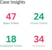
Our aim is to create a story as shown in the image below.

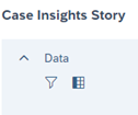
To create a new story, Navigate to Settings > Design Stories and click New. This opens the Story Editor in the Query Designer View.
Creating a Data Model
Data sources are needed to create data stories. The embedded SAC provides a Query Designer view with data sources that can be used to create a story. On the right pane, there is a list of sources in the Data Sources section.
- Choose Analytical Model from the Query Designer.
- Click and drag the Analytical Model of Case data source to the window on the left to build a query.

3. Select a data source to choose the columns needed in the story.

4. Click Preview Query to see an intuitive view of the columns and data present.

Creating Filters and Calculated Columns on Data Source
You can add Filters and Calculated Columns in the Query Designer.
- Filters allow users to view multiple dimensions defined based on a set of logical conditions.

- Calculated Columns allow users to use any arithmetical functionality such as sum of a column. You can use the Formula function to process the data present in the column. The Calculated Columns are then used on the charts to give meaningful insights.


Here is an example of a Calculated column

You can exit the Query Designer after creating a calculated column by clicking Finish.

Creating a Numeric Chart
Numeric charts are appealing and give a clear understanding on the numbers used in a story.
Here’s an example of a numeric chart

- Create a new chart of type numeric chart.
- Choose Open tickets as the primary value for Measures.
- Choose Open Tickets for color.

Repeat the steps above to create numeric counts on all user statuses present in the data source chosen.

Creating Measures
You can create different measures that will aid in designing stories using the Create Calculation functionality under Measures. For more information, see
Guide on how to create Calculations.
Let us create an Aggregated calculated measure for the following columns:
- User Status – Open Tickets, In Process, Completed, Closed
- Escalation Status – Escalated and Not Escalated
1. Insert chart of count type.

2. Under measures, Navigate to Add Measure > Create Calculation > Aggregation.
3. Update the following fields with corresponding values:
- Operation: SUM
- Aggregation Dimensions: User Status
- Measure: Count
- Dimensions: User Status
- Values or Input Controls: Open
- Select the Use Conditional Aggregation checkbox.
Repeat the process and add more calculated measures for the different User Status.


You can view the current calculations in the Calculations section as shown below

Repeat the above steps to create an Aggregated Calculation for the Escalated Status (Both Escalated and Not Escalated) using Escalation Status as the Aggregation Dimensions.


Repeat the process to add the reminder of the count for the Closed, Completed, In Process Counts.
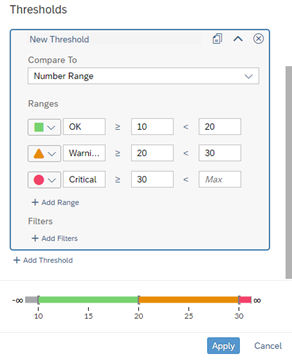
Color and Threshold
Using Colors gives stories an intuitive look and feel. SAC offers the Threshold functionality to use colors. Use Threshold to set ranges and individual colors. This saves time to create individual colors for different measures. You can save a threshold and reuse it.
Let us now create colors and thresholds as shown in the below image.
- Navigate to the color section and select Add Threshold.

2. Add the threshold as follows:
For more on applying styling to stories ,refer the
help page.
We have created simple number charts. In the next section, we will focus on more complex charts and will reuse the measures we have created.
Let’s see how to create a stacked bar chart with the previously created Measures (Escalated and Not Escalated), and Dimension is Priority code.

- Set Dimensions and Measures as shown below.
- Assign a color to the calculated measure on Escalation. This color will be applied on every chart in which the measures are used. This saves time used in deciding and applying color to the same measures in different charts.


Let’s now create a combination column and Line with the Aggregated Measure. Dimension in this case is Source.

Set the following dimensions

The color in this case is applied from the set color on the other chart considering we applied it to the Aggregated measures (Escalated and Not Escalated).
Bubble charts - A bubble chart is a variation of a scatter chart in which the data points are replaced with bubbles and an added dimension of the data is represented in the size of the bubbles. The below bubble chart depicts cases in different states.

1. To create a cluster bubble chart, set the following values:
- Measures: Count
- Dimensions: Priority Code
- Color: User Status

Creating Filters
Filters help in focusing on specific data in a chart or in every chart to get the specific insights. Filters on SAC can be added globally to the story or individually to the respective charts.
Global Filters once set and applied affects every chart in the story and the desired insight is achieved on each chart.
Individual Filters can be set on each chart and are set and applied to that chart only.
Setting Global Filters
Select Dimensions and add Escalation and User Status. These are the global filters for our story.

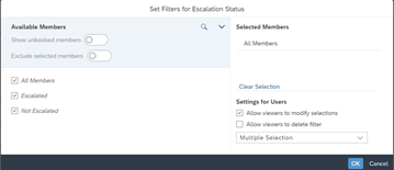

You have now set a global filter.
Individual Chart Filters
Creating an individual chart filter involves choosing a chart you want to get insights from and adding the filter to it.
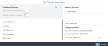
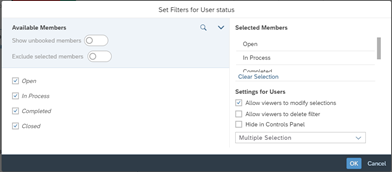
For this, we will add a user status filter to a Donut chart in the story as shown below:


- Use the designer section on the donut and add Count as Measure and Source as Color.
- On the Filters, choose User status and check all statuses.
- Click OK.

Saving a Story
Once all charts are created and desired insights are achieved, the last step is to save your story. On the toolbar, click on the Save icon. The save icon offers the following options to save your story:
- Save
- Save As...
- Save Template... : Save the story as a template and reuse it.
- ..: Save the story as a PDF for later use.

Sharing a Story
Click on the Share icon to share your story with other users.


Summary
What do we need to remember? While creating stories, it is important to understand who the audience are, and what is the most relevant data required for them to accomplish their tasks. With this understanding it is easy to create data driven stories with embedded SAP Analytics Cloud. Users will benefit from the data rich dashboards tailored to their needs and these stories will help them to take informed decisions.
The Blog post could only give a high-level overview of the capabilities and functionalities in the embedded Analytics in SAP Service Cloud V2. Further information can be found on help.sap.com and future blog posts.
Follow the #SAPV2ServiceCloud, #EmbeddedAnalytics, #SAPServiceCloudV2EmbeddedAnalytics, #StoriesInServiceCloudV2
Links
In collaboration with:
joek01
