Introduction
With the latest UI theme designer Version (1.70.0) you have now the possibility to theme the
SAPUI5 Avatar control.
The Avatar control is used for displaying images, initials, placeholder images or icons related to a user The control can also be used for business images, such as product pictures.
For more information visit the
SAP Fiori Design Guidelines of the Avatar control.

SAPUI5 Avatar control sample
Theming the Avatar control
If you want to theme the Avatar control open your custom theme inside the UI theme designer and add the newly created preview page to your preview pages. You find the Avatar preview under the
SAPUI5 Control Previews.
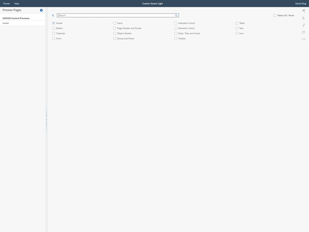
Select the Avatar control page inside the UI theme designer
The preview page will show you a wide set with possibilities of the Avatar control.
To go straight into the theming of the control, you can select the Avatar tag under the expert theming.

Select the Avatar tag inside the expert theming
After that you can start theming the Avatar control with the three main parameters:
- sapAvatar_Background
- sapAvatar_BorderColor
- sapAvatar_TextColor
But what if you want to theme the Image, Shape or Badge Avatar?
To get the information what other parameters you can theme, just hover over the Avatar control inside the preview. You will then see a tooltip with the relevant parameters. Now search these parameters in the expert theming and you will have the ability to change them.

Hover over the control to get more information about the used parameters
Recap
From now on it is possible to theme the Avatar control inside the Ui theme designer under the expert theming. And with just a few clicks you can start customizing your Avatar controls to fit even better into your product.
Have you already tried the new theming preview and started customizing your Avatar controls?
Let me know what you think about it in the comments.
