
- SAP Community
- Products and Technology
- CRM and Customer Experience
- CRM and CX Blogs by SAP
- Building a Dashboard for ML based Ticket Categoriz...
CRM and CX Blogs by SAP
Stay up-to-date on the latest developments and product news about intelligent customer experience and CRM technologies through blog posts from SAP experts.
Turn on suggestions
Auto-suggest helps you quickly narrow down your search results by suggesting possible matches as you type.
Showing results for
Advisor
Options
- Subscribe to RSS Feed
- Mark as New
- Mark as Read
- Bookmark
- Subscribe
- Printer Friendly Page
- Report Inappropriate Content
02-01-2022
10:49 PM
Using Machine learning for Service Ticket categorization
Machine learning for Service Ticket categorization is a powerful tool to help automate ticket categorizations. It is based on the prediction capabilities of Leonardo which learns from your data and uses that to predict the ticket category and priority with a certain degree of confidence.
You could have a catalog using Service Categories, Incident Categories, Object Categories and Resolution Categories. Depending upon how you have set up your catalog – in a flat structure or hierarchical structure, you could specify at what level(s) ML predictions should happen. This takes place with the Ticket Categorization model that you can train and activate. You can specify whether you like Priority to be predicted as well. Apart from this setting, you can also set a threshold. If ML’s prediction confidence is above the threshold set by you, it can automatically populate the ticket category and Priority fields - thereby freeing up resources and saving time of the service agent who manually classifies the incoming tickets. For example, if you’ve specified the threshold as 60, then only if the confidence is greater than 60, the system auto-populates the relevant category field in the ticket
KPIs that matter for analyzing ML effectiveness
As an organization, if you have implemented or are in the journey to implement Service Ticket categorizations using Machine Learning in Service Cloud, I’m sure you’re also wondering how to analyze its effectiveness across different regions or support teams
Some of the KPIs that you probably want to track are
Not having visibility into these aspects pose the challenge of not being able to understand the effectiveness of ML based ticket categorization for your organization, explaining the value internally to the management or even taking decisions to clean up your catalog or to retrain the model
Aim of this blog
This blog aims to inspire you with ideas to create your own dashboard for the ML based Ticket Categorization scenario, using standard Business Analytics capabilities. I will introduce key aspects of the Data sources involved, key figures to create, report views and finally the dashboard
Design and setup
As always, the best practice recommendation is to first think and decide on paper about what you want to achieve with the dashboard. What tiles make sense and how it will help you in the analysis. Then work backwards to see what you need to achieve that - which data sources, key figures and reports are required. Which ones are available in standard, and which ones do you need to create as custom
Example setup from my tenant
What do I want in the dashboard?
For my dashboard design I want two broad perspectives
To achieve this, I went back to the KPIs that were important as explained earlier. I looked into what the Ticket Intelligence data source offers and what it doesn’t. While the DS has the main aspects – information of all actual categories as well as ML predicted categories, ticket information etc. as characteristics, it doesn’t have the Created-on date, or the service and support team information. The DS also has a counter and prediction confidence as key figures. What I needed additionally was a way to get a count of all tickets with prediction confidence greater than the threshold and reflect it as a % of the total volume of tickets. Ticket threshold is not available in the data source, but this is not something one would change frequently. Hence, I could still use it as an absolute value in my calculations
Data Source:
For reporting ML predictions for Ticket Categorization – Ticket Intelligence data source
Purpose of this data source – It captures the predicted values as well as the confidence value of each ticket, provided the confidence is greater than the threshold. Hence, say you set the threshold as 60, but the prediction confidence for Incident Category was 55, then it wouldn’t get reflected in the data source. However, if you had selected Incident category as well as Priority for prediction, and the prediction confidence was 55 for Incident category but 85 for Priority, both would get reflected in the data source. This is since at least one of them was greater than 60
Data Source Fields:
Key Figure design
For the KPIs explained above, I ended up creating the following key figures using the standard key figures in the formula
Here’s an example:
Key Figure: Predicted Incident Category count Greater than Threshold
Step 1
Step 2
Step 3
Explanation -
Key Figure: % of tickets with Incident categories predicted above the threshold
Step 1
Step 2
Report design
Finally, I created a new report on the Ticket Intelligence data source and pulled in these key figures. For the missing characteristics, I preferred to pull them in using Add fields instead of creating a Join with the Ticket data source. I used these additional fields as selection parameters - especially the created on field. Having a selection and making it mandatory is recommended because with time the data volume can be huge and you probably want to restrict that for more near term analysis
Also, note that this dashboard is built to show aggregated information. If you have implemented ML you probably have large volumes of data. I built the report on the Ticket Intelligence data source without any joins. The selections for the date were on the Created On field which was pulled in using Add Fields.
Standard and Custom Key figures available in the report
Report Views: I then created the views I needed for my dashboard. You will see these as part of the dashboard tiles
Here’s a Tip! Follow a naming convention that allows you to easily locate these views in the dashboard design process. You can always rename it there. I followed a prefix 010 (don’t ask me why!)
Dashboard design
Finally, it was time to design the dashboard and to present the perspectives visually
Scroll up to see the section What do I want in the dashboard?
Knowing that I can have a maximum of 3 * 3 tiles in the dashboard, I decided on the layout – first two columns for perspective 1 and the last column for perspective 2. This is the dashboard that I had on paper and that I finally managed to achieve
Perspective 1: (Reads top to bottom)
Perspective 2:
We can see that for the Actual label Missed Appointment there are 109 ML predicted Missed Appointments as well. But there are 2 predicted as Fridge app OS version and 7 which were not predicted by ML. If a large portion is correct – meaning where the actual vs predicted value is the same, then the quality of prediction is also good. If it’s the reverse, then there’s a need to analyze what the data set, volume and data balance looks like. Maybe there is also a need to retrain the model or clean up the catalog structure
You can also export the matrix data into excel (ideally without the columnar layout) and build further calculations to report on the prediction quality. Here’s a simple example where the data was exported and a new column D was introduced to get a total count of true labels vs false labels in column E. Finally, column G shows a % of prediction accuracy based on this calculation. You can build good visualizations of course using standard excel features. You can also use the Excel Add in for this – it’ll allow you to have real time data from Service Cloud and you can also access the report directly from within Service Cloud
This dashboard is also interactive in nature and offers global value selections (Created on, Support team). Interactivity allows you to focus your analysis - I built this interactivity on the Support team. Selecting a specific team or teams makes the other tiles react - it basically passes the Support team as a filter to the other tiles
To summarize, you can see how I used the Ticket Intelligence data source to create my own key figures, report and dashboard for analysis of the predictions.
Hope this gives you some ideas about your own Dashboard implementation for ML based Service Categorization
Here are a few helpful links that may be relevant for your Sales/Service Analytics and ML journeys
Cheers !
Vinita
SAP Intelligent Adoption & Consumption Team
Machine learning for Service Ticket categorization is a powerful tool to help automate ticket categorizations. It is based on the prediction capabilities of Leonardo which learns from your data and uses that to predict the ticket category and priority with a certain degree of confidence.
You could have a catalog using Service Categories, Incident Categories, Object Categories and Resolution Categories. Depending upon how you have set up your catalog – in a flat structure or hierarchical structure, you could specify at what level(s) ML predictions should happen. This takes place with the Ticket Categorization model that you can train and activate. You can specify whether you like Priority to be predicted as well. Apart from this setting, you can also set a threshold. If ML’s prediction confidence is above the threshold set by you, it can automatically populate the ticket category and Priority fields - thereby freeing up resources and saving time of the service agent who manually classifies the incoming tickets. For example, if you’ve specified the threshold as 60, then only if the confidence is greater than 60, the system auto-populates the relevant category field in the ticket
KPIs that matter for analyzing ML effectiveness
As an organization, if you have implemented or are in the journey to implement Service Ticket categorizations using Machine Learning in Service Cloud, I’m sure you’re also wondering how to analyze its effectiveness across different regions or support teams
Some of the KPIs that you probably want to track are
- Volume of incoming Tickets
- Number of tickets that are getting predicted above the threshold
- Incoming tickets vs ML predicted tickets per team / country / region etc
- Top X predicted categories
- Prediction trends
- True value vs Predicted value
Not having visibility into these aspects pose the challenge of not being able to understand the effectiveness of ML based ticket categorization for your organization, explaining the value internally to the management or even taking decisions to clean up your catalog or to retrain the model
Aim of this blog
This blog aims to inspire you with ideas to create your own dashboard for the ML based Ticket Categorization scenario, using standard Business Analytics capabilities. I will introduce key aspects of the Data sources involved, key figures to create, report views and finally the dashboard
Design and setup
As always, the best practice recommendation is to first think and decide on paper about what you want to achieve with the dashboard. What tiles make sense and how it will help you in the analysis. Then work backwards to see what you need to achieve that - which data sources, key figures and reports are required. Which ones are available in standard, and which ones do you need to create as custom
Example setup from my tenant

- Prediction enabled for Incident category, Process category and Priority
- Threshold set at 60
What do I want in the dashboard?
For my dashboard design I want two broad perspectives
- Overall Ticket volume and prediction information – by team and date/month
- Deeper dive into Incident category predictions
To achieve this, I went back to the KPIs that were important as explained earlier. I looked into what the Ticket Intelligence data source offers and what it doesn’t. While the DS has the main aspects – information of all actual categories as well as ML predicted categories, ticket information etc. as characteristics, it doesn’t have the Created-on date, or the service and support team information. The DS also has a counter and prediction confidence as key figures. What I needed additionally was a way to get a count of all tickets with prediction confidence greater than the threshold and reflect it as a % of the total volume of tickets. Ticket threshold is not available in the data source, but this is not something one would change frequently. Hence, I could still use it as an absolute value in my calculations
Data Source:
For reporting ML predictions for Ticket Categorization – Ticket Intelligence data source
Purpose of this data source – It captures the predicted values as well as the confidence value of each ticket, provided the confidence is greater than the threshold. Hence, say you set the threshold as 60, but the prediction confidence for Incident Category was 55, then it wouldn’t get reflected in the data source. However, if you had selected Incident category as well as Priority for prediction, and the prediction confidence was 55 for Incident category but 85 for Priority, both would get reflected in the data source. This is since at least one of them was greater than 60

Data Source Fields:
Do a preview of the data source to see the fields. The data source gives us information at a ticket level. This includes the actual as well as the predicted values on that ticket. If populated (as explained above), it tells you the confidence
Key Figure design
For the KPIs explained above, I ended up creating the following key figures using the standard key figures in the formula
- Predicted Incident Category count Greater than Threshold
- Predicted Service Category count Greater than Threshold
- Predicted Priority count Greater than Threshold
- % of tickets with Incident categories predicted above the threshold
- % of tickets with Process/Service categories predicted above the threshold
- % of tickets with Priority predicted above the threshold
Here’s an example:
Key Figure: Predicted Incident Category count Greater than Threshold
Step 1

Step 2

Step 3
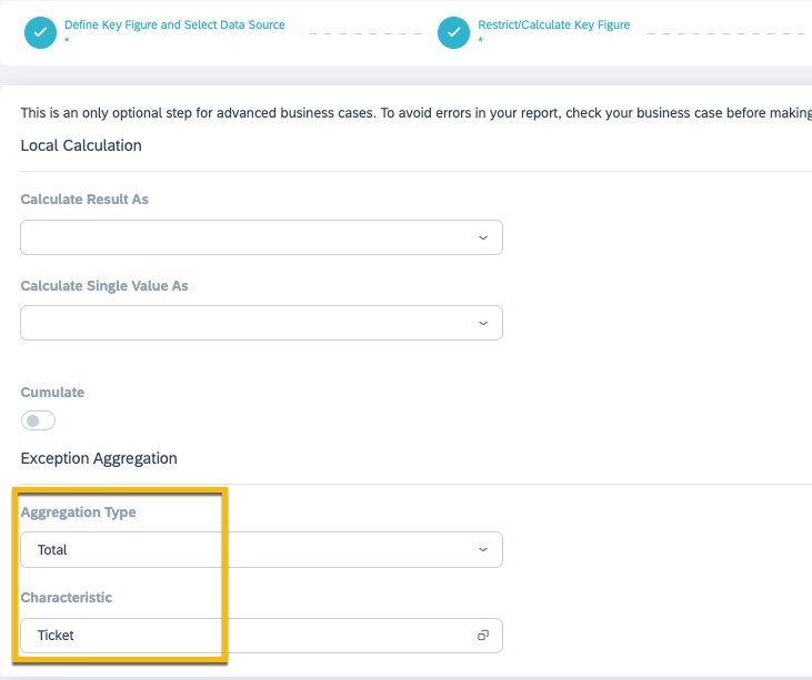
Explanation -
- The boolean condition in step 2 works on each ticket to check if the prediction confidence was greater than equal to 60. If yes, it would return True (1) else False (0)
- Step 3 collects all the tickets via exception aggregation and applies a Total on that. For example, if there was a total of 1000 tickets out of which 700 had an incident category prediction confidence GE 60, it would sum up the 1s(True) for these 700 tickets and 0s(False) for 300 tickets. Thus, you would get an aggregate/total of 700. This is required for the % calculation key figure shown below
Key Figure: % of tickets with Incident categories predicted above the threshold
Step 1

Step 2

Report design
Finally, I created a new report on the Ticket Intelligence data source and pulled in these key figures. For the missing characteristics, I preferred to pull them in using Add fields instead of creating a Join with the Ticket data source. I used these additional fields as selection parameters - especially the created on field. Having a selection and making it mandatory is recommended because with time the data volume can be huge and you probably want to restrict that for more near term analysis
Also, note that this dashboard is built to show aggregated information. If you have implemented ML you probably have large volumes of data. I built the report on the Ticket Intelligence data source without any joins. The selections for the date were on the Created On field which was pulled in using Add Fields.

Standard and Custom Key figures available in the report

Report Views: I then created the views I needed for my dashboard. You will see these as part of the dashboard tiles
Here’s a Tip! Follow a naming convention that allows you to easily locate these views in the dashboard design process. You can always rename it there. I followed a prefix 010 (don’t ask me why!)

Dashboard design
Finally, it was time to design the dashboard and to present the perspectives visually
Scroll up to see the section What do I want in the dashboard?
Knowing that I can have a maximum of 3 * 3 tiles in the dashboard, I decided on the layout – first two columns for perspective 1 and the last column for perspective 2. This is the dashboard that I had on paper and that I finally managed to achieve
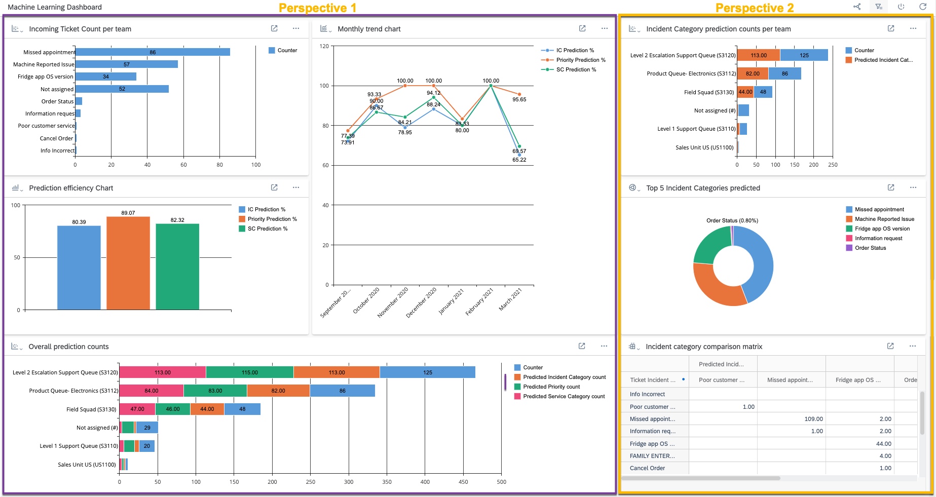
Perspective 1: (Reads top to bottom)
- Shows the Ticket count per team – This is important since you can see the incoming volume of tickets per team. You could also use regions, countries, service orgs etc
- Prediction efficiency chart – Shows the % of automation of tickets. Wherever the prediction confidence was greater than 60 (that was my threshold), it represents it as a % of the total ticket count
- Overall prediction counts – Organizations also want to see the counts, not just the % to get a true idea – this stacked chart shows the incoming ticket count vs predicted incident category count, predicted service category count and predicted priority count
- Finally, the line chart shows the prediction efficiency per month. This could especially be helpful in the initial months after the rollout to see if the graph is on an upward or constant trend. Downward is not desirable
Perspective 2:
- Focus on Incident category prediction counts per team – this is helpful to gauge how useful is the ticket prediction for individual teams
- Top 5 categories predicted – useful again to see which categories are getting predicted the most. If bulk of your issues are in these top 5/top x categories, you’re good
- Finally, there is an incident category comparison matrix – this is a report view which presents actual/final Incident categories maintained on a ticket vs what was predicted by the system. It’s a true label vs predicted label comparison in that sense. Here’s a closer look into it

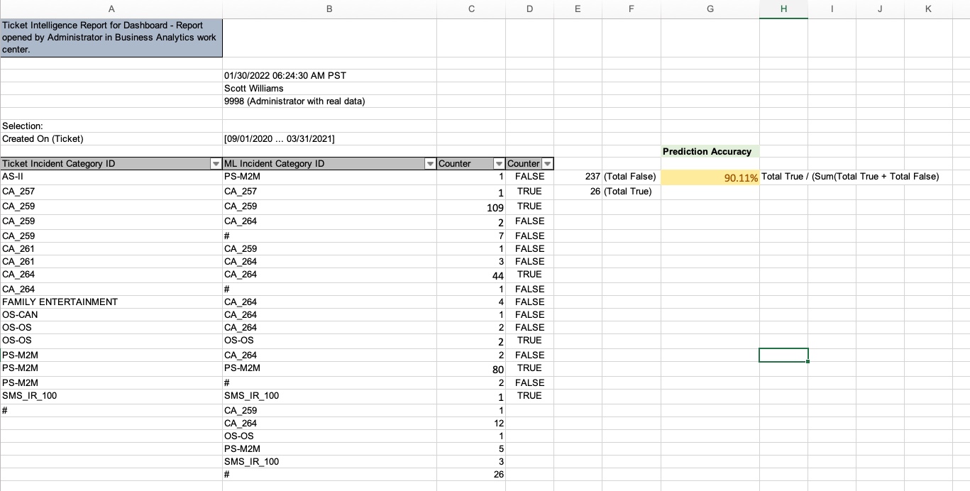
We can see that for the Actual label Missed Appointment there are 109 ML predicted Missed Appointments as well. But there are 2 predicted as Fridge app OS version and 7 which were not predicted by ML. If a large portion is correct – meaning where the actual vs predicted value is the same, then the quality of prediction is also good. If it’s the reverse, then there’s a need to analyze what the data set, volume and data balance looks like. Maybe there is also a need to retrain the model or clean up the catalog structure
You can also export the matrix data into excel (ideally without the columnar layout) and build further calculations to report on the prediction quality. Here’s a simple example where the data was exported and a new column D was introduced to get a total count of true labels vs false labels in column E. Finally, column G shows a % of prediction accuracy based on this calculation. You can build good visualizations of course using standard excel features. You can also use the Excel Add in for this – it’ll allow you to have real time data from Service Cloud and you can also access the report directly from within Service Cloud
This dashboard is also interactive in nature and offers global value selections (Created on, Support team). Interactivity allows you to focus your analysis - I built this interactivity on the Support team. Selecting a specific team or teams makes the other tiles react - it basically passes the Support team as a filter to the other tiles

To summarize, you can see how I used the Ticket Intelligence data source to create my own key figures, report and dashboard for analysis of the predictions.
Hope this gives you some ideas about your own Dashboard implementation for ML based Service Categorization
Here are a few helpful links that may be relevant for your Sales/Service Analytics and ML journeys
- Machine Learning in Sales and Service Cloud Playbook
- Deliver Service Excellence with the power of AI Webinar
- Drive Sales by smart decision making with Analytics Webinar
- Service Analytics for smart decision making Webinar
- Adoption Lab – Sales Analytics Webinar/Adoption Lab
Cheers !
Vinita
SAP Intelligent Adoption & Consumption Team
- SAP Managed Tags:
- Machine Learning,
- Service Ticket Intelligence,
- C4C Analytics,
- C4C Service
Labels:
You must be a registered user to add a comment. If you've already registered, sign in. Otherwise, register and sign in.
Labels in this area
-
Business Trends
270 -
Business Trends
10 -
chitchat
1 -
customerexperience
1 -
Event Information
256 -
Event Information
17 -
Expert Insights
30 -
Expert Insights
48 -
Life at SAP
133 -
Life at SAP
1 -
Product Updates
666 -
Product Updates
24 -
SAP HANA Service
1 -
SAPHANACloud
1 -
SAPHANAService
1 -
Technology Updates
453 -
Technology Updates
15
Related Content
- Get Started with Embedded SAP Analytics Cloud in SAP Sales & Service Cloud (C4C) in CRM and CX Blogs by SAP
- Observability 101: What Customers Can See & Where/When in CRM and CX Blogs by SAP
- How to monitor DTU on SAP Commerce Cloud lower environments in CRM and CX Blogs by SAP
- Harnessing the Power of Data: Visualising Sales and Service Metrics in CRM and CX Blogs by SAP
- Overview of Design Dashboard and Its Functionality in SAP C4C in CRM and CX Blogs by Members
Top kudoed authors
| User | Count |
|---|---|
| 4 | |
| 2 | |
| 2 | |
| 1 | |
| 1 | |
| 1 | |
| 1 | |
| 1 | |
| 1 | |
| 1 |