
- SAP Community
- Products and Technology
- Technology
- Technology Blogs by Members
- Line Chart with integrated Variance in SAC Story M...
Technology Blogs by Members
Explore a vibrant mix of technical expertise, industry insights, and tech buzz in member blogs covering SAP products, technology, and events. Get in the mix!
Turn on suggestions
Auto-suggest helps you quickly narrow down your search results by suggesting possible matches as you type.
Showing results for
ezeugner
Participant
Options
- Subscribe to RSS Feed
- Mark as New
- Mark as Read
- Bookmark
- Subscribe
- Printer Friendly Page
- Report Inappropriate Content
01-27-2022
4:25 AM
Introduction
A customer of mine came up with the question, if we could do some variance reporting on the SAC in the context of line charts. Though there are settings which allow for variance reporting with line charts, they add another bar chart below the actual line chart, which then provides the positive or negative deviation between two key figures.
Settings this standard SAC variance feature up in an already packed dashboard may lead to sizing issues of the already used components and decrease readability of the chart itself. On the other hand integrating the variance into the line chart itself increases the density of information in the reporting case and allows for a more context driven analysis of your variances between KPI A and KPI B or scenario A and scenario B like in an Actual vs. Plan reporting scenario.
Since I wanted to support the self service positioning of the SAC and also support hybrid architecture scenarios, I decided to set this integtrated variance line chart report (sometimes also called "Icicle chart", even though you will find totally different looking results on google) based entirely on the Story Mode and a SAP BW Live Connection.
Following these thoughts, the upcoming Blog guides you through the process on how to transform a standard variance chart like this:

to this integrated design:

Prerequisites
This Blog content has been created under the following technical conditions:
- Live Connection to a query on a SAP BW system
- SAC tenant on version 2021.20.22
- SAC Story in Canvas Mode
Spoiler: The procedure provides a feasible solution which can be used in productive environments, though at the time I am writing this blog, the story mode lacks some functionality, which would ease the creation and reduce the complexity of the setup. I am pointing out the from my point of view missing features as I am describing the procedure. In the text I will mark missing features with a " * " and list them afterwards in the conclusion.
All set, let´s go.
Implementation
Our fictional sample scenario is a workforce comparison between Actual and Plan for a company´s FTE along the the time series of booking periods from January to December. To get a rough overview, I started with a simple line chart. As we can see, we started above plan in the first quarter, but our FTE for some reason declined during the second quarter below plan, followed by a sharp rise in the third until leveling at the year end.

As we can see in this scenario, we have sections in our report where our Actual is above Plan and vice versa we also have sections where our Actual is below our Plan. these numeric differences between Actual and Plan are in fact the core information we want to visualize in our target chart. Visualizing this, allows us to get rid of the plain Plan line, since let alone it does not provide any essential information to us.
So how to reach our goal of an integrated deviation indicator? Taking the SAP SAC standard variance chart approach into account, the deviation is shown as bars for each element on our x-axis while also showing the Actual FTE as our base line, from which the deviation bars are arising. That at the same time is the essential difference of our approach and the standard variance chart, as the standard chart takes the x-axis as a base line. So in order to place our deviation bars directly on top or below the Actual data point, we need some kind of foundation or base for them.
We will solve this problem by utilizing the SAC´s integrated feature of a combined chart consisting of a line chart and a stacked column chart. Doing so, we just have to think about a way to derive the correct size of the foundation and the size of the bars indicating the deviation. Below you see a sketch of how we will approach this issue, depending on being above or below Plan at a certain point in time.
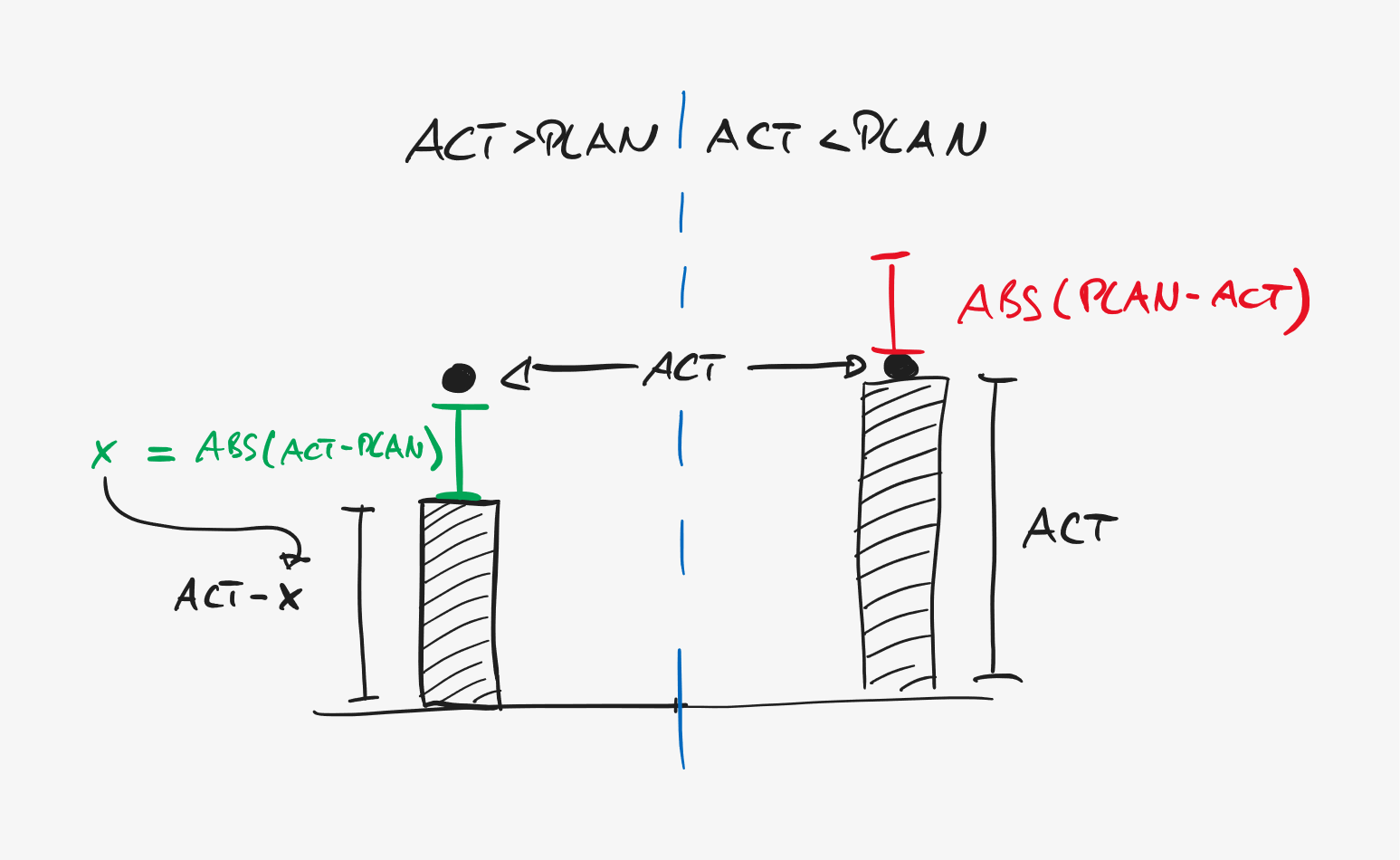
In order to be able to distinguish the two possible deviation scenarios (Actual > Plan and Actual < Plan), we will create two calculations in our story. Since our sample company is eager to grow in regards to workforce, being above Plan is considered positive and being above is considered negative. The definition of those two calculations is fairly simple by just applying a subtraction of our ACT FTE and our PLAN FTE, depending on which number is larger. Please be aware of two restrictions we have to apply:
1. We need to make sure, that our calculation is returning 0 if our condition is not met.
2. Since we use a stacked bar chart, we need to use the ABS() function to negate any negative presigns in our calculation result. Not doing so would result in a negative deviation bar to be shown on the x-axis level and not at our Actual base line.
This results in the following two calculation formulas.
Deviation positive:
ABS( IF( [#FTE (Actual)]>[#FTE (Plan)];[#FTE (Actual)]-[#FTE (Plan)];0))Deviation negative:
ABS(IF([#FTE (Actual)]<[#FTE (Plan)]; [#FTE (Plan)]-[#FTE (Actual)];0))Adding those two calculations to our line chart already shows us the deviations between Actual and Plan quite nicely. For readability reasons, I also defined the colors for the calculations to red (negative deviation) and green (positive deviation). But of course, this is only an intermediate step since the line chart itself just got more chaotic instead of sleeker as we want to be in the end.

Having the deviations correctly in place already from a value perspective, we can now move on with changing the chart type to the combined line / stacked-bar chart type. In that process we will already remove the Plan FTE key figure, since it was only needed to create and validate our deviation calculations.

After changing the chart type, initially all key figures will be shown as parts of the stacked bars. For our chart we want the Actual FTE the line chart component and the deviation calculations the bar components. After changing this, we will get the following result. Not bad at all.

So we do have a deviation bars all set up, but they are stuck at the x-axis base line at the moment. Looking back at our implementation idea, we need to take care of their base now, in order to lift them to our ACT FTE data points.
To do this, we will create another calculation in our story, called "base". The base needs to take care, that for periods where we are above Plan, the green deviation bar´s upper bound is equal our ACT FTE and for periods in which we are below plan, the red deviation bar´s lower bound is equal our ACT FTE. We are doing this by subtracting the positive deviation from our ACT FTE in order to make make the deviation and base sum up to the Actual data point. On the other hand we can set the base equal to the Actual data point´s value for period we are below plan.
So we can implement the following formula for our base calculation:
IF([#Deviation (positive)] >0 ;[#FTE (Actual)]-[#Deviation (positive)];[#FTE (Actual)])As soon as you add the base calculation to the bar section, and change the order to be it at the bottom, you can see the result as follows. That is looking good already and quite close to where we want to get.

As we are now done from a data perspective, we need to take care of the formatting. Being said easily, this turned out to be tricky facing severe SAC restrictions and pitfalls in story mode.
First we want to "hide" our base bars, since we want the deviation bars to appear floating around the ACT FTE line component. This can easily be done by changing the color of the base calculation key figure to white. Of course this is not ideal, since it forces us to make sure, that the base bar color matches the background of your report or dashboard. For unicoloured backgrounds this may be possible, in case you have gradient backgrounds, this may look strange. It would be great, if SAC would provide the functionality to be able to make chart components transparent.(*) Thinking about this even further, removing certain key figures from the legend would be an exquisite feature in such a scenario, but I can understand, that the use cases for such an specific feature are rather limited.

Changing the color of the base bars leads us to the next formatting challenge. As you can see on the chart above, changing the color to white causes the data point description to automatically change from black to white due to SAC´s integrated readability features. The feature itself is nice and useful, but not being able to change data point font colors per key figure in a chart is not and a huge hassle in our scenario. The fact that we cannot set font colors individually for each key figure forces us to select one color for all data points in our chart.(*) Since we need to get rid of the black text in our base bars to make them entirely invisible and thereby useful at all, we need to pick white as the general font color for the data points. That leads us to the situation, where we are able to see the data point texts on our deviation bars if we picked colors with sufficient contrast, but it makes the data point descriptions for our Actual disappear, which is nothing we want to happen.

Sadly I could not find any setting which did the trick. If you do not need at least some data point texts on the Actual line, then you are good to go with the result you have now. For all other readers, I found a feasible workaround.
In order to add descriptions for data points on the Actual line, we will create a duplicate of our previously created chart. In the duplicate we change the chart type to a simple line chart and remove all key figures except the Actual an change the font color of the data points to black. After that, you can move the line chart above the combined chart, Make sure, the x-axis and it´s elements are aligned and appear as one.

In case you did it properly, looking at the x-axis you wont be able to see its two overlapping charts now. You may hover see, that Actual lines are not matching and have some offset. In order to fix this, we will utilize the uniform chart scaling feature of the SAC and apply it to our Actual FTE key figure. After that the lines from both charts will align and match.
For the final touch I changed the colors for the deviation calculations a bit to exactly match the colouring set by SAP in the standard variation charts. Additionally I changed the data point configuraton for the line chart to only show me texts on the start, end, high and low values to not overload the chart. A positive side effect of the workaround is, that you can hide the base bars of the combined chart by pulling the line chart to the foreground and pushing the combined chart to the background in the formatting layer concept. This prevents users from interacting with the base bars when hovering over the chart with the cursor. Additionally you can add the deviation calculation key figures and the plan to the quick info, so the users can still see the values when hovering ofer the overlapping line chart.
Thats it, you´re done!

Conclusion
Wrapping it all up, the implementation of a line chart with integrated variance is possible with some thoughtful report design and issues to overcome. However for the future it would be nice to see the following functionalities at the SAC:
- Be able to set the color of chart elements to transparent.
- Be able to set the font size and color individually for each key figure individually, at least for data points.
I hope you can benefit from that insight and hope, it enables you to provide a new chart layout to your dashboards using the SAC story mode. Thank you very much for reading.
In case you are interested in further exchange on SAC developments and it´s usage in Reporting, Analytics and Planning use cases, I am always interested in further exchange.
Kind regards
Eric Zeugner
- SAP Managed Tags:
- BW (SAP Business Warehouse),
- SAP Analytics Cloud
5 Comments
You must be a registered user to add a comment. If you've already registered, sign in. Otherwise, register and sign in.
Labels in this area
-
"automatische backups"
1 -
"regelmäßige sicherung"
1 -
"TypeScript" "Development" "FeedBack"
1 -
505 Technology Updates 53
1 -
ABAP
14 -
ABAP API
1 -
ABAP CDS Views
2 -
ABAP CDS Views - BW Extraction
1 -
ABAP CDS Views - CDC (Change Data Capture)
1 -
ABAP class
2 -
ABAP Cloud
2 -
ABAP Development
5 -
ABAP in Eclipse
1 -
ABAP Platform Trial
1 -
ABAP Programming
2 -
abap technical
1 -
absl
2 -
access data from SAP Datasphere directly from Snowflake
1 -
Access data from SAP datasphere to Qliksense
1 -
Accrual
1 -
action
1 -
adapter modules
1 -
Addon
1 -
Adobe Document Services
1 -
ADS
1 -
ADS Config
1 -
ADS with ABAP
1 -
ADS with Java
1 -
ADT
2 -
Advance Shipping and Receiving
1 -
Advanced Event Mesh
3 -
AEM
1 -
AI
7 -
AI Launchpad
1 -
AI Projects
1 -
AIML
9 -
Alert in Sap analytical cloud
1 -
Amazon S3
1 -
Analytical Dataset
1 -
Analytical Model
1 -
Analytics
1 -
Analyze Workload Data
1 -
annotations
1 -
API
1 -
API and Integration
3 -
API Call
2 -
Application Architecture
1 -
Application Development
5 -
Application Development for SAP HANA Cloud
3 -
Applications and Business Processes (AP)
1 -
Artificial Intelligence
1 -
Artificial Intelligence (AI)
5 -
Artificial Intelligence (AI) 1 Business Trends 363 Business Trends 8 Digital Transformation with Cloud ERP (DT) 1 Event Information 462 Event Information 15 Expert Insights 114 Expert Insights 76 Life at SAP 418 Life at SAP 1 Product Updates 4
1 -
Artificial Intelligence (AI) blockchain Data & Analytics
1 -
Artificial Intelligence (AI) blockchain Data & Analytics Intelligent Enterprise
1 -
Artificial Intelligence (AI) blockchain Data & Analytics Intelligent Enterprise Oil Gas IoT Exploration Production
1 -
Artificial Intelligence (AI) blockchain Data & Analytics Intelligent Enterprise sustainability responsibility esg social compliance cybersecurity risk
1 -
ASE
1 -
ASR
2 -
ASUG
1 -
Attachments
1 -
Authorisations
1 -
Automating Processes
1 -
Automation
2 -
aws
2 -
Azure
1 -
Azure AI Studio
1 -
B2B Integration
1 -
Backorder Processing
1 -
Backup
1 -
Backup and Recovery
1 -
Backup schedule
1 -
BADI_MATERIAL_CHECK error message
1 -
Bank
1 -
BAS
1 -
basis
2 -
Basis Monitoring & Tcodes with Key notes
2 -
Batch Management
1 -
BDC
1 -
Best Practice
1 -
bitcoin
1 -
Blockchain
3 -
bodl
1 -
BOP in aATP
1 -
BOP Segments
1 -
BOP Strategies
1 -
BOP Variant
1 -
BPC
1 -
BPC LIVE
1 -
BTP
12 -
BTP Destination
2 -
Business AI
1 -
Business and IT Integration
1 -
Business application stu
1 -
Business Application Studio
1 -
Business Architecture
1 -
Business Communication Services
1 -
Business Continuity
1 -
Business Data Fabric
3 -
Business Partner
12 -
Business Partner Master Data
10 -
Business Technology Platform
2 -
Business Trends
4 -
CA
1 -
calculation view
1 -
CAP
3 -
Capgemini
1 -
CAPM
1 -
Catalyst for Efficiency: Revolutionizing SAP Integration Suite with Artificial Intelligence (AI) and
1 -
CCMS
2 -
CDQ
12 -
CDS
2 -
Cental Finance
1 -
Certificates
1 -
CFL
1 -
Change Management
1 -
chatbot
1 -
chatgpt
3 -
CL_SALV_TABLE
2 -
Class Runner
1 -
Classrunner
1 -
Cloud ALM Monitoring
1 -
Cloud ALM Operations
1 -
cloud connector
1 -
Cloud Extensibility
1 -
Cloud Foundry
4 -
Cloud Integration
6 -
Cloud Platform Integration
2 -
cloudalm
1 -
communication
1 -
Compensation Information Management
1 -
Compensation Management
1 -
Compliance
1 -
Compound Employee API
1 -
Configuration
1 -
Connectors
1 -
Consolidation Extension for SAP Analytics Cloud
2 -
Control Indicators.
1 -
Controller-Service-Repository pattern
1 -
Conversion
1 -
Cosine similarity
1 -
cryptocurrency
1 -
CSI
1 -
ctms
1 -
Custom chatbot
3 -
Custom Destination Service
1 -
custom fields
1 -
Customer Experience
1 -
Customer Journey
1 -
Customizing
1 -
cyber security
3 -
Data
1 -
Data & Analytics
1 -
Data Aging
1 -
Data Analytics
2 -
Data and Analytics (DA)
1 -
Data Archiving
1 -
Data Back-up
1 -
Data Governance
5 -
Data Integration
2 -
Data Quality
12 -
Data Quality Management
12 -
Data Synchronization
1 -
data transfer
1 -
Data Unleashed
1 -
Data Value
8 -
database tables
1 -
Datasphere
2 -
datenbanksicherung
1 -
dba cockpit
1 -
dbacockpit
1 -
Debugging
2 -
Delimiting Pay Components
1 -
Delta Integrations
1 -
Destination
3 -
Destination Service
1 -
Developer extensibility
1 -
Developing with SAP Integration Suite
1 -
Devops
1 -
digital transformation
1 -
Documentation
1 -
Dot Product
1 -
DQM
1 -
dump database
1 -
dump transaction
1 -
e-Invoice
1 -
E4H Conversion
1 -
Eclipse ADT ABAP Development Tools
2 -
edoc
1 -
edocument
1 -
ELA
1 -
Embedded Consolidation
1 -
Embedding
1 -
Embeddings
1 -
Employee Central
1 -
Employee Central Payroll
1 -
Employee Central Time Off
1 -
Employee Information
1 -
Employee Rehires
1 -
Enable Now
1 -
Enable now manager
1 -
endpoint
1 -
Enhancement Request
1 -
Enterprise Architecture
1 -
ETL Business Analytics with SAP Signavio
1 -
Euclidean distance
1 -
Event Dates
1 -
Event Driven Architecture
1 -
Event Mesh
2 -
Event Reason
1 -
EventBasedIntegration
1 -
EWM
1 -
EWM Outbound configuration
1 -
EWM-TM-Integration
1 -
Existing Event Changes
1 -
Expand
1 -
Expert
2 -
Expert Insights
2 -
Fiori
14 -
Fiori Elements
2 -
Fiori SAPUI5
12 -
Flask
1 -
Full Stack
8 -
Funds Management
1 -
General
1 -
Generative AI
1 -
Getting Started
1 -
GitHub
8 -
Grants Management
1 -
groovy
1 -
GTP
1 -
HANA
6 -
HANA Cloud
2 -
Hana Cloud Database Integration
2 -
HANA DB
2 -
HANA XS Advanced
1 -
Historical Events
1 -
home labs
1 -
HowTo
1 -
HR Data Management
1 -
html5
8 -
HTML5 Application
1 -
Identity cards validation
1 -
idm
1 -
Implementation
1 -
input parameter
1 -
instant payments
1 -
Integration
3 -
Integration Advisor
1 -
Integration Architecture
1 -
Integration Center
1 -
Integration Suite
1 -
intelligent enterprise
1 -
iot
1 -
Java
1 -
job
1 -
Job Information Changes
1 -
Job-Related Events
1 -
Job_Event_Information
1 -
joule
4 -
Journal Entries
1 -
Just Ask
1 -
Kerberos for ABAP
8 -
Kerberos for JAVA
8 -
KNN
1 -
Launch Wizard
1 -
learning content
2 -
Life at SAP
5 -
lightning
1 -
Linear Regression SAP HANA Cloud
1 -
local tax regulations
1 -
LP
1 -
Machine Learning
2 -
Marketing
1 -
Master Data
3 -
Master Data Management
14 -
Maxdb
2 -
MDG
1 -
MDGM
1 -
MDM
1 -
Message box.
1 -
Messages on RF Device
1 -
Microservices Architecture
1 -
Microsoft Universal Print
1 -
Middleware Solutions
1 -
Migration
5 -
ML Model Development
1 -
Modeling in SAP HANA Cloud
8 -
Monitoring
3 -
MTA
1 -
Multi-Record Scenarios
1 -
Multiple Event Triggers
1 -
Neo
1 -
New Event Creation
1 -
New Feature
1 -
Newcomer
1 -
NodeJS
2 -
ODATA
2 -
OData APIs
1 -
odatav2
1 -
ODATAV4
1 -
ODBC
1 -
ODBC Connection
1 -
Onpremise
1 -
open source
2 -
OpenAI API
1 -
Oracle
1 -
PaPM
1 -
PaPM Dynamic Data Copy through Writer function
1 -
PaPM Remote Call
1 -
PAS-C01
1 -
Pay Component Management
1 -
PGP
1 -
Pickle
1 -
PLANNING ARCHITECTURE
1 -
Popup in Sap analytical cloud
1 -
PostgrSQL
1 -
POSTMAN
1 -
Process Automation
2 -
Product Updates
4 -
PSM
1 -
Public Cloud
1 -
Python
4 -
Qlik
1 -
Qualtrics
1 -
RAP
3 -
RAP BO
2 -
Record Deletion
1 -
Recovery
1 -
recurring payments
1 -
redeply
1 -
Release
1 -
Remote Consumption Model
1 -
Replication Flows
1 -
research
1 -
Resilience
1 -
REST
1 -
REST API
1 -
Retagging Required
1 -
Risk
1 -
Rolling Kernel Switch
1 -
route
1 -
rules
1 -
S4 HANA
1 -
S4 HANA Cloud
1 -
S4 HANA On-Premise
1 -
S4HANA
3 -
S4HANA_OP_2023
2 -
SAC
10 -
SAC PLANNING
9 -
SAP
4 -
SAP ABAP
1 -
SAP Advanced Event Mesh
1 -
SAP AI Core
8 -
SAP AI Launchpad
8 -
SAP Analytic Cloud Compass
1 -
Sap Analytical Cloud
1 -
SAP Analytics Cloud
4 -
SAP Analytics Cloud for Consolidation
3 -
SAP Analytics Cloud Story
1 -
SAP analytics clouds
1 -
SAP BAS
1 -
SAP Basis
6 -
SAP BODS
1 -
SAP BODS certification.
1 -
SAP BTP
21 -
SAP BTP Build Work Zone
2 -
SAP BTP Cloud Foundry
6 -
SAP BTP Costing
1 -
SAP BTP CTMS
1 -
SAP BTP Innovation
1 -
SAP BTP Migration Tool
1 -
SAP BTP SDK IOS
1 -
SAP Build
11 -
SAP Build App
1 -
SAP Build apps
1 -
SAP Build CodeJam
1 -
SAP Build Process Automation
3 -
SAP Build work zone
10 -
SAP Business Objects Platform
1 -
SAP Business Technology
2 -
SAP Business Technology Platform (XP)
1 -
sap bw
1 -
SAP CAP
2 -
SAP CDC
1 -
SAP CDP
1 -
SAP CDS VIEW
1 -
SAP Certification
1 -
SAP Cloud ALM
4 -
SAP Cloud Application Programming Model
1 -
SAP Cloud Integration for Data Services
1 -
SAP cloud platform
8 -
SAP Companion
1 -
SAP CPI
3 -
SAP CPI (Cloud Platform Integration)
2 -
SAP CPI Discover tab
1 -
sap credential store
1 -
SAP Customer Data Cloud
1 -
SAP Customer Data Platform
1 -
SAP Data Intelligence
1 -
SAP Data Migration in Retail Industry
1 -
SAP Data Services
1 -
SAP DATABASE
1 -
SAP Dataspher to Non SAP BI tools
1 -
SAP Datasphere
10 -
SAP DRC
1 -
SAP EWM
1 -
SAP Fiori
2 -
SAP Fiori App Embedding
1 -
Sap Fiori Extension Project Using BAS
1 -
SAP GRC
1 -
SAP HANA
1 -
SAP HCM (Human Capital Management)
1 -
SAP HR Solutions
1 -
SAP IDM
1 -
SAP Integration Suite
9 -
SAP Integrations
4 -
SAP iRPA
2 -
SAP Learning Class
1 -
SAP Learning Hub
1 -
SAP Odata
2 -
SAP on Azure
1 -
SAP PartnerEdge
1 -
sap partners
1 -
SAP Password Reset
1 -
SAP PO Migration
1 -
SAP Prepackaged Content
1 -
SAP Process Automation
2 -
SAP Process Integration
2 -
SAP Process Orchestration
1 -
SAP S4HANA
2 -
SAP S4HANA Cloud
1 -
SAP S4HANA Cloud for Finance
1 -
SAP S4HANA Cloud private edition
1 -
SAP Sandbox
1 -
SAP STMS
1 -
SAP successfactors
3 -
SAP SuccessFactors HXM Core
1 -
SAP Time
1 -
SAP TM
2 -
SAP Trading Partner Management
1 -
SAP UI5
1 -
SAP Upgrade
1 -
SAP Utilities
1 -
SAP-GUI
8 -
SAP_COM_0276
1 -
SAPBTP
1 -
SAPCPI
1 -
SAPEWM
1 -
sapmentors
1 -
saponaws
2 -
SAPS4HANA
1 -
SAPUI5
4 -
schedule
1 -
Secure Login Client Setup
8 -
security
9 -
Selenium Testing
1 -
SEN
1 -
SEN Manager
1 -
service
1 -
SET_CELL_TYPE
1 -
SET_CELL_TYPE_COLUMN
1 -
SFTP scenario
2 -
Simplex
1 -
Single Sign On
8 -
Singlesource
1 -
SKLearn
1 -
soap
1 -
Software Development
1 -
SOLMAN
1 -
solman 7.2
2 -
Solution Manager
3 -
sp_dumpdb
1 -
sp_dumptrans
1 -
SQL
1 -
sql script
1 -
SSL
8 -
SSO
8 -
Substring function
1 -
SuccessFactors
1 -
SuccessFactors Platform
1 -
SuccessFactors Time Tracking
1 -
Sybase
1 -
system copy method
1 -
System owner
1 -
Table splitting
1 -
Tax Integration
1 -
Technical article
1 -
Technical articles
1 -
Technology Updates
14 -
Technology Updates
1 -
Technology_Updates
1 -
terraform
1 -
Threats
1 -
Time Collectors
1 -
Time Off
2 -
Time Sheet
1 -
Time Sheet SAP SuccessFactors Time Tracking
1 -
Tips and tricks
2 -
toggle button
1 -
Tools
1 -
Trainings & Certifications
1 -
Transport in SAP BODS
1 -
Transport Management
1 -
TypeScript
2 -
ui designer
1 -
unbind
1 -
Unified Customer Profile
1 -
UPB
1 -
Use of Parameters for Data Copy in PaPM
1 -
User Unlock
1 -
VA02
1 -
Validations
1 -
Vector Database
2 -
Vector Engine
1 -
Visual Studio Code
1 -
VSCode
1 -
Web SDK
1 -
work zone
1 -
workload
1 -
xsa
1 -
XSA Refresh
1
- « Previous
- Next »
Related Content
- Top Picks: Innovations Highlights from SAP Business Technology Platform (Q1/2024) in Technology Blogs by SAP
- What’s New in SAP Analytics Cloud Release 2024.08 in Technology Blogs by SAP
- SAP Build Code - Speed up your development with Generative AI Assistant - Joule in Technology Blogs by SAP
- What’s New in SAP Analytics Cloud Release 2024.07 in Technology Blogs by SAP
- Unleashing AI Magic: Building Full-Stack Apps with SAP Build Code in Technology Blogs by SAP
Top kudoed authors
| User | Count |
|---|---|
| 10 | |
| 9 | |
| 5 | |
| 4 | |
| 4 | |
| 4 | |
| 4 | |
| 3 | |
| 3 | |
| 3 |