


- SAP Community
- Products and Technology
- Technology
- Technology Blogs by SAP
- What’s new in Mobile development kit client 6.1
Technology Blogs by SAP
Learn how to extend and personalize SAP applications. Follow the SAP technology blog for insights into SAP BTP, ABAP, SAP Analytics Cloud, SAP HANA, and more.
Turn on suggestions
Auto-suggest helps you quickly narrow down your search results by suggesting possible matches as you type.
Showing results for
 Jitendra_Kansal
Product and Topic Expert
Options
- Subscribe to RSS Feed
- Mark as New
- Mark as Read
- Bookmark
- Subscribe
- Printer Friendly Page
- Report Inappropriate Content
12-01-2021
8:33 AM
I am happy to announce that a new release of the Mobile Development Kit is now available for all Mobile Services customers and can be downloaded on the SAP Software Center and community Download page).
SAP Mobile Services Client has also been updated in Apple app store and will soon be available in Google Play Store.
SAP Mobile Development Kit enables developers and technical business users to build multi-channel applications. It allows you to build your application once, in an integrated development environment (SAP Business Application Studio/ VSCode extension) and run it natively on Mobile (Android & iOS) and as a web application (online) in the browser.
This release includes the following:
Support Image Section
You can now display an image in a section as a Banner or a detailed image.
This Image section supports:
Check documentation for details.
Support Data Table for iOS and Android
Data Table is a scrollable table that supports showing more columns in a table and scrolling to view data off page.
Check documentation for details.
Support Inline Signature Capture for iOS and Android
This new Form Cell control allows you to show the signature capture canvas in the form cell container page directly instead of having to show it in a separate pop-up dialog box.
Check documentation for details.
New platform specific system icons (for System Item) are introduced to give you more choices of icons provided by
You can use them in the SystemItem property for Action Bar and Toolbar items.
Platform specific symbols for SystemItem can be provided via $(PLT, iOS, Android) metadata function.
In above snippet, line.3.horizontal.decrease.circle, doc.viewfinder are from SF symbols and filter_list, document_scanner from Material icons.
Check documentation for details.
Support Programmatic Filters in Object Table
This feature allows
We have introduced a new metadata property called Filters in Sectioned Table that allows you to see a certain set of values of filter / sorter pre-applied on loading of a list page.
We introduce UI Fragment that allows you to define parts of your UI in fragment file that can be re-used in different part of the page or different pages.
For example:
ProductObjectCell.fragment is a single control fragment
Consuming the fragment in a Sectioned Table:
Check documentation for details.
Toolbar items will be moved to overflow popover when there's not enough space to display them.
This feature is already available in the Mobile client and is now supported in the web environment.
DetailImageText property allows you to put a placeholder text that will be rendered in place of the Detail Image. This can be useful for displaying initials of a person name if they do not have a profile image.
Sectioned Table now supports Target property for binding. It allows you to generate dynamically rendered sections, one for each row of the target result set.
Use cases:
This rule returns a single section control definition and is executed for every entries of the target binding results.
Check documentation for details.
We have introduced new Form Cell Control Proxy class with new getter and setter function that allows you to get or set control’s properties at runtime.
e.g., For a Note Form Cell control
you can get its properties from a rule
and can also set its properties via a rule
You can now generate and receive custom events within your MDK application.
Events are generated using the ClientAPI executeCustomEvent which can be called from any rule or MDK Extension. This can be useful for:
When executing the custom event you specify an event type along with the event data (specified a JSON block)
Events are received at the new Page level OnCustomEventDataReceived handler. The handler will be triggered whenever a custom event is executed (and the page is active).
In your handler you can easily check the event type and then if applicable, process the event data accordingly.
In below example, I am calling this rule on an action bar item which triggers executeCustomEvent ClientAPI with required input parameters.
And then it triggers OnCustomEventDataReceived event on the Product page which process the “EventType” and “Data” received from the executeCustomEvent ClientAPI and then act upon the page to set a value in the search placeholder.
You can now get and set Client Data on application level instead of page level. This allows you to store information in application client data which are accessible anywhere within the app.
It can be accessed via "#Application/#ClientData/<CustomPropName>"
e.g. "#Application/#ClientData/CustomUserSettings"
A new getAppClientData() API is also introduced to allow you to retrieve Application Client Data in a JavaScript rule.
Check documentation for details.
Contact Cell's ActivityItems property now supports rules. You can return an array of Activity Items.
setActionBarItemVisible API now also accepts the name of the action bar item in string format.
Check documentation for more details.
We have introduced a new Upload Media action that allows you upload a new media to replace an existing media in a media entity.
e.g. "Product" EntityType is a Media Entity.
Check documentation for more details.
Up until now, In order to display OData image from sources such as Media Entity or Edm.Stream property you had to write code to download media or stream and then store it to local file before displaying it in the control. You can now display it directly on any UI control that support image such as Object Cell's Detail Image, Image Cell, Action Bar Icon, and so on by specifying a binding syntax.
/<ServicePath>/<EntityReadLink>/<$value or PropertyName>
e.g. To display respective images for a product in a list, you can directly bind e.g. DetaiImage property as below:
You can also use same binding to the Path property in the OpenDocument action to open it
Note: You can bind non-image media with Open Document action too as long as you provide the correct mime-type to the MimeType property of the action.
Check documentation for more details.
Multi users support for iOS has been enhanced to be more closer to Android counterpart.
MDK additionally supports below languages/dialect:
You can now upload an Overrides.json in Android device by going to your app's info page > additional settings (might vary depending on device) > Upload Overrides.json, this allows you to override certain properties in BrandedSettings.json such as DebugSettings and AllowCerts properties (other properties are not overridable).
We introduce a new action SetDebugSettings that allow you to enable DebugSettings during runtime or override the DebugSettings in BrandedSettings.json.
You can also set debug settings via setDebugSettingsClient API.
Check documentation for more details.
You can now use --include-source-map option to the create-client command script that will include source map of the built-in metadata to the generated client project.
In the welcome page, you can find references to latest MDK contents like tutorials, samples available on public GitHub.

You can learn more in documentation :
I am looking forward to your feedback/comments.
Jitendra
SAP Mobile Services Client has also been updated in Apple app store and will soon be available in Google Play Store.
SAP Mobile Development Kit enables developers and technical business users to build multi-channel applications. It allows you to build your application once, in an integrated development environment (SAP Business Application Studio/ VSCode extension) and run it natively on Mobile (Android & iOS) and as a web application (online) in the browser.
This release includes the following:
- New UI enhancements
- Support Image Section
- Support Data Table for iOS and Android
- Support Inline Signature Capture for iOS and Android
- Support more system icons in iOS and Android
- Support Programmatic Filters in Object Table
- Support UI Control Fragments
- Toolbar buttons automatically show overflow icon
- Support Detail Image Text (avatar image) for Object Cell in Web runtime
- API and Syntax enhancements
- Generate sections contents based upon a section target
- Getter/Setter APIs for Form Cell controls’ properties
- Support custom event
- Support Application level ClientData
- Support Rules in a ContactCell's ActivityItems
- Allow name for SetActionBarItemVisible API
- OData enhancements
- General enhancements
- Multi-user support improvements on iOS
- Additional languages supported
- Support Overrides.json in Android
- Support overriding / enabling debug settings from Overrides.json file, rule and action
- Add source map option in create client script
- BAS editor- Additional enhancements
Support Image Section
You can now display an image in a section as a Banner or a detailed image.
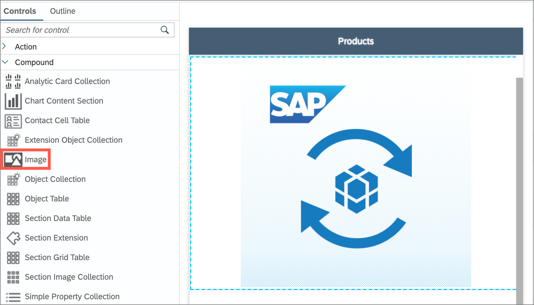
Image Section control in Layout editor
This Image section supports:
- Only a single image
- All the image sources (native image resources, metadata image, font-icon, sap-icon, HTTP URL, PDF images, base64 image and OData direct rendering).
- Configuring the height, width, content mode to scale fit or stretch or fill.

Image Section in mobile clients

Image Section in web application
Check documentation for details.
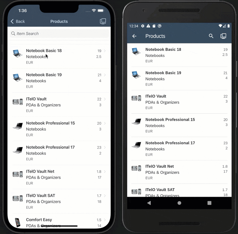
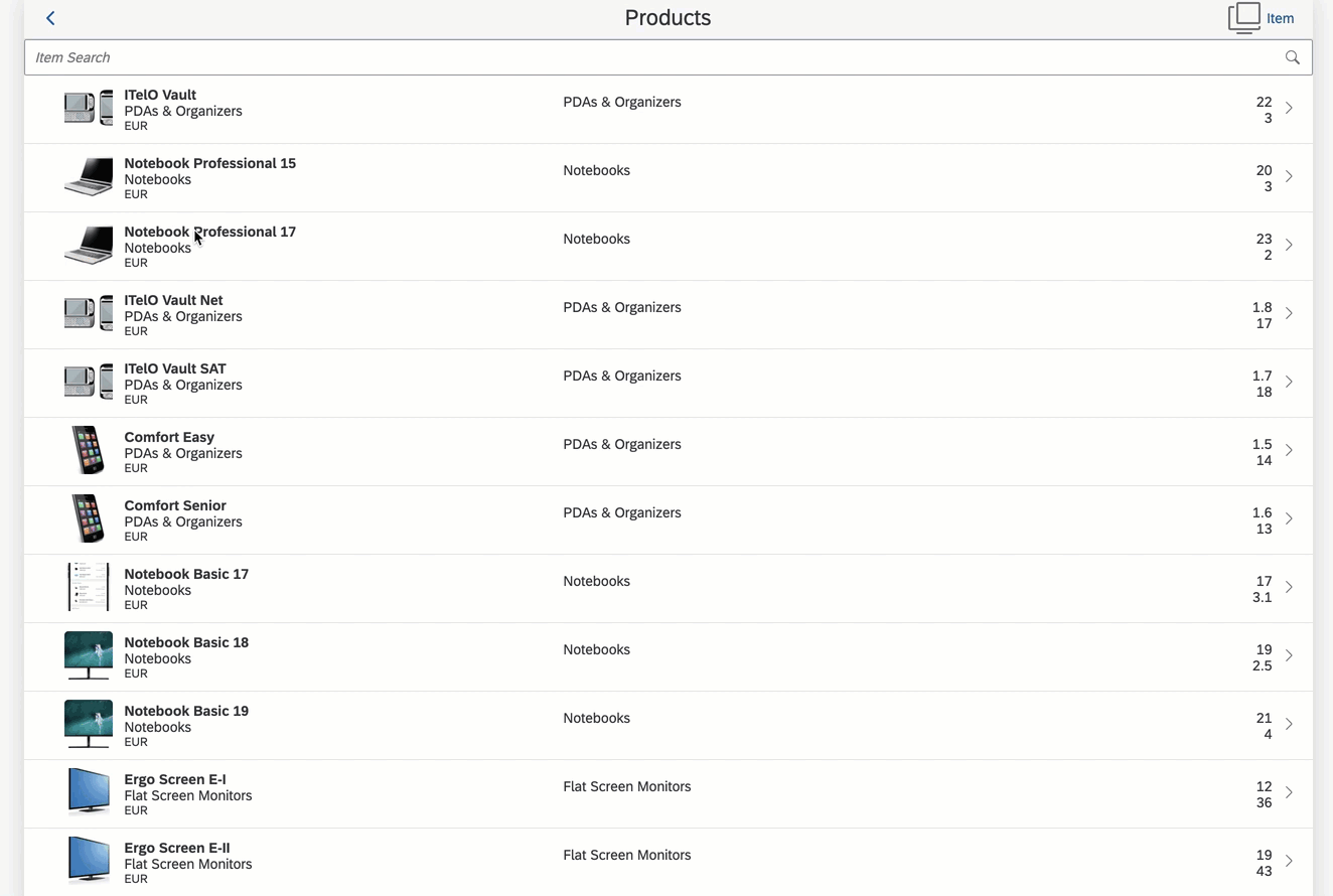
Support Data Table for iOS and Android
Data Table is a scrollable table that supports showing more columns in a table and scrolling to view data off page.
- It allows you to have the first column to be fixed at its position and only the other columns will be scrolling.
- This is especially helpful on Phones where the Grid table will auto-covert to an Object Table list.

Data Table in Layout editor

Data Table in mobile clients
Check documentation for details.
Support Inline Signature Capture for iOS and Android
This new Form Cell control allows you to show the signature capture canvas in the form cell container page directly instead of having to show it in a separate pop-up dialog box.

Inline Signature control in Layout editor

Inline Signature in mobile clients
Check documentation for details.
Support more system icons in iOS and Android
New platform specific system icons (for System Item) are introduced to give you more choices of icons provided by
- SAP Fiori for iOS icons, SF Symbols for iOS platform
- Material icons for Android platform
You can use them in the SystemItem property for Action Bar and Toolbar items.
"ActionBar": {

        "Items": [{

            "_Name": "ActionBarItem0",

            "Caption": "Item",

            "SystemItem": "$(PLT, line.3.horizontal.decrease.circle, filter_list)",

            "Position": "Right"

        }],

        "_Name": "ActionBar1"

    },

    "ToolBar": {

        "Items": [{

            "_Type": "Control.Type.ToolbarItem",

            "_Name": "ToolbarItem0",

            "Caption": "ToolbarItem",

            "SystemItem": "$(PLT, doc.viewfinder, document_scanner)"

        }]

    }
Platform specific symbols for SystemItem can be provided via $(PLT, iOS, Android) metadata function.
In above snippet, line.3.horizontal.decrease.circle, doc.viewfinder are from SF symbols and filter_list, document_scanner from Material icons.

System Icons in mobile clients
Check documentation for details.
Support Programmatic Filters in Object Table
This feature allows
- developer to pre-filter object table and still allows user to modify those filter settings.
- to persist the current filter state and re-apply the persisted filter criteria when user comes to the page
- to get the current Filter criteria applied to the Sectioned Table using ClientAPI
- to set the new filter criteria on the Sectioned Table using ClientAPI
We have introduced a new metadata property called Filters in Sectioned Table that allows you to see a certain set of values of filter / sorter pre-applied on loading of a list page.
- This property accepts only JavaScript rules.
- Any filters / sorter that are set will be applied when user opens the filter page.
- In the rule, you can return an array of FilterCriteria that can be created via createFilterCriteria API.
e.g. I have set below rule to the Filters property in Sectioned Table where the filter and sorter will be pre-applied on loading of the Product page. When user opens the filter page, the pre-defined filters are shown as current values.
let result = [
//createFilterCriteria(filterType: FilterType, name: string, caption: string, filterItems: Array‹object›, isFilterItemsComplex: boolean)
context.createFilterCriteria(context.filterTypeEnum.Sorter, 'FormCellSorter0', undefined, ['NumberOfProducts desc'], false),
context.createFilterCriteria(context.filterTypeEnum.Filter, 'FormCellFilter0', undefined, ['NumberOfProducts ge 4'], true),
context.createFilterCriteria(context.filterTypeEnum.Filter, 'FormCellFilter1', undefined, ['MainCategoryName eq \'Smartphones & Tablets\''], true)
];
return result;

filters are pre-applied on loading of a page in mobile clients

filters are pre-applied on loading of a page in web application
- get Filters API allows to get the filter criteria currently applied to the Sectioned Table
let currentAppliedFilters = context.getPageProxy().getControl('SectionedTable').filters;
//convertFilterCriteriaArrayToJSONString method allows to save/restore filters using string
var currentFilterInJSONString = context.convertFilterCriteriaArrayToJSONString(currentAppliedFilters);
context.getClientData().currentFilterInJSONString = context.convertFilterCriteriaArrayToJSONString(currentAppliedFilters);
alert('Current applied filters are:\n\n' + currentFilterInJSONString);

Currently applied filter criteria to the Sectioned Table in mobile clients

- get Filters API allows to get the filter criteria currently applied to the Sectioned Table
Currently applied filter criteria to the Sectioned Table in web application
- set Filters API allows to set new filter / sorter on the Sectioned Table
const sectionedTable = clientAPI.getPageProxy().getControl('SectionedTable');
//convertJSONStringToFilterCriteriaArray method converts JSON string to array of FilterCriteria
sectionedTable.filters = clientAPI.convertJSONStringToFilterCriteriaArray(clientAPI.getClientData().currentFilterInJSONString);

Setting filter criteria to the Sectioned Table in mobile clients

Setting filter criteria to the Sectioned Table in web application
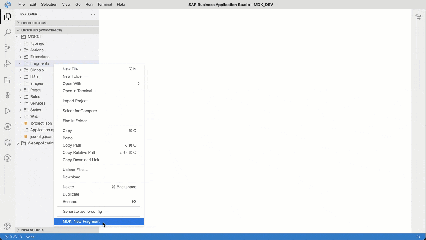
Support UI Control Fragments
We introduce UI Fragment that allows you to define parts of your UI in fragment file that can be re-used in different part of the page or different pages.
- When you need to make changes to that piece of the UI, you can modify it in the fragment and all the pages that reference the fragment will pick up the new UI change when you deploy your application.
- Fragment can be a single control or an array
- You can have a fragment within fragment
For example:
ProductObjectCell.fragment is a single control fragment
{

    "_Type": "Control.Type.SectionObjectCell",

    "Title": "{Name}",

    "Visible": true,

    "Selected": false,

    "Footnote": "{Price} {CurrencyCode}",

    "Description": "{CategoryName}",

    "StatusText": "Depth: {DimensionDepth} {DimensionUnit}",

    "SubstatusText": "Height: {DimensionHeight} {DimensionUnit}",

    "DetailImage": "/MDK61/Services/SampleServiceV2_offline.service/{@odata.readLink}/$value",

    "DetailImageIsCircular": false,

    "AccessoryType": "disclosureIndicator",

    "PreserveIconStackSpacing": false,

    "OnPress": "/MDK61/Actions/ImageSection/NavToProducts_Detail.action"

}
Consuming the fragment in a Sectioned Table:
{

        "_Type": "Control.Type.SectionedTable",

        "_Name": "SectionedTable0",

        "Sections": [{

            "_Type": "Section.Type.ObjectTable",

            "_Name": "SectionObjectTable0",

            "ObjectCell": "/MDK61/Fragments/ProductObjectCell.fragment"


        }]

    }
Fragment support in Layout editor
Check documentation for details.
Toolbar buttons automatically show overflow icon
Toolbar items will be moved to overflow popover when there's not enough space to display them.
Overflow icon in mobile clients
Support Detail Image Text (avatar image) for Object Cell in Web runtime
This feature is already available in the Mobile client and is now supported in the web environment.
DetailImageText property allows you to put a placeholder text that will be rendered in place of the Detail Image. This can be useful for displaying initials of a person name if they do not have a profile image.
ObjectCells": [{

        "ObjectCell": {

            "AccessoryType": "none",

            "DetailImageIsCircular": false,

            "DetailImageText": "AI",

            "Title": "Avatar Image"

        }

    },

    {

        "ObjectCell": {

            "AccessoryType": "none",

            "DetailImageIsCircular": true,

            "DetailImageText": "CI",

            "Title": "Circular Avatar Image"

        }

    }

]
Generate sections contents based upon a section target
Sectioned Table now supports Target property for binding. It allows you to generate dynamically rendered sections, one for each row of the target result set.
Use cases:
- Display feeds with different content types per item
- personalization - allow a user to define a sequence of sections on a pageIn below example, i have set the Sectioned Table's target to ProductCategories which returns an array and have bound the Section property to a rule so that application can return different section type based on business logic.
{

    "Controls": [{

        "Section": "/MDK61/Rules/GenerateSectionContents/GetSection.js",

        "_Type": "Control.Type.SectionedTable",

        "Target": {

            "Service": "/MDK61/Services/SampleServiceV2_online.service",

            "EntitySet": "ProductCategories",

            "QueryOptions": "$top=3"

        },

        "_Name": "SectionedTable0"

    }],

    "_Type": "Page",

    "_Name": "ProductsCategories_generate",

    "Caption": "Products By Categories"

}
This rule returns a single section control definition and is executed for every entries of the target binding results.
export default function GetSection(context) {

    const binding = context.binding;

    if (binding.CategoryName == 'Bins & Baskets') {

        return {

            "_Type": "Section.Type.ObjectTable",

            "EmptySection": {

                "Caption": "No product for {CategoryName}"

            },

            "Header": {

                "Caption": "{CategoryName}",

                "UseTopPadding": true

            },

            "Target": {

                "EntitySet": "Products",

                "Service": "/MDK61/Services/SampleServiceV2_online.service",

                "QueryOptions": "$filter=CategoryName eq '{CategoryName}'"

            },

            "ObjectCell": {

                "Title": "{Name}",

                "Footnote": "{CategoryName}",

                "Description": "{ProductId}",

                "StatusText": "{Price} {CurrencyCode}",

                "DetailImage": "/MDK61/Services/SampleServiceV2_online.service/{@odata.readLink}/$value"

            }

        };

    }

    else {

        return {

            "_Type": "Section.Type.ObjectCollection",

            "EmptySection": {

                "Caption": "No product for {CategoryName}"

            },

            "Header": {

                "Caption": "{CategoryName}",

                "UseTopPadding": true

            },

            "Layout": {

                "NumberOfColumns": 2

            },

            "Target": {

                "EntitySet": "Products",

                "Service": "/MDK61/Services/SampleServiceV2_online.service",

                "QueryOptions": "$filter=CategoryName eq '{CategoryName}'&$top=4"


            },

            "ObjectCell": {

                "Title": "{Name}",

                "Footnote": "{CategoryName}",

                "StatusText": "{Price} {CurrencyCode}",

                "DetailImage": "/MDK61/Services/SampleServiceV2_online.service/{@odata.readLink}/$value"

            }

        };

    }


}
Generating sections in mobile clients

Generating sections in web application
Check documentation for details.
Getter/Setter APIs for Form Cell controls’ properties
We have introduced new Form Cell Control Proxy class with new getter and setter function that allows you to get or set control’s properties at runtime.
e.g., For a Note Form Cell control
{

    "_Type": "Control.Type.FormCell.Note",

    "_Name": "FormCellNote0",

    "IsEditable": true,

    "IsVisible": true,

    "PlaceHolder": "MinNumberOfLines 2 MaxNumberOfLines 5",

    "MaxNumberOfLines": 5,

    "MinNumberOfLines": 2

},
you can get its properties from a rule
var noteFormCell = context.evaluateTargetPathForAPI("#Control:FormCellNote0");

    message += "\n\n  Note: \n MaxNumberOfLines: " + noteFormCell.getMaxNumberOfLines();

    message += "\n MinNumberOfLines: " + noteFormCell.getMinNumberOfLines();

    alert(message);
and can also set its properties via a rule
var noteFormCell = context.evaluateTargetPathForAPI("#Control:FormCellNote0");

noteFormCell.setMinNumberOfLines(10);

noteFormCell.setMaxNumberOfLines(20);

noteFormCell.setPlaceHolder("MinNumberOfLines 10 MaxNumberOfLines 20");
Getting and setting FormCell controls properties in mobile clients
Getting and setting FormCell controls properties in mobile clients
Support custom event
You can now generate and receive custom events within your MDK application.
Events are generated using the ClientAPI executeCustomEvent which can be called from any rule or MDK Extension. This can be useful for:
- Hardware based scan events
- Bluetooth data sync input
- Real time feed input
When executing the custom event you specify an event type along with the event data (specified a JSON block)
Events are received at the new Page level OnCustomEventDataReceived handler. The handler will be triggered whenever a custom event is executed (and the page is active).
In your handler you can easily check the event type and then if applicable, process the event data accordingly.
In below example, I am calling this rule on an action bar item which triggers executeCustomEvent ClientAPI with required input parameters.
export default function EnterSearchText(context) {

    let eventData = {

        Placeholder: "Watering Can"

    };

    // executeCustomEvent ClientAPI accepts two parameters "EventType" and "Data"

    // Client API executeCustomEvent(String: EventType, Object: Data)

    context.getPageProxy().executeCustomEvent("SearchEvent", eventData);

}
And then it triggers OnCustomEventDataReceived event on the Product page which process the “EventType” and “Data” received from the executeCustomEvent ClientAPI and then act upon the page to set a value in the search placeholder.

export default function SearchEvent(context) {

    let eventData = context.getAppEventData();

    let sectionTableProxy = context.getPageProxy().getControl('SectionedTable');

    sectionTableProxy.searchString = eventData.Data.Placeholder;

}.
Custom event support in mobile clients
Support Application level ClientData
You can now get and set Client Data on application level instead of page level. This allows you to store information in application client data which are accessible anywhere within the app.
It can be accessed via "#Application/#ClientData/<CustomPropName>"
e.g. "#Application/#ClientData/CustomUserSettings"
A new getAppClientData() API is also introduced to allow you to retrieve Application Client Data in a JavaScript rule.
Check documentation for details.
Support Rules in a ContactCell's ActivityItems
Contact Cell's ActivityItems property now supports rules. You can return an array of Activity Items.
"ContactCell": {

    "DetailImage": "sap-icon://customer",

    "Headline": "{FirstName} {LastName}",

    "Subheadline": "{City}, {Country}",

    "ActivityItems": "/MDK61/Rules/ActivityItems.js"

}
export default function ActivityItems (context) {
let customerId = context.evaluateTargetPath("CustomerId");
let activityItems = [];
activityItems.push({
ActivityType: 'VideoCall',
ActivityValue: "0123456789"
});
activityItems.push({
ActivityType: 'Email',
ActivityValue: "mailme@mail.de"
});
activityItems.push({
ActivityType: 'Detail',
ActivityValue: customerId
});
return activityItems;
}Allow name for SetActionBarItemVisible API
setActionBarItemVisible API now also accepts the name of the action bar item in string format.
Check documentation for more details.
Support Upload Media
We have introduced a new Upload Media action that allows you upload a new media to replace an existing media in a media entity.
e.g. "Product" EntityType is a Media Entity.
<EntityType Name="Product" m:HasStream="true">

<Key>

<PropertyRef Name="ProductId"/>

</Key>

<Property Name="Category" Type="Edm.String" Nullable="true" MaxLength="40"/>

<Property Name="ProductId" Type="Edm.String" Nullable="false" MaxLength="36"/>

...

...

<Property Name="WeightUnit" Type="Edm.String" Nullable="true" MaxLength="3"/>

</EntityType>
{
"_Type": "Action.Type.ODataService.UploadMedia",
"ActionResult": {
"_Name": "OData"
},
"OnFailure": "/MDK61/Rules/ODataImage/FailureUploadMedia.js",
"OnSuccess": "/MDK61/Actions/CloseModalPage_Complete.action",
"Target": {
"Service": "/MDK61/Services/SampleServiceV2_online.service",
"EntitySet": "Products",
"ReadLink": "{@odata.readLink}"
},
"Media": "#Control:FormCellAttachment1/#Value"
}
Upload a media in mobile clients
Upload a media in web application
Check documentation for more details.
Support direct rendering of an OData Image
Up until now, In order to display OData image from sources such as Media Entity or Edm.Stream property you had to write code to download media or stream and then store it to local file before displaying it in the control. You can now display it directly on any UI control that support image such as Object Cell's Detail Image, Image Cell, Action Bar Icon, and so on by specifying a binding syntax.
/<ServicePath>/<EntityReadLink>/<$value or PropertyName>
e.g. To display respective images for a product in a list, you can directly bind e.g. DetaiImage property as below:
//OData Media Entity

{

    "ObjectCell": {

        "DetailImage": "/MDK61/Services/SampleServiceV2_online.service/{@odata.readLink}/$value"

    }

}


//OData property (Picture) with type Edm.stream

{

    "ObjectCell": {

        "DetailImage": "/MDK61/Services/SampleServiceV4_online.service/{@odata.readLink}/Picture"

    }

}
You can also use same binding to the Path property in the OpenDocument action to open it
//OData Media Entity

{

    "_Type": "Action.Type.OpenDocument",

    "Path": "/MDK61/Services/SampleServiceV2_online.service/{@odata.readLink}/$value",

    "MimeType": "image/jpeg"

}


//OData property (Picture) with type Edm.stream

{

    "_Type": "Action.Type.OpenDocument",

    "Path": "/MDK61/Services/SampleServiceV4_online.service/{@odata.readLink}/Picture",

    "MimeType": "image/jpeg"

}
Note: You can bind non-image media with Open Document action too as long as you provide the correct mime-type to the MimeType property of the action.
Check documentation for more details.
Multi-user support improvements on iOS
Multi users support for iOS has been enhanced to be more closer to Android counterpart.
- Forgot passcode flow was improved to be more streamlined.
- Passcode code screen text customization is also added
- Email obfuscation is added.
- Lock Timeout value from Mobile Services can be read

Additional languages supported
MDK additionally supports below languages/dialect:
- English - UK (en_GB)
- French – Canada (fr_CA)
- Portuguese – Brazil ( pt_BR)
Support Overrides.json in Android
You can now upload an Overrides.json in Android device by going to your app's info page > additional settings (might vary depending on device) > Upload Overrides.json, this allows you to override certain properties in BrandedSettings.json such as DebugSettings and AllowCerts properties (other properties are not overridable).
Support overriding / enabling debug settings from Overrides.json file, rule and action
We introduce a new action SetDebugSettings that allow you to enable DebugSettings during runtime or override the DebugSettings in BrandedSettings.json.

{

    "_Type": "Action.Type.SetDebugSettings",

    "OnSuccess": "/MDK61/Actions/Success.action",

    "DebugODataProvider": true,

    "TracingEnabled": false,

    "Categories": [

        "mdk.trace.odata"

    ]

}
You can also set debug settings via setDebugSettingsClient API.
export default function SetDebugSettings(context) {
let debugODataProvider = true;
let tracingEnabled = true;
let tracingCategories = [
'mdk.trace.action',
'mdk.trace.odata',
'mdk.trace.profiling'
]
context.setDebugSettings(debugODataProvider, tracingEnabled, tracingCategories);
}- DebugODataProvider setting enables debug logs for OData calls.
- Once Tracing is enabled, you can find the logs in the console window
Check documentation for more details.
Add source map option in create client script
You can now use --include-source-map option to the create-client command script that will include source map of the built-in metadata to the generated client project.
Tutorials, sample repo references in welcome page
In the welcome page, you can find references to latest MDK contents like tutorials, samples available on public GitHub.

New to MDK development?
Follow these tutorials to get your hands dirty and learn more about Mobile development kit!
Further Information:
You can learn more in documentation :
I am looking forward to your feedback/comments.
Jitendra
8 Comments
You must be a registered user to add a comment. If you've already registered, sign in. Otherwise, register and sign in.
Labels in this area
-
ABAP CDS Views - CDC (Change Data Capture)
2 -
AI
1 -
Analyze Workload Data
1 -
BTP
1 -
Business and IT Integration
2 -
Business application stu
1 -
Business Technology Platform
1 -
Business Trends
1,661 -
Business Trends
87 -
CAP
1 -
cf
1 -
Cloud Foundry
1 -
Confluent
1 -
Customer COE Basics and Fundamentals
1 -
Customer COE Latest and Greatest
3 -
Customer Data Browser app
1 -
Data Analysis Tool
1 -
data migration
1 -
data transfer
1 -
Datasphere
2 -
Event Information
1,400 -
Event Information
64 -
Expert
1 -
Expert Insights
178 -
Expert Insights
273 -
General
1 -
Google cloud
1 -
Google Next'24
1 -
Kafka
1 -
Life at SAP
784 -
Life at SAP
11 -
Migrate your Data App
1 -
MTA
1 -
Network Performance Analysis
1 -
NodeJS
1 -
PDF
1 -
POC
1 -
Product Updates
4,577 -
Product Updates
326 -
Replication Flow
1 -
RisewithSAP
1 -
SAP BTP
1 -
SAP BTP Cloud Foundry
1 -
SAP Cloud ALM
1 -
SAP Cloud Application Programming Model
1 -
SAP Datasphere
2 -
SAP S4HANA Cloud
1 -
SAP S4HANA Migration Cockpit
1 -
Technology Updates
6,886 -
Technology Updates
403 -
Workload Fluctuations
1
Related Content
- Top Picks: Innovations Highlights from SAP Business Technology Platform (Q1/2024) in Technology Blogs by SAP
- Unlocking Full-Stack Potential using SAP build code - Part 1 in Technology Blogs by Members
- Consume Ariba APIs using Postman in Technology Blogs by SAP
- Mass Transport Owner Changes in Technology Q&A
- Launching an application built with SAP Mobile Services directly through SAP Mobile Start in Technology Q&A
Top kudoed authors
| User | Count |
|---|---|
| 12 | |
| 10 | |
| 10 | |
| 7 | |
| 7 | |
| 7 | |
| 6 | |
| 6 | |
| 5 | |
| 4 |