Dear SAP Analytics Cloud beginners,
This is a blog post for beginners in SAP Analytics Cloud. I also started learning SAP Analytics Cloud from August 2021. I'd like to share my trial and error from a beginner's point of view, and hope it helps you get started easily!
Day3: Geo map chart
I posted a blog "Datatype and data transform" before creating a chart. (Link to
Beginner's SAP Analytics Cloud Journey: Day2)
A geo map chart to show a map of a country or region map with colors, sizes and values assigned to a specific area. Today we will create a geo map chart and please follow the steps
🙂
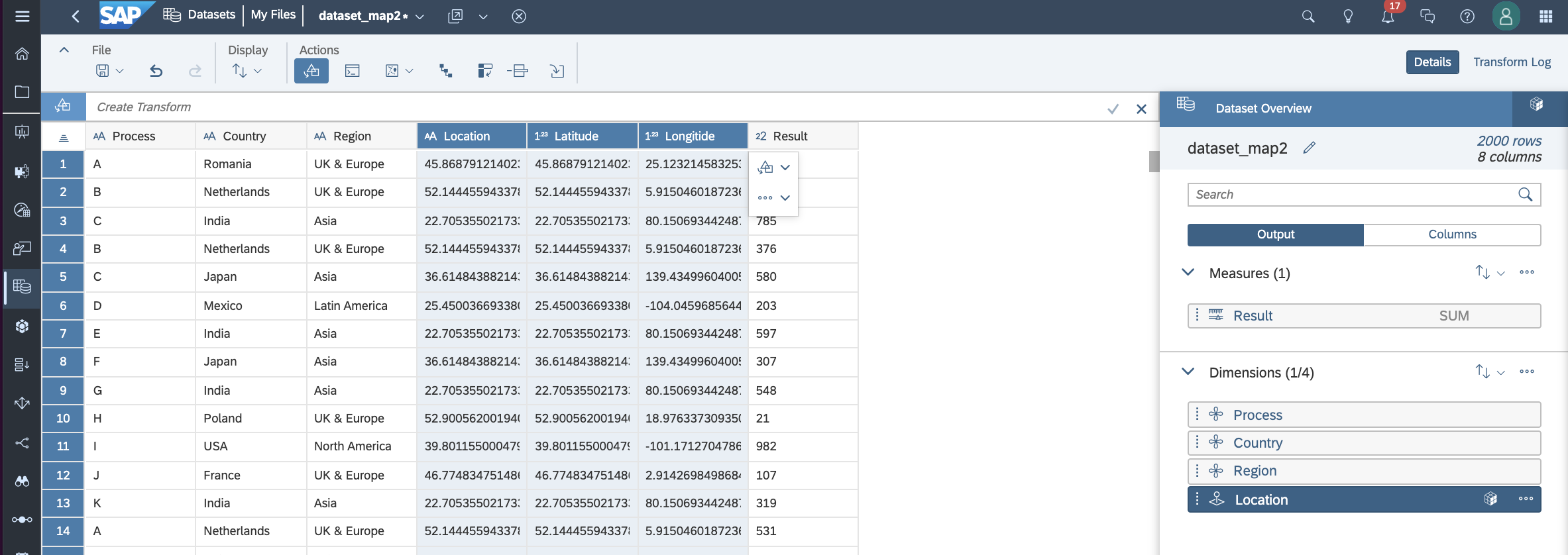
Step1: Upload dataset
This dataset includes geo information with latitude, longitude and country.
- Dimensions: Process, Country, Region
- Measures: Latitude, Longitude, Result(random number by country level)

Upload dataset
Step2: Change dataset with Geo Enrich By: Coordinates
Please select latitude and longitude and click coordinates

Geo Enrich By Coordinates
Step3: Create new dimension by Location with Coordinates
You can create new Dimension for location with latitude and longitude.

Create new dimension
Step4: Check the new dimension as a Location
You can check the new dimensions, "Location" as a dimension.
Check the new dimension as a Location
Step5: Change dimension properties: Description by Country
You can change the dimension properties by description.

Change dimension properties-Description
But! Without description setting, the data in geo map shows as below with Latitude and Longitude information.
 Without description
Here is a map chart with descriptions of country information, which is our target geo map.
 With Description - country
Step6: Create story for Geo Map
Add data and add an Geo Map to the story canvas.

Create story for geo map
Step7: Add Map Layers
In the Builder section, we can add map layers and change the different types of basemap such as Streets, light gray and hybrid.

Add layers

Base Layer
Step8: Set Location Dimension
We previously created the new location dimension,"Location" in the dataset (step3), and please click the Location as location dimensions in the layer builder.

Add location dimension
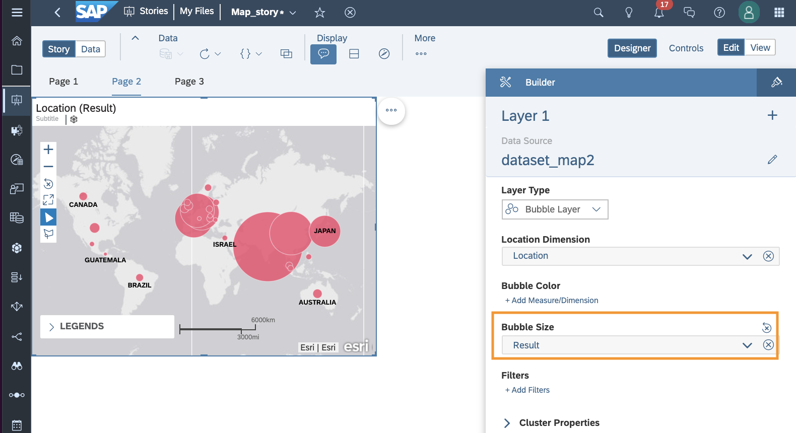
Step9: Set Bubble Size
You can set the bubble size as a unit of measure in the layer builder. In this example, we will set the "Result" measure.
Set bubble size
Step10: Adjust Bubble Size
For the Result measure, you can adjust the bubble size and range scale as follows:

Bubble size and range scale
Step11: Set Bubble Color
The bubble color of a measure or dimension can be changed according to your preference. In this example, "Result" measure is selected.

Bubble color of a measures or dimensions

Set palette

Set ranges
Step12: Set filters
In the Layer Builder, you can set filters
at the layer level by location, process, or region dimensions.
In this example, the "Process" dimension has been selected.

Set filters
You can set a filter for "Process" and members are included or excluded.

Include/Exclude members
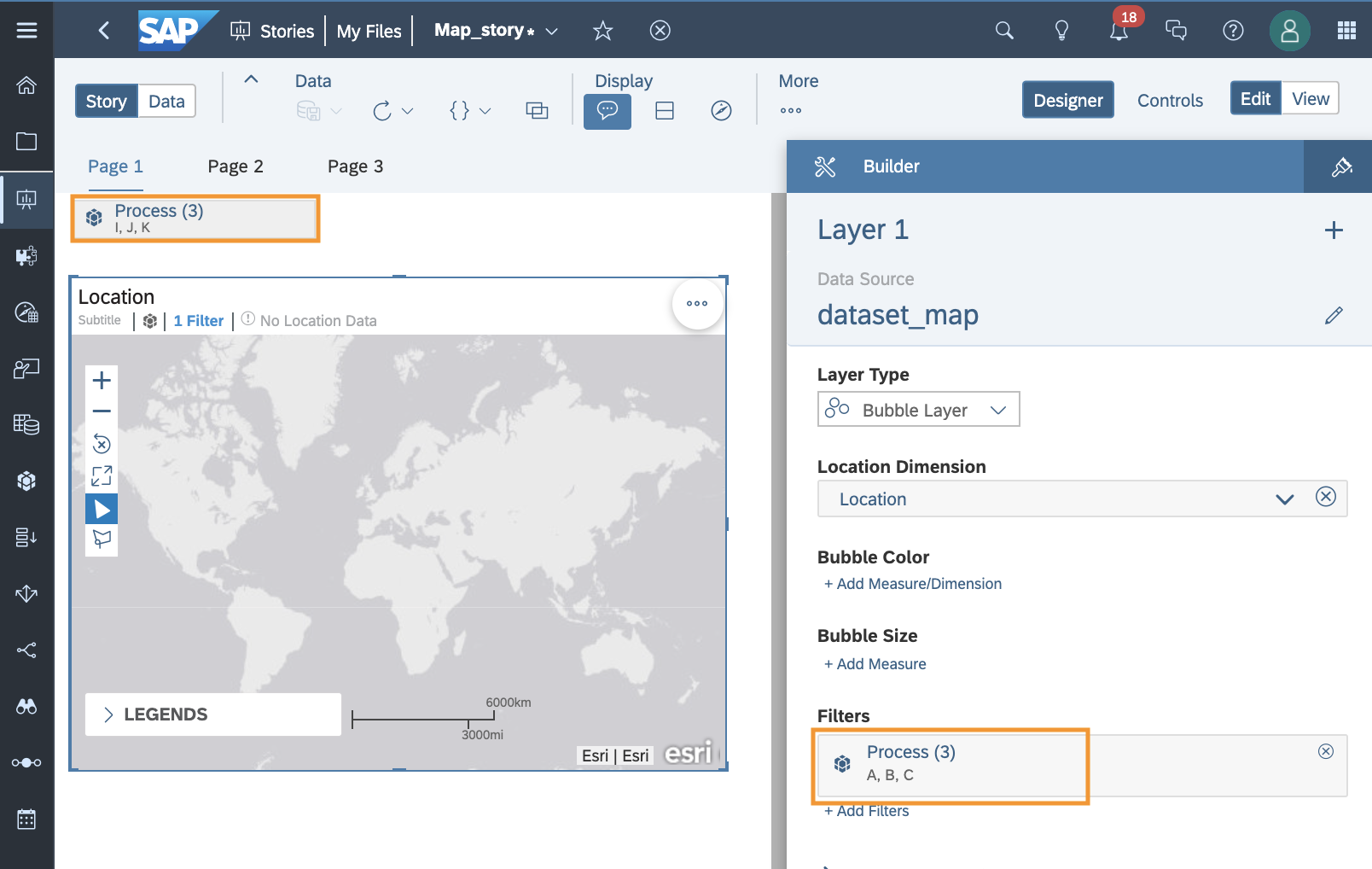
You can check Process A, B, C selected in the Layer Builder filter.

Check selected members
Additionally, in the geomap chart, you can check the selected filters. When you click the Edit Filter, you can set the filters.

Set filters in the canvas
When setting additional filters for the 'Region' dimension, you can see additional filters as shown below.
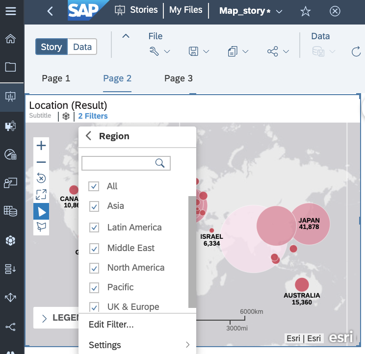
Location filters for Region dimension
Step13: Input control
You can also set the input control
at the page filter level.

Add Input control
Please select page filter by dimensions or measures. This example sets a filter on the "Process" dimension.

Set Input control for dimensions or measures
Please set filters for the Process dimension

Set Filters for Process
You can check the Input control for the Process.

Check the input control by process filter
Questions) Then what is the difference between the filter in the layer builder and the input control?
Filter level is different as follows:
- Filters in the layer builder are at the geo map chart layer level.
- Filters in the input controls are at the page filter level.
Higher priority is Set Filters in the layer builder setting (Step11). The filter settings on the Input Control page are affected by the filter settings in the Layer Builder.
For example, geo map doesn't show I, J, K data, because filter in the layer builder only includes A, B, C process.
Filter setting: layer builder vs. Input control
Step14: Check the Geo map chart
Now you can now create Geo map chart
👏👏👏!
Geo map charts are great for visualizing datasets at the geographic level. And please don't forget to check your dataset before creating a geo map chart.

Result of geo map chart
If you’d like to learn more about charting and analyzing time series data? Please refer to my blog postings:
Following on Beginner’s SAP Analytics Cloud Journey: Day4 – How to create chart with selected measures
Learn more about SAP Analytics Cloud
