
- SAP Community
- Products and Technology
- Technology
- Technology Blogs by SAP
- Fundamental Styles version 0.19 is out
Technology Blogs by SAP
Learn how to extend and personalize SAP applications. Follow the SAP technology blog for insights into SAP BTP, ABAP, SAP Analytics Cloud, SAP HANA, and more.
Turn on suggestions
Auto-suggest helps you quickly narrow down your search results by suggesting possible matches as you type.
Showing results for
 deno
deno
Advisor
Options
- Subscribe to RSS Feed
- Mark as New
- Mark as Read
- Bookmark
- Subscribe
- Printer Friendly Page
- Report Inappropriate Content
07-22-2021
9:42 PM
It has been more than 2 months since the last release of Fundamental Library Styles. This release (0.19) brings quite some new features and components and a lot of improvements. Some of those components are brand new or existing components with new design. We are proud to release them first. They were available as release candidates for quite some time (e.g. Vertical Navigation).
Let's start with the components:
This was one of the biggest components we have brought in the library. It includes huge list of features and options. It reflects the very recent design by SAP Design.
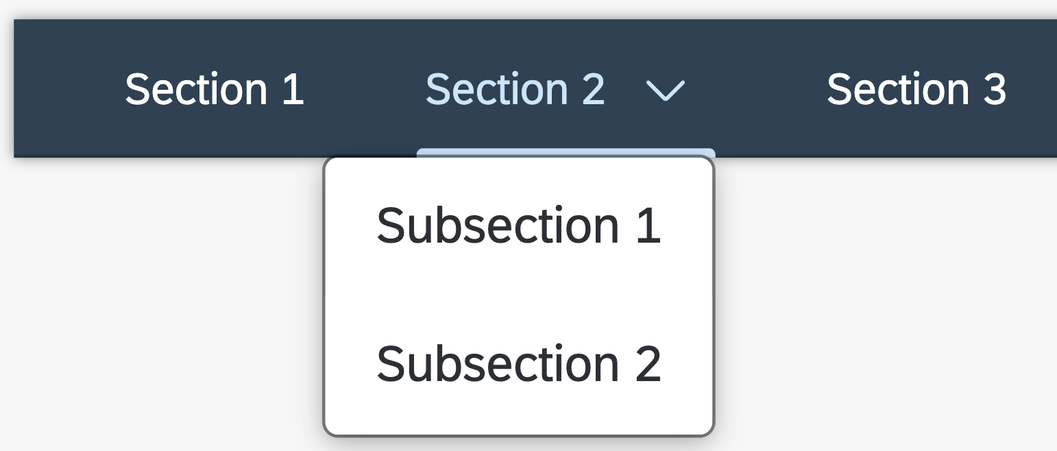
It is a component meant to be used for navigation within an object, or as a filter. Each tab of the component can link to a different content area or a view.
This is the most common type. It allows longer labels, and can also display counters next to the text to indicate the number of items on the tab page. The labels of the tabs do not get truncated. The full text is always shown.


The counters are shown on top of the labels.

The Icon tabs are rounded tabs that can be populated with any icon. The labels in this case are omitted and counters are optional.


You can also use the tab bar to depict a process. In this case, each tab stands for one step.


The tab bar as a filter has two parts:


Tabs can have an overflow to either sides of the control. Depending on if the order is fixed (process steps) or can be rearranged (tabs). For processes with a fixed order, an overflow to both sides is used. For tabs that can be rearranged, only one overflow will be displayed on the right side.

When there is only one click area per tab (also including tabs with sub-items), regular tabs get selected immediately after the click is released. Tabs with sub-items trigger the expansion of a menu (Popover) showing its sub-items. The parent tab title remains displayed when its child is select.

In case of two click areas for tabs with sub-tabs, the behaviour for regular tabs (without sub-items) remains unchanged, like described above the tabs get selected immediately. Tabs with two click areas behave differently: when the main part of the tab is clicked, it is highlighted and then selected immediately. Clicking the second area opens a menu (Popover) containing the sub-items. Once a sub-item is clicked, the main tab is highlighted as selected.


The Tab attention badge is applied as a visual eye-catcher to indicate a change within a Tab. The badge can be animated by adding an additional modifier class. In this case the badge appears for a few milliseconds and then disappears.


The Navigation Tab Bar is the main/default navigation displayed on the launchpad home page. It offers the user an easy access to multiple pages per space. The background color of the Shell Navigation is connected the Home/Shell Header to properly differentiate the global shell navigation versus any application specific navigation. The Navigation Bar snaps to top and remains visible while scrolling. It is not visible in App view.
The implementation is based on UniversalIconTabBar with some different color parameters that are specific to Shell Bar and Tool Header.
If there are more Tabs than the screen can accommodate, the remaining Tabs move into an Overflow.
The component supports semantic colors, horizontal paddings, different backgrounds, content density, responsive paddings. You can checkout all the example of the component documentation page.
ToolHeader is a component that is found in most Business Technology Platform products, most commonly as a part of the Tool Page Layout. The tool header inherits its functionality from the overflow toolbar and its visual design from the shell bar. You may consider using it in your application if it is somewhat or purely technical in nature, and the application’s main use cases are in development, administration, or configuration.
The side navigation menu button is used to collapse/expand the side navigation. It is not recommended to use horizontal and responsive paddings when this button is present.
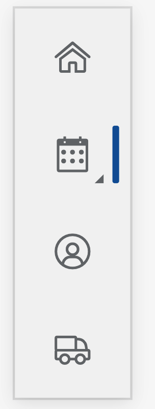
Vertical Navigation is component that can be used as an alternative to the Horizontal Navigation.
This navigation type is composed by two distinct item levels:
This component is a brand new one and Fundamental Library is the first to release it officially.
Vertical navigation can be viewed in three different states:
The default vertical navigation is comprised of several navigation list items.
A vertical navigation list does not need to have icons. However this is only available in expanded mode.
In condensed mode, only icons are shown unless some navigation items have second levels and the second level is expanded.
The Vertical Navigation items can be further visually grouped using the Group Header List Item.
We added new options to the existing Busy Indicator components. If more information needs to be displayed with the loading animation, it is replaced by the Extended Busy Indicator
Another 50+ more improvements and updates.
The full release notes can be found here.
Stay tuned for more updates. Want to read more blog posts about Fundamental Library? Check these out or visit out brand new Topic Page
Feel free to raise any questions or try our libraries in case you didn’t have a chance.
Join us at our very first virtual conference on August 11, 2021 - website.
Let's start with the components:
Icon Tab Bar
This was one of the biggest components we have brought in the library. It includes huge list of features and options. It reflects the very recent design by SAP Design.
It is a component meant to be used for navigation within an object, or as a filter. Each tab of the component can link to a different content area or a view.

Icon Tab Bar with text-only variant
This is the most common type. It allows longer labels, and can also display counters next to the text to indicate the number of items on the tab page. The labels of the tabs do not get truncated. The full text is always shown.
Icon Tab Bar with text only variant and semantic colors
Icon Tab Bar with counters and text
The counters are shown on top of the labels.
Icon Tab Bar with icons only
The Icon tabs are rounded tabs that can be populated with any icon. The labels in this case are omitted and counters are optional.
Icon Tab Bar with icons, text and counters
Icon Tab Bar with icons, text and counters in semantic colors
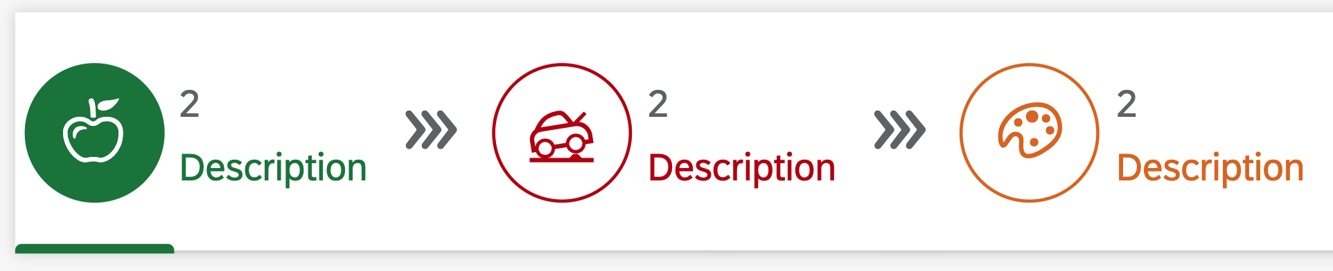
Icon Tab Bar as process
You can also use the tab bar to depict a process. In this case, each tab stands for one step.
Icon Tab Bar as process in semantic colors
Icon Tab Bar as process with text only
Icon Tab Bar as filters
The tab bar as a filter has two parts:
- An “all” tab on the left - shows the total number of items, and describes the type of item (for example, 189 Products).
- Tabs for specific filters - the tab text indicates the filter attribute. It is recommended to show a counter on every tab.
Icon Tab Bar with overflow
Icon Tab Bar with overflow
Tabs can have an overflow to either sides of the control. Depending on if the order is fixed (process steps) or can be rearranged (tabs). For processes with a fixed order, an overflow to both sides is used. For tabs that can be rearranged, only one overflow will be displayed on the right side.
Universal Icon Tab Bar Single Click Area
When there is only one click area per tab (also including tabs with sub-items), regular tabs get selected immediately after the click is released. Tabs with sub-items trigger the expansion of a menu (Popover) showing its sub-items. The parent tab title remains displayed when its child is select.
Universal Icon Tab Bar Multi Click Area
In case of two click areas for tabs with sub-tabs, the behaviour for regular tabs (without sub-items) remains unchanged, like described above the tabs get selected immediately. Tabs with two click areas behave differently: when the main part of the tab is clicked, it is highlighted and then selected immediately. Clicking the second area opens a menu (Popover) containing the sub-items. Once a sub-item is clicked, the main tab is highlighted as selected.
Icon Tab Bar with badges
Icon Tab Bar with badges
Icon Tab Bar with badges
Icon Tab Bar with badges
The Tab attention badge is applied as a visual eye-catcher to indicate a change within a Tab. The badge can be animated by adding an additional modifier class. In this case the badge appears for a few milliseconds and then disappears.
Navigation Icon Tab Bar with overflow
Navigation Icon Tab Bar with multi click area
Navigation Icon Tab Bar with single click area
The Navigation Tab Bar is the main/default navigation displayed on the launchpad home page. It offers the user an easy access to multiple pages per space. The background color of the Shell Navigation is connected the Home/Shell Header to properly differentiate the global shell navigation versus any application specific navigation. The Navigation Bar snaps to top and remains visible while scrolling. It is not visible in App view.
The implementation is based on UniversalIconTabBar with some different color parameters that are specific to Shell Bar and Tool Header.
If there are more Tabs than the screen can accommodate, the remaining Tabs move into an Overflow.
The component supports semantic colors, horizontal paddings, different backgrounds, content density, responsive paddings. You can checkout all the example of the component documentation page.
Tool Header
ToolHeader is a component that is found in most Business Technology Platform products, most commonly as a part of the Tool Page Layout. The tool header inherits its functionality from the overflow toolbar and its visual design from the shell bar. You may consider using it in your application if it is somewhat or purely technical in nature, and the application’s main use cases are in development, administration, or configuration.

Tool Header with components

Tool Header with side navigation menu
The side navigation menu button is used to collapse/expand the side navigation. It is not recommended to use horizontal and responsive paddings when this button is present.

Tool Header with side navigation menu and menu buttons

Tool Header with responsive padding

Tool Header with horizontal paddings
Vertical Navigation
Vertical Navigation is component that can be used as an alternative to the Horizontal Navigation.
This navigation type is composed by two distinct item levels:
- First Level items - always visible, can be either navigable in and of themselves or be a container for Second Level items (it should not be both)
- Second Level items → Are always contained by a First Level item, and can have their visibility toggled by this First Level item. They are always only navigable\
This component is a brand new one and Fundamental Library is the first to release it officially.
Vertical navigation can be viewed in three different states:
- Expanded: everything is shown; icons and/or text.
- Condensed: only icons are shown; text-only condensed state is not supported.
- Off-canvas: side navigation is completely off-screen, and can be triggered via the menu icon in the Tool Header. Note: It is recommend to use only two states per device.

Vertical Navigation - default
The default vertical navigation is comprised of several navigation list items.

Vertical Navigation - text only
A vertical navigation list does not need to have icons. However this is only available in expanded mode.

Vertical Navigation - condensed mode
In condensed mode, only icons are shown unless some navigation items have second levels and the second level is expanded.
All the possible combinations of navigation indication are visualized below. When a second level item has been navigated to and the second list has been collapsed, the indicator is shown on the right of the corresponding first level item, but the text and icon color do not change.

Vertical Navigation - active item
Vertical Navigation - condensed mode with active item

Vertical Navigation - Grouping Headers
The Vertical Navigation items can be further visually grouped using the Group Header List Item.
Extended Busy Indicator
We added new options to the existing Busy Indicator components. If more information needs to be displayed with the loading animation, it is replaced by the Extended Busy Indicator

Extended Busy Indicator

Extended Busy Indicator inside Message Toast
Another 50+ more improvements and updates.
The full release notes can be found here.
Stay tuned for more updates. Want to read more blog posts about Fundamental Library? Check these out or visit out brand new Topic Page
Feel free to raise any questions or try our libraries in case you didn’t have a chance.
Join us at our very first virtual conference on August 11, 2021 - website.

Fundamental Conference
- SAP Managed Tags:
- SAP Fiori,
- Open Source,
- User Interface
Labels:
You must be a registered user to add a comment. If you've already registered, sign in. Otherwise, register and sign in.
Labels in this area
-
ABAP CDS Views - CDC (Change Data Capture)
2 -
AI
1 -
Analyze Workload Data
1 -
BTP
1 -
Business and IT Integration
2 -
Business application stu
1 -
Business Technology Platform
1 -
Business Trends
1,658 -
Business Trends
91 -
CAP
1 -
cf
1 -
Cloud Foundry
1 -
Confluent
1 -
Customer COE Basics and Fundamentals
1 -
Customer COE Latest and Greatest
3 -
Customer Data Browser app
1 -
Data Analysis Tool
1 -
data migration
1 -
data transfer
1 -
Datasphere
2 -
Event Information
1,400 -
Event Information
66 -
Expert
1 -
Expert Insights
177 -
Expert Insights
293 -
General
1 -
Google cloud
1 -
Google Next'24
1 -
Kafka
1 -
Life at SAP
780 -
Life at SAP
13 -
Migrate your Data App
1 -
MTA
1 -
Network Performance Analysis
1 -
NodeJS
1 -
PDF
1 -
POC
1 -
Product Updates
4,577 -
Product Updates
341 -
Replication Flow
1 -
RisewithSAP
1 -
SAP BTP
1 -
SAP BTP Cloud Foundry
1 -
SAP Cloud ALM
1 -
SAP Cloud Application Programming Model
1 -
SAP Datasphere
2 -
SAP S4HANA Cloud
1 -
SAP S4HANA Migration Cockpit
1 -
Technology Updates
6,873 -
Technology Updates
419 -
Workload Fluctuations
1
Related Content
- SAP BTP SDK for iOS 24.4.0 is now available in Technology Blogs by SAP
- S4HANA Web UI Kit v1.106 for Figma in Technology Q&A
- Problem with nativescript plugin when deploying in Technology Q&A
- Create an xP&A Business Flow with SAP Analytics Cloud, SAP Datasphere & SAP Cloud Integration in Technology Blogs by SAP
- Installing Composable Storefront for SAP Commerce 2211.20 in Technology Blogs by SAP
Top kudoed authors
| User | Count |
|---|---|
| 35 | |
| 25 | |
| 14 | |
| 13 | |
| 7 | |
| 7 | |
| 6 | |
| 6 | |
| 5 | |
| 5 |