Product Information
SAP Fiori Design Guidelines – Version 1.90 Now Available
We’ve updated the SAP Fiori design guidelines for web applications. Read on to see what’s been added with guideline version 1.90.
New topics
“My Home” on SAP Fiori launchpad
Users working with SAP Fiori launchpad spaces can set up a personalized “My Home” space.
“My Home” space in the SAP Fiori launchpad
The basic concept is similar to the classic launchpad home page: “My Home” is the first listed space, and users can add and group apps as they like. To save time when you first set up the “My Home” space, existing content can be imported from the classic home page or from other spaces.
New guidelines for SAP Fiori elements
In the SAP Fiori Elements Framework section, we’ve added a few smaller topics to clarify common questions. These include handling unsaved changes in object pages, the form page variant of an object page, and the display options for list reports with OData V2.
Scroll container
Too many scroll bars can spoil the user experience. Check out the new guideline for the existing scroll container to see when (and when not) to use it.
Updated topics
Complex objects – local flow
We’ve revised and simplified the guideline for complex objects with a local flow. This is the latest in a series of updates for object handling.
This guideline is relevant if your object has subitems on separate subpages (“complex objects”) and each subpage needs to be saved individually (“local flow”). It outlines the flows for creating and editing the subitems step by step. The examples are based on a full screen layout, but the guideline also includes the flows for the flexible column layout.
Tables and lists
Many of the updates in this edition relate to tables and lists, including:
- Keyboard shortcuts for selecting/deselecting items, rearranging columns, adapting the column width, and opening the view settings dialog
- A message strip to indicate table-related errors and warnings
- More detailed guidance on initial sort settings and adding items
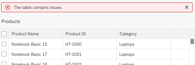
Message strip to indicate errors in a table
Designing intelligent systems – user feedback
The User Feedback guideline has a new section on AI feedback patterns. The patterns help you determine which UI interactions and controls need to be implemented at app level to collect user feedback and deliver it back to the AI service.
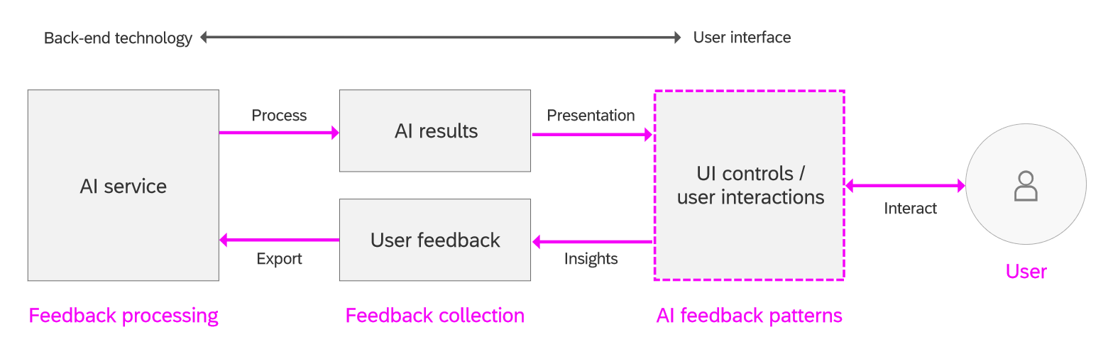
User feedback loop for AI
The guideline outlines 3 basic pattern types for collecting the user feedback: let users confirm or correct the AI results, track user actions, and measure observable behavior. For each pattern, you’ll find variants, examples, and usage recommendations.
Object page – edit actions in display mode
If you’re building a freestyle object page, you can let users edit certain types of content directly without forcing them switch to a dedicated editing mode. A new section on edit actions in display mode offers guidance on when (and when not) to use this option.
Other updates
For a full overview of all updates, see What’s New in Guideline Version 1.90.
SAP Fiori design stencils
We’ve now added stencils for illustrated messages (from version 1.88), tabular suggestions for input fields, and the table personalization dialog (P13n). Several other stencils have been updated. See below for details:
- Sketch: What’s new in 1.90| Download version 1.90
- Axure RP: What’s new in 1.90 | Download version 1.90
- Adobe XD: What’s new in 1.90 | Download version 1.90
We’re constantly expanding our stencil library, so be sure to check for the latest download before you start working on a new app design.
Thank you for this great overview, Susanne!
Regarding Buttons the guide defines that either Icons or Text is allowed:
https://experience.sap.com/fiori-design-web/button/#text-or-icon
Why not combine?
This combination is allowed in other components, like Links, Split Menu etc... so it is a bit strange...
Best,
Ravid
Hi Ravid,
We agreed on this approach as part of our internal UX consistency alignment. To make it easier for users to learn and recognize icons in SAP Fiori, we allow icons only for some standard generic actions that are used across all apps (like "Share" or "Help"). Here, we show only the icon (with a corresponding tooltip), unless the generic actions appear in a drop-down menu, where we do show the icon and text side-by-side. You can see this in the user menu.
All transactional or business actions require a text. We decided against accompanying icons here because there isn't a meaningful, universally recognized icon for every action. So rather than have a mix of buttons with and without icons, or icons that don't obviously depict the action, we went for text buttons only. Since some apps also need to offer several options, text-only buttons also help to avoid visual clutter.
I hope this helps clarify.
Best regards,
Susanne
Thank you!
Another thing:
I was trying to find the qr code icon
https://sapui5.hana.ondemand.com/sdk/test-resources/sap/m/demokit/iconExplorer/webapp/index.html#/overview/SAP-icons/?tab=grid&search=qr&icon=qr-code
in the axure library pack, but it was not there.
Also, the Barcode Icon here
https://sapui5.hana.ondemand.com/sdk/test-resources/sap/m/demokit/iconExplorer/webapp/index.html#/overview/SAP-icons/?tab=grid&icon=bar-code&search=code
looks different from the one in the Axure stencil.
Best!
Ravid
Hi Ravid,
The Icon Explorer is showing the latest icon set (version 4.10) which came in with UI5 version 1.91.
This includes the new QR code icon and the update to the barcode icon. The following icons were also updated:
e0bb; icon-table-chart
e254; icon-circle-task
e255; icon-circle-task-2
e046; icon-calendar
The current guidelines reflect the status as of UI5 1.90. The updated icon font will be included in the next guideline version for 1.91/1.92.
Best regards,
Susanne
Thank you, Susanne!!!
Hi Susanne,
In our company we have a requirement to follow a strict set of corporate guidance for the "look and feel" of any application deployed externally. This means use of specific fonts, pitches, colors and placement of specific objects in specific relative locations on a screen, as well as many other rules. We have struggled for a few years now on how to build and apply a corporate look and feel template that meets the UX demands. Our current technical environments are almost exclusively ECC6 which seems to be a limiting factor on the options we have. Although we are beginning S/4 deployment, we will for the coming several years be in a mixture of ECC6 and S/4 and need to meet the demands against both environments. Is there any general guidance you could offer on how we could approach this?
Hi Larry,
Here's the info I received from our visual design experts:
In our company we have a requirement to follow a strict set of corporate guidance for the "look and feel" of any application deployed externally. This means use of specific fonts, pitches, colors and placement of specific objects in specific relative locations on a screen, as well as many other rules.
With the improved theming capabilities you can:
However, the UI theme designer does not allow for changes on placement of specific objects in specific relative locations on a screen. Screen or UI adaption is something usually done separately when configuring the apps or if there is some UI adaptation layer added.
It's also currently not possible to upload your own fonts.
Resources that might help:
Our current technical environments are almost exclusively ECC6 which seems to be a limiting factor on the options we have. Although we are beginning S/4 deployment, we will for the coming several years be in a mixture of ECC6 and S/4 and need to meet the demands against both environments. Is there any general guidance you could offer on how we could approach this?
The UI theme designer is available in ABAP on-premise systems. Please have a look at note https://launchpad.support.sap.com/#/notes/1852401 to get information which version is available for your system.
Best regards,
Susanne