
- SAP Community
- Products and Technology
- Technology
- Technology Blogs by Members
- Create Analytic List page (Fiori Elements) in Busi...
Technology Blogs by Members
Explore a vibrant mix of technical expertise, industry insights, and tech buzz in member blogs covering SAP products, technology, and events. Get in the mix!
Turn on suggestions
Auto-suggest helps you quickly narrow down your search results by suggesting possible matches as you type.
Showing results for
priteshpatel65
Active Participant
Options
- Subscribe to RSS Feed
- Mark as New
- Mark as Read
- Bookmark
- Subscribe
- Printer Friendly Page
- Report Inappropriate Content
06-17-2021
7:14 AM
Hello Everyone,
In this blog post, I am sharing information about how to add chart annotation to the analytic list page(Fiori elements).
SAP Fiori elements is a framework that comprises the most commonly used floorplan templates and is designed to:
Speed up development by reducing the amount of frontend code needed to build SAP Fiori apps.
Drive UX consistency and compliance with the latest SAP Fiori design guidelines.
Analytic Page
The analytical list page (ALP) offers a unique way to analyze data step by step from different perspectives, investigate a root cause through drill down, and act on transactional content. All this can be done seamlessly within one page. The purpose of the analytical list page is to identify interesting areas within datasets or significant single instances using data visualization and business intelligence.
Visualizations help users to recognize facts and situations and reduce the number of interaction steps needed to gain insights or to identify significant single instances. Chart visualization increases the joy of use and enables users to spot relevant data more quickly.
The main target group is users who work on transactional content. They benefit from fully transparent business object data and direct access to business actions. In addition, they have access to analytical views and functions without having to switch between systems. These include KPIs, a visual filter where filter values are enriched by measures and visualizations, and a combined table/chart view with drill-in capabilities (hybrid view). Users can interact with the chart to dig deep into the data. The visualization enables them to identify spikes, deviations, and abnormalities more quickly, and to take appropriate action right away.
Use of analytic list page:
Follow the below step to create Analytic List Page
Step: 1
Go to – File > New Project From Template > SAP Fiori Application
Click Next
Step: 2
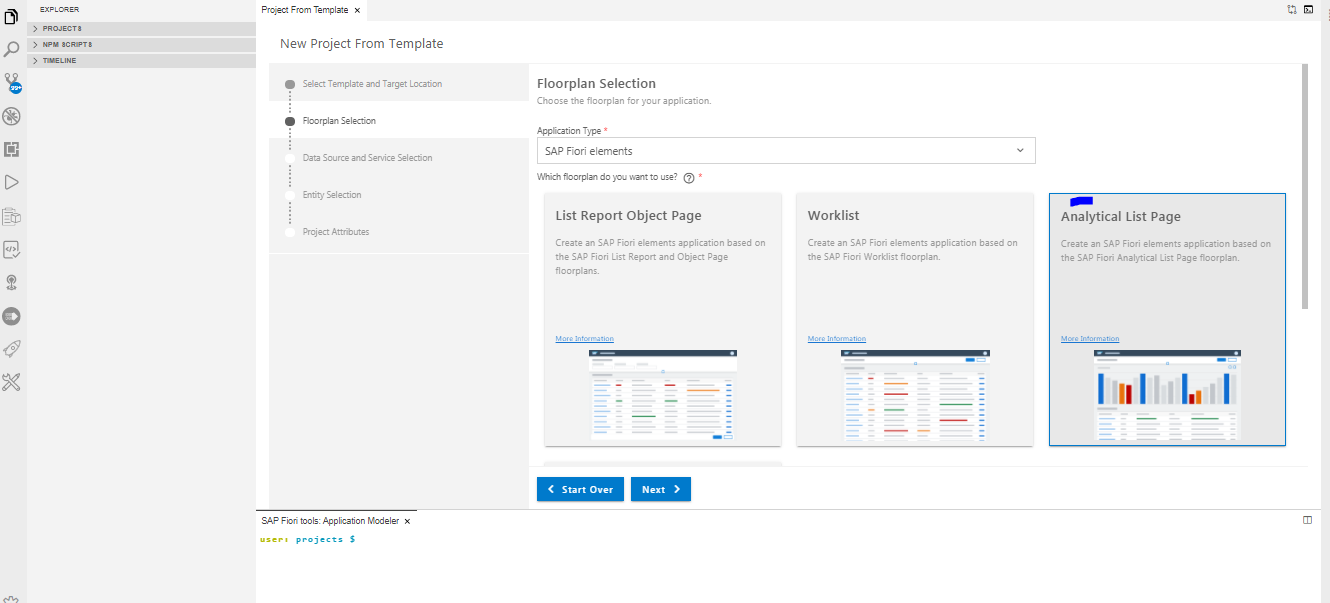
Select SAP Fiori Elements from the Application type dropdown. Select Analytic List Page.
Step : 3
Select Data source, System, Service username, and password
Username and password must be the same as your backend system username and password.
Select Specific service form list and click next.
Step: 4
Select your main entity from the list and select Table type.
Step: 5
Give the project name and namespace of your project.
Click finish.
Step: 6
After clicking on finish, you see that your newly created project is in your project list.
Now just simply right-click on the project name and select preview application.
You see that below screen
Step:7
Open your annotation file from the project webapp folder
Step: 8
Now add the below code for a chart in the annotation schema section.
Step: 9
Preview of your application
Step:10
if you want to see the selected field of table write a new annotation into the annotations section.
add below annotation in your file
if you face any kind of issues executing these steps kindly comment down here and give me your valuable feedback regarding this blog post, I am always ready to help!!
Thanks for reading!
In this blog post, I am sharing information about how to add chart annotation to the analytic list page(Fiori elements).
SAP Fiori elements is a framework that comprises the most commonly used floorplan templates and is designed to:
Speed up development by reducing the amount of frontend code needed to build SAP Fiori apps.
Drive UX consistency and compliance with the latest SAP Fiori design guidelines.
Analytic Page
The analytical list page (ALP) offers a unique way to analyze data step by step from different perspectives, investigate a root cause through drill down, and act on transactional content. All this can be done seamlessly within one page. The purpose of the analytical list page is to identify interesting areas within datasets or significant single instances using data visualization and business intelligence.
Visualizations help users to recognize facts and situations and reduce the number of interaction steps needed to gain insights or to identify significant single instances. Chart visualization increases the joy of use and enables users to spot relevant data more quickly.
The main target group is users who work on transactional content. They benefit from fully transparent business object data and direct access to business actions. In addition, they have access to analytical views and functions without having to switch between systems. These include KPIs, a visual filter where filter values are enriched by measures and visualizations, and a combined table/chart view with drill-in capabilities (hybrid view). Users can interact with the chart to dig deep into the data. The visualization enables them to identify spikes, deviations, and abnormalities more quickly, and to take appropriate action right away.
Use of analytic list page:
- Users need to extract key information to understand the current situation or identify a root cause. The way the data is presented is crucial for giving them the insights they need to take the right action.
- Users need a way to analyze data step by step from different perspectives, investigate a root cause through drill down, and act on transactional content within one page.
- In addition to the filtered dataset, users need to see the impact of their filter settings in a chart (visual filter).
- Users need to switch between integrated chart and table views (hybrid view).
- Users need to see the impact of their action on a global key performance indicator (KPI).
- Users need to find and act on relevant items out of a large set of items by searching, filtering, sorting, grouping, drilling down, and slicing and dicing.
Follow the below step to create Analytic List Page
Step: 1
Go to – File > New Project From Template > SAP Fiori Application
Click Next

Step: 2
Select SAP Fiori Elements from the Application type dropdown. Select Analytic List Page.
Step : 3
Select Data source, System, Service username, and password
Username and password must be the same as your backend system username and password.
Select Specific service form list and click next.

Step: 4
Select your main entity from the list and select Table type.

Step: 5
Give the project name and namespace of your project.
Click finish.

Step: 6
After clicking on finish, you see that your newly created project is in your project list.
Now just simply right-click on the project name and select preview application.
You see that below screen

Step:7
Open your annotation file from the project webapp folder

Step: 8
Now add the below code for a chart in the annotation schema section.
<Annotations Target="write your target name (select using ctrl+space)">

                <Annotation Term="UI.Chart">

                    <Record Type="UI.ChartDefinitionType">

                        <PropertyValue Property="ChartType" EnumMember="UI.ChartType/Bar" />

                        <PropertyValue Property="Dimensions">

                            <Collection>

                                <PropertyPath>Rlwrt</PropertyPath>

                            </Collection>

                        </PropertyValue>

                        <PropertyValue Property="MeasureAttributes">

                            <Collection>

                                <Record Type="UI.ChartMeasureAttributeType">

                                    <PropertyValue Property="Measure" PropertyPath="Rlwrt180p" />

                                    <PropertyValue Property="Role" EnumMember="UI.ChartMeasureRoleType/Axis1" />

                                </Record>

                            </Collection>

                        </PropertyValue>

                        <PropertyValue Property="Measures">

                            <Collection>

                                <PropertyPath>Rlwrt180p</PropertyPath>

                            </Collection>

                        </PropertyValue>

                        <PropertyValue Property="DimensionAttributes">

                            <Collection>

                                <Record Type="UI.ChartDimensionAttributeType">

                                    <PropertyValue Property="Dimension" PropertyPath="Rlwrt" />

                                    <PropertyValue Property="Role" EnumMember="UI.ChartDimensionRoleType/Category" />

                                </Record>

                            </Collection>

                        </PropertyValue>

                    </Record>

                </Annotation>


            </Annotations>
Step: 9
Preview of your application

Step:10
if you want to see the selected field of table write a new annotation into the annotations section.
add below annotation in your file
  <Annotation Term="UI.LineItem">

                    <Collection>

                        <Record Type="UI.DataField">

                            <PropertyValue Property="Value" Path="Rlwrt" />

                        </Record>

                        <Record Type="UI.DataField">

                            <PropertyValue Property="Value" Path="Rlwrt180p" />

                        </Record>

                        <Record Type="UI.DataField">

                            <PropertyValue Property="Value" Path="Day180" />

                        </Record>

                        <Record Type="UI.DataField">

                            <PropertyValue Property="Value" Path="Day30" />

                        </Record>

                        <Record Type="UI.DataField">

                            <PropertyValue Property="Value" Path="Day90" />

                        </Record>

                        <Record Type="UI.DataField">

                            <PropertyValue Property="Value" Path="Name1" />

                        </Record>

                    </Collection>

                </Annotation>
if you face any kind of issues executing these steps kindly comment down here and give me your valuable feedback regarding this blog post, I am always ready to help!!
Thanks for reading!
- SAP Managed Tags:
- SAP Business Application Studio,
- SAP Fiori,
- SAP Fiori Elements,
- SAPUI5
2 Comments
You must be a registered user to add a comment. If you've already registered, sign in. Otherwise, register and sign in.
Labels in this area
-
"automatische backups"
1 -
"regelmäßige sicherung"
1 -
"TypeScript" "Development" "FeedBack"
1 -
505 Technology Updates 53
1 -
ABAP
14 -
ABAP API
1 -
ABAP CDS Views
2 -
ABAP CDS Views - BW Extraction
1 -
ABAP CDS Views - CDC (Change Data Capture)
1 -
ABAP class
2 -
ABAP Cloud
2 -
ABAP Development
5 -
ABAP in Eclipse
1 -
ABAP Platform Trial
1 -
ABAP Programming
2 -
abap technical
1 -
absl
2 -
access data from SAP Datasphere directly from Snowflake
1 -
Access data from SAP datasphere to Qliksense
1 -
Accrual
1 -
action
1 -
adapter modules
1 -
Addon
1 -
Adobe Document Services
1 -
ADS
1 -
ADS Config
1 -
ADS with ABAP
1 -
ADS with Java
1 -
ADT
2 -
Advance Shipping and Receiving
1 -
Advanced Event Mesh
3 -
AEM
1 -
AI
7 -
AI Launchpad
1 -
AI Projects
1 -
AIML
9 -
Alert in Sap analytical cloud
1 -
Amazon S3
1 -
Analytical Dataset
1 -
Analytical Model
1 -
Analytics
1 -
Analyze Workload Data
1 -
annotations
1 -
API
1 -
API and Integration
3 -
API Call
2 -
Application Architecture
1 -
Application Development
5 -
Application Development for SAP HANA Cloud
3 -
Applications and Business Processes (AP)
1 -
Artificial Intelligence
1 -
Artificial Intelligence (AI)
5 -
Artificial Intelligence (AI) 1 Business Trends 363 Business Trends 8 Digital Transformation with Cloud ERP (DT) 1 Event Information 462 Event Information 15 Expert Insights 114 Expert Insights 76 Life at SAP 418 Life at SAP 1 Product Updates 4
1 -
Artificial Intelligence (AI) blockchain Data & Analytics
1 -
Artificial Intelligence (AI) blockchain Data & Analytics Intelligent Enterprise
1 -
Artificial Intelligence (AI) blockchain Data & Analytics Intelligent Enterprise Oil Gas IoT Exploration Production
1 -
Artificial Intelligence (AI) blockchain Data & Analytics Intelligent Enterprise sustainability responsibility esg social compliance cybersecurity risk
1 -
ASE
1 -
ASR
2 -
ASUG
1 -
Attachments
1 -
Authorisations
1 -
Automating Processes
1 -
Automation
2 -
aws
2 -
Azure
1 -
Azure AI Studio
1 -
B2B Integration
1 -
Backorder Processing
1 -
Backup
1 -
Backup and Recovery
1 -
Backup schedule
1 -
BADI_MATERIAL_CHECK error message
1 -
Bank
1 -
BAS
1 -
basis
2 -
Basis Monitoring & Tcodes with Key notes
2 -
Batch Management
1 -
BDC
1 -
Best Practice
1 -
bitcoin
1 -
Blockchain
3 -
bodl
1 -
BOP in aATP
1 -
BOP Segments
1 -
BOP Strategies
1 -
BOP Variant
1 -
BPC
1 -
BPC LIVE
1 -
BTP
12 -
BTP Destination
2 -
Business AI
1 -
Business and IT Integration
1 -
Business application stu
1 -
Business Application Studio
1 -
Business Architecture
1 -
Business Communication Services
1 -
Business Continuity
1 -
Business Data Fabric
3 -
Business Partner
12 -
Business Partner Master Data
10 -
Business Technology Platform
2 -
Business Trends
4 -
CA
1 -
calculation view
1 -
CAP
3 -
Capgemini
1 -
CAPM
1 -
Catalyst for Efficiency: Revolutionizing SAP Integration Suite with Artificial Intelligence (AI) and
1 -
CCMS
2 -
CDQ
12 -
CDS
2 -
Cental Finance
1 -
Certificates
1 -
CFL
1 -
Change Management
1 -
chatbot
1 -
chatgpt
3 -
CL_SALV_TABLE
2 -
Class Runner
1 -
Classrunner
1 -
Cloud ALM Monitoring
1 -
Cloud ALM Operations
1 -
cloud connector
1 -
Cloud Extensibility
1 -
Cloud Foundry
4 -
Cloud Integration
6 -
Cloud Platform Integration
2 -
cloudalm
1 -
communication
1 -
Compensation Information Management
1 -
Compensation Management
1 -
Compliance
1 -
Compound Employee API
1 -
Configuration
1 -
Connectors
1 -
Consolidation Extension for SAP Analytics Cloud
2 -
Control Indicators.
1 -
Controller-Service-Repository pattern
1 -
Conversion
1 -
Cosine similarity
1 -
cryptocurrency
1 -
CSI
1 -
ctms
1 -
Custom chatbot
3 -
Custom Destination Service
1 -
custom fields
1 -
Customer Experience
1 -
Customer Journey
1 -
Customizing
1 -
cyber security
3 -
cybersecurity
1 -
Data
1 -
Data & Analytics
1 -
Data Aging
1 -
Data Analytics
2 -
Data and Analytics (DA)
1 -
Data Archiving
1 -
Data Back-up
1 -
Data Flow
1 -
Data Governance
5 -
Data Integration
2 -
Data Quality
12 -
Data Quality Management
12 -
Data Synchronization
1 -
data transfer
1 -
Data Unleashed
1 -
Data Value
8 -
database tables
1 -
Datasphere
3 -
datenbanksicherung
1 -
dba cockpit
1 -
dbacockpit
1 -
Debugging
2 -
Delimiting Pay Components
1 -
Delta Integrations
1 -
Destination
3 -
Destination Service
1 -
Developer extensibility
1 -
Developing with SAP Integration Suite
1 -
Devops
1 -
digital transformation
1 -
Documentation
1 -
Dot Product
1 -
DQM
1 -
dump database
1 -
dump transaction
1 -
e-Invoice
1 -
E4H Conversion
1 -
Eclipse ADT ABAP Development Tools
2 -
edoc
1 -
edocument
1 -
ELA
1 -
Embedded Consolidation
1 -
Embedding
1 -
Embeddings
1 -
Employee Central
1 -
Employee Central Payroll
1 -
Employee Central Time Off
1 -
Employee Information
1 -
Employee Rehires
1 -
Enable Now
1 -
Enable now manager
1 -
endpoint
1 -
Enhancement Request
1 -
Enterprise Architecture
1 -
ETL Business Analytics with SAP Signavio
1 -
Euclidean distance
1 -
Event Dates
1 -
Event Driven Architecture
1 -
Event Mesh
2 -
Event Reason
1 -
EventBasedIntegration
1 -
EWM
1 -
EWM Outbound configuration
1 -
EWM-TM-Integration
1 -
Existing Event Changes
1 -
Expand
1 -
Expert
2 -
Expert Insights
2 -
Exploits
1 -
Fiori
14 -
Fiori Elements
2 -
Fiori SAPUI5
12 -
Flask
1 -
Full Stack
8 -
Funds Management
1 -
General
1 -
General Splitter
1 -
Generative AI
1 -
Getting Started
1 -
GitHub
8 -
Grants Management
1 -
GraphQL
1 -
groovy
1 -
GTP
1 -
HANA
6 -
HANA Cloud
2 -
Hana Cloud Database Integration
2 -
HANA DB
2 -
HANA XS Advanced
1 -
Historical Events
1 -
home labs
1 -
HowTo
1 -
HR Data Management
1 -
html5
8 -
HTML5 Application
1 -
Identity cards validation
1 -
idm
1 -
Implementation
1 -
input parameter
1 -
instant payments
1 -
Integration
3 -
Integration Advisor
1 -
Integration Architecture
1 -
Integration Center
1 -
Integration Suite
1 -
intelligent enterprise
1 -
iot
1 -
Java
1 -
job
1 -
Job Information Changes
1 -
Job-Related Events
1 -
Job_Event_Information
1 -
joule
4 -
Journal Entries
1 -
Just Ask
1 -
Kerberos for ABAP
8 -
Kerberos for JAVA
8 -
KNN
1 -
Launch Wizard
1 -
Learning Content
2 -
Life at SAP
5 -
lightning
1 -
Linear Regression SAP HANA Cloud
1 -
Loading Indicator
1 -
local tax regulations
1 -
LP
1 -
Machine Learning
2 -
Marketing
1 -
Master Data
3 -
Master Data Management
14 -
Maxdb
2 -
MDG
1 -
MDGM
1 -
MDM
1 -
Message box.
1 -
Messages on RF Device
1 -
Microservices Architecture
1 -
Microsoft Universal Print
1 -
Middleware Solutions
1 -
Migration
5 -
ML Model Development
1 -
Modeling in SAP HANA Cloud
8 -
Monitoring
3 -
MTA
1 -
Multi-Record Scenarios
1 -
Multiple Event Triggers
1 -
Myself Transformation
1 -
Neo
1 -
New Event Creation
1 -
New Feature
1 -
Newcomer
1 -
NodeJS
2 -
ODATA
2 -
OData APIs
1 -
odatav2
1 -
ODATAV4
1 -
ODBC
1 -
ODBC Connection
1 -
Onpremise
1 -
open source
2 -
OpenAI API
1 -
Oracle
1 -
PaPM
1 -
PaPM Dynamic Data Copy through Writer function
1 -
PaPM Remote Call
1 -
PAS-C01
1 -
Pay Component Management
1 -
PGP
1 -
Pickle
1 -
PLANNING ARCHITECTURE
1 -
Popup in Sap analytical cloud
1 -
PostgrSQL
1 -
POSTMAN
1 -
Process Automation
2 -
Product Updates
4 -
PSM
1 -
Public Cloud
1 -
Python
4 -
Qlik
1 -
Qualtrics
1 -
RAP
3 -
RAP BO
2 -
Record Deletion
1 -
Recovery
1 -
recurring payments
1 -
redeply
1 -
Release
1 -
Remote Consumption Model
1 -
Replication Flows
1 -
research
1 -
Resilience
1 -
REST
1 -
REST API
2 -
Retagging Required
1 -
Risk
1 -
Rolling Kernel Switch
1 -
route
1 -
rules
1 -
S4 HANA
1 -
S4 HANA Cloud
1 -
S4 HANA On-Premise
1 -
S4HANA
3 -
S4HANA_OP_2023
2 -
SAC
10 -
SAC PLANNING
9 -
SAP
4 -
SAP ABAP
1 -
SAP Advanced Event Mesh
1 -
SAP AI Core
8 -
SAP AI Launchpad
8 -
SAP Analytic Cloud Compass
1 -
Sap Analytical Cloud
1 -
SAP Analytics Cloud
4 -
SAP Analytics Cloud for Consolidation
3 -
SAP Analytics Cloud Story
1 -
SAP analytics clouds
1 -
SAP BAS
1 -
SAP Basis
6 -
SAP BODS
1 -
SAP BODS certification.
1 -
SAP BTP
21 -
SAP BTP Build Work Zone
2 -
SAP BTP Cloud Foundry
6 -
SAP BTP Costing
1 -
SAP BTP CTMS
1 -
SAP BTP Innovation
1 -
SAP BTP Migration Tool
1 -
SAP BTP SDK IOS
1 -
SAP Build
11 -
SAP Build App
1 -
SAP Build apps
1 -
SAP Build CodeJam
1 -
SAP Build Process Automation
3 -
SAP Build work zone
10 -
SAP Business Objects Platform
1 -
SAP Business Technology
2 -
SAP Business Technology Platform (XP)
1 -
sap bw
1 -
SAP CAP
2 -
SAP CDC
1 -
SAP CDP
1 -
SAP CDS VIEW
1 -
SAP Certification
1 -
SAP Cloud ALM
4 -
SAP Cloud Application Programming Model
1 -
SAP Cloud Integration for Data Services
1 -
SAP cloud platform
8 -
SAP Companion
1 -
SAP CPI
3 -
SAP CPI (Cloud Platform Integration)
2 -
SAP CPI Discover tab
1 -
sap credential store
1 -
SAP Customer Data Cloud
1 -
SAP Customer Data Platform
1 -
SAP Data Intelligence
1 -
SAP Data Migration in Retail Industry
1 -
SAP Data Services
1 -
SAP DATABASE
1 -
SAP Dataspher to Non SAP BI tools
1 -
SAP Datasphere
9 -
SAP DRC
1 -
SAP EWM
1 -
SAP Fiori
3 -
SAP Fiori App Embedding
1 -
Sap Fiori Extension Project Using BAS
1 -
SAP GRC
1 -
SAP HANA
1 -
SAP HCM (Human Capital Management)
1 -
SAP HR Solutions
1 -
SAP IDM
1 -
SAP Integration Suite
9 -
SAP Integrations
4 -
SAP iRPA
2 -
SAP LAGGING AND SLOW
1 -
SAP Learning Class
1 -
SAP Learning Hub
1 -
SAP Odata
2 -
SAP on Azure
1 -
SAP PartnerEdge
1 -
sap partners
1 -
SAP Password Reset
1 -
SAP PO Migration
1 -
SAP Prepackaged Content
1 -
SAP Process Automation
2 -
SAP Process Integration
2 -
SAP Process Orchestration
1 -
SAP S4HANA
2 -
SAP S4HANA Cloud
1 -
SAP S4HANA Cloud for Finance
1 -
SAP S4HANA Cloud private edition
1 -
SAP Sandbox
1 -
SAP STMS
1 -
SAP successfactors
3 -
SAP SuccessFactors HXM Core
1 -
SAP Time
1 -
SAP TM
2 -
SAP Trading Partner Management
1 -
SAP UI5
1 -
SAP Upgrade
1 -
SAP Utilities
1 -
SAP-GUI
8 -
SAP_COM_0276
1 -
SAPBTP
1 -
SAPCPI
1 -
SAPEWM
1 -
sapmentors
1 -
saponaws
2 -
SAPS4HANA
1 -
SAPUI5
5 -
schedule
1 -
Script Operator
1 -
Secure Login Client Setup
8 -
security
9 -
Selenium Testing
1 -
Self Transformation
1 -
Self-Transformation
1 -
SEN
1 -
SEN Manager
1 -
service
1 -
SET_CELL_TYPE
1 -
SET_CELL_TYPE_COLUMN
1 -
SFTP scenario
2 -
Simplex
1 -
Single Sign On
8 -
Singlesource
1 -
SKLearn
1 -
Slow loading
1 -
soap
1 -
Software Development
1 -
SOLMAN
1 -
solman 7.2
2 -
Solution Manager
3 -
sp_dumpdb
1 -
sp_dumptrans
1 -
SQL
1 -
sql script
1 -
SSL
8 -
SSO
8 -
Substring function
1 -
SuccessFactors
1 -
SuccessFactors Platform
1 -
SuccessFactors Time Tracking
1 -
Sybase
1 -
system copy method
1 -
System owner
1 -
Table splitting
1 -
Tax Integration
1 -
Technical article
1 -
Technical articles
1 -
Technology Updates
14 -
Technology Updates
1 -
Technology_Updates
1 -
terraform
1 -
Threats
2 -
Time Collectors
1 -
Time Off
2 -
Time Sheet
1 -
Time Sheet SAP SuccessFactors Time Tracking
1 -
Tips and tricks
2 -
toggle button
1 -
Tools
1 -
Trainings & Certifications
1 -
Transformation Flow
1 -
Transport in SAP BODS
1 -
Transport Management
1 -
TypeScript
2 -
ui designer
1 -
unbind
1 -
Unified Customer Profile
1 -
UPB
1 -
Use of Parameters for Data Copy in PaPM
1 -
User Unlock
1 -
VA02
1 -
Validations
1 -
Vector Database
2 -
Vector Engine
1 -
Visual Studio Code
1 -
VSCode
1 -
Vulnerabilities
1 -
Web SDK
1 -
work zone
1 -
workload
1 -
xsa
1 -
XSA Refresh
1
- « Previous
- Next »
Related Content
- Sorting not working on object Page Item table SAP CAP BTP Fiori elements in Technology Q&A
- SAP Build Process Automation Pre-built content for Finance Use cases in Technology Blogs by SAP
- ABAP RAP - Service Binding is not getting refreshed automatically after change in CDS Entities in Technology Q&A
- Consuming SAP with SAP Build Apps - Mobile Apps for iOS and Android in Technology Blogs by SAP
- Support for API Business Hub Enterprise in Actions Project in Technology Blogs by SAP
Top kudoed authors
| User | Count |
|---|---|
| 8 | |
| 5 | |
| 5 | |
| 4 | |
| 4 | |
| 4 | |
| 4 | |
| 4 | |
| 3 | |
| 3 |