
- SAP Community
- Products and Technology
- Technology
- Technology Blogs by SAP
- Introducing a New Product Navigation for SAP Analy...
Technology Blogs by SAP
Learn how to extend and personalize SAP applications. Follow the SAP technology blog for insights into SAP BTP, ABAP, SAP Analytics Cloud, SAP HANA, and more.
Turn on suggestions
Auto-suggest helps you quickly narrow down your search results by suggesting possible matches as you type.
Showing results for
sean_mcgregor
Explorer
Options
- Subscribe to RSS Feed
- Mark as New
- Mark as Read
- Bookmark
- Subscribe
- Printer Friendly Page
- Report Inappropriate Content
04-20-2021
6:45 PM
Data workers spend a significant portion of their working week on data-related activities (searching, preparation, analytics) and this means a lot of time spent inside different software applications.
I use a lot of productivity software in my daily work (including SAP Analytics Cloud) and I'm always looking for ways to reduce the noise and find shortcuts to my end goal. Simpler is better, and I'm happier when the tools get out of my way and let me focus on the content I want to create or the problem I'm trying to solve.
This year, we're introducing major changes to the overall UI design and navigation experience of SAP Analytics Cloud. We had several goals in mind to improve SAP Analytics Cloud:
When you sign in to SAP Analytics Cloud for the first time after the update, you'll first notice three main changes: our new side navigation, top shell bar, and start pages for the different content creation tools:
The navigation redesign is the result of many hours talking to users about their wants, needs, and pain points working with our product. And the aim of the new navigation shares that common goal of giving you more time back to spend focusing on your work - whether it be creating analytics or consuming them to discover insights and solve problems.
Here's a brief teaser of the changes before we dive into details:
Read on for highlights of these changes that are rolling out to all customers for the Q3 2021 QRC release.
One of the first things we wanted to do was simplify the menu navigation. The old Browse and Create menu structure hid menu items, and we heard from many people on the extra time spent switching between different tools within the product. We wanted to make it clear where to go and shorten the time to get there. The new side navigation menu now offers one-click access to most of your tools.
As before, the side navigation adapts to your permissions. If you're an administrator you'll have full access to all the content creation and administration tools, whereas analytics consumers see a simpler menu with a reduced set of items.
As we simplified the navigation, we also wanted to tackle the lack of consistency across the entry points into different content viewing and creation workflows. Whether it be working with stories, models, datasets, or planning-specific features, we aimed for a consistent start page experience where you can browse your recent files and create new content from the same place.
A tile-based view lets you see at-a-glance what new content you can create. For example, when creating a new story, you'll see options to create blank stories based on different page types or instead from a starting template. Whereas if you're creating a new dataset or model, you'll see tiles to start from an existing data source or start from data located in an external CSV file.
But what if you're not creating something new, and instead looking to get back to some previous work?
We've added a Recent Files table on each start page that shows the most recent content you've worked on. So, you don't have to hunt through the Files area again, or depend on the multiple, small "Recent" cards that are optionally pinned to your Home screen.
There are times, however, when you may want to view the Files area. For example, you may have related stories or models organized together in a folder and want to access this related content.
To speed this up, we've added breadcrumb navigation links underneath the file name - both in the Recent Files table and also the file name that appears in the new top shell bar when you have a file open. Click any link in the breadcrumb and you're automatically taken to that folder in the Files area. It's a fast and easy way to find related files and folders.
One more thing to mention on the topic of content access: each tool in SAP Analytics Cloud now has a human-readable URL that's easy to bookmark in your web browser and share. We didn't stop at tools, however. You can now also bookmark folders and files directly using their unique IDs. Opening a folder bookmark takes you directly to that folder in the Files area, letting you skip some clicks if there's a folder you use often.
Designing a simpler navigation and more efficient and consistent entry into individual tools were very important goals. But we knew from talking with many customers that the act of getting around the product was also much more cumbersome and slower than it needed to be. There's a lot of cases where you need to leave the current space you're working in. You go to another tool, or to the Files area, and return, sometimes repeatedly in a back-and-forth manner. There's a lot of interruptions with how the current workflows are set up,
Our next goal was to optimize interconnected workflows and allow you some flexibility to leave and come back without breaking your flow.
One of the features with this in mind is a set of contextual files actions, accessible from the new shell bar. For example, you can now create a new story based on an open model or launch directly into a planning workflow from that model. There are shortcuts for many common interactions. In the model-to-story case, if you create a new story from an existing, open model, that model is automatically loaded into the story and available to design with, skipping those extra steps and keeping you in the flow.
We've also made changes to how the Files area behaves to cut down the time you spend searching and provide a more instant response. The Files area now preserves the state of where you left it. So, if you navigate away to another part of the product, and come back through the side navigation, it remembers the folder you had open when you return, helping you maintain your flow.
You should also notice a quicker response time when going to the Files area - a benefit of architectural enhancements made to support many of the features highlighted so far.
SAP Analytics Cloud isn't the only product getting some of the redesigned navigation. We've also harmonized the side navigation and shell bar functionality in SAP Data Warehouse Cloud. If you own multiple products, you can use the product switch in the upper-right of the shell bar to go between your SAP Analytics Cloud and SAP Data Warehouse Cloud tenants in your landscape.
SAP Analytics Hub is also accessible from the product switch, however, note that it doesn't have the overall product navigation improvements. We're also exploring bringing the new navigation experience to additional cloud products in the SAP Business Technology Platform.
Many designers and engineers across the entire product collaborated to bring these product navigation improvements to life. We're excited to finally put the new experience in your hands!
If you're on our quarterly release cycle, the new navigation experience is coming your way in our Q3 2021 release. There are several things you can do now to prepare:
You can also learn more about the changes step-by-step, with Wendy McGrath in the SAP Analytics Cloud New Navigation Walkthrough.
Drop a comment below and tell us what you think!
I use a lot of productivity software in my daily work (including SAP Analytics Cloud) and I'm always looking for ways to reduce the noise and find shortcuts to my end goal. Simpler is better, and I'm happier when the tools get out of my way and let me focus on the content I want to create or the problem I'm trying to solve.
This year, we're introducing major changes to the overall UI design and navigation experience of SAP Analytics Cloud. We had several goals in mind to improve SAP Analytics Cloud:
- Simplify the navigation to be intuitive, consistent, and seamless.
- Provide a user experience that is made for the needs of each and every person.
- Lay the groundwork for SAP Analytics Cloud to better work together with SAP Data Warehouse Cloud and our other data & analytics cloud offerings as an interconnected set of solutions, while retaining the flexibility to use the products separately.
When you sign in to SAP Analytics Cloud for the first time after the update, you'll first notice three main changes: our new side navigation, top shell bar, and start pages for the different content creation tools:
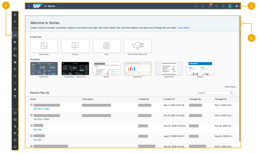
The new side navigation (1), shell bar (2), and start pages (3) act as the foundation of the new navigation experience
The navigation redesign is the result of many hours talking to users about their wants, needs, and pain points working with our product. And the aim of the new navigation shares that common goal of giving you more time back to spend focusing on your work - whether it be creating analytics or consuming them to discover insights and solve problems.
Here's a brief teaser of the changes before we dive into details:
Read on for highlights of these changes that are rolling out to all customers for the Q3 2021 QRC release.
Simpler navigation
One of the first things we wanted to do was simplify the menu navigation. The old Browse and Create menu structure hid menu items, and we heard from many people on the extra time spent switching between different tools within the product. We wanted to make it clear where to go and shorten the time to get there. The new side navigation menu now offers one-click access to most of your tools.

Before-and-after: A more accessible side navigation is faster and responsive to your needs
As before, the side navigation adapts to your permissions. If you're an administrator you'll have full access to all the content creation and administration tools, whereas analytics consumers see a simpler menu with a reduced set of items.

The side navigation continues to be role-specific, showing you only the tools you have access to. Items are moved responsively into a sub-menu if your list gets too busy
We also wanted to provide you the flexibility to change the way your side navigation is displayed. The menu expands and collapses with a single click of the ![]() menu, so you can gain additional real estate when working. The expanded view shows you the full names of all the tools. Once you're familiar with the icons, the collapsed view is a great way to reclaim space while still having quick access to jump to another part of the product. When viewing stories, the side navigation menu reduces further, and you can still expand the view to use your full screen.
menu, so you can gain additional real estate when working. The expanded view shows you the full names of all the tools. Once you're familiar with the icons, the collapsed view is a great way to reclaim space while still having quick access to jump to another part of the product. When viewing stories, the side navigation menu reduces further, and you can still expand the view to use your full screen.

Change the navigation display to suit your working style
Streamlined access to your content
As we simplified the navigation, we also wanted to tackle the lack of consistency across the entry points into different content viewing and creation workflows. Whether it be working with stories, models, datasets, or planning-specific features, we aimed for a consistent start page experience where you can browse your recent files and create new content from the same place.
A tile-based view lets you see at-a-glance what new content you can create. For example, when creating a new story, you'll see options to create blank stories based on different page types or instead from a starting template. Whereas if you're creating a new dataset or model, you'll see tiles to start from an existing data source or start from data located in an external CSV file.
But what if you're not creating something new, and instead looking to get back to some previous work?
We've added a Recent Files table on each start page that shows the most recent content you've worked on. So, you don't have to hunt through the Files area again, or depend on the multiple, small "Recent" cards that are optionally pinned to your Home screen.

Everything on the start page is one-click to get started
There are times, however, when you may want to view the Files area. For example, you may have related stories or models organized together in a folder and want to access this related content.
To speed this up, we've added breadcrumb navigation links underneath the file name - both in the Recent Files table and also the file name that appears in the new top shell bar when you have a file open. Click any link in the breadcrumb and you're automatically taken to that folder in the Files area. It's a fast and easy way to find related files and folders.

Use the breadcrumb navigation to jump directly to a specific folder in the Files area
One more thing to mention on the topic of content access: each tool in SAP Analytics Cloud now has a human-readable URL that's easy to bookmark in your web browser and share. We didn't stop at tools, however. You can now also bookmark folders and files directly using their unique IDs. Opening a folder bookmark takes you directly to that folder in the Files area, letting you skip some clicks if there's a folder you use often.

Create web browser bookmarks to your favorite files and folders. Check out our IT Handbook at the end of this blog for a list of URL shortcuts.
Increased user flow
Designing a simpler navigation and more efficient and consistent entry into individual tools were very important goals. But we knew from talking with many customers that the act of getting around the product was also much more cumbersome and slower than it needed to be. There's a lot of cases where you need to leave the current space you're working in. You go to another tool, or to the Files area, and return, sometimes repeatedly in a back-and-forth manner. There's a lot of interruptions with how the current workflows are set up,
Our next goal was to optimize interconnected workflows and allow you some flexibility to leave and come back without breaking your flow.
One of the features with this in mind is a set of contextual files actions, accessible from the new shell bar. For example, you can now create a new story based on an open model or launch directly into a planning workflow from that model. There are shortcuts for many common interactions. In the model-to-story case, if you create a new story from an existing, open model, that model is automatically loaded into the story and available to design with, skipping those extra steps and keeping you in the flow.

Suggested next steps keep you moving in your workflow. Check out our IT Handbook at the end of this blog for a complete list of workflow shortcuts available in this first release.
We've also made changes to how the Files area behaves to cut down the time you spend searching and provide a more instant response. The Files area now preserves the state of where you left it. So, if you navigate away to another part of the product, and come back through the side navigation, it remembers the folder you had open when you return, helping you maintain your flow.
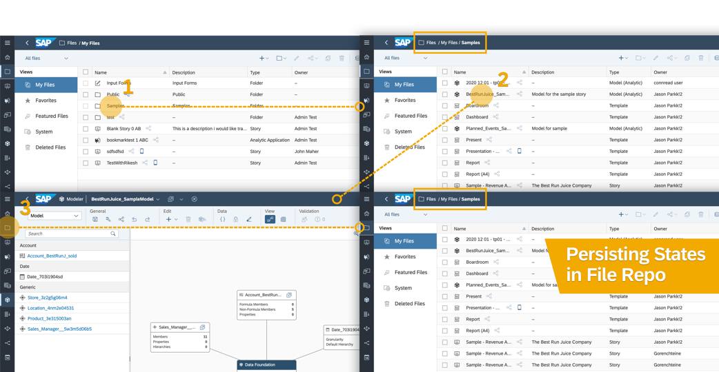
Return right where you left off in the Files area
You should also notice a quicker response time when going to the Files area - a benefit of architectural enhancements made to support many of the features highlighted so far.
Product switching
SAP Analytics Cloud isn't the only product getting some of the redesigned navigation. We've also harmonized the side navigation and shell bar functionality in SAP Data Warehouse Cloud. If you own multiple products, you can use the product switch in the upper-right of the shell bar to go between your SAP Analytics Cloud and SAP Data Warehouse Cloud tenants in your landscape.
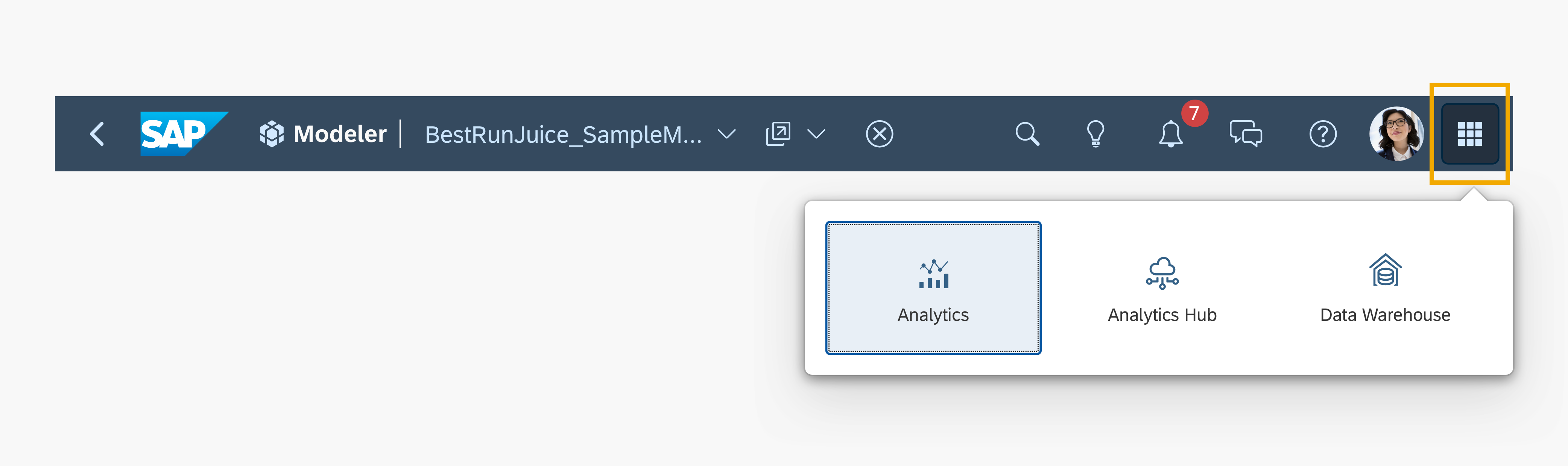
Use the Product Switch to move easily from one product to another
SAP Analytics Hub is also accessible from the product switch, however, note that it doesn't have the overall product navigation improvements. We're also exploring bringing the new navigation experience to additional cloud products in the SAP Business Technology Platform.
What next?
Many designers and engineers across the entire product collaborated to bring these product navigation improvements to life. We're excited to finally put the new experience in your hands!
We'll continue listening to your feedback as we look into further improvements of our product navigation. Meanwhile, product improvements related to story design, data modeling, performance, and other areas continue in parallel.
If you're on our quarterly release cycle, the new navigation experience is coming your way in our Q3 2021 release. There are several things you can do now to prepare:
- Check out our IT Handbook - aside from covering the overall changes in more detail, there's an FAQ with answers to the most frequent questions from customers who have tried or seen the changes so far. And a couple Quick References highlight the key menu changes and new URL shortcuts. The handbook is also available in these languages: Chinese (Simplified), Chinese (Traditional), French, German, Italian, Japanese, Korean, Portuguese (Brazil), Russian, Spanish
- Watch the recording of our Webinar to see a preview of the changes and a Q&A.
You can also learn more about the changes step-by-step, with Wendy McGrath in the SAP Analytics Cloud New Navigation Walkthrough.
Drop a comment below and tell us what you think!
- SAP Managed Tags:
- SAP Analytics Cloud,
- SAP Business Technology Platform
Labels:
1 Comment
You must be a registered user to add a comment. If you've already registered, sign in. Otherwise, register and sign in.
Labels in this area
-
ABAP CDS Views - CDC (Change Data Capture)
2 -
AI
1 -
Analyze Workload Data
1 -
BTP
1 -
Business and IT Integration
2 -
Business application stu
1 -
Business Technology Platform
1 -
Business Trends
1,661 -
Business Trends
88 -
CAP
1 -
cf
1 -
Cloud Foundry
1 -
Confluent
1 -
Customer COE Basics and Fundamentals
1 -
Customer COE Latest and Greatest
3 -
Customer Data Browser app
1 -
Data Analysis Tool
1 -
data migration
1 -
data transfer
1 -
Datasphere
2 -
Event Information
1,400 -
Event Information
65 -
Expert
1 -
Expert Insights
178 -
Expert Insights
280 -
General
1 -
Google cloud
1 -
Google Next'24
1 -
Kafka
1 -
Life at SAP
784 -
Life at SAP
11 -
Migrate your Data App
1 -
MTA
1 -
Network Performance Analysis
1 -
NodeJS
1 -
PDF
1 -
POC
1 -
Product Updates
4,577 -
Product Updates
330 -
Replication Flow
1 -
RisewithSAP
1 -
SAP BTP
1 -
SAP BTP Cloud Foundry
1 -
SAP Cloud ALM
1 -
SAP Cloud Application Programming Model
1 -
SAP Datasphere
2 -
SAP S4HANA Cloud
1 -
SAP S4HANA Migration Cockpit
1 -
Technology Updates
6,886 -
Technology Updates
408 -
Workload Fluctuations
1
Related Content
- Top Picks: Innovations Highlights from SAP Business Technology Platform (Q1/2024) in Technology Blogs by SAP
- Sneak Peek in to SAP Analytics Cloud release for Q2 2024 in Technology Blogs by SAP
- Prevent users from navigation in Sap analytics cloud menu in Technology Q&A
- Deep dive into Q4 2023, What’s New in SAP Cloud ALM for Implementation Blog Series in Technology Blogs by SAP
- CAP LLM Plugin – Empowering Developers for rapid Gen AI-CAP App Development in Technology Blogs by SAP
Top kudoed authors
| User | Count |
|---|---|
| 13 | |
| 11 | |
| 10 | |
| 9 | |
| 9 | |
| 7 | |
| 6 | |
| 5 | |
| 5 | |
| 5 |