Introduction
This blogpost series is about the new design of the
SAP Analytics Cloud. The user experience of SAP Analytics Cloud and SAP Data Warehouse Cloud has been unified to simplify how you interact with our data and analytics solutions, increase your productivity, and provide a solid platform that supports you on your data journey.
This blog is a sneak peak at the new design. It will be generally available for all SAP Analytics Cloud customers in
August 2021.
The initial improvements to SAP Analytics Cloud are focused on three main parts: a new
side navigation, a unified top
shell bar, and
enhancements to how you interact with the different data, analytics, and administration
applications and tools for your productive work:

This blogpost is about the new side navigation. But don't forget to visit all the posts in the series.
New Side Navigation
A new side navigation flattens the hierarchy of menu options for easier access, replacing the separate
Browse and
Create paradigm for a simpler, single-click entry point for viewing and creating content.
The new side navigation is responsive, adapting its vertical layout as users are given access to additional features. It also offers flexible
collapsed,
expanded, and
full-screen display options so it can be tailored to each user's needs.
Simplified Access
The
Browse and
Create menus in our previous navigation duplicated menu names and caused some confusion by separating the experience of opening your previous files and creating new ones. We've flattened the side navigation into a single list. Less clicks means easier access and a faster way to switch between different areas of the product.

So for example whether you want to create a new story or continue working on an existing story, in either case click on
Stories to get working.
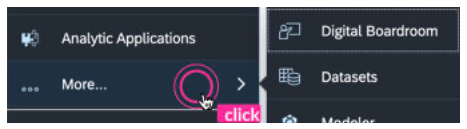
 Like before, what's visible in the side navigation changes depending on the permissions and license each user has. To reduce clutter, the new side navigation has a responsive design. Once your browser hits the minimum height, menu options are automatically hidden under More... .
Flexible Display Options
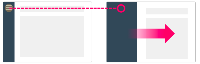
As your users become familiar with the location and icons in the side navigation, they can collapse it to gain more screen space to work with. Click the
Main Menu to expand or collapse the side navigation.
When presenting stories and Digital Boardroom dashboards and agendas, the side navigation is still hidden to maintain that full-screen experience.

Easy Movement Between Applications
Often users want to make quick changes in different areas of the products. We're working on making movement between different areas as fast and easy as possible.
The flattened side navigation allows for quicker back-and-forth movement. But also in this initial release of updates, those who prefer can now open multiple browser tabs by right-clicking on the side navigation.

Options for keeping multiple applications and tools open at the same time is a key goal of the new design - this is the first step.
Conclusion
As mentioned in the introduction, this is the first of several blogs in my series on the new design of the SAP Analytics Cloud. All information from this blog and further improvements can be found in the
IT Handbook. To get an overview of all SAP Analytics Cloud innovations, it is best to use the
Roadmap Explorer. As an interactive tool, you can view all new features there.
