
- SAP Community
- Products and Technology
- Technology
- Technology Blogs by SAP
- SAP Analytics Cloud - Focused Run - How to easily ...
Technology Blogs by SAP
Learn how to extend and personalize SAP applications. Follow the SAP technology blog for insights into SAP BTP, ABAP, SAP Analytics Cloud, SAP HANA, and more.
Turn on suggestions
Auto-suggest helps you quickly narrow down your search results by suggesting possible matches as you type.
Showing results for
former_member69
Participant
Options
- Subscribe to RSS Feed
- Mark as New
- Mark as Read
- Bookmark
- Subscribe
- Printer Friendly Page
- Report Inappropriate Content
04-09-2021
9:47 PM
CONTEXT
SAP Analytics Cloud platform allows us to visualize key performance indicators to help customers improve the performance of their applications and optimize the capacity of their SAP environment. With innovative stories providing weekly or monthly reports, we can analyze a series of key performance indicators like system availability, resources consumption, system performance, number of users...
GOAL
Identify performance issues by analyzing the overall health of the SAP solution
For this blog, each step (data validation - data extraction - data visualization) is detailed to make it as easy as possible for you. However, you may already be familiar with some of the steps, so feel free to navigate the blog as you wish.
APPROACH
Data validation
Before consuming the data in the SAP Analytics Cloud, you should first create your own Focused Run tactical dashboard. To do this, in your launchpad, in the Advanced Analytics & Intelligence menu, click on Tactical dashboard.
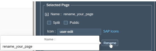
Then, you will be able to create a custom page that you can rename.
You can also select the view for your layout. You have the choice between:
In our example, I have selected the view by Systems.
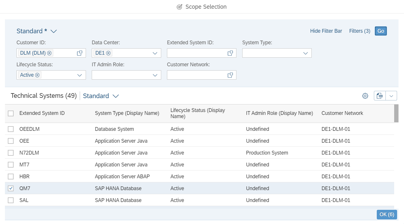
Then, by clicking on Open personalization, you can select the systems you want to analyze.
Thanks to the scope selection, it is possible to filter directly using keywords. I selected 6 systems.
The Tactical dashboard provides essential information for a selected of systems. If you want to aggregate multiple instances in a single view for your customers, you need to retrieve the data into the SAP Analytics Cloud to build a story to get actionable insights.
To do this, you need the ID of the page which can be retrieved by clicking on Page Information.
Data extraction
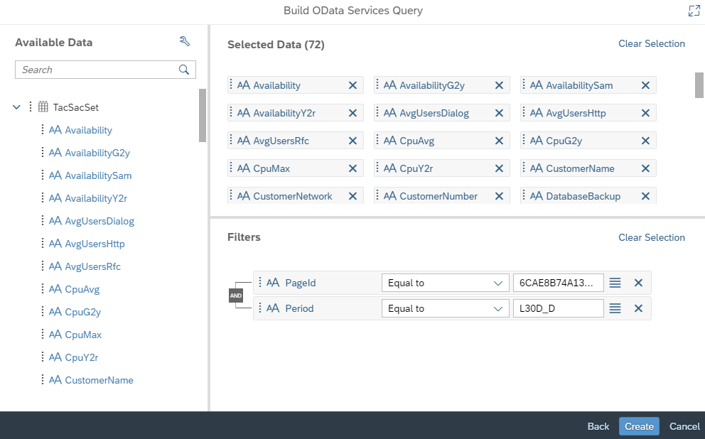
In the goal to retrieve the data in the SAP Analytics Cloud, we recover the ID of the page and the desired period. Then, I build a model that sits on an ODATA connection consuming data through Focused Run services.
A connection is created by getting the data with the entity TacSacSet and we filtered with the PageId and the Period.
In our example, the study will be done at most 1 month back, so the period: L30D_ D (last 30 days) is the most appropriate.
Then, an essential step is the data modelling. Make sure that the measurements and dimensions are correctly assigned, that there are no outliers. Moreover, if you want to add a geographical dimension to your Story, you must create a location column with the Geo Enrichment button.
When the model is created, the schedule setting must be set so that the data is recorded and synchronized every day.
Data visualization
Once the model is ready, I create the Story to allow the client to have a global and detailed analysis of their systems.
Step 1: Creation of inputs controls
In our example, it’s more efficient to put 3 inputs controls "Data Center", "Customer" and "System". This allows us to have a faster control and to filter directly according to the data center and the customer and finally to select more quickly the system that we want to analyze. In our example, we have 3 data centers which for each data center is associated one or more customers. Also, each customer has one or more systems.
Step 2: Creation of key performance indicators
The purpose of this report is to visualize the status of the key performance indicators for the solution. The story is split in 3 parts, Yesterday, Last 7 days, Last 4 weeks. Indeed, "Yesterday" provide us a current overview of how the system works. With "Last 7 days" we can make a comparison with the other days of the week and finally "Last 4 week" allows us to determine a good or bad trend.
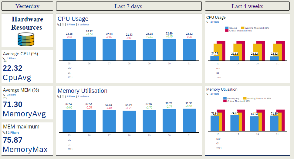
For each part, I focused on indicators such as Availability, Hardware resources (CPU & Memory), User Load (Number of Logged on Users) and Performance (Performance HTTPS - STEPS - HTTP - DIALOG).
For example, this is the Hardware Resource’s part:
You can also add a MAP overview that allows you to directly distinguish where the DataCenter is located and to have an overview of the system performance.
Step 3: Interaction between charts
By using the SAP Analysis Cloud’s Linked Analysis function, you will be able to filter the data at the same time by doing a linked analysis between all the chart in the Story. This function creates interactivity instantly and allow the user to analyze multiple systems with a single click. In this section, I configure the setting and select desired widgets that connect to the widget « System ».
With this option activated, you can now select the system that you want to identify the status of key performances indicators and quickly display information of the system.
CONCLUSION
SAP Analytics Cloud Platform and Focused RUN allows us to create and delivery powerful story to visualize the status of the performance keys indicators and to quickly identify the performance problems in order to help you to improve your application performance.
Thanks for reading and don't hesitate to share feedback or thoughts in a comment!
SAP Analytics Cloud platform allows us to visualize key performance indicators to help customers improve the performance of their applications and optimize the capacity of their SAP environment. With innovative stories providing weekly or monthly reports, we can analyze a series of key performance indicators like system availability, resources consumption, system performance, number of users...
GOAL
Identify performance issues by analyzing the overall health of the SAP solution

For this blog, each step (data validation - data extraction - data visualization) is detailed to make it as easy as possible for you. However, you may already be familiar with some of the steps, so feel free to navigate the blog as you wish.
APPROACH
Data validation
Before consuming the data in the SAP Analytics Cloud, you should first create your own Focused Run tactical dashboard. To do this, in your launchpad, in the Advanced Analytics & Intelligence menu, click on Tactical dashboard.

Then, you will be able to create a custom page that you can rename.
You can also select the view for your layout. You have the choice between:
- Systems = System Monitoring
- SUM Scenarios = Synthetic user Monitoring Scenarios and location
- RUM Groups = Real User Monitoring Groups
- Open Components = Open Components Monitoring
In our example, I have selected the view by Systems.
Then, by clicking on Open personalization, you can select the systems you want to analyze.
Thanks to the scope selection, it is possible to filter directly using keywords. I selected 6 systems.
Then, after validating the systems, you get the information about the selected systems in the dashboard.

The Tactical dashboard provides essential information for a selected of systems. If you want to aggregate multiple instances in a single view for your customers, you need to retrieve the data into the SAP Analytics Cloud to build a story to get actionable insights.
To do this, you need the ID of the page which can be retrieved by clicking on Page Information.
Data extraction
In the goal to retrieve the data in the SAP Analytics Cloud, we recover the ID of the page and the desired period. Then, I build a model that sits on an ODATA connection consuming data through Focused Run services.
A connection is created by getting the data with the entity TacSacSet and we filtered with the PageId and the Period.
In our example, the study will be done at most 1 month back, so the period: L30D_ D (last 30 days) is the most appropriate.
Then, an essential step is the data modelling. Make sure that the measurements and dimensions are correctly assigned, that there are no outliers. Moreover, if you want to add a geographical dimension to your Story, you must create a location column with the Geo Enrichment button.
When the model is created, the schedule setting must be set so that the data is recorded and synchronized every day.

Data visualization
Once the model is ready, I create the Story to allow the client to have a global and detailed analysis of their systems.
Step 1: Creation of inputs controls
In our example, it’s more efficient to put 3 inputs controls "Data Center", "Customer" and "System". This allows us to have a faster control and to filter directly according to the data center and the customer and finally to select more quickly the system that we want to analyze. In our example, we have 3 data centers which for each data center is associated one or more customers. Also, each customer has one or more systems.

Step 2: Creation of key performance indicators
The purpose of this report is to visualize the status of the key performance indicators for the solution. The story is split in 3 parts, Yesterday, Last 7 days, Last 4 weeks. Indeed, "Yesterday" provide us a current overview of how the system works. With "Last 7 days" we can make a comparison with the other days of the week and finally "Last 4 week" allows us to determine a good or bad trend.
For each part, I focused on indicators such as Availability, Hardware resources (CPU & Memory), User Load (Number of Logged on Users) and Performance (Performance HTTPS - STEPS - HTTP - DIALOG).
For example, this is the Hardware Resource’s part:
You can also add a MAP overview that allows you to directly distinguish where the DataCenter is located and to have an overview of the system performance.
Step 3: Interaction between charts
By using the SAP Analysis Cloud’s Linked Analysis function, you will be able to filter the data at the same time by doing a linked analysis between all the chart in the Story. This function creates interactivity instantly and allow the user to analyze multiple systems with a single click. In this section, I configure the setting and select desired widgets that connect to the widget « System ».

With this option activated, you can now select the system that you want to identify the status of key performances indicators and quickly display information of the system.

CONCLUSION
SAP Analytics Cloud Platform and Focused RUN allows us to create and delivery powerful story to visualize the status of the performance keys indicators and to quickly identify the performance problems in order to help you to improve your application performance.
Thanks for reading and don't hesitate to share feedback or thoughts in a comment!
- SAP Managed Tags:
- SAP Analytics Cloud,
- SAP Focused Run,
- SAP Solution Manager
Labels:
You must be a registered user to add a comment. If you've already registered, sign in. Otherwise, register and sign in.
Labels in this area
-
ABAP CDS Views - CDC (Change Data Capture)
2 -
AI
1 -
Analyze Workload Data
1 -
BTP
1 -
Business and IT Integration
2 -
Business application stu
1 -
Business Technology Platform
1 -
Business Trends
1,658 -
Business Trends
93 -
CAP
1 -
cf
1 -
Cloud Foundry
1 -
Confluent
1 -
Customer COE Basics and Fundamentals
1 -
Customer COE Latest and Greatest
3 -
Customer Data Browser app
1 -
Data Analysis Tool
1 -
data migration
1 -
data transfer
1 -
Datasphere
2 -
Event Information
1,400 -
Event Information
66 -
Expert
1 -
Expert Insights
177 -
Expert Insights
299 -
General
1 -
Google cloud
1 -
Google Next'24
1 -
Kafka
1 -
Life at SAP
780 -
Life at SAP
13 -
Migrate your Data App
1 -
MTA
1 -
Network Performance Analysis
1 -
NodeJS
1 -
PDF
1 -
POC
1 -
Product Updates
4,577 -
Product Updates
344 -
Replication Flow
1 -
RisewithSAP
1 -
SAP BTP
1 -
SAP BTP Cloud Foundry
1 -
SAP Cloud ALM
1 -
SAP Cloud Application Programming Model
1 -
SAP Datasphere
2 -
SAP S4HANA Cloud
1 -
SAP S4HANA Migration Cockpit
1 -
Technology Updates
6,873 -
Technology Updates
422 -
Workload Fluctuations
1
Related Content
- SAP Analytics Cloud for planning - Set Advanced Filters on Date and Version in Technology Q&A
- Sorting not working on object Page Item table SAP CAP BTP Fiori elements in Technology Q&A
- Daten aus der LMDB oder SLD abrufen in Technology Q&A
- SAP Build Process Automation Pre-built content for Finance Use cases in Technology Blogs by SAP
- SAC: Find drill level in hierarchy based on string in Technology Q&A
Top kudoed authors
| User | Count |
|---|---|
| 40 | |
| 25 | |
| 17 | |
| 13 | |
| 7 | |
| 7 | |
| 7 | |
| 6 | |
| 6 | |
| 6 |