
- SAP Community
- Products and Technology
- Technology
- Technology Blogs by SAP
- SAP BTP Showcase - Provide governed business seman...
Technology Blogs by SAP
Learn how to extend and personalize SAP applications. Follow the SAP technology blog for insights into SAP BTP, ABAP, SAP Analytics Cloud, SAP HANA, and more.
Turn on suggestions
Auto-suggest helps you quickly narrow down your search results by suggesting possible matches as you type.
Showing results for
Employee
Options
- Subscribe to RSS Feed
- Mark as New
- Mark as Read
- Bookmark
- Subscribe
- Printer Friendly Page
- Report Inappropriate Content
02-07-2021
10:48 PM
Overview
This is the 6th blog post of the SAP Business Technology Platform Showcase series of blogs and videos. We invite you to check this overall blog, so you can understand the full end-to-end story and the context involving multiple SAP BTP solutions.
Here we will see how to consume all of the multiple data sources referenced in the blog, enabling business users with self-service data modeling and harmonization.
Below you can see this is the 6th step of the “Solution Map” prepared for the journey on the referred overall blog:

SAP BTP Showcase – Overall Technical Architecture
You can also follow these scenarios watching this technical demonstration video.
Prerequisites
- Having completed the Blog 1: Load data into SAP Data Warehouse Cloud
- Having completed the Blog 4: Run future sales prediction using SAP HANA Cloud Machine Learning algorithms
Scenarios
Enabling self-service data modelling and harmonization through Analytical Datasets
In this scenario we will show how business users can consume the data sources created in the blog 1 (Load data into SAP Data Warehouse Cloud) and blog 4 (Run future sales prediction using SAP HANA Cloud Machine Learning algorithms) and make it available to consumption on SAP Analytics Cloud through Analytical Datasets in Graphical Views. The business user is empowered to create its own data models using graphical resources, such as drag and drop, freeing up the IT department´s resources.

For this first example, we will create a model that enables us to analyze energy production and consumption in weekdays. To do this, we will join some CSV files: one containing the energy production values, another containing the energy consumption values, both of which were previously replicated from the S3 filesystem, and the file that contains the weekdays values, which was imported from our computer.
First, open the Repository tab, then drag and drop the table containing the energy consumption values to the Graphical View.

Then, drag and drop the table containing the production values above the consumption table to create a join between those tables.
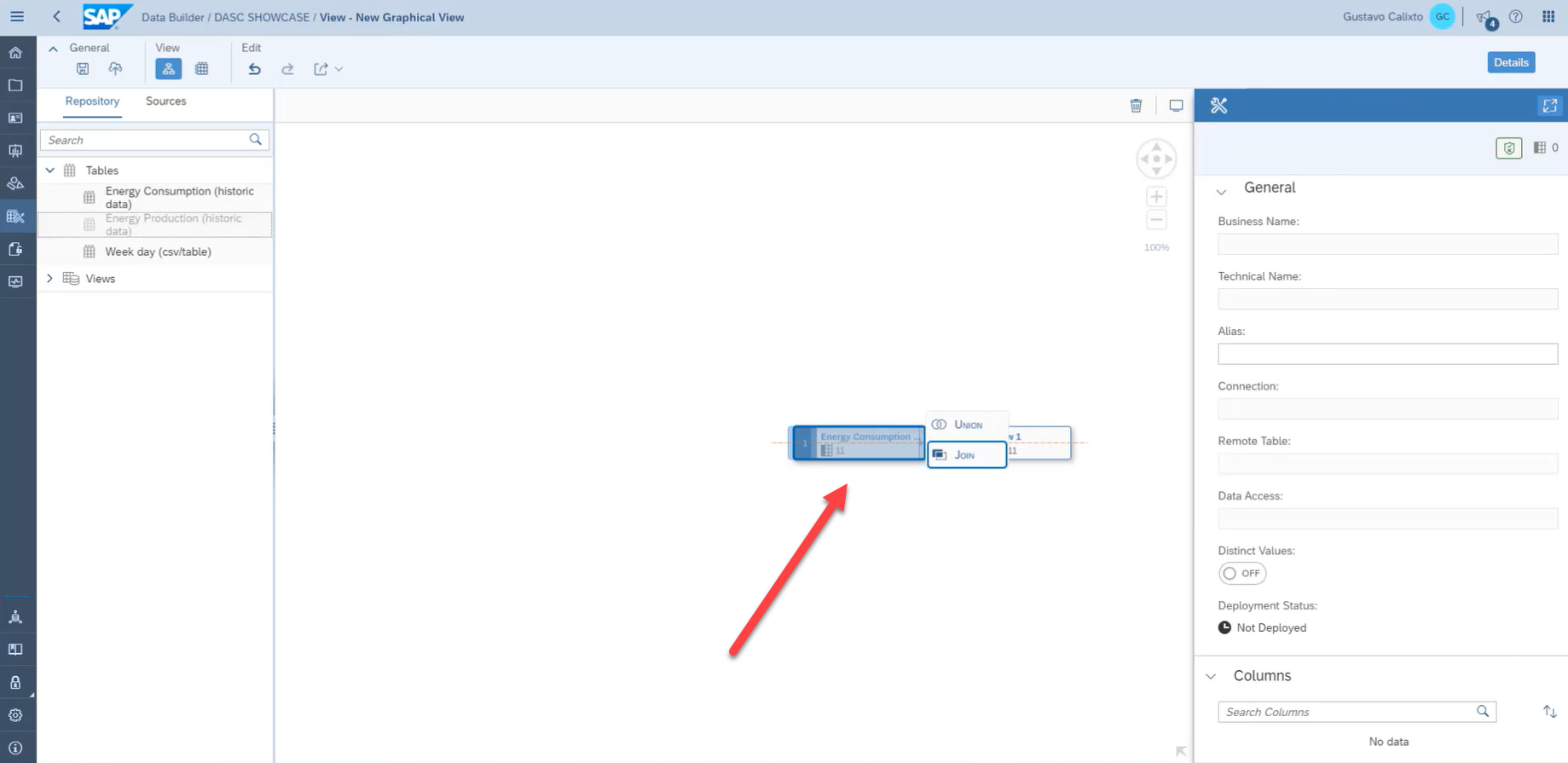
After creating the join, open the join properties and create a columns mapping by dragging and dropping the columns.

On the view properties, enter a meaningful business name, so that this graphical view is easily understandable by other business users and also a technical name. Select Analytical Dataset as the semantic usage and turn on the Expose for Consumption, this way the view will be available to be used by SAP Analytics Cloud after its deployment.

Then, click on the result table and select which columns will be used as measures. For this example, we selected all of the columns related to energy production and consumption values.

Now, we will add the weekday values to our view and join it with the energy values. Open the repository tab and drag and drop the Weekday data source above the projection properties.

Just as we did for the first join, map the columns of this join by dragging and dropping the columns.

Using Graphical Views, the business user is also capable of creating calculated columns to enrich even more its model. To do this, click on the projection properties, then on the add function button.

In the calculated columns tab, click on the add button.
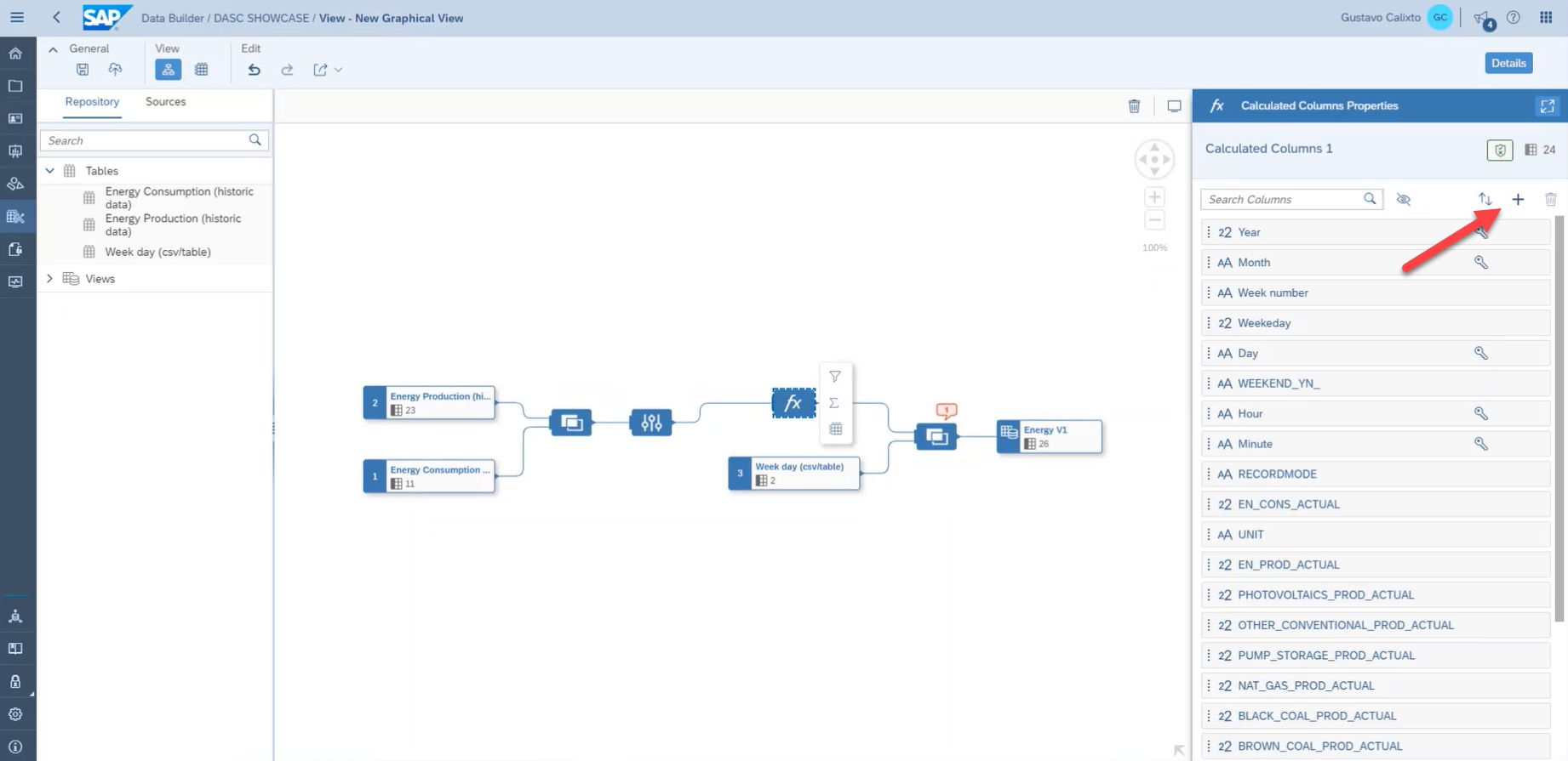
In our dataset, we have fields containing the year, month, and day. However, we do not have a field containing the entire date. Therefore, we will use an expression to create this calculated column as an example. Add the expression below to create this column:
CONCAT(CONCAT(CONCAT(YEAR_,'-'),CONCAT(MONTH_,'-')),DAY_)If the business user does not know the function definition, there is a search input just below the expression field that allows he/she to search for its usage.

Now, we can save the model and deploy it to make it available for consumption on SAP Analytics Cloud.

For the second example, we will consume the forecast consumption values that were created in the Blog 4: Run future sales prediction using SAP HANA Cloud Machine Learning algorithms and the production plan values from the oData connection created in the Blog 1: Load data into SAP Data Warehouse Cloud. This way, the business user himself, without the need of the IT department is capable of harmonizing data from multiple sources to verify if the planned production values will satisfy the predicted energy demand.
Just as the first example, drag and drop the forecast source into the Graphical View.

Then, drag and drop the oData data source above the forecast table.

We will need to replicate the data from the oData source into SAP Data Warehouse Cloud. Select the business name for the table and its technical name, then click on import and deploy.

Now, open the join properties and create the column mapping for this join by dragging and dropping the columns, as shown in the picture below.

Then, click on the add projection property button.

On the projection properties tab, exclude the duplicated columns.

Now, just as we did on the first example, add two calculated columns. This time, we will add the same expression to create a date field and the expression below to add the month names abbreviations to our view:
LEFT(MONTHNAME(Date),3)
Then, add the weekday source to our view, just as we did on the first example.

After that, we can select the measures for the output, define the business name, the technical name, select Analytical Dataset as the semantic usage, turn on the expose for consumption, and finally save and deploy the model, just as we did on the first example.

For the final example, we will create a union between the two views previously created in this scenario.

At the column mappings, add all source columns as union columns.


After that, we can select the measures for the output, define the business name, the technical name, select Analytical Dataset as the semantic usage, turn on the expose for consumption, and finally save and deploy the model, just as we did on the previous examples.
Summary
Congratulations! In this blog post we created three Analytical Datasets using Graphical Views. These Analytical Datasets we created will be consumed on SAP Analytics Cloud as shown in the next blog post of this series.
With SAP Data Warehouse Cloud the business user was able to consolidate the multiple data sources that we created for this showcase by himself, without needing deep SQL knowledge or the IT department´s help. With these features at hand, the user is empowered to visually build his own models, using data sources that ranged from a S3 filesystem, to a predictive analysis running on SAP HANA Cloud, to an oData service, and make it available to be consumed.
- SAP Managed Tags:
- SAP Datasphere
Labels:
You must be a registered user to add a comment. If you've already registered, sign in. Otherwise, register and sign in.
Labels in this area
-
ABAP CDS Views - CDC (Change Data Capture)
2 -
AI
1 -
Analyze Workload Data
1 -
BTP
1 -
Business and IT Integration
2 -
Business application stu
1 -
Business Technology Platform
1 -
Business Trends
1,661 -
Business Trends
87 -
CAP
1 -
cf
1 -
Cloud Foundry
1 -
Confluent
1 -
Customer COE Basics and Fundamentals
1 -
Customer COE Latest and Greatest
3 -
Customer Data Browser app
1 -
Data Analysis Tool
1 -
data migration
1 -
data transfer
1 -
Datasphere
2 -
Event Information
1,400 -
Event Information
64 -
Expert
1 -
Expert Insights
178 -
Expert Insights
275 -
General
1 -
Google cloud
1 -
Google Next'24
1 -
Kafka
1 -
Life at SAP
784 -
Life at SAP
11 -
Migrate your Data App
1 -
MTA
1 -
Network Performance Analysis
1 -
NodeJS
1 -
PDF
1 -
POC
1 -
Product Updates
4,577 -
Product Updates
329 -
Replication Flow
1 -
RisewithSAP
1 -
SAP BTP
1 -
SAP BTP Cloud Foundry
1 -
SAP Cloud ALM
1 -
SAP Cloud Application Programming Model
1 -
SAP Datasphere
2 -
SAP S4HANA Cloud
1 -
SAP S4HANA Migration Cockpit
1 -
Technology Updates
6,886 -
Technology Updates
407 -
Workload Fluctuations
1
Related Content
- 体验更丝滑!SAP 分析云 2024.07 版功能更新 in Technology Blogs by SAP
- 10+ ways to reshape your SAP landscape with SAP BTP - Blog 4 Interview in Technology Blogs by SAP
- 10+ ways to reshape your SAP landscape with SAP Business Technology Platform – Blog 4 in Technology Blogs by SAP
- What’s New in SAP Analytics Cloud Release 2024.08 in Technology Blogs by SAP
- ad-hoc analysis on BW Querys in SAP Analytics Cloud on iOS mobile devices in Technology Q&A
Top kudoed authors
| User | Count |
|---|---|
| 13 | |
| 10 | |
| 10 | |
| 7 | |
| 7 | |
| 6 | |
| 5 | |
| 5 | |
| 5 | |
| 4 |