
- SAP Community
- Products and Technology
- Technology
- Technology Blogs by SAP
- What’s new in Mobile development kit client 5.1
Technology Blogs by SAP
Learn how to extend and personalize SAP applications. Follow the SAP technology blog for insights into SAP BTP, ABAP, SAP Analytics Cloud, SAP HANA, and more.
Turn on suggestions
Auto-suggest helps you quickly narrow down your search results by suggesting possible matches as you type.
Showing results for
 Jitendra_Kansal
Product and Topic Expert
Options
- Subscribe to RSS Feed
- Mark as New
- Mark as Read
- Bookmark
- Subscribe
- Printer Friendly Page
- Report Inappropriate Content
12-17-2020
10:31 AM
I am happy to announce that a new release of the Mobile Development Kit is now available for all Mobile Services customers and can be downloaded on the SAP Software Center and community Download page).
SAP Mobile Services Client 5.1 is also available in Google Play Store and in Apple app store.
This release adds incremental functionality over the previous MDK Client 5.0 release.
SAP Mobile Development Kit enables developers and technical business users to build multi-channel applications. It allows you to build your application once, in an integrated development environment (SAP Business Application Studio/SAP Web IDE/ VSCode extension) and run it natively on Mobile (Android & iOS) and as a web application (online) in the browser.
The release includes the following:
You can now enable horizontal swipe on a cell to show a context menu to implement actions associated with Object Table or Contact Table controls.
In the mobile client, it is triggered by swiping the item left or right. The Context Menu supports the use of interactive elements within the cell being swiped.
Note: The Context Menu can render multiple menu items on the iOS platform. However, it displays only the first menu item on the Android platform. If there's more than 3 menu items on the iOS platform, it displays the first 2 menu items inline and the 3rd menu item is displayed as More menu item. Tapping the More menu item, it shows all the menu items as action sheet on the phone and as popover on the tablet.
In the web environment, an overflow button is visible in the cell, when selected, it displays a popover with all the menu items, which combines leading and trailing menu items together.
Check the documentation for more details.
PLT function lets you to define a platform specific value for metadata property.
The PLT function support was already there for UI control properties, you can now it further to invoke platform specific events.
e.g.
This capability is supported for all the controls which have one of the following events
Check the documentation for more details.
A new property PageSize allow you to define page size while fetching the data from backend.
This is used by the client to define number of records to be automatically returned on the page (in collection controls) via $top and $skip query options parameter.
Check the documentation for more details.
A new event OnRendered has been introduced for SectionedTable. This event will be triggered after the sectioned table is fully rendered for the first time and also post redraw of the table.
It’s now easy to fetch individual section (controls like ObjectTable, ObjectCollection, KeyValueCollection, Extension and more) from a SectionedTable page using getSection client API.
Check the documentation for more details.
Navigation action now support a new property called PageMetadata. You can assign a rule to this property and return a Page definition in JSON format. The definition format is the same as what you will get in a .page file. This allows you to dynamically build a page definition and return it from the rule to this property. If this property is defined, any value for PageToOpen will be ignored.
Check the documentation for more details.
This feature is currently applicable to Mobile client only.
This feature is currently applicable to Mobile client only.
This feature is currently applicable to Mobile client only.
Each individual KPI items in the KPIHeader now supports an OnPress event. This event can be used to invoke a rule or an action.
This feature is already available in the Mobile client and is now supported in the web environment.
You can use Tabs control (part of a Tabs Page) to show the navigation items in your MDK web app. This control allows you to have any number of tab items either in Top or Bottom position.
Check the guide & metadata reference for more details.
This feature is already available in the Mobile client and is now supported in the web environment.
When using a tab page you can also include a persistent header at the top of the page if there is common information you want to display for all tab pages (Object or Profile) and the tabs below that.
Check the documentation for more details.
This feature is already supported in the Mobile client and is now supported in the web environment.
MDK web applications now support the use of a Form Cell section in a Section table page. This allows you to put Form Cell controls together with the other section types.
E.g., you can now display results for a given input field being in the same page or you can toggle a switch to make data visible/invisible.
Check the documentation for more details.
This feature is already supported in the client and is now supported in the web environment.
We have enhanced the search to allow searching when you have multiple sections. Previously, search was available when you had a single section. You can now include the search when you have multiple sections and choose which sections will get that search input to get to do something with.
This feature is already supported in the Mobile client and is now supported in the web environment.
Key Value items are now support an on-click action. You can indicate if Key value item is clickable via styling property.
Check the documentation for more details.
This feature is already supported in the Mobile client and is now supported in the web environment.
This enhancement will allow the developers to better control or programmatically set focus into some of the FormCell fields (Title, SimpleProperty, Note). This makes web application more intuitive.
Possible use cases are:
Check the documentation for more details.
This feature is already supported in the Mobile client and is now supported in the web environment.
You now have access to the full return that comes back from the OData server in case of errors to be able to parsed out and display better error messages from the backend.
ActionResult.error now contains the following new properties:
Check the documentation for more details.
This feature is already supported in the Mobile client and is now supported in the web environment.
Banner Message & Progress Banner now support interactivity which can be used to execute an action or rule when clicked.
This feature is already supported in the Mobile client and is now supported in the web environment.
You can now default the list picker if there is only one value in the list. This helps the user from having to click into the list to make a selection when there is only one choice.
Check the documentation for more details.
This feature is already available in the Mobile client and is now supported in the web environment.
UI controls on web environment that support image can now use SAP font icons using sap-icon://<name> syntax e.g. "DetailImage":"sap-icon://person-placeholder". The list of the supported SAP icons can be found here.
These font icons also support styling.
This feature is already available in the Mobile client and is now supported in the web environment.
Action Bar supports below properties:
Check the documentation for more details.
This feature is already available in the Mobile client and is now supported in the web environment.
This feature is already available in the Mobile client and is now supported in the web environment.
ServerSidePaging specifies if the Target service supports pagination via skipToken instead of using client supplied $top and $skip values..
This feature is useful for scenarios where OData service supports only server pagination (no client pagination).
Check the documentation for more details.
Follow these tutorials to get your hands dirty and learn more about Mobile development kit!
You can learn more in documentation :
I am looking forward to your feedback and comments.
Jitendra
SAP Mobile Services Client 5.1 is also available in Google Play Store and in Apple app store.
This release adds incremental functionality over the previous MDK Client 5.0 release.
SAP Mobile Development Kit enables developers and technical business users to build multi-channel applications. It allows you to build your application once, in an integrated development environment (SAP Business Application Studio/SAP Web IDE/ VSCode extension) and run it natively on Mobile (Android & iOS) and as a web application (online) in the browser.
The release includes the following:
- Mobile & Web
- Context Menu (Swipe on Mobile)
- Expand Platform metadata function (PLT) support for events
- PageSize support in Data Paging
- Support OnRendered Event For SectionedTable
- getSection API for SectionedTable
- PageMetadata Support for Navigation Action
- Mobile only
- Web (already supported on Mobile)
- Tabs Control
- Support Header Type control & Tabs in a page
- Support Form Cell Section
- Searching across multiple sections in the same page
- Clickable Key Value
- SetFocus API for Title, SimpleProperty and Note Form Cell controls
- Expose OData Error response Body in Action Result
- Action support in Banner Message & Progress Banner
- Enhanced List Picker to support defaulting the selection if only one value exists
- Support SAP Font Icons
- Avatar and Circular Icon support for ActionBar Item
- OData Service enhancements
- Service Side Paging Support
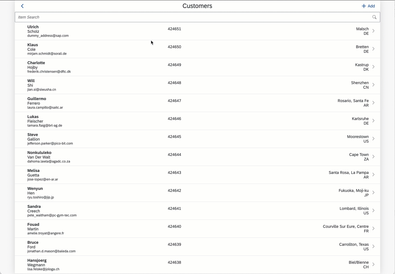
Context Menu (Swipe on Mobile)
You can now enable horizontal swipe on a cell to show a context menu to implement actions associated with Object Table or Contact Table controls.
//Excerpt of a page


"ContextMenu": {

    "Items": [{

            "Image": "sap-icon://delete",

            "Mode": "Deletion",

            "OnSwipe": "/DemoApp/Actions/Customers/Customers_DeleteEntity.action",

            "Text": "Delete",

            "_Name": "Delete"

        },

        {

            "Image": "sap-icon://edit",

            "Mode": "Normal",

            "OnSwipe": "/DemoApp/Actions/Customers/NavToCustomers_Edit.action",

            "Text": "Edit",

            "_Name": "Edit"

        }

    ],

    "LeadingItems": [

        "Delete"

    ],

    "PerformFirstActionWithFullSwipe": true,

    "TrailingItems": [

        "Edit

    ]

},
In the mobile client, it is triggered by swiping the item left or right. The Context Menu supports the use of interactive elements within the cell being swiped.
Note: The Context Menu can render multiple menu items on the iOS platform. However, it displays only the first menu item on the Android platform. If there's more than 3 menu items on the iOS platform, it displays the first 2 menu items inline and the 3rd menu item is displayed as More menu item. Tapping the More menu item, it shows all the menu items as action sheet on the phone and as popover on the tablet.

In the web environment, an overflow button is visible in the cell, when selected, it displays a popover with all the menu items, which combines leading and trailing menu items together.

Check the documentation for more details.
Expand Platform metadata function (PLT) support for events
PLT function lets you to define a platform specific value for metadata property.
The PLT function support was already there for UI control properties, you can now it further to invoke platform specific events.
$(PLT, <iOS>, <Android>, <Web>)e.g.
//Excerpt of a page


"OnSuccess": "$(PLT,'/DemoApp/Actions/SuccessIOS.action','/DemoApp/Actions/ SuccessAndroid.action',/DemoApp/Rules/SuccessWeb.js)",
This capability is supported for all the controls which have one of the following events
- OnPress, OnAccessoryButtonPress, FormatRule, OnValueChange
- All the page level events except OnActivityBackPressed event support PLT. OnActivityBackPressed is an Android platform specific event.
- All the application level events.
- OnSuccess, OnFailure and OnInvalid events for an action.
Check the documentation for more details.
PageSize support in Data Paging
A new property PageSize allow you to define page size while fetching the data from backend.
This is used by the client to define number of records to be automatically returned on the page (in collection controls) via $top and $skip query options parameter.

Check the documentation for more details.
Support OnRendered Event For SectionedTable
A new event OnRendered has been introduced for SectionedTable. This event will be triggered after the sectioned table is fully rendered for the first time and also post redraw of the table.
getSection API for SectionedTable
It’s now easy to fetch individual section (controls like ObjectTable, ObjectCollection, KeyValueCollection, Extension and more) from a SectionedTable page using getSection client API.
export default function findCity(context) {

//SectionObjectTable0 is the section name

    const customerSection = context.getSection('SectionObjectTable0');

    alert(customerSection.City);

}
Check the documentation for more details.
PageMetadata Support for Navigation Action
Navigation action now support a new property called PageMetadata. You can assign a rule to this property and return a Page definition in JSON format. The definition format is the same as what you will get in a .page file. This allows you to dynamically build a page definition and return it from the rule to this property. If this property is defined, any value for PageToOpen will be ignored.
Check the documentation for more details.
SideDrawer Navigation page enhancements
This feature is currently applicable to Mobile client only.
- You can now omit PageToOpen in SideDrawerItem and it will not attempt to open an empty page. This will allow you to open a modal page or trigger non UI related actions such as Logout action.
- Styling enhancements:
- Styling override at the Section level - This styling attribute can now be used to override the styling defined at the SideDrawer level.
- Styling override at an individual item level - This styling attribute can now be used to override the styling at the SideDraweras well at the Section level.
- Optional section separator lines - Section separator lines can now be disabled using the property SeparatorEnabled.
- Item title alignment - Items title can now be aligned left, center or right using the TextAlignment property.
- Header alignment - SideDrawerheader can now be aligned left, center or right using the Alignment property in SideDrawer Header.
- User supplied SideDrawer icon - DrawerButton property can be used to specify a user supplied SideDrawer icon instead of standard hamburger icon.
- You can now open a Master Detail from Side drawer frame.

Offline OData enhancements
This feature is currently applicable to Mobile client only.
- OData Version 4 is now supported in offline mode. You can initialize your OData Version 4 service as offline OData service in your app and perform OData actions on it, including syncing (uploading and downloading) the offline store. This is applicable to Cloud Foundry environment only. You can find more details on the OData Version 4 support & limitations in this document.
- CancelDownload and CancelUpload types are introduced in offline action.
- CancelDownload action can be used to cancel Offline Download. This action will cancel all the offline downloads including those part of a queue.
- CancelUpload action can be used to cancel Offline Upload. This action will cancel the currently ongoing offline upload.
- Note: EnableRepeatableRequests should not be set to false in store parameter as this is required to prevent duplication of requests in the back end when upload is called again.
OnPress event support for KPI
This feature is currently applicable to Mobile client only.
Each individual KPI items in the KPIHeader now supports an OnPress event. This event can be used to invoke a rule or an action.
Tabs Control
This feature is already available in the Mobile client and is now supported in the web environment.
You can use Tabs control (part of a Tabs Page) to show the navigation items in your MDK web app. This control allows you to have any number of tab items either in Top or Bottom position.
Check the guide & metadata reference for more details.
Support Header Type control & Tabs in a page
This feature is already available in the Mobile client and is now supported in the web environment.
When using a tab page you can also include a persistent header at the top of the page if there is common information you want to display for all tab pages (Object or Profile) and the tabs below that.

Check the documentation for more details.
Support Form Cell Section
This feature is already supported in the Mobile client and is now supported in the web environment.
MDK web applications now support the use of a Form Cell section in a Section table page. This allows you to put Form Cell controls together with the other section types.
E.g., you can now display results for a given input field being in the same page or you can toggle a switch to make data visible/invisible.
Check the documentation for more details.
Searching across multiple sections in the same page
This feature is already supported in the client and is now supported in the web environment.
We have enhanced the search to allow searching when you have multiple sections. Previously, search was available when you had a single section. You can now include the search when you have multiple sections and choose which sections will get that search input to get to do something with.

Clickable Key Value
This feature is already supported in the Mobile client and is now supported in the web environment.
Key Value items are now support an on-click action. You can indicate if Key value item is clickable via styling property.

Check the documentation for more details.
SetFocus API for Title, SimpleProperty and Note Form Cell controls
This feature is already supported in the Mobile client and is now supported in the web environment.
This enhancement will allow the developers to better control or programmatically set focus into some of the FormCell fields (Title, SimpleProperty, Note). This makes web application more intuitive.
Possible use cases are:
- If there is a list picker/switch – once a user selects a value or turns the switch, taking them to the next mandatory field for them to enter.
- If the field is a specific length, app could set focus to the next field once the value has been validated or reached the specific length of the field.
- If an error occurs on the screen, taking the user to the specific field which contains the error.
Check the documentation for more details.
Expose OData Error response Body in Action Result
This feature is already supported in the Mobile client and is now supported in the web environment.
You now have access to the full return that comes back from the OData server in case of errors to be able to parsed out and display better error messages from the backend.
ActionResult.error now contains the following new properties:
- responseCode - this is the HTTP error code in the response returned by the OData service (e.g., #ActionResults:update/responseCode)
- responseBody - this is the response body pay load returned by the OData service in string format. If the payload is a JSON string, you can directly target sub element of the result for further use. (e.g., #ActionResults:update/responseBody/Error/Msg)
Check the documentation for more details.
Action support in Banner Message & Progress Banner
This feature is already supported in the Mobile client and is now supported in the web environment.
Banner Message & Progress Banner now support interactivity which can be used to execute an action or rule when clicked.
Enhanced List Picker to support defaulting the selection if only one value exists
This feature is already supported in the Mobile client and is now supported in the web environment.
You can now default the list picker if there is only one value in the list. This helps the user from having to click into the list to make a selection when there is only one choice.
//Excerpt of a page


{

    "AllowDefaultValueIfOneItem": true,

    "AllowEmptySelection": false,

    "AllowMultipleSelection": false,

    "Caption": "Product",

    "IsEditable": true,

    "IsVisible": true,

    "PickerItems": {

        "DisplayValue": "{Name}",

        "ReturnValue": "{ProductId}",

        "Target": {

            "EntitySet": "Products",

            "Service": "/MDK51/Services/sample.service"

        }

    },

    "PickerPrompt": "Please select one single item",

    "_Name": "FormCellListPicker0",

    "_Type": "Control.Type.FormCell.ListPicker"

},
Check the documentation for more details.
Support SAP Font Icons
This feature is already available in the Mobile client and is now supported in the web environment.
UI controls on web environment that support image can now use SAP font icons using sap-icon://<name> syntax e.g. "DetailImage":"sap-icon://person-placeholder". The list of the supported SAP icons can be found here.
These font icons also support styling.
Avatar and Circular Icon support for ActionBar Item
This feature is already available in the Mobile client and is now supported in the web environment.
Action Bar supports below properties:
- IconText : is used to generate a text based avatar image
- IsIconCircular: can be used to render a circular icon
//Excerpt of a page

{

    "IsIconCircular": true,

    "Position": "right",

    "Visible": true,

    "IconText": "MDK Developer"

}
Check the documentation for more details.
OData Service enhancements
This feature is already available in the Mobile client and is now supported in the web environment.
- Support LanguageURLParam: LanguageURLParam are now supported in web environment.
- Support Custom Headers: You can now define custom headers (key/value pairs) in “Headers” property of. service file, the defined headers will be added automatically to all of the OData actions.

Server Side Paging Support
This feature is already available in the Mobile client and is now supported in the web environment.
ServerSidePaging specifies if the Target service supports pagination via skipToken instead of using client supplied $top and $skip values..
This feature is useful for scenarios where OData service supports only server pagination (no client pagination).
"_Type":"Section.Type.ObjectTable",

"Target":{

   "Service":"/MDK51/Services/sample.service",

   "EntitySet":"/SalesOrders",

   "QueryOptions":"$expand=Items",

   "ServerSidePaging":true

},
Check the documentation for more details.
New to MDK development?
Follow these tutorials to get your hands dirty and learn more about Mobile development kit!

Further Information:
You can learn more in documentation :
I am looking forward to your feedback and comments.
Jitendra
2 Comments
You must be a registered user to add a comment. If you've already registered, sign in. Otherwise, register and sign in.
Labels in this area
-
ABAP CDS Views - CDC (Change Data Capture)
2 -
AI
1 -
Analyze Workload Data
1 -
BTP
1 -
Business and IT Integration
2 -
Business application stu
1 -
Business Technology Platform
1 -
Business Trends
1,658 -
Business Trends
92 -
CAP
1 -
cf
1 -
Cloud Foundry
1 -
Confluent
1 -
Customer COE Basics and Fundamentals
1 -
Customer COE Latest and Greatest
3 -
Customer Data Browser app
1 -
Data Analysis Tool
1 -
data migration
1 -
data transfer
1 -
Datasphere
2 -
Event Information
1,400 -
Event Information
66 -
Expert
1 -
Expert Insights
177 -
Expert Insights
294 -
General
1 -
Google cloud
1 -
Google Next'24
1 -
Kafka
1 -
Life at SAP
780 -
Life at SAP
13 -
Migrate your Data App
1 -
MTA
1 -
Network Performance Analysis
1 -
NodeJS
1 -
PDF
1 -
POC
1 -
Product Updates
4,577 -
Product Updates
341 -
Replication Flow
1 -
RisewithSAP
1 -
SAP BTP
1 -
SAP BTP Cloud Foundry
1 -
SAP Cloud ALM
1 -
SAP Cloud Application Programming Model
1 -
SAP Datasphere
2 -
SAP S4HANA Cloud
1 -
SAP S4HANA Migration Cockpit
1 -
Technology Updates
6,873 -
Technology Updates
419 -
Workload Fluctuations
1
Related Content
- Consuming SAP with SAP Build Apps - Mobile Apps for iOS and Android in Technology Blogs by SAP
- Recommended approach for Fiori Adapt UI in S/4H On-Premise system (Customizing client) with no data in Technology Q&A
- What’s new in Mobile development kit client 24.4 in Technology Blogs by SAP
- ABAP Cloud Developer Trial 2022 Available Now in Technology Blogs by SAP
- New Machine Learning features in SAP HANA Cloud in Technology Blogs by SAP
Top kudoed authors
| User | Count |
|---|---|
| 36 | |
| 25 | |
| 16 | |
| 13 | |
| 7 | |
| 7 | |
| 6 | |
| 6 | |
| 6 | |
| 6 |