
- SAP Community
- Products and Technology
- Technology
- Technology Blogs by SAP
- Beyond SAPUI5 and SAP Fiori Elements - Appendix to...
Technology Blogs by SAP
Learn how to extend and personalize SAP applications. Follow the SAP technology blog for insights into SAP BTP, ABAP, SAP Analytics Cloud, SAP HANA, and more.
Turn on suggestions
Auto-suggest helps you quickly narrow down your search results by suggesting possible matches as you type.
Showing results for
 mariusobert
Developer Advocate
Options
- Subscribe to RSS Feed
- Mark as New
- Mark as Read
- Bookmark
- Subscribe
- Printer Friendly Page
- Report Inappropriate Content
12-02-2020
8:57 AM
This post is an extension of my session IIS114 during the SAP TechEd Global. This session introduces UI developers to all available options to create SAP Fiori-compliant web interfaces and highlights their differences. The on-demand session can be watched here (and on YouTube), but of course, you can also read this post first and watch the session later. In contrast to the presentation, this post is a little bit heavier on source code and includes web references to the various projects.
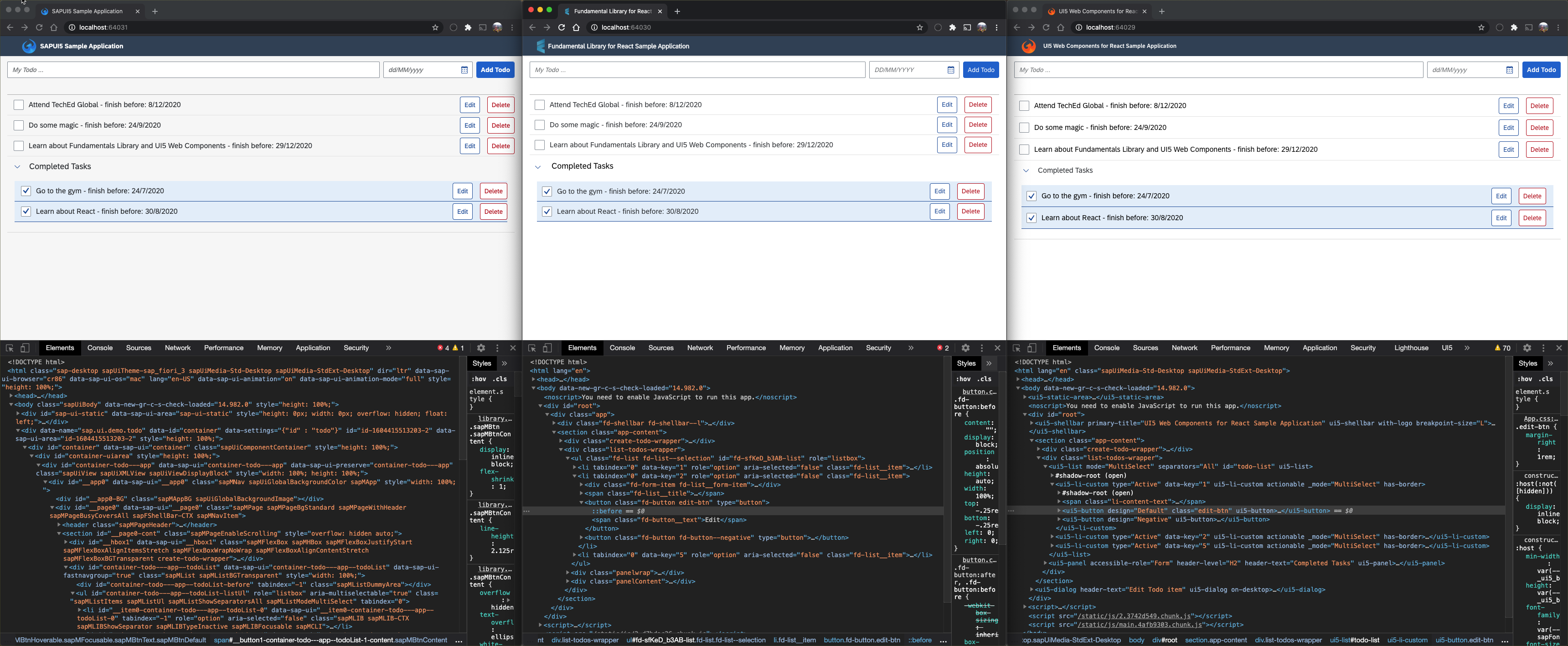
While the three web apps look very much alike, you can easily spot the DOM tree differences within the developer tools.
The screenshot above shows three To-Do list applications that come with the same features. I've been told that there has been a similar project in the past that compares a bunch of other frameworks with the same approach (Disclaimer: From what I see that code isn't leveraging the latest version and best practices of the respective frameworks). While they use their own layout for the To-Do app, the technologies of this project will implement SAP Fiori UX. Each of our web apps has input fields to add new items and shows the existing items in two separate lists. The unchecked items are in the upper list and the checked ones in the lower, collapsable list. Items can also be removed and changed via the edit dialog that we will focus on later. These apps look identical because all of them follow the SAP Fiori Design Guidelines. From the standard browser view, you wouldn't expect that all apps are built with very different technologies:
The left one is built with SAPUI5, the center one with Fundamental React, and the right one with UI5 Web Components for React. These technologies follow different paradigms and have, therefore, also distinct advantages and disadvantages. In the TechEd session, I mostly focus on a conceptual comparison and how much flexibility and reusability the frameworks/libraries offer. In the end, it’s up to the architect to make the following trade-off on a per-project basis:

This post will be less about the conceptual differences and focus more on the different "coding experience."
SAPUI5 Sample App

The gold standard: An app built with the well-established SAPUI5 framework.
Introduction
SAPUI5 and its open-sourced sibling, OpenUI5, are probably the best knows web technologies in this comparison. Both are commonly referred to as “UI5” and let you build enterprise-ready web applications responsive to all devices, running on almost any browser of your choice. They are based on JavaScript, using jQuery as their foundation, and follow web standards. They ease your development with a client-side HTML5 rendering library, including a rich set of controls, and support data binding to different data models (JSON, XML, and OData).
SAPUI5 uses the well-established Model-View-Controller (MVC) model to separate the project’s code. The models (OData, JSON, and XML) just need to point to a resource, and the framework takes care of the model’s lifecycle via hooks. The view is typically built with XML and combines standard controls, custom controls, and fragments to create an appealing user experience. The framework will render the HTML code based on these views. The various controllers (one per view) take care of the event handling and the navigation of the views. So overall, we can say that the developer’s primary focus is on the orchestration of existing controls and the business logic in the controllers.
Code Review

The edit dialog
Here is a snippet of a dialog view that consists of labels, fields, and buttons. You can also see that the i18n support comes "for free" without any additional work.
<Dialog id="editDialog" title="{i18n>EDIT_TODO}" contentWidth="400px">

  <content >

    <VBox>

      <Label text="{i18n>TODO_TITLE}" labelFor="input-title" />

      <TextArea width="100%" id="input-title" value="{/edit/text}"/>

      <Label text="{i18n>TODO_DATE}" labelFor="input-date" />

      <DatePicker id="input-date" valueFormat="dd/MM/yyyy" displayFormat="dd/MM/yyyy" value="{/edit/deadline}" />

    </VBox>

  </content>

  <buttons >

    <Button text="{i18n>CANCEL}" press=".onClose"/>

    <Button type="Emphasized" text="{i18n>SAVE}" press=".onSave"/>

  </buttons>

</Dialog>
When we want to open the dialog, we need to (a) provide data via the model and (b) call the "open" function. Both can be done from a controller method via event handling.
onEditTodo: function (oEvent) {

	var oModel = this.getView().getModel();

	const todo = oEvent.getSource().getBindingContext().getObject();


	oModel.setProperty("/edit", Object.assign({}, todo));

	this.getView().byId("editDialog").open();

},
UI5 Web Components for React Sample App

Strictly following web standards: This web app has been build with UI5 Web Components.
Introduction
This sample app leverages the UI5 Web Components, which provide a set of web components that share many methods and properties with well-known SAPUI5 controls. This will help SAPUI5 developers to find their way when getting started with this new technology. UI5 Web Components are neither built on top of UI5, but rather lightweight and independent UI elements nor are they a successor of UI5, but rather a complementary offering. These web components can be used natively or in combination with any web development framework such as Angular, React, and Vue.js.
For React, there is even a separate wrapper implementation around UI5 Web Components, making them even more comfortable. This sample application has been implemented with the UI5 Web Components for React.
Code Review
React apps don’t follow the MVC model but use so-called components. Not to be confused with UI5 Web Components or the web technology web components! These React components are used to divide the code into various files. The philosophy behind this is to have small, light-weight, self-enclosed components that can easily be reused. For this, each component needs to manage its own data (state) and business logic. Larger components delegate parts of that state to their subcomponents. Components are built with a mix of JavaScript (or TypeScript) and XML, so-called JSX. To assemble the edit dialog we’re seen above, we would have to build a dedicated “EditDialog” component with the following snippet:
import { Label } from "@ui5/webcomponents-react/lib/Label";

import { TextArea } from "@ui5/webcomponents-react/lib/TextArea";

import { Dialog } from "@ui5/webcomponents-react/lib/Dialog";

import { Button } from "@ui5/webcomponents-react/lib/Button";

import { DatePicker } from "@ui5/webcomponents-react/lib/DatePicker";


import PropTypes from "prop-types";

import React, { Component, createRef } from "react";


class EditDialog extends Component {


  constructor(props) {

    super(props);

    this.state = {

      id: "",

      text: "",

      deadline: ""

    };

    this.editDialog = createRef();

  }


  open() {

    this.editDialog.current.open();

  }


  onBeforeOpen = () => {

    this.setState({

      id: this.props.todoBeingEditted.id,

      text: this.props.todoBeingEditted.text,

      deadline: this.props.todoBeingEditted.deadline

    });

  }


  handleTextChange = event => {

    this.setState({ text: event.target.value });

  };


  handleDateChange = event => {

    this.setState({ deadline: event.target.value });

  };


  render() {

    return <Dialog header-text="Edit Todo item" ref={this.editDialog} onBeforeOpen={this.onBeforeOpen} >

      <div className="dialog-content">

        <div className="edit-wrapper">

          <Label>Title:</Label>

          <TextArea className="title-textarea" max-length="24" show-exceeded-text value={this.state.text} onChange={this.handleTextChange} ></TextArea>

        </div>


        <div className="edit-wrapper date-edit-fields">

          <Label>Date:</Label>

          <DatePicker format-pattern="dd/MM/yyyy" value={this.state.deadline} onChange={this.handleDateChange} ></DatePicker>

        </div>

      </div>

      <div className="dialog-footer" >

        <Button design="Transparent" onClick={() => { this.editDialog.current.close(); }}>Cancel</Button>

        <Button design="Emphasized" onClick={() => { this.props.saveItem(this.state); this.editDialog.current.close(); }}>Save</Button>

      </div>

    </Dialog>;

  }


}


EditDialog.propTypes = {

  todoBeingEditted: PropTypes.object,

  saveItem: PropTypes.func,

};


export default EditDialog;
We see that the component is self-enclosed and provides an "open" function, which delegates this call to the generic UI5 Web Components Dialog component. Most of the rest of the code takes care of internal state management.
To render this component in a larger component, we need to import it, add it to the render function via JSX, and pass in props:
<EditDialog ref={editDialog} todoBeingEditted={todoBeingEditted} saveItem={handleSave} />Like the previous example, we need to provide data and call the "open" function to display the dialog. This JSX code is the equivalent of the snippet we saw in the previous section.
 const handleEdit = useCallback((id) => {

    const todoObj = todos.filter(todo => {

      return todo.id === id;

    })[0];


    setTodoBeingEditted(() => ({

      id: id,

      text: todoObj.text,

      deadline: todoObj.deadline

    }));


    editDialog.current.open();

  }, [todos, setTodoBeingEditted]);
Fundamental React Sample App

The extendable: This application is based on Fundamental Library Styles.
Introduction
The sample application leverages the Fundamental Library Styles, which delivers a Fiori 3 component library for building SAP user interfaces with any web technology. Fundamental Library Styles is a light-weight presentation layer that can be used with your UI framework of choice (e.g., Angular, React, Vue.js, etc.). With this library of stylesheets and HTML tags, developers can build consistent SAP Fiori apps in any web-based technology.
This sample application has been implemented with Fundamental React, which offers a React implementation of the components designed in Fundamental Styles.
Code Review
The following React component is very much like the previous example. The most significant difference is that we have an additional state, showDialog, and import different components (this time from the Fundamental React library). The Fundamental React library leaves it up to us to manage the "visible" state of the dialog components while the UI5 Web Components provided a semantic "open" method.
import { Dialog } from "fundamental-react/lib/Dialog";

import { Button } from "fundamental-react/lib/Button";

import { DatePicker } from "fundamental-react/lib/DatePicker";

import { FormLabel, FormTextarea } from "fundamental-react/lib/Forms";


import PropTypes from "prop-types";

import React, { Component, createRef } from "react";


class EditDialog extends Component {


  constructor(props) {

    super(props);

    this.state = {

      id: "",

      text: "",

      deadline: "",

      showDialog: false

    };

  }


  open() {

    this.setState({

      id: this.props.todoBeingEditted.id,

      text: this.props.todoBeingEditted.text,

      deadline: this.props.todoBeingEditted.deadline,

      showDialog: true

    });

  }


  onBeforeOpen = () => {

    this.setState({

      id: this.props.todoBeingEditted.id,

      text: this.props.todoBeingEditted.text,

      deadline: this.props.todoBeingEditted.deadline

    });

  }


  handleTextChange = event => {

    this.setState({ text: event.target.value });

  };


  handleDateChange = event => {

    this.setState({ deadline: event.formattedDate});

  };


  render() {

    return <Dialog

      actions={[

        (<Button key="cancelBtn" option="transparent" >Cancel</Button>),

        (<Button key="saveBtn" option="emphasized" onClick={() => { this.props.saveItem(this.state); this.setState({ showDialog: false }); }} >Save</Button>)

      ]}

      onClose={() => { this.setState({ showDialog: false }); }}

      show={this.state.showDialog}

      title="Edit Todo item" >

      <div className="dialog-content">

        <div className="edit-wrapper">

          <FormLabel>Title:</FormLabel>

          <FormTextarea  onChange={this.handleTextChange}  defaultValue={this.state.text} />

        </div>


        <div className="edit-wrapper date-edit-fields">

          <FormLabel>Date:</FormLabel>

          <DatePicker

            dateFormat="DD/MM/YYYY"

            className="add-todo-element-width"

            onChange={this.handleDateChange}

            defaultValue={this.state.deadline} />

        </div>

      </div>

    </Dialog>;

  }

}


EditDialog.propTypes = {

  todoBeingEditted: PropTypes.object,

  saveItem: PropTypes.func,

};


export default EditDialog;
The usage of this edit dialog works in the same way as the previous example.
<EditDialog ref={editDialog} todoBeingEditted={todoBeingEditted} saveItem={handleSave} />Another difference to the previous example is that the library only brings the SAP Fiori Styles and the component implementations. Some general SAP Fiori resources such as the used fonts and icons need to be imported manually in the project. The easiest option to do this is via CSS and a file-copy-operation in the post-install hook.
@font-face {

  font-family: "72";

  src: url("72-Regular.woff") format("woff");

  font-weight: normal;

  font-style: normal;

}


@font-face {

  font-family: "SAP-icons";

  src: url("SAP-icons.woff") format("woff");

  font-weight: normal;

  font-style: normal;

}
"scripts": {
...
"postinstall": "cp node_modules/@sap-theming/theming-base-content/content/Base/baseLib/sap_fiori_3/fonts/SAP-icons.woff src && cp node_modules/@sap-theming/theming-base-content/content/Base/baseLib/sap_base_fiori/fonts/72-Regular.woff src"
},Number of wrapper libraries
I made a mistake during the session recording, and unfortunately, I noticed it when it was just too late to correct it. I said that there was a wrapping library for Angular, React, and Vue.js for both approaches, but this is not true. There is only a React wrapper for the UI5 Web Components. Which means there are not six but four open-source projects available on GitHub:
Fundamental Library Styles
Fundamental React
Fundamental Angular
Fundamental Vue
UI5 Web Components
UI5 Web Components for React
By the way: These are the official names of the projects. Please apologize if I used slightly different variations in the recording.
Comparison
The following table shows a comparison between the mentioned web technologies. For a further explanation, please check out the source code on GitHub or the associated TechEd Online session IIS114.
Fundamental Library Styles | UI5 Web Components | SAPUI5/OpenUI5 | |
|---|---|---|---|
Runtime size of sample app¹ | ≈1.6MB | ≈0.9MB | ≈7.6MB |
Performance of sample app² | 99 | 100 | 67 |
Flexibility | Very high | High | Moderate |
Open standards | High | Very high | Moderate |
Available controls | 100+ | 80+ | 650+ |
Vendors | >2 | >2 | 1 |
Compatibility with SAP Fiori launchpad | Decoupled <iframe> | Decoupled <iframe> | Integrated <iframe> |
Maturity | v0.13.0 | v0.27.0 | v1.84.1 |
Themeable | ✅ | ✅ | ✅ |
SAP Fiori compliant | ✅ | ✅ | ✅ |
As of December 2020
¹ Measured with the network inspector of the Google Chrome Dev Tools
² According to the Google Chrome Lighthouse report
Summary
We've seen that both React-based applications are the clear winners in the performance comparison as the web apps have a small footprint and load very fast. Their disadvantage is that they have not yet reached a stable release, which means breaking changes could still happen on any minor release. They cannot be integrated as natively in the SAP Fiori Launchpad as SAPUI5 and SAP Fiori Elements apps can. Another advantage of SAPUI5 is that it comes with a broad set of available and well-tested controls that have been working reliably for years. Besides this, SAPUI5 comes with many enterprise-features like i18n support, routing capabilities, theming, adaptability, and OData clients out of the box. This makes the development process as smooth as possible.
My personal recommendation for projects that require multiple of the enterprise features that I mentioned above is SAPUI5. This well-aged framework is very stable, and you can be sure that it comes with all you need. The situation looks a little bit different when we're talking about research-like projects or POCs. SAPUI5 is also well suited for these projects, but the React-based libraries' advantages could outweigh SAPUI5 here. Using these new frameworks will not only help you to get a beautiful, incredibly responsive user interface, it will also help your developers to broaden their horizons and get to know a new development philosophy and mindset. In the SAP TechEd session IIS114, I'll talk more about the differences between Fundamental Library Styles and UI5 Web Components.
- SAP Managed Tags:
- SAP Fiori,
- SAPUI5,
- User Interface
Labels:
22 Comments
You must be a registered user to add a comment. If you've already registered, sign in. Otherwise, register and sign in.
Labels in this area
-
ABAP CDS Views - CDC (Change Data Capture)
2 -
AI
1 -
Analyze Workload Data
1 -
BTP
1 -
Business and IT Integration
2 -
Business application stu
1 -
Business Technology Platform
1 -
Business Trends
1,661 -
Business Trends
87 -
CAP
1 -
cf
1 -
Cloud Foundry
1 -
Confluent
1 -
Customer COE Basics and Fundamentals
1 -
Customer COE Latest and Greatest
3 -
Customer Data Browser app
1 -
Data Analysis Tool
1 -
data migration
1 -
data transfer
1 -
Datasphere
2 -
Event Information
1,400 -
Event Information
64 -
Expert
1 -
Expert Insights
178 -
Expert Insights
273 -
General
1 -
Google cloud
1 -
Google Next'24
1 -
Kafka
1 -
Life at SAP
784 -
Life at SAP
11 -
Migrate your Data App
1 -
MTA
1 -
Network Performance Analysis
1 -
NodeJS
1 -
PDF
1 -
POC
1 -
Product Updates
4,578 -
Product Updates
323 -
Replication Flow
1 -
RisewithSAP
1 -
SAP BTP
1 -
SAP BTP Cloud Foundry
1 -
SAP Cloud ALM
1 -
SAP Cloud Application Programming Model
1 -
SAP Datasphere
2 -
SAP S4HANA Cloud
1 -
SAP S4HANA Migration Cockpit
1 -
Technology Updates
6,886 -
Technology Updates
397 -
Workload Fluctuations
1
Related Content
- Cloud Integration: Manually Sign / Verify XML payload based on XML Signature Standard in Technology Blogs by SAP
- SAP Cloud Integration: Understanding the XML Digital Signature Standard in Technology Blogs by SAP
- Cloud Integration: Manually Encrypt/Decrypt XML payload based on XML-Enc Standard in Technology Blogs by SAP
- SAP Fiori elements and Lufthansa @ DSAG Technologietage 2024 in Technology Blogs by SAP
- How to adapt modern Fiori apps without breaking them completely in Technology Blogs by Members
Top kudoed authors
| User | Count |
|---|---|
| 11 | |
| 11 | |
| 10 | |
| 9 | |
| 7 | |
| 7 | |
| 7 | |
| 7 | |
| 6 | |
| 5 |