
- SAP Community
- Products and Technology
- Technology
- Technology Blogs by SAP
- Multi-model in hana_ml 2.6 for Python (part 04): G...
Technology Blogs by SAP
Learn how to extend and personalize SAP applications. Follow the SAP technology blog for insights into SAP BTP, ABAP, SAP Analytics Cloud, SAP HANA, and more.
Turn on suggestions
Auto-suggest helps you quickly narrow down your search results by suggesting possible matches as you type.
Showing results for
Developer Advocate
Options
- Subscribe to RSS Feed
- Mark as New
- Mark as Read
- Bookmark
- Subscribe
- Printer Friendly Page
- Report Inappropriate Content
11-19-2020
7:26 PM
In the previous post, we looked at the exploration of spatial data using HANA dataframes. But even more than regular data types geospatial results require visualization to be properly understood by a human.
...and I am going to create a new notebook
Then import usual modules and connect to SAP HANA instance (SAP HANA Cloud trial instance in my case).
Nothing new so far, but here comes...
GeoPandas extends the datatypes used by Pandas to include geometric types and allow spatial operations on them. And as such GeoPandas provides a high-level interface to the
Let's install and load it. Please note I included
Let's create a HANA DataFrame
Previously we would create Pandas dataframe from it, but now let's create GeoPandas dataframe. I will use
Please note, that here we need to tell GeoPandas what is the geometry column and what Coordinate Reference System, or
You can use the following statements to check what GeoPandas types are used.
The beauty of using GeoPandas for plotting is that takes only a single method
Cool! But... a little bit too tiny, isn't it? That's because the default size is set to 6x4 in inches, as we can find by running:
You can specify the size when calling the plot (and please note the use of
...or set the size for all plots.
GeoPandas plots are very convenient as well to quickly create Choropleth maps. Just specify the column and its values will be used to set the color. Below are examples for using the categorical variable "UN Subregion" and the numeric variable "Population in 2005".
Please note:
Let's move to data from the airports' table
So, these are all the airports accordingly to the dataset we originally loaded. They fit into land masses, so our imagination can add the world map just by looking at this picture.
But what if I select airports from one country (which is Poland in my case)?
Well, not that clear even for me now ?So, some additional details would be helpful. Maybe airport names? For that we need to create a new variable
Now better, and I can even clearly spot my nearest airport by its code.
But still, some more context, like a country's shape from
Please note:
So far, we've been plotting spatial data using only data we have in the SAP HANA database. And even though we can have the complete OpenStreetMap in SAP HANA db instance (as POC'ed by our engineering team), for visualization it might be convenient to use map services already available online. For that purpose, we will use
And now we can add a map background (you have a choice of multiple map providers using the
I am happy with the result, but before we move on, I'd like to make sure you don't miss the
SAP HANA gives you several ways to run in-database clustering of spatial data. One of the recent additions to these methods is the Voronoi cells. As the documentation says: "Such a Voronoi cell consists of all locations of the plane that are closer to its generating point than to any other input point."
Let's do this for our airports. This time we know that we need to transform spatial coordinates to SRID 3857 before we can display them properly with the map's background. And we do this already in the SAP HANA Cloud, which provides this SRS by default!
And now let's add these Voronoi cells to the plot, remembering to order layers properly using the
Good job, isn't it? We used three HANA DataFrames and four layers in this GeoPandas plot!
And the complete notebook can be found at: https://github.com/SAP-samples/hana-ml-samples/blob/main/Python-API/usecase-examples/multimodel-anal....
But...
like Folium, Geoplot, or Cartopy. Have you used any of them and would like to share your experience with others? Please add in the comments.
In the next episode, we will move to what's new in
Stay healthy ❤️
-Vitaliy (aka @Sygyzmundovych)
Let's go...
...and I am going to create a new notebook
03 Spatial Viz.ipynb in JupyterLab.Then import usual modules and connect to SAP HANA instance (SAP HANA Cloud trial instance in my case).
import pandas as pd

from hana_ml import dataframe as dfhhana_cloud_endpoint="<uuid>.hana.trial-eu10.hanacloud.ondemand.com:443"hana_cloud_host, hana_cloud_port=hana_cloud_endpoint.split(":")
cchc=dfh.ConnectionContext(port=hana_cloud_port,
address=hana_cloud_host,
user='HANAML',
password='Super$ecr3t!',
encrypt=True
)cchc.connection.isconnected()Nothing new so far, but here comes...
GeoPandas
GeoPandas extends the datatypes used by Pandas to include geometric types and allow spatial operations on them. And as such GeoPandas provides a high-level interface to the
matplotlib library for plotting spatial data.Let's install and load it. Please note I included
descartes supporting plotting in GeoPandas.!pip install geopandas descartesimport geopandas
Let's create a HANA DataFrame
dfh_countries from the existing SAP HANA table TM_WORLD_BOARDERSthat we loaded in the previous post. You can see the table() method in hana_ml has been extended to support geo_cols property too.dfh_countries = cchc.table("TM_WORLD_BORDERS", geo_cols={"SHAPE":"4326"})Previously we would create Pandas dataframe from it, but now let's create GeoPandas dataframe. I will use
dfg_ prefixes for that.dfg_countries = geopandas.GeoDataFrame(dfh_countries.collect(),
geometry='SHAPE', crs="EPSG:4326"
)Please note, that here we need to tell GeoPandas what is the geometry column and what Coordinate Reference System, or
crs, is used. It matches SAP HANA's SRID that is based on a dataset maintained by EPSG as well.
You can use the following statements to check what GeoPandas types are used.
dfg_countries.dtypesprint(type(dfg_countries))
print(type(dfg_countries.LON))
print(type(dfg_countries.SHAPE))Visualizing countries dataframe
The beauty of using GeoPandas for plotting is that takes only a single method
plot() to do it!dfg_countries.plot()
Cool! But... a little bit too tiny, isn't it? That's because the default size is set to 6x4 in inches, as we can find by running:
import matplotlib.pyplot as plt


print(plt.rcParams.get('figure.figsize'))
You can specify the size when calling the plot (and please note the use of
boundary here, as we will need it later as well)...dfg_countries.boundary.plot(figsize=(26, 12))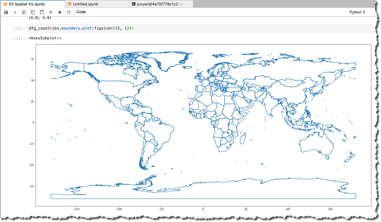
...or set the size for all plots.
plt.rcParams["figure.figsize"] = [26, 12]GeoPandas plots are very convenient as well to quickly create Choropleth maps. Just specify the column and its values will be used to set the color. Below are examples for using the categorical variable "UN Subregion" and the numeric variable "Population in 2005".
dfg_countries.plot(column="SUBREGION", cmap='flag')
dfg_countries.plot(column="POP2005", cmap='rainbow', legend=True)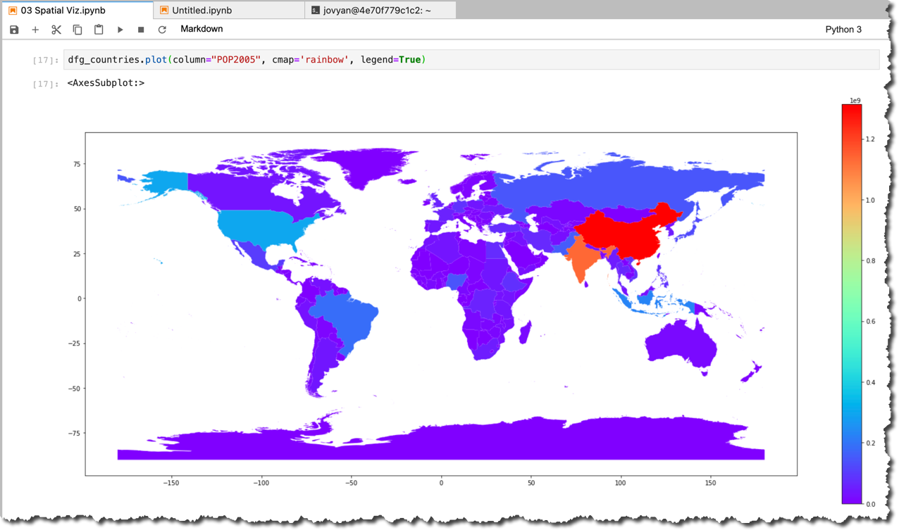
Please note:
- the use of two different colormaps
cmapto get the best use of colors to convey information. You can play with different colormaps available in Matplotlib. - the use of the
legendin the second example.
Visualizing airports dataframe
Let's move to data from the airports' table
PORTS in SAP HANA.dfh_ports = cchc.table("PORTS", geo_cols={"POINT_LON_LAT_GEO":"4326"}).select('CODE','POINT_LON_LAT_GEO')geopandas.GeoDataFrame(
dfh_ports.collect(),
geometry='POINT_LON_LAT_GEO', crs="EPSG:4326"
).plot()
So, these are all the airports accordingly to the dataset we originally loaded. They fit into land masses, so our imagination can add the world map just by looking at this picture.
But what if I select airports from one country (which is Poland in my case)?
dfh_ports_pl = (dfh_ports

                .alias('P')

                .join(dfh_countries.filter("NAME='Poland'").alias('C'),

                      condition='P.POINT_LON_LAT_GEO.ST_CoveredBy(C.SHAPE)=1',

                      select=["P.*"]

                     )

               )
dfg_ports_pl = geopandas.GeoDataFrame(dfh_ports_pl.collect(),
geometry='POINT_LON_LAT_GEO', crs="EPSG:4326"
)dfg_ports_pl.plot()
Well, not that clear even for me now ?So, some additional details would be helpful. Maybe airport names? For that we need to create a new variable
fig_port_pl representing the plot.fig_port_pl=dfg_ports_pl.plot()
dfg_ports_pl.apply(
lambda port: fig_port_pl.annotate(
port.CODE,
xy=port.POINT_LON_LAT_GEO.coords[0],
xytext=(-10, 10), textcoords="offset points"
), axis=1
)Now better, and I can even clearly spot my nearest airport by its code.

But still, some more context, like a country's shape from
TM_WORLD_BORDERS, would help. Don't you think so?dfg_poland = geopandas.GeoDataFrame(dfh_countries.filter("ISO2='PL'").collect(),
geometry='SHAPE', crs="EPSG:4326"
)fig_port_pl=dfg_ports_pl.plot(color='w', edgecolor='r', markersize=300)
dfg_ports_pl.apply(lambda port: fig_port_pl.annotate(port.CODE, xy=port.POINT_LON_LAT_GEO.coords[0], xytext=(-10, 15), textcoords="offset points"), axis=1)
dfg_poland.plot(ax=fig_port_pl, alpha=0.6, edgecolor='k', zorder=0)
Please note:
- the use of
color,edgecolorandmarkersizeto make airport locations more visually prominent, - the use of the
alphaparameter to set the transparency of the country shape (we will need it later), and - most importantly: the use of
zorderto add a country shape as a layer below airports.
Map background
So far, we've been plotting spatial data using only data we have in the SAP HANA database. And even though we can have the complete OpenStreetMap in SAP HANA db instance (as POC'ed by our engineering team), for visualization it might be convenient to use map services already available online. For that purpose, we will use
contextily module.!pip install contextilyimport contextily as ctx
And now we can add a map background (you have a choice of multiple map providers using the
source parameter in the ctx.add_basemap() method. I am using standard OpenStreetMap here:fig_port_pl=dfg_ports_pl.to_crs(epsg=3857).plot(alpha=1, color='w', edgecolor='r', markersize=300, zorder=2)
dfg_ports_pl.to_crs(epsg=3857).apply(lambda port: fig_port_pl.annotate(port.CODE, xy=port.POINT_LON_LAT_GEO.coords[0], xytext=(-10, 15), textcoords="offset points"), axis=1)
dfg_poland.to_crs(epsg=3857).plot(ax=fig_port_pl, alpha=0.4, edgecolor='k', zorder=1)
fig_port_pl.set_axis_off()
ctx.add_basemap(fig_port_pl, source=ctx.providers.OpenStreetMap.Mapnik)
I am happy with the result, but before we move on, I'd like to make sure you don't miss the
to_csr() method we had to apply to convert our datasets to Pseudo-Mercator coordinate spatial reference 3857. This is the spatial reference that was first introduced in Google Maps, and then adopted by most of the map services, incl. OpenStreetMap.Do you know that Google tried to get EPSG to register this CSR using the number900913? Because, you know,
SAP HANA's spatial clustering
SAP HANA gives you several ways to run in-database clustering of spatial data. One of the recent additions to these methods is the Voronoi cells. As the documentation says: "Such a Voronoi cell consists of all locations of the plane that are closer to its generating point than to any other input point."
Let's do this for our airports. This time we know that we need to transform spatial coordinates to SRID 3857 before we can display them properly with the map's background. And we do this already in the SAP HANA Cloud, which provides this SRS by default!
country_iso2='PL'


sql_3857='''

SELECT

	p."POINT_LON_LAT_GEO".ST_Transform(3857) AS "PORTGEO",

	ST_VoronoiCell(p."POINT_LON_LAT_GEO".ST_Srid(0), 30).ST_Srid(4326).ST_Intersection(wb."SHAPE").ST_Transform(3857) OVER () AS "CELL"

FROM "PORTS" p

JOIN "TM_WORLD_BORDERS" wb

ON p."POINT_LON_LAT_GEO".ST_COveredBy(wb."SHAPE")=1

WHERE wb."ISO2" ='{}'

'''.format(country_iso2)
dfp_ports_pl_voronoi = cchc.sql(
sql_3857, geo_cols=['CELL','PORTGEO'],
srid=3857
).collect()
dfg_ports_pl_voronoi = geopandas.GeoDataFrame(
dfp_ports_pl_voronoi,
geometry='CELL', crs="EPSG:3857"
)
And now let's add these Voronoi cells to the plot, remembering to order layers properly using the
zorder parameter.fig_port_pl=dfg_ports_pl.to_crs(epsg=3857).plot(alpha=1, color='w', edgecolor='r', markersize=300, zorder=3)
dfg_ports_pl.to_crs(epsg=3857).apply(lambda port: fig_port_pl.annotate(port.CODE, xy=port.POINT_LON_LAT_GEO.coords[0], xytext=(-10, 15), textcoords="offset points"), axis=1)
dfg_poland.to_crs(epsg=3857).plot(ax=fig_port_pl, alpha=0.4, edgecolor='k', zorder=1)
fig_port_pl.set_axis_off()
ctx.add_basemap(fig_port_pl, source=ctx.providers.OpenStreetMap.Mapnik)
dfg_ports_pl_voronoi.boundary.plot(ax=fig_port_pl, edgecolor='r',
zorder=2
)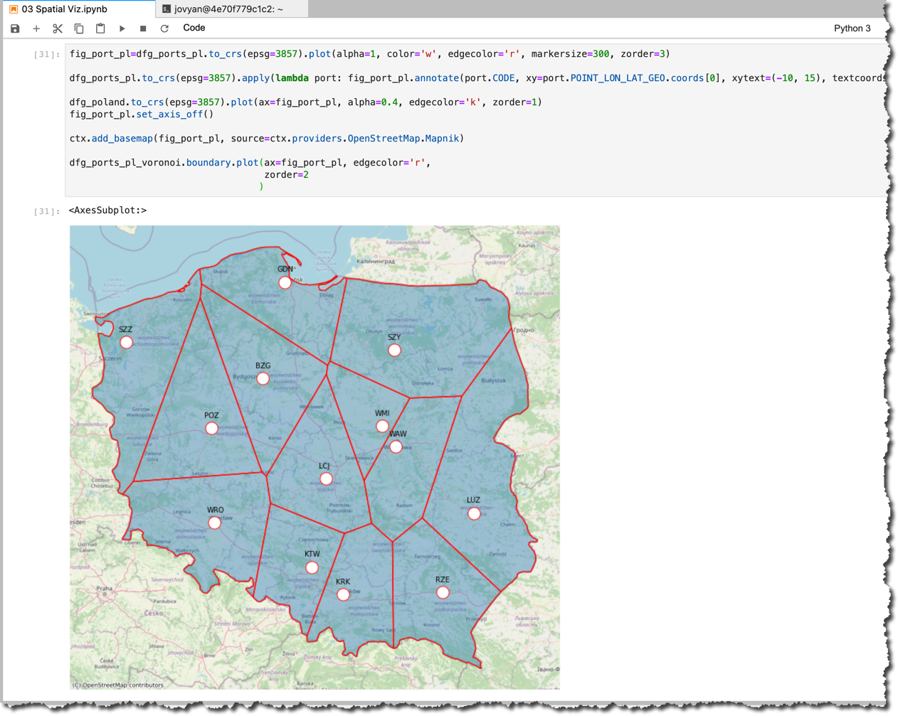
Good job, isn't it? We used three HANA DataFrames and four layers in this GeoPandas plot!
And the complete notebook can be found at: https://github.com/SAP-samples/hana-ml-samples/blob/main/Python-API/usecase-examples/multimodel-anal....
But...
...there are more ways to visualize geospatial data in Python
like Folium, Geoplot, or Cartopy. Have you used any of them and would like to share your experience with others? Please add in the comments.
In the next episode, we will move to what's new in
hana_ml 2.6 processing connected data using SAP HANA's graph workspaces!Stay healthy ❤️
-Vitaliy (aka @Sygyzmundovych)
- SAP Managed Tags:
- SAP HANA Cloud,
- Python,
- SAP HANA,
- SAP HANA multi-model processing,
- SAP HANA Spatial,
- Big Data
Labels:
You must be a registered user to add a comment. If you've already registered, sign in. Otherwise, register and sign in.
Labels in this area
-
ABAP CDS Views - CDC (Change Data Capture)
2 -
AI
1 -
Analyze Workload Data
1 -
BTP
1 -
Business and IT Integration
2 -
Business application stu
1 -
Business Technology Platform
1 -
Business Trends
1,658 -
Business Trends
91 -
CAP
1 -
cf
1 -
Cloud Foundry
1 -
Confluent
1 -
Customer COE Basics and Fundamentals
1 -
Customer COE Latest and Greatest
3 -
Customer Data Browser app
1 -
Data Analysis Tool
1 -
data migration
1 -
data transfer
1 -
Datasphere
2 -
Event Information
1,400 -
Event Information
66 -
Expert
1 -
Expert Insights
177 -
Expert Insights
298 -
General
1 -
Google cloud
1 -
Google Next'24
1 -
Kafka
1 -
Life at SAP
780 -
Life at SAP
13 -
Migrate your Data App
1 -
MTA
1 -
Network Performance Analysis
1 -
NodeJS
1 -
PDF
1 -
POC
1 -
Product Updates
4,577 -
Product Updates
343 -
Replication Flow
1 -
RisewithSAP
1 -
SAP BTP
1 -
SAP BTP Cloud Foundry
1 -
SAP Cloud ALM
1 -
SAP Cloud Application Programming Model
1 -
SAP Datasphere
2 -
SAP S4HANA Cloud
1 -
SAP S4HANA Migration Cockpit
1 -
Technology Updates
6,873 -
Technology Updates
420 -
Workload Fluctuations
1
Related Content
- SAP BTP Innobytes – March 2024 in Technology Blogs by SAP
- Unraveling the SAP DataSphere: Insights in bite-sized pieces in Technology Blogs by Members
- Multi-Model powering Intelligent Data Apps (2/3) in Technology Blogs by SAP
- Just Released: Enrich Your Intelligent Data Applications with Location Data from Esri using HANA Spatial Services in Technology Blogs by SAP
- Data Mesh with SAP Business Technology Platform Part 2 – SAP HANA Cloud in Technology Blogs by SAP
Top kudoed authors
| User | Count |
|---|---|
| 37 | |
| 25 | |
| 17 | |
| 13 | |
| 7 | |
| 7 | |
| 7 | |
| 6 | |
| 6 | |
| 6 |