In this blog post, we will try to go through the basics of selecting the right chart and how it can help you in your SAP SuccessFactors People Analytics Report Stories journey.
As an HR analyst, we often wear multiple hats depending upon the responsibilities we discharge. A lot of time it involves working with HR data and commonly includes responsibilities like data collection, data interpretation, and analysis (finding patterns and trends), and finally data visualization and communication.
We spend a lot of time on the data interpretation and analysis but sometimes the critical end goal of data visualization and communication is missed or fails to deliver the message that we had originally intended to make. At the same time, some of these stakeholders may be making pivotal decisions for the organization based on the analysis we shared, and hence articulating the insights from the analysis becomes critical. This is where spending a good amount of time in designing the dashboards/reports that you want to present becomes important.
With the following document, we wish to focus on HR specific use case and application of chart selection for the same.
Charts serve a very critical purpose in visual communication and even though you can use charts to portray data; but in order to share the same insight that you perceived from the data, it is important. that you select the right chart
SAP SuccessFactors People Analytics Report Stories provide a variety of modern charts that are categorized and designed for the purpose of helping chart designers to help them deliver their point succinctly. Report Stories categorizes charts according to the purpose of each chart server.
As a report creator, the first thing once you have the data first question you may ask is what are you trying to communicate with your data to? The answer is majorly among the 4 common types.
- Comparison - It is used for comparing multiple variables in a data set or multiple categories in a single variable.
- Distribution - It is used to show how variables are distributed over time.
- Relationship – It is used to show if any relation exists between 2 or more variables.
- Composition – It is used to show how individual parts make up the whole data point.
The following illustration can be used as a handy guide for chart selection.
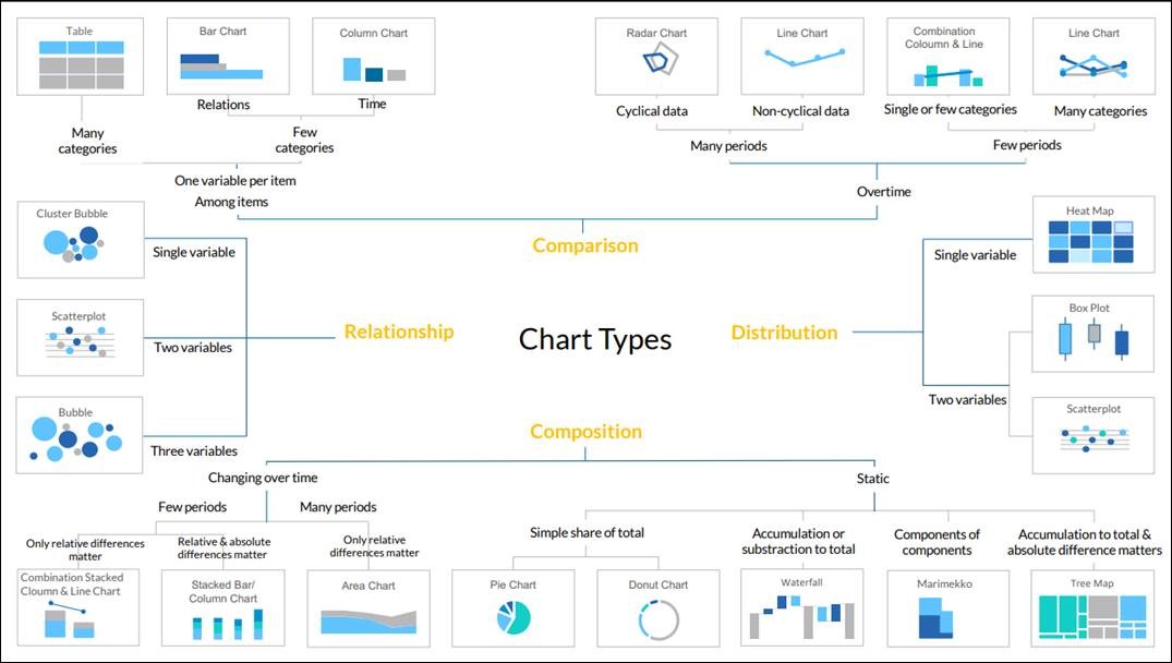
Source: Internal SAP
How do SAP SuccessFactors People Analytics Report Stories classify chart types?
As some of the charts can be used for a different purpose, SAP SuccessFactors People Analytics Report Stories has distributed the charts in 6 categories to help users find the chart according to the purpose.
- Comparison
- Distribution
- Correlation/ Relationship
- Trend
- Indicator
- More
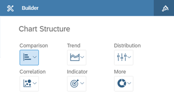
Details of each chart category are as below.
Category |
Chart |
Comparison |
Column Chart |
Bar Chart |
Stacked Bar Chart / Column Chart |
Combination Column & Line |
Combination Stacked Column & Line |
Waterfall |
Trend |
Stacked Area |
Line |
Time Series |
Distribution |
Box Plot |
Heat Map |
Histogram |
Radar |
TreeMap |
Correlation |
Bubble |
Cluster Bubble |
Indicator |
Scatter Plot |
Bullet |
Numeric Point |
More |
Donut |
Marimekko |
Pie Chart |
You can also refer to the official
SAP Analytics Cloud Reference chart type guide.
In the next article in the series, we will try to cover the basics of each of these categories starting with comparison charts and also share examples of the same created in Report Stories.
